


steven919
-
Posts
63 -
Joined
-
Last visited
Posts posted by steven919
-
-
On 2016-05-12 at 2:51 AM, mightyduck said:
I would love a return, full time, to this in the desert...
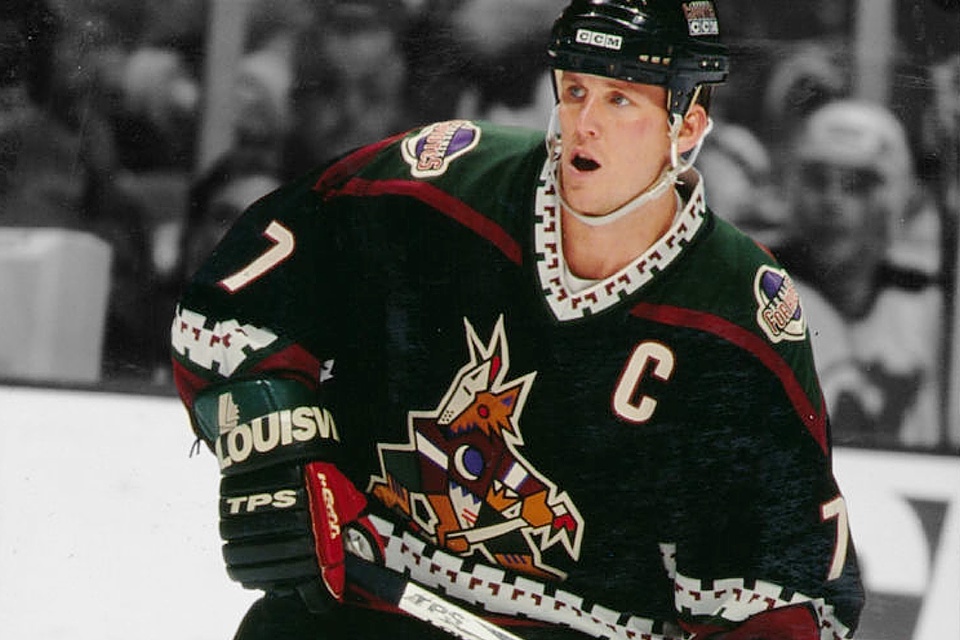
They are far from perfect, but there are a lot of good looking and unique elements there. Would love to see a new design that is a somewhat simplified version of this, including just the head of that logo. It's a moot point though since the team is almost certainly moving either this summer or the next.
Unpopular Opinions
in Sports Logo General Discussion
Posted
These uniforms are not good looking at all.
Shoulder yokes are too big, making the player look small.
Pant stripes are too wide, again making the player look small and there is an unmotivated widening of the stripes at the bottom of the pants.
Pant stripes and shoulder yokes don't match the pattern around arms, waist and socks.
Combine this and there's just too much going on. The uniforms are crowded, chaotic and incoherent.
That particular blue color at times looks too purple.
70/80's hockey jersey design in general is bad and this is also true for the Oilers.
Dynasty nostalgia is the only reason to keep wearing these uniforms.