


PrimalCookie
-
Posts
2,153 -
Joined
-
Last visited
Posts posted by PrimalCookie
-
-
The Broncos were the last holdout in not using mountain imagery. Now all 5 teams in the Rockies do on at least one jersey - who wants to bet the Coyotes make it 6/6?
-
I'm disappointed the Magic aren't using the throwbacks - Minnesota is so it's definitely allowed. However, I can't really complain since they're not using the city at all.
Both games in Cleveland will be Cavs white/Magic black, in Orlando it's Magic blue/Cavs white, so at least the consistency will be nice. Better than most other series, from what I can tell.
-
 4
4
-
-
I understand having a placeholder logo/uniforms for year 1 but there’s no reason they can’t pick out a name before the start of the season. I really hope they do
-
Cities that tried to get the Coyotes but failed:
- Kansas City
- Hamilton- Winnipeg
- Seattle
- Quebec City
- Houston
- Likely more that I’m forgetting/we don’t know about
The city that finally got them:
- Salt Lake City
I think Utah will be a pretty good hockey market, I’m just shocked they were the ones to get it done after so long. I really hate it for the the Coyotes fans… but it was time. It had been time for a while. Maybe they get a second chance down the road and make use of it, or not and they just become Atlanta 2.
Sucks, but it also doesn’t. Yknow?
-
2
-
-
14 hours ago, infrared41 said:
That race was old school short track stock car racing. It would have been better if the teams had known going in that tires weren't going to be indestructible (like they usually are with the NextGen car), but other than that, it was a good race. Record amount of short track lead changes and they could actually pass...for once.
Turns out aero packages don't matter when you have a tire that actually wears. What a concept!
They need to find a compound that lays down rubber instead of just shredding, but that was still pretty fun. I'm scared Goodyear will overreact and go back to the standard bricks they usually make.
-
Extreme Mountain West disrespect in this bracket. Every team except San Diego State dropped at least one seed from where the BracketMatrix average had them, with everyone except Colorado State dropping at least two. Nevada in particular was predicted as a 7 and ended up as a 10. That's brutal.
The other teams that the bracketologists were significantly off on were Gonzaga and FAU (both +2) and Virginia (only 20 of the 200 had them in the field). Most had Oklahoma or St. John's in Virginia's place.
-
Ole Miss has been inching closer and closer toward making powder the main blue over the last few years. Definitely worried about the rest of the design considering how Kiffin likes the whole "different combo for every game" thing, but I hope they make the switch official.
-
So I was going to make my usual "I don't like the Chargers gold pants, in fact I don't like any uniform where all 3 elements are different and the helmet's the lightest of them" post that I always make whenever the Chargers come up, and then I came across this picture.

The reason I was never a fan was because it made the uniform imbalanced and the helmet sticks out like it doesn't belong. The white numbers help somewhat (Wyoming is much worse than the Chargers because they have gold numbers), but yeah. I'm now realizing I think white socks fixes the problem. It makes it white at the top and bottom, and then blue/gold in between. The color blocking works now. Light-dark-medium-light instead of light-dark-medium-dark.
I will never say this again: thank you players for wearing the incorrect socks, because it actually improved the look this time.
-
4
-
 3
3
-
-
1 hour ago, DCarp1231 said:
Servpro scheme for Noah Gragson this weekend
Danica is back!
-
6 hours ago, DCarp1231 said:
Not a scheme, but trademark news-
The DEI specific trademarked fonts in relation to the 1 & 8 are due to expire in June. Teresa Earnhardt’s reign of terror is nearly over
Apparently the 15 font was abandoned some time ago by Teresa, but was picked up by Michael Waltrip to use at his brewing company
Semi related, did they ever explain why the 1 didn't use the RCR font like the 8/15?
-
I think Nike will go for a certain crowd-pleaser in 2026. Either the sash or the Waldos for the home and then a 1994 denim callback for the away.
...so naturally it'll actually be plain white and some weird royal/red camo pattern.
-
8
-
-
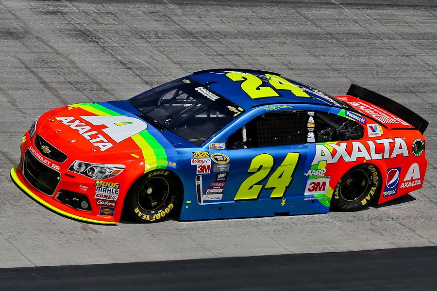
1 hour ago, DCarp1231 said:
What in the OSS trickery is going on here? That black border on the roof and A-post is crazy
-
1
-
-
I don’t love the switch from royal to navy, but the Sixers and Pistons are more established in red/white/blue so I get it. Would’ve preferred going the opposite direction since they have a history with powder, but it’s fine. Overall pretty good, big fan of going back to the script
-
On 2/17/2024 at 11:31 AM, upperV03 said:
I’ve long thought Orlando would be a natural candidate to wear a Chelsea-esque kit combo for their primary kit.
I can see it, although I'd prefer both purple/white/purple and sticking with all-purple. My pick for the Chelsea style is New England.
-
7 hours ago, Lights Out said:
Is it 2029 yet?
By this logic the Mets, White Sox, and Angels should all move too. After all, there's still the Yankees, Cubs, and Dodgers in those markets. Surely their fans would just switch over to those teams, just like A's fans will definitely switch to the Giants! What a genius he is.
-
1
-
-
4 minutes ago, DCarp1231 said:
To be fair, this was Gragson’s scheme with JRM in Xfinity
That's true, but I wasn't expecting it to carry over to a new team and manufacturer, especially since it was just a recoloring in the first place.
-
Ah yes, the 2019-20 Chase Elliott NAPA scheme on a NextGen SHR Ford. Doesn't look bad though
-
1
-
-
7 hours ago, DCarp1231 said:
Looks like we may be getting two(!!) throwback races this season-
Axalta is finally vindicated for doing the Rainbow Warrior at Bristol instead of Darlington in 2015.
-
3
-
-
6 hours ago, HOOVER said:
Have to fix that pant stripe to Teal/Gold/Black, and go all-Black on the collar, but this is a Yes for me.
Perfection.
-
21
-
 4
4
-
 6
6
-
 1
1
-
-
9 hours ago, DCarp1231 said:
It'll take a while to get used to something other than a 7 or 8 in the Furniture Row font.
The scheme looks nice. Definitely looks like more of a Trackhouse design than a Spire one, if that makes sense. Understandable, since Zane Smith is a Trackhouse driver who's simply being loaned to Spire for the season.
-
2
-
-
Oh hey, a nice opportunity to say the Nationals should drop the curly W and go with the interlocking DC full time.
Unfortunately, the reappearance of that logo is the only good thing that came out of these two uniforms.
-
2
-
-
I can go either way on the white outlines but the stripes needed to go. They always felt out of place on a team that’s otherwise as classic as can be. That makes the change an upgrade to me.
-
5 hours ago, DCarp1231 said:
Noah Gragson may have just secured the absolute worst scheme for 2024. It’s almost impressive how bad it is.
Eh, Preseason Thunder cars usually aren't too detailed. The actual scheme will probably like the rest of the Rush cars have been, black with yellow and red accents... wait, hold on, this is the actual scheme? Good lord. Wow.
It'll be hard to top this one for the worst scheme of the year award.
-
1
-
-


2024 NFL Changes
in Sports Logo News
Posted
Home
Away
Alternate 1
Alternate 2
Overall