


deltarich87
-
Posts
43 -
Joined
-
Last visited
Posts posted by deltarich87
-
-
Kings City Edition uniforms and court

-
 1
1
-
 3
3
-
 2
2
-
-
21 minutes ago, chakfu said:
It's good except for the wordmark. Wish either this or the black had the full Sacramento wordmark and the other kings. I can understand not wanting the same wordmark for all 3. Somehow the black next to purple on the regular ones with the script evokes mitch Richmond, tiny Archibald, Phil Ford dark blues and I like it.
Yeah I'm hoping their City uniform has the full Sacramento script on it whenever that's revealed
-
6 hours ago, Pirate_Nation said:
Statement uniform
While I'm not a fan of the execution of it, I will say that it looks better in these pics than the one that was leaked the other day of just the uniform. Could do without the Sacramento wordmark atop the Kings one. The ad logo stands out in a bad way on this one compared to their Icon and Association uniforms
Another look at the set here
I'd probably get on board with this more if it was their City uniform, and they instead had something like this as their Statement uniform
credit for the mockup: https://www.instagram.com/jerseyxswap/
-
30
-
-
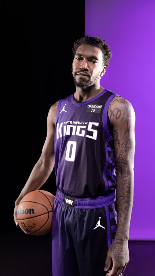
Well it's certainly purple lol. You knew they'd lean in on the whole beam thing which made sense but not a fan of the execution of this one at all and it's back to the bad wordmark they had prior, just done in a way that sort of invokes the 94-02 wordmark with the enlarged K and S. Oh well
-
New wordmark does wonders for the Kings new uniforms since their prior one was bland/bad overall. Icon uniforms are top notch and the ones they'll probably be wearing most of the time I'd imagine. Association ones would look so much better if the black/purple was flipped on things like the wordmark/number/collar and arm trim IMO. The black wordmark on white just looks plain. Really hope the Statement uniform is purple to help sell the new rebrand better for me. Would have liked to have seem that new Sacramento script on one of the uniforms but the Statement uni that's being teased looks to have the 94-2002 wordmark on it. Maybe the City uniform will have that new Sacramento script. Here's hoping


2023 - 2024 NBA changes
in Sports Logo News
Posted
Confirmed to be red