


Thaumatrope
-
Posts
285 -
Joined
-
Last visited
Posts posted by Thaumatrope
-
-
What's interesting is the serpentine shape of the walls is based on an English masonry technique that uses fewer bricks. Nothing inherently racist, but clearly there is an association that makes the current design unacceptable. Good on UVA for acknowledging the issue and taking steps to address it right away.
-
 9
9
-
-
20 hours ago, king_mahalo said:
seems like a ridiculous argument. How many teams out there are called the Wildcats, or the Bears, or Bulldogs, or Tigers? Nobody will be confusing an OHL team in Flint with an AHL team in Palm Springs, CA.
At the risk of beating a dead horse...it kinda makes me wonder what Vegas could have accomplished if they actually talked with the London Knights. That being said, I do appreciate the Henderson Silver Knights brand and how it helps to grow the overall Knights brand.
Meanwhile...it seems like Seattle was pretty adamant about using the Firebirds name. I know it's been shot down whenever it's been brought up, but could this be a sign that Seattle wants to adopt the Thunderbirds name? In addition to the historical significance of the name, it would be a clever tie-in to the Seahawks (another bird) and the Supersonics (the USAF Thunderbirds were the world's first supersonic demonstration team).
-
5
-
-
...and not a single formulaic cartoon character swinging a bat to be seen. Clearly not a Brandiose project.
-
4
-
-
23 hours ago, MBurmy said:
I'm still bummed that the Idaho Steelheads got snubbed...they are a TRULY GREAT organization with proven support and deserve to make the jump up!
Oh well, at least the bidding process may have given them some buzz as a possible relocation destination.I think what did Idaho in was travel. Much like Edmonton and Calgary, I think Seattle ultimately chose to put their farm team in Southern California because it places their prospects near a major hub (LAX) and close to their divisional opponents for call-ups on the road.
That being said, I agree it's a shame. Maybe in a few more years...we'll see.
-
22 hours ago, kimball said:
I still prefer this look ...
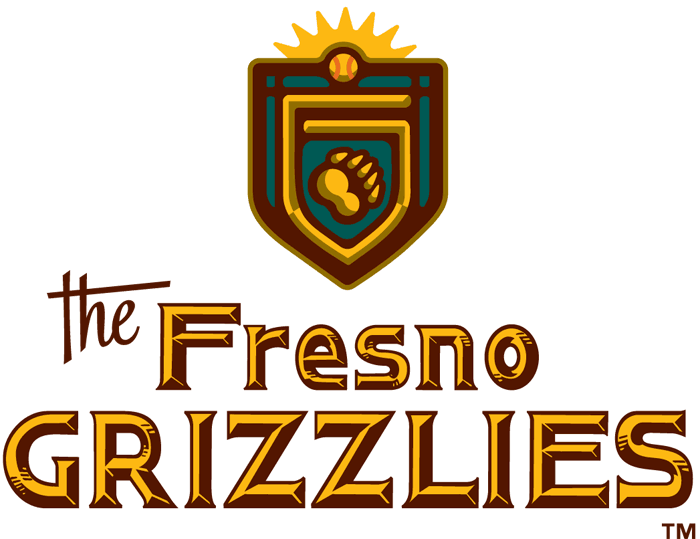
Fun fact: that design/branding was *also* done by Brandiose (although they were still going by Plan B at that time).
I agree though, in terms of concept and connection to the region, the Craftsman/Art Decco look is the best they've ever had... although the grizzly rendering hasn't aged particularly well.
-
1
-
-
5 hours ago, TShaw528 said:
I'm biased because they're my hometown team, but I think one example Brandiose nailed are the Lehigh Valley Iron Pigs. It's a weird, made up name, but the area was a huge steel town, so it has some basis in local roots. Fans pretty much like the name, but they still sell merch nationwide pretty consistently (The bacon hats sold in all 50 states in no time). Strikes the right balance between being a fun name while still making some sense.
The name isn't entirely made up as there's such a thing as pig iron, which is an unprocessed form of iron. It's not a huge stretch to go from pig iron to iron pigs.
That being said, it's hard not to look at Lehigh Valley in the light of Brandiose's more recent work and wonder if this was the start of their descent into the absurd.
-
4
-
-
32 minutes ago, bartodell said:
You realize there is one centralized location here in town where these "Sod Poodles" are known for inhabiting. Apparently, it is across the street from the hotel where the "branding agency" stayed when they came to visit the town for research. Funny thing is the city just eradicated them from the area...
Were they actually referred to as "sod poodles" or is that just Brandiose brand free association a-la Baby Cakes?
-
1 hour ago, Dilbert said:
See if they had just done something normal like Prairie Dogs they wouldnt have been in this mess
I think think they could have gone with Sod Dogs and had better buy in from the community.
It's one thing to go with an odd or obscure aspect of local culture, but at this point I'm pretty sure Brandiose just pulls adjectives and animals out of a hat.
-
3
-
-
8 minutes ago, Green27 said:
"Stone Ranch Media filed for the trademark two days after Amarillo Professional Baseball announced Sod Poodles on the list of name finalists.
In a Facebook post, Dusty Green said the team made three offers for his trademark in September, but he turned them down. Green said he will not only not sell the trademark, but he now plans to make his own Sod Poodles merchandise."
What a lovely individual. Jumps on the trademark to make a quick buck but then won't go through with selling to the actual team because...he wants to print his own tshirts? What kind of a spiteful game is this?
This man is a GD American hero.
Here's hoping others follow suit and start using the power of trademark registration to keep Brandiose in check.
I'm all for novelty and experimentation, but we passed that point years ago.
-
5
-
-
19 hours ago, rams80 said:
Gonna assume nobody thought to sanity-check the heavy usage of outdoor activity-related fire in iconography for a place that is less than a decade removed from multiple devastating wildfires and at a time when massive devastating wildfires are in the news.
Agreed. Not only that, but massive wildfires are projected to increase in frequency and severity going forward. While California gets a lot of attention due to the number of people effected by fires, the entire west experiences frequent (and devastating) wildfires. It's worth noting that we've already seen one sports brand emerge from this new wildfire reality: the Arizona Hot Shots of the AAF, and it would not surprise me to see more going forward (Smokejumpers anyone?).
However, I would argue that the days of fire-related brands (especially relating to wild fires), being "safe" is probably coming to an end. Then again, we've managed to have Hurricanes and Quakes at various levels of sports without incident, so it's possible this will blow over as well.
-
4 hours ago, CaliforniaGlowin said:
That name sounds straight outta Scooby doo. A team with flamingo pink sounds awesome though.
Pretty sure I've seen that episode...
In all seriousness, rougarou is the cajun form of loup-garou, which is the french word for werewolf.
Ultimately I'm not a fan as the name is associated with cajun culture, and Baton Rouge is nowhere near cajun country. If this was a team that was playing in Lafayette or even New Orleans I'd be more open to it, but I suspect the name wouldn't fly in either place as the folklore surrounding the rougarou is quite gruesome.
This would be like a team in Phoenix or Tuscon calling themselves the Skinwalkers.
-
2
-
-
10 hours ago, Gothamite said:
Yeah, I think there’s something of a disconnect between “Milwaukee” and “Milkmen”.
Unless they continue to lean on the “deliverers of milk” theme more than “producers of milk”, in which case Milwaukee could be a good choice for the 1950s associations, be it the Braves’ glory days or Happy Days.
Not enthusiastic about what we’ve seen so far - Black and white can be a striking color combination but can also be exceedingly boring. And with the complicated logos shown, it’s not a great choice.

Here’s the uniform set:
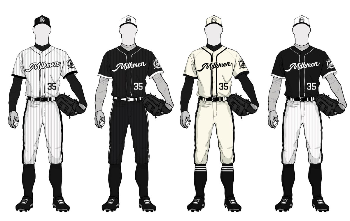
Bonus points for a cream alt, but no “Milwaukee” jersey?
The cap logos are pretty terrible - they really need an “M” logo. Something better than the M on their word mark, which is awkward.
Agreed. Now that we've seen the whole brand I can't help but question the insistence on a monochromatic palette. I realize they're trying to channel the classic milkman uniform, but even within that space there's still room for a touch of color. A nice light blue would be a natural choice (especially in conjunction with the off-white cream...which is definitely the best set of the bunch), although a judicious use of medium value red could add a nice "pop" to everything as well. That being said, I give the designer a lot of credit for restraint. In this age of six color cap logos (I'm looking at you Brandiose) it's refreshing to see an organization take the "less is more" approach.
-
1
-
-
1 hour ago, MBurmy said:
The name-the-team contest was won by yours truly...as I said, I am ready for EVERY fantastic possibility the name inspires to come to fruition!
Hopefully they can milk it for all it's worth.
-
5
-
-
On the one hand, its really cool that the team is paying such thorough tribute to the organization's history.
On the other hand, at what point are they just highlighting how awful their current identity is?
-
1
-
-
I have mixed feelings about this.
On the one hand I like the name and appreciate the celebration of Vermont maple syrup. The cap/crown with the maple leaf is a really nice touch too.
On the other hand, it looks like the jug is carrying the dismembered hand/foot of the Everett Aquasox mascot in his bucket.
-
Honestly I think the baseball stitches are very inspired. Considering the name of the team they do a remarkable job of conveying bloodshot eyes...
EDIT: Points to @NicDB...I hit reply before scrolling down to see your post. Well played.
-
1
-
-
I admit I'm a little disappointed. It can't be a true internet naming poll without some version of "Teamy McTeamface" as an option.
-
3
-
-
19 minutes ago, Soblito said:
I'm no artist, but there seems to be some heavy over analyzing of this logo. The team got exactly
what they wanted, I'm sure. It's their dime. The logo seems to be well received here. I don't think
one fan cares to pick it apart and critique it. LOL
True...but this is a forum dedicated to sports logos. A big part of the reason why folks are here is to pick stuff apart and debate the merits of different design choices. I'll be the first to admit that there are conversations that take place here that I have zero interest in (when people start comparing and contrasting the stripe thickness on socks my eyes start to glaze over)...but ultimately most (all?) of us are here to scratch a very particular itch. It doesn't have to be your thing...but understand that it's likely to be someone's thing.
-
1
-
-
13 hours ago, Dilbert said:
The new Atlantic League team in High Point NC in 2019 has released their name and logo.

Wow...there’s a whole lot going on here, to the point the design as a whole is weaker than its constituent elements.
I like the High Point script quite a bit, but it’s dwarfed by the giant Rockers block text with the inexplicable chrome/hotrod font. Worse still the NC on the chair looks like an afterthought (and introduces a third font).
Another issue with the NC is that it distracts from the fact that the back of the chair is meant to be home base...which goes nicely with the balls and bats integrated into the rocking chair. But could someone explain to me why the chair is rocketing through space? It’s like the team decided on the name, but then started to worry that it was too boring.
The whole thing looks like a case study in logo design by committee...or a cautionary tale on what happens when you give a client everything they ask for regardless of whether it makes good design sense.
-
2
-
-
22 hours ago, TheHealthiestScratch said:
I mean a tree was once living and a baseball player is now swinging it’s dead corpse as a bat.... this is getting deep.
...and cinnamon comes from the bark of a tree.
churro-ception
edit:
CINNE-CEPTION!
-
1
-
-
Pretty sure that's a cinnamon stick.
-
8
-
-
That is a real shame about the Mallards. They're one of those minor league identities that is bigger than any one franchise and is really synonymous with their community. While there was a lot wrong with how the AHL team was run, the decision to go with Flames over Mallards was very emblematic of just how out of touch that group was. Sadly,the AHL seems to be moving more in a G-League direction with teams being owned by NHL clubs and closer(ish) to their parent organizations. This is what ultimately did in the Ice Caps, who are just the most recent team to succumb to the trend (see Worcester, Manchester, Norfolk, and Portland).
Meanwhile the ECHL, especially in the west, has seen a major loss of markets due to the AHL restructuring as well. The Colorado Eagles will be displaced by Colorado's AHL franchise (although I believe the move is being presented as a "promotion" with the Eagles organization continuing to play a major role with the new AHL team), and there have been serious rumblings about Kansas City (currently home to the Missouri Mavericks) becoming the new home of a St. Louis affiliated AHL team. With an NHL team in Seattle all but guaranteed, I can easily see Utah or Idaho being targeted for an AHL affiliate as well. Ironically, with the AHL and ECHL effectively trading markets, the ECHL could go back to calling itself the East Coast Hockey League.
-
It's pretty fast and dirty, but I did a quick overlay in Photoshop. The Moondog logo is the top layer at 50% opacity. It's not an exact copy, but it's pretty damn close. To the point that some of the lines are almost identical.

On an unrelated note...is there no longer a way to upload and host images? I can't seem to find a way to add the image to my attachments.
-
I had to look up what the old MoonDogs logo looked like...dear god:

By way of comparison, here's the new logo:

An absolute night-and-day improvement (pun most definitely intended). My only complaint is the use of red for the moon...it ends up reading more like a sun, or just a red circle, rather than the moon. I would have liked to see them make the dog red and white (or better yet, use the same orange from the bat instead of red) and use the silver for the moon. But overall...an absolutely fantastic rebrand. Good job Diamond Dreams LLC!

AHL/ECHL/Minor/Junior League Hockey Changes
in Sports Logo News
Posted
The one thing I will say about the Moosejaw Warriors logo is that I appreciated how they incorporated the hockey stick and puck into the design. It was subtle, but clever.
Unfortunately that's about it, and it's time to say goodbye to the war bonnet.