


Chico
-
Posts
122 -
Joined
-
Last visited
-
Days Won
1
Posts posted by Chico
-
-
12 minutes ago, chcarlson23 said:
Looking at those photos the Devils old white sweater is actually a little disappointing. It feels like way to much black, when it should be a little more red heavy. I guess that’s why I like the wider stripes on the new set, but the lack of tail stripes is awful. They look like freaking nightshirts on the players…
Agreed. I like how the red pops more on the new white jersey than it did on the previous one. If they had the hem stripes I would say the current set is superior but their absence really makes it look incomplete.
-
 1
1
-
 1
1
-
-
The New York Rangers have banners for Regular Season Championships as well.


-
Beautiful matchup

-
 6
6
-
-
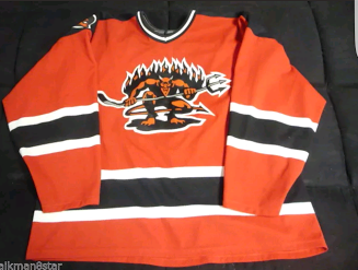
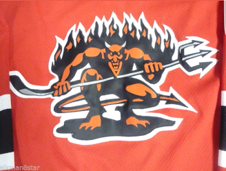
Found this New Jersey Devils jersey on ebay today. I believe the Devils introduced these logos in 1996. They were mainly used for promoting the Devils Den merchandise catalog but do remember having a hat with the shoulder logo on it.


-
Check out the logo on the helmet on a 1964 New York Jets game program


NFL 2023 Changes
in Sports Logo News
Posted
I actually liked that Jets logo without the NY behind it better than the official 98 logo.