


selgy
-
Posts
360 -
Joined
-
Last visited
-
Days Won
1
Posts posted by selgy
-
-
13 hours ago, MJWalker45 said:

It's been tried already. I'm sure someone complained it was too shiny and took away from the game. LOL!!!
Is that Trap Jaw?-
 3
3
-
-
On 4/3/2021 at 5:23 PM, fouhy12 said:
I can't believe I've been on this forum for a decade and we're still having the grey facemask debate. It's what really makes this place feel like home.
Just make them clear!
(I will see myself out)-
3
-
-
1 hour ago, WBeltz said:
Maybe it’s because I got into football when these uniforms were around, but I like them.
-
4
-
-
6 hours ago, WSU151 said:
A couple weeks ago @Justpassingby said it wouldn't be Washington, it'd be another team that will be owned by Bezos.
Asking cause I don't know the rules.
But could he own a team while being a major broadcast partner? Might cause some possible conflicts.-
3
-
-
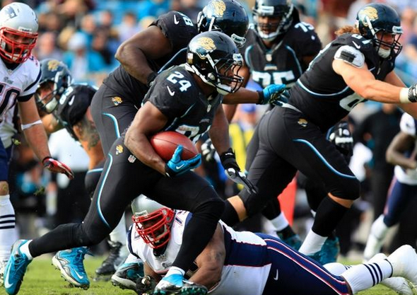
The jags should be teal with black and gold accents.
Any uniform that doesn't include all three should be thrown away.
Stop trying to be the Raiders (black primary) or the Saints (gold and black).
Be the Jags. Teal with Gold and black.-
26
-
 1
1
-
-
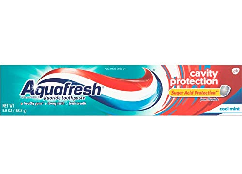
7 minutes ago, SSmith48 said:
I feel like I'm about to rustle some feathers, but I also somewhat liked the Jags' pre-Nikefied uniforms, worn for their first year with Nike. They were pretty much the more detailed version of their current set, albeit with the awesome teal-flake helmet.
The "aquafresh" pipping was terrible-
17
-
 1
1
-
-
On 2/3/2021 at 1:59 PM, LogoFan said:
This is what the Falcons and Saints remind me of when they go with their unitard look. Essentially long-johns without the butt-flap, but knowing Nike, they'll try that at some point.
The only difference is the presence of numbers on the NFL uniforms. Just say "NO'. It's a bad, bad look.
-
2
-
-
2 hours ago, kutztown said:
Would love to see the Panthers overhaul their uniforms and go black helmets. It just works for that identity. Also waiting patiently for this ever elusive return of kelly green for the Eagles.
If not kelly green...at least something that isn't as dark and drab as they have now. It is terrible.-
3
-
-
7 minutes ago, Old School Fool said:
Do this. Clear decal instead of black so the Panther blends with the helmet to create a panther in the shadows.
I understand that is just a mock-up and not an actual rendering. But that example has an extremely large graphic/logo to make that work. That size might run into issues that the Bucs ran into with the larger Flag that would not fit properly due to the newer helmet crevasses and holes.
If you make the logo smaller does it ruin the effect? At that size it looks good. But at the same time it is also too large and would need to be smaller.
So will a smaller logo look bad and will it allow a stripe(s) down the center? -
51 minutes ago, andrewharrington said:
The patterning was designed by a Polynesian artist. How else would one execute this?
Not everything needs to be "executed" on every canvas.
The design and inspiration are probably gorgeous. But limiting the design to a football uniform that will get squished, torn, stretched, etc are in my mind a bad decision. You then put that design on 50 different bodies that are all shaped differently and to me the execution failed.-
1
-
-
Just now, dont care said:
No, it’s the “ohana” uniform for their history of Polynesian players. It’s suppose to be tribal patterns.
I understand the intent. But the execution looked terrible (and my attempted joke).-
1
-
-
Was Oregon going for the Oregon Trail ms dos look?
-
3
-
-
3 minutes ago, Wings said:
Revenge of the Lizard People
-
1
-
-
4 minutes ago, GDAWG said:
The home whites arent bad. But the Oregon would be embarrassed to wear the green on green mess.


/cdn.vox-cdn.com/uploads/chorus_image/image/5820663/20120819_kkt_ah6_126.0.jpg)
:format(jpeg)/cdn.vox-cdn.com/uploads/chorus_image/image/3858925/156662043.0.jpg)


NFL Changes 2021
in Sports Logo News
Posted
When people ask William H Macy about this movie he quick changes the topic to his families college admission scandal.