


kimball
-
Posts
2,649 -
Joined
-
Last visited
-
Days Won
8
Posts posted by kimball
-
-
3 hours ago, tscuzzy said:
Love how the NBA playoffs are a complete free-for-all with no logic or order to the choice of uniforms game-to-game, and then you have Bucks-Pacers where both teams are wearing the exact same jersey for the first four games of the series. The lack of consistency is maddening.
I don't mind the Pacers/Bucks color vs. color match-ups, but yeah ... there needs to be some general playoff rules in the NBA.
- No City or Throwback Editions during the playoffs.
- No Association (or white) Edition worn by the road team.
- Color vs. Color is cool during the first couple of rounds.
- Conference and NBA Finals should be strictly White at Home and Color on Road.
-
 3
3
-
I'm a little surprised that they didn't give the Jets 2.0 the Jets 1.0 history. Maybe they would in 5 years if the Coyotes don't come back?
Yeah, I have many questions here as well.
-
1
-
-
1 hour ago, The_Admiral said:
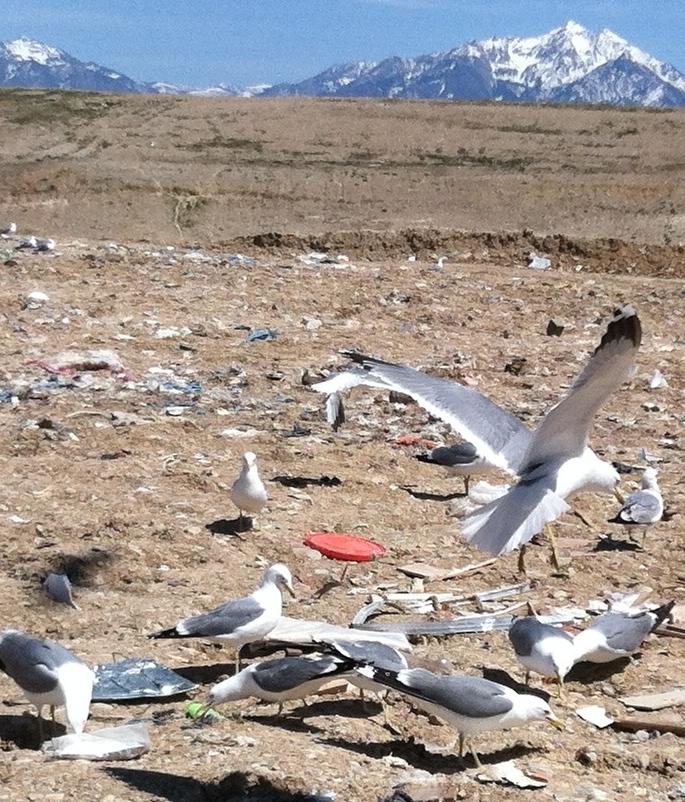
Lake Michigan has fish, Great Salt Lake doesn't
Not that it helps the case for the name, but seagulls eat trash. Here in Utah you're more likely to see seagulls at the dump rather than the GSL.

-
1 hour ago, CreamSoda said:
Leaks were real;
Oh man, I am excited! ARENA FOOTBALL IS BACK BABY!
-
 3
3
-
-
Reason #1 why the Utah Fury is a TERRIBLE decision

-
40 minutes ago, mjarvie said:
If you're not going to go with Eagles or Grizzlies, then I say go with Gulls. I know a lot of people would question that but it is the state bird. Or go with the state animal, Elk. Any of those four are simple and solid.
I am in this same boat. I am not a fan of the Utah Elk, but the Utah Gulls works on both levels of being the state bird and being the name of a past MiLB team. Just don't know how easy it would be to wrestle from San Diego?
-
11 minutes ago, Mingjai said:
Back when I used to drive between Utah (school) and Idaho (home), I’m pretty sure each time I was driving by a polygamist farm somewhere between Plymouth and the Idaho border. I recognized some of the farm structures from a news story on polygamists.Yeah, that's a different sect of polygamists unrelated to the FLDS. The Kingston Clan is definitely as messed up as the Jeffs/FLDS group.
-
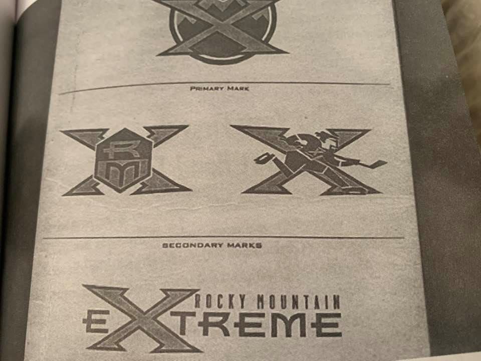
34 minutes ago, habsfan1 said:
Rocky Mountain Xtreme
Part of the mountain range is in Utah, so the name could work.
I won't lie ... I had the same thought.
Plus, Salt Lake City MORE so in the mountains than Denver is. Denver is basically Kansas.
-
1
-
-
-
Fascinating. Might as well put some long sleeves on these jerseys and call it a day for next season ...
-
 1
1
-
-
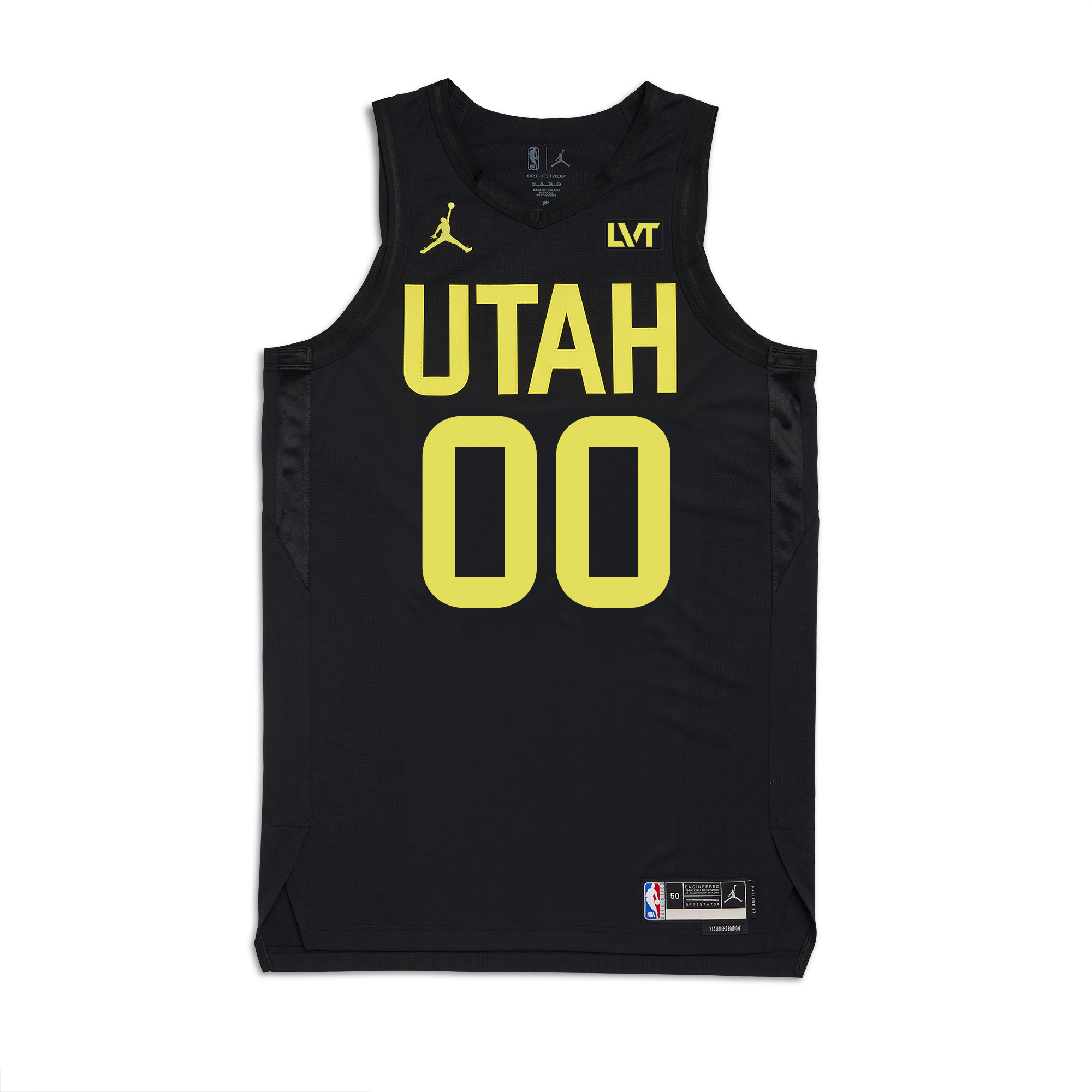
18 hours ago, VancouverFan69 said:
Besides coming up with a big league professional name instead of a singular Tier II name, I do hope the team uses "Salt Lake City" instead of the state identity. The team can be referenced to as SLC in short. Leave Utah for the Jazz and a future NFL team
The nickname is going to be "Utah" after the state legislature approved a funding bill for a new arena. One of the stipulations (same as a funding bill for a baseball stadium) is that tenants use "Utah" in their nickname.
I do prefer Salt Lake over Utah.
-
1
-
-
1 hour ago, The_Admiral said:
I have no excitement for this. I have major reservations about a market of 2.5 million with heavily directional sprawl where the only other team in the market runs concurrently and is almost as established as the Church of England, where hockey does not have a long history of success, where the arena has the same NBA-first sightlines that doomed Phoenix in the first place. The only advantage Salt Lake City has over Quebec City is staying on Mountain Time.
But the Coyotes have been on life support for 15 years, the league has cockteased four or five different cities now only to keep doubling down on stupid, and every owner since the days of league control has run out of money, not paid taxes, or both. Enough already. I'm old and tired. Just let this end.
I agree with the concerns, however, I think it helps having both the Jazz and NHL team owned by the same person.
-
3
-
-
10 hours ago, Gary said:
SLIDES INTO ALEX'S DMs ...
-
On 4/2/2024 at 2:25 PM, DJT said:
i'd imagine it will be pretty minimal.
Can they get any more minimal?
-
1
-
-
I love the bright yellow. I just hate the design elements of ... well ... nothingness.
If the design is based off this year's City Jersey ... meh.
-
3
-
-
17 hours ago, The_Admiral said:
I feel the same way about the Iowa Wolves having a superior rendering of the Timberwolves logo. It's truer to the original logo that people love for some reason.
Mixed feelings on several levels with the D-league San Diego Clippers, though. The first is that it would have looked better in the original light blue and orange if you're going to go back to that name. The other is, should they have gone back to that name? There's something that doesn't sit right with me about suggesting a departed major-league team's old IP for a minor-league replacement. I felt the same way about the Connecticut Whale as farm team for the Rags. It's kind of a dunk on them that they'll never be invited back to the big table, but they can live on as a feeder for a city you used to not like.
Yeah, I am a little conflicted with the name as well. I think it works out okay for a few reasons ...
- It's been 40 years since the team left San Diego.
- Donald Sterling doesn't own the Clippers anymore.
- There's not much of a demand for a NBA team in San Diego.
- Nostalgia points will sell some tickets.
Granted, I don't feel like this would work in Kansas City, Seattle and Vancouver. But, maybe Cincinnati? Baltimore?
-
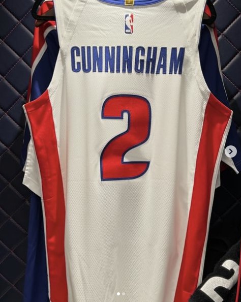
2 hours ago, projectjohn said:
The Pistons are using horizonal NOB today for the 20th anniversary celebration of their 2004 championship, proving it is possible on the Nike template. I wish they'd go back to it full-time.
20 years? Oy. I feel old. That feels like yesterday.
-
3
-
-
On 3/13/2024 at 5:51 PM, BottomlessPitt said:
Looks like we have two competing groups for NHL expansion to Atlanta (Both in Alpharetta) . Vernon Krause with his South Forsyth (The Gathering) plan and former NHLer Anson Carter and his North Point Mall property site plan. They're about 5 miles from each other.
Build both arenas. Once Atlanta 3.0 moves to Quebec just award Atlanta 4.0 to the other group ... soooo Saskatoon can get in on the NHL fun.
-
2
-
-
On 3/8/2024 at 3:00 PM, Digby said:
Vermont is number one on this list, which is a searingly obvious tell that the methodology is too flawed to take seriously.
Real numbers say SLC's public transit usage is pretty anemic. Not really out of the ordinary for American cities but I'm not seeing this as a special selling point necessarily.
Being a resident I'd say it is pretty anemic compared to bigger cities. It's getting better ... if that means anything.
-
5 hours ago, GhostOfNormMacdonald said:
They should just let Caesar's have the team and make the stadium a replica of the Roman Coliseum
I don't know why I love this idea so much? It'd be the most Las Vegas thing ever.
-
2
-
-
As much as this is for expansion, I still think this is a play for the A's right now, especially if they can't finalize things in Vegas.
-
3
-
-
1 hour ago, ruttep said:
Navy blue is also way overdone though. One of the most enduring consequences of 90s/00s sports design has been teams replacing their classic royal blue color schemes with duller navy blue.
Agreed. We'll now probably see a swing back to royal blue hues in the next 3-5 years. Something I'd welcome because Navy blue just seems too formal, serious and stale.
-
1
-
-
3 hours ago, AstroCree said:
I just noticed, is the bottom of the ship suppose to be a basketball? The NBA still has that (honestly silly) rule about having a basketball somewhere on the logo, right?
3 hours ago, TaylorMade said:Yes and yes
Ehhhh ... I don't know?
I believe in the past the main logo had to have one. But, now ... I think a basketball has to be in one of the logos within the whole logo package? Newer logos like Cleveland, Golden State, San Antonio, etc. don't have a basketball within their main logos., but do within alternates, etc.
With that said, the ship ball logo is a bit too much in my opinion. It just feels forced.
-
1
-
-
12 hours ago, CaliforniaGlowin said:
Jazz are already phasing out the yellow, so that should continue.
I'm with Markkanen, I like the bright yellow. Just not a fan of the application.


2024-25 NHL Changes
in Sports Logo News
Posted
It's better than the previous flag, but pretty despised locally.