


Angelo18
-
Posts
12 -
Joined
-
Last visited
Posts posted by Angelo18
-
-
$800,000 and 2 years go growing for that? Disappointing to say the least. Not only the obvious slipping and sliding for 4 quarters but the white paint speckles littered all over the field after the start on the game. The contrasting shades of green stripping every 5 yards also disappeared quickly. I think it's time to make some changes from personal (sorry, TOMA) to strategy, a billion dollar organization must do better than what happened tonight! Embarrassing NFL
-
file:///var/folders/zf/jdkg2t957dq1x3rphbs9cqnh0000gn/T/WebKitDropDestination-iZG1Lx8a/Image-1%20copy.jpg
-
Really anxious to see just how bad the NFL will mess up the field for this special Super Bowl season. If they manage to screw this up, then we know it's time for some higher up individuals to retire, or lose their job. Between the team woodwork, team logo, team helmet, NFL shield, NFL 100th logo, conference logos, Super Bowl logo...they have A LOT to work with for this game. If the field looks anything like the past 10 plus years of half-u-know-what garbage, we will all be very disappointed. It makes me appreciate how well the fields were colored and prepared for the first 39 super bowls, since then it has progressively gotten worse, capped off by the generic super bowl logo. COME ON NFL!
-
 3
3
-
-
8 minutes ago, DJB said:
Well, I got some answers today and unfortunately our hopes of spiced up endzones are all in the hands of the NFL. Asked Ed Mangan a bunch of questions, some on mic and some off mic. Honestly, the interview isnt worth posting because all of the design factors are in the hands of the NFL. He told me that the NFL creative department develops the look of the endzones and runs it by the teams for their approval. The teams may make minor adjustments, but they basically are all on the same page.
As for the helmets and conference logos, again, an NFL creative decision.
He gave me insight on how this field was developed and compared it to last year. This year, he said they scrubbed the entire field after the Peach Bowl and started new. This makes sense from last year, where they really couldn’t scrub the field considering the Vikings were still playing in mid-January. So, that’s why the Vikings yard-line numbers stayed on the field for Super Bowl LIII.
As for a special field next year, he said it’s in the hands of the NFL. Which would also give us the answer on a potential throwback field.
I will add more when i get a chance. Feel free to ask any questions that I may have forgotten to address.
Thank you DJB for getting info straight from the top. Very interesting stuff and I think we all would love to hear more (although sounds like he didn't give you the answers we would have liked to hear). My take away from this is....If this is the best the NFL creative department can do to develop and submit for approval by NFL teams, for their Championship game, I think it's time to go in a different direction, because this is embarrassing for a billion dollar organization. As the big bad NFL, how can you look at SB fields of the past and think these recent efforts are acceptable? I will say, this years field is an improvement over the past 3 (same spaced end zone woodworks for both teams), but still a ways to go...
-
3
-
-
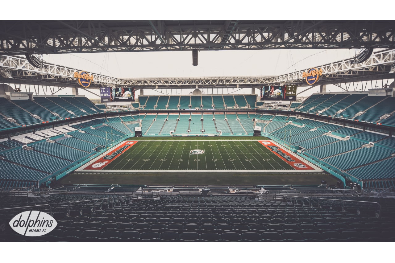
Holy gorgeous.....hire this crew to do the super bowl field! That's how you paint super bowl quality end zones!!! Well done Miami
-
1
-
-
Wow. I don't know if I'm just OCD or weird, but these end zones are absolute joke. How in the hell can you NOT have the same sized woodworks/fonts in the end zone? It looks ridiculous that the Patriots end zone looks the correct size (despite no AFC conference logo) while the Eagles end zone looks about half that size (way too much green, empty space. I don't get it, can't you just enlarge the Eagles woodwork to the same as the patriots? This was the same mistake with the end zones for Super Bowl 50. It looked correct for SB 51. Who does the NFL hire for this job? I want it. It's not that difficult. I'm almost glad my Vikings lost so I don't have to look at this for 2 weeks and a 3 1/2 hour game.
-
Really hoping my home state Minnesota does us proud and not only has the Vikings in their first Super Bowl since '77 but gives us something better for the big game besides the crap they have had for end zone and field designs the last few years. Although, I know, in the end it's up to the NFL, Goodell, and lazy people they employ! Paint the field like you did before Super Bowl 40, the beginning of the end of creative SB fields.
-
22 minutes ago, pitt6pack said:
They usually paint the endzone logos and wordmarks first before painting the endzone the team color. What I find surprising is that the Falcons wordmark is white. In that case I think they will go with a red endzone.
I find the white woodmark for the Falcons surprising as well. This has me worried about no paint in the end zones. White woodmark with red paint would be a surprise. Not sure about that, unless you outline the woodmark in black. But both end zones in red (a la Super Bowl 31 and 33 for Pats and Falcons, respectively) would be interesting!
-
No team colored end zones???

-
As a huge fan of the NFL and being extremely interested in the design of the Super Bowl field since I can remember my first, Super Bowl 18 (Raiders/Washington), I must say I am SO disappointed with the direction of the field/logos for the most important game the league plays. Since Super Bowl 45 starting with the generic logo template, it just gets worse. I really wonder who is making these decisions. It's like league execs are getting together before every super bowl and saying "How can we make the field less and less aesthetically appealing?" Is it a cost cutting move or are they really that boring? How can a field design get worse over time? Anyways...I sincerely hope they go back to a end zone design featuring the team helmets and conference logos. The SB 50 end zone design was so bad. You would think you'd at least do a throwback field design or something extra special for the 50th! No Conference logos and the symmetry of the word marks were off! I think it looks so much better when they outline the numbers with team colors and have some personality to the Super Bowl logo (does the league not want to pay an artist to design a new logo every year?), not the same template with some small changes. The best looking field ever was SB 33, even though my Vikings should have been there:( Doing something similar to that and the earlier SB fields would be the best IMO. Can I please have the job to design the field? Sorry for the rant....Come on NFL!
-
1
-


Super Bowl Field Database - Super Bowl LVIII
in Concepts
Posted
As the 2024 NFL Playoffs begin, let me be the first to hope that we finally get a different looking Super Bowl field design (especially the end zones)!!!