

_DietDrPepper_
-
Posts
2,723 -
Joined
-
Last visited
-
Days Won
1
Posts posted by _DietDrPepper_
-
-
8 hours ago, QCS said:
The only problem with the Raptors' chevron jerseys was that they said "North". They are leagues better than the Cavs' sleeved nastiness and the Bucks' awful black logo jersey.
Hard disagree, theres no way they’re “leagues better,” they may be slightly better but the North slogan as you said is gimmicky and dumb, the lack of black or purple makes it not feel like the Raptors, the chevron design itself feels like a dumb copy of the Sonics classic design but worse, the letters don’t even fit cohesively in the chevron. The pants chevron looked awkward as well.
It makes it worse too because their regular home and away were maybe the best they’d ever looked.
-
 3
3
-
-
41 minutes ago, AgentColon2 said:
The Bucks can’t win tonight. This might the worst uniform to win it all since the short sleeve Cavs.

You’re forgetting the Raptors chevron nightmare.
-
4
-
-
On 7/18/2021 at 9:38 PM, Unocal said:
I liked the Lions black alternates of the mid-2000s
This uniform and the Cardinals black alts both have this charm I can’t explain. They’re ugly but I like em. Same with some of the piping uniforms from the same era, namely Jacksonville.
-
1 hour ago, 4_tattoos said:
The STL era jersey numbers are considered a block font?
I think they meant excluding their time in St. Louis, they’ve only used a block font.
-
2
-
-
2 hours ago, TenaciousG said:
If the Bucks win the title tomorrow are we going to be stuck with their Soviet Bloc font forever?
Winning a title before didn’t stop them from changing their color scheme 4 times, so I doubt it. Although I am a fan of the home and away.
-
3
-
-
2 hours ago, Berlin Wall said:
The Thunder really just took the old Warriors lightning identity and threw some sky blue in it.
They didn’t just take it, they somehow made it worse. Replace the word Warriors with Thunder on that uniform and it would instantly become the best OKC uniform ever, by a landslide.
-
6
-
-
Meh, it’s a fantastic upgrade over Bone, hopefully they get permission to actually replace the bone jersey with this, but it’s still probably one of the worst uniforms in the league. The number font and dumb fruit roll up pattern are awful, the name patch, the style of shoulder loops, the helmet still has a dumb horn design, and the shades of blue and yellow are off. It’s an insult to the original still and I’m not going to praise the Rams for the revolutionary idea of adopting a white uniform like they should’ve last year.
If this was unveiled last year it would be hated too. I rate it an F+, maybe a D-.
-
3
-
-
13 minutes ago, AFirestormToPurify said:
Yeah it would objectively look great. But some people on here will say it's awful garbage just cause it's not silver and that the Raiders didn't have a black helmet in the 1980s so it's automatically wrong. At this point it's just silly lol. But I get it, when the Habs announced they would be wearing blue jerseys I had the same knee jerk reaction, so I'm not gonna be a hypocrite and pretend I'm better than every else for being more open minded
Objectively an all black Raiders uniform doesn’t sound all that great. It doesn’t add a single thing to the brand.
And no, I mean I could care less what a team wore in the 80’s, their brand integrity still matters. Having two helmets can possibly dilute a brand, especially in a sport with as few a games, and with such a cultural focus on a helmet like football.
Not to mention this gets Nike one foot in the door for total NBA-ification.
Its not about solely about what the team wore in the past, yes a historic iconic team like the Raiders or Packers should definitely have 1 helmet only because of their history, but for most NFL teams, it’s about keeping the identity of the team together, people were just arguing about teams looking similar to each other, wouldn’t that increase if teams started having different options for the most important aspect of their uniform?
-
10
-
-
1 hour ago, spartacat_12 said:
They look like intra-squad scrimmages. I thought that point was obvious.
I mean, the obvious logos and wordmark differences show otherwise. Maybe with the Lightning and Maple Leafs I could see it, but again the giant chest logos are pretty dead give aways.
-
2
-
 1
1
-
-
Just now, spartacat_12 said:
That logic is fine if you are designing uniforms in a vacuum, but you're not. Yes you want the team to look good, but a major part of branding is standing out and offering something unique compared to your competitors. Your way of thinking is what has lead to matchups like these:
What’s wrong with these matchups? Outside of the Cardinals, Falcons, Twolves, and Canes wearing some of the worst uniforms they’ve ever made.
There’s only so many colors, the Cowboys are completely fine in royal blue.
-
3
-
-
Why the stars? That’s just a meaningless choice. Murray State has so much to pull from, look at the jockey inspired stripe on the helmet. Why not base the whole look around that? This seems almost US Navy-esq.
Also download some new fonts for once. There’s a million tutorials out there. It screams lazy when you reuse the same 3 fonts on over 100 different concepts.
-
3
-
-
1 hour ago, DNAsports said:
You said-
The point I was making is how Dallas continues to over saturate their uniform schedule with the worst possible choice of their set. Which happens to be one singular uniform occupying the primary home AND away designation
You might as well call the navy set an alternate alongside the color rush. Both of which are better, more cohesive choices compared to the normal primary whites.
Throw the primary whites in the dumpster, light it on fire, and blow it up. Promote the Navy and CR to Primary Home-Away status and call it a day.
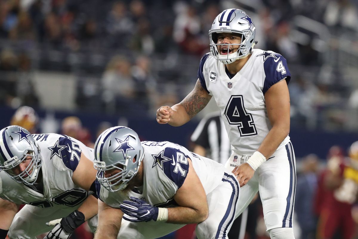
I’m so fascinated with how people can sit there and say that the Cowboys color rush is good. What in the world is good about it? Is it just nostalgia? The uniforms were just as awful in the 90s too. The double outline is dumb, the star on the shoulder isn’t awful but doesn’t look necessarily better then if it was on the sleeve, and those color sleeves look pitiful. It looks like a featured that was design with a microsoft paint bucket tool. The white pants are dumb because the ruins any color balance with the silver, which is also my complaint with the ugly Niners throwbacks.
Honestly the green pants are somehow their best look, and that look is probably a bottom five, or around there, uniform in the league.
-
9
-
 1
1
-
-
4 hours ago, Sport said:
Sharing for no reason other than I saw this and it really showed how much better the new unis look compared directly with the old look.
I’m still shocked Nike managed to pull off such a straight update of an old uniform. No gradients, no pewter shoulders, no armpit stripes, just a simple, straight to the point update. It looks great.
-
4
-
-
2 hours ago, Jay_Mellowed said:
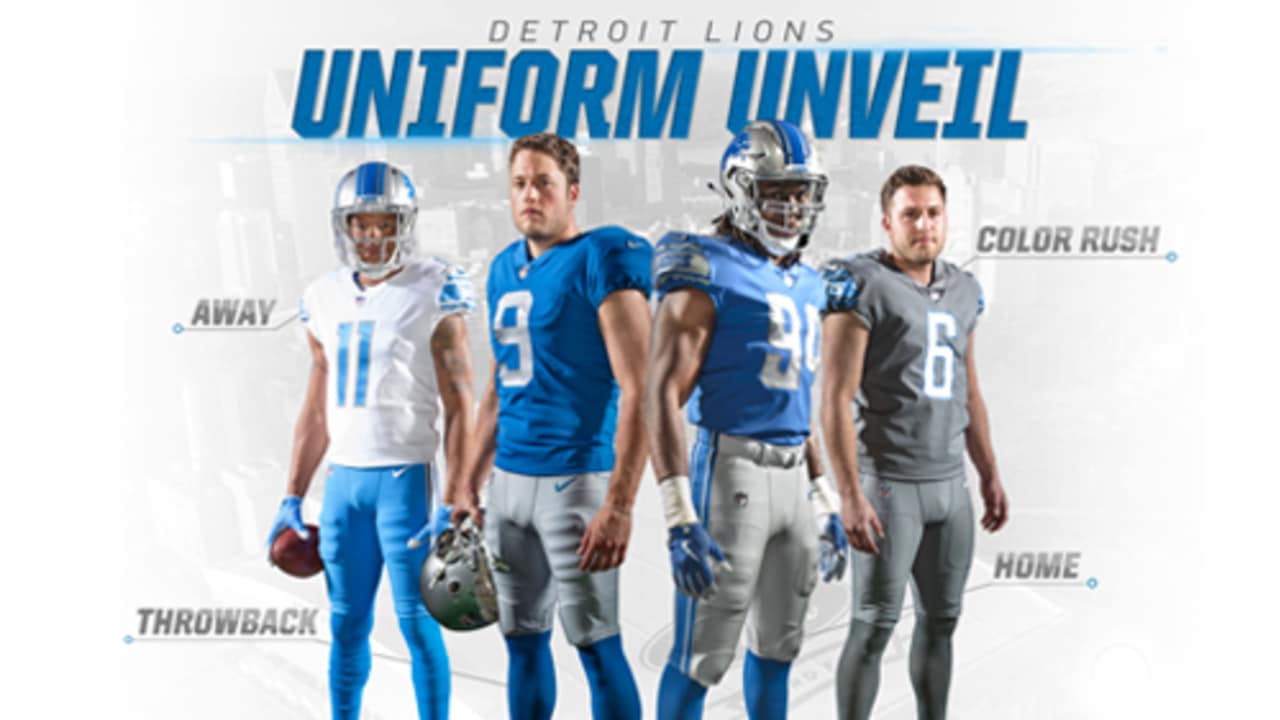
Speaking of the Lions, they really need to look into adding a set of white pants that are striped, as well as adding white striped socks.
The last thing the Lions need is another pair of pants. Ideally they really only need silver pants. That’s how they’ve looked for decades and they look great that way.
-
12
-
-
1 hour ago, Bill0813 said:
I don't see why the league which has 5 teams in white helmets, 4 teams in black helmets is fine, but a second team in purple isn't. Baltimore could use a different shade of purple, just as the 49ers and Saints don't use the same gold, for example.
Because purple is much more unique and less frequently seen color in sports, especially the NFL, where the Vikings were the only team in the league who had purple in their color scheme for 40 years.
The Ravens also not only share purple, but also a shade of gold, plus black which is found more in Minnesota’s identity now then ever, even if it’s not a lot. That means even the small distinctions matter more so then just any other team that wears purple.
-
6
-
-
1 hour ago, BBTV said:
Why do they "feel like the team to pull a stunt like that"? They've basically had the same look their entire history, with the exception of the new purple pants and the failed gold pants experiment. They're certainly not "traditional", but they're pretty consistent, and seem to be pretty content with their brand.
I guess your right, originally I was thinking they were a team that felt like they had more of a social media presence therefore would be more appeasing of those trends, plus just being a younger more modern team they’d be willing to try that. But thinking about it more I’m not sure I can actually say that.
In short, they feel closer to the Rams or Flacons in how they treat their identity rather then the Packers or Bears, or even a team like Houston or Denver.-
1
-
-
6 minutes ago, DNAsports said:
I never said they need one, but in the event they decide to have one, a purple alt helmet is the best option.
I wouldn’t be surprised if they rolled out an all white “icy” look. Ravens feel like the team to pull a stunt like that and a purple helmet is understandably close to Minnesota. Can’t say I’d hate it anymore then a purple one either.
-
2 hours ago, DNAsports said:
Seriously though, what do you suggest the Ravens do in the event of the team deciding they want a second helmet?
Just not get one. The Ravens don’t need a second helmet. Outside of throwbacks nobody needs a second helmet.
-
15
-
-
13 hours ago, DNAsports said:
There was nothing wrong with the 2007-19 Chargers set.
Agreed.
13 hours ago, DNAsports said:It didn’t need to be changed, but the team managed to improve their look in every way
However, my unpopular opinion is that it’s actually a worse look. Not bad, but I think navy just works so much nicer for the Chargers, give powder blue to another team, the Rams could probably pull it off just as nicely as they have royal (well not with their current set but historically speaking.)
Honestly it’s a bit of a tough predicament because both schemes do look so good, but I think they had a much better balance with it in their last set. The angle of the bolt however was an upgrade, I do like that change a lot.
-
2
-
-
12 minutes ago, DNAsports said:
I’m sure if my eyes deceive me, but I think Detroit has three different shades of grey pants
Wait, white over silver isn’t Detroit’s standard home uniform? Was it white over blue before their most recent change too?
-
29 minutes ago, chakfu said:
I didn't think the pants really figured into the designations. If the white jersey is the primary road, switching the pants shouldn't change that. They need to make a 2nd version of white and call it color rush with a white helmet. In the meantime add some orange to the white road.
It did for the Packers
-
1
-
 1
1
-
-
5 hours ago, Magic Dynasty said:
They’re probably going to do a White Tiger helmet to match the rest of the CR set and I’m all for it.
But white over white is their current primary road, which they aren’t allowed to wear the alternate helmets with. So either they make white over black the primary road next summer, so then white over white can technically be their color rush, similar to the Packers, or we get to see any early break in the rules to allow the all white look. Which for the record I’m not super thrilled about. The orange on the jersey will stick out like a sore thumb, and it just feels gimmicky and arena league.
-
3
-
-
39 minutes ago, MCM0313 said:
Buccaneers, Broncos, Eagles, Patriots, Titans/Oilers, Chargers, Falcons, Steelers, Bills...heck, a couple years ago people were clamoring on here to see the Jets stick with white helmets while going back to kelly green. They can do the proper Namath throwback that they wouldn’t do when their unis were so close that casual fans wouldn’t have noticed the difference.
Now, will some teams trot out garbage? Um, yeah. (Looking at you, Rams.) I do like the idea of throwbacks being possible again, though.
My biggest fear is the hype around all black “night looks” will eventually become more exciting then throwbacks. Sure the Jets can go for throwbacks the first couple seasons but after, what is it, 4 seasons? They’re going to roll out a black helmet of course to go with the black uniforms.
There’s also the fear that this opens the door to the NFL removing other good restrictions such as the 4 year rule, or the restrictions on how often alternates can be worn.
Who says in 5 years the NFL hasn’t introduced a city uniform program that changes once a year similar to the MLB and NBA and the Packers are trotting out in red or black uniforms 4-5 games out of the year.
-
2
-
-
One step closer to the next NBA.
-
8
-


/cdn.vox-cdn.com/uploads/chorus_image/image/56390055/usa_today_10241445.0.jpg)

/cdn.vox-cdn.com/uploads/chorus_image/image/68912730/1297249906.0.jpg)
/cdn.vox-cdn.com/uploads/chorus_image/image/63220190/1072887328.jpg.0.jpg)
:no_upscale()/cloudfront-us-east-1.images.arcpublishing.com/dmn/DPXAMIZ27ZB7VCPNHTIEA24T4M.jpg)


NFL Changes 2021
in Sports Logo News
Posted
Looks like a Browns uniform with a Broncos AFL era helmet. That white stripe really throws the whole look off almost, which sucks because the rest is absolutely gorgeous. It’s easy to look past though thankfully, so I’m a big fan.