


eastfirst107
-
Posts
129 -
Joined
-
Last visited
Posts posted by eastfirst107
-
-
15 hours ago, coco1997 said:
This is a nice look. Which other teams' minor leaguers have jerseys that their parent clubs don't wear?
(that's a gray Tigers' jersey with the Old English D)
Back in the day, the Appalachian League was always good for some oddball hand-me-downs.
-
 3
3
-
-
1 hour ago, GrayJ12 said:
I feel like it was not uncommon back in the day for college teams to borrow logos from pro teams
At least when it comes to baseball, it's not uncommon today for college teams to borrow logos from pro teams:
-
1
-
 1
1
-
-
3 hours ago, nash61 said:
Imagine this: a cap logo of either a single boxing glove, or two hanging gloves similar to the Red Sox logo, and a wordmark with the gloves hanging off the T in Knockouts.
What, do you mean like this?
-
1
-
 1
1
-
-
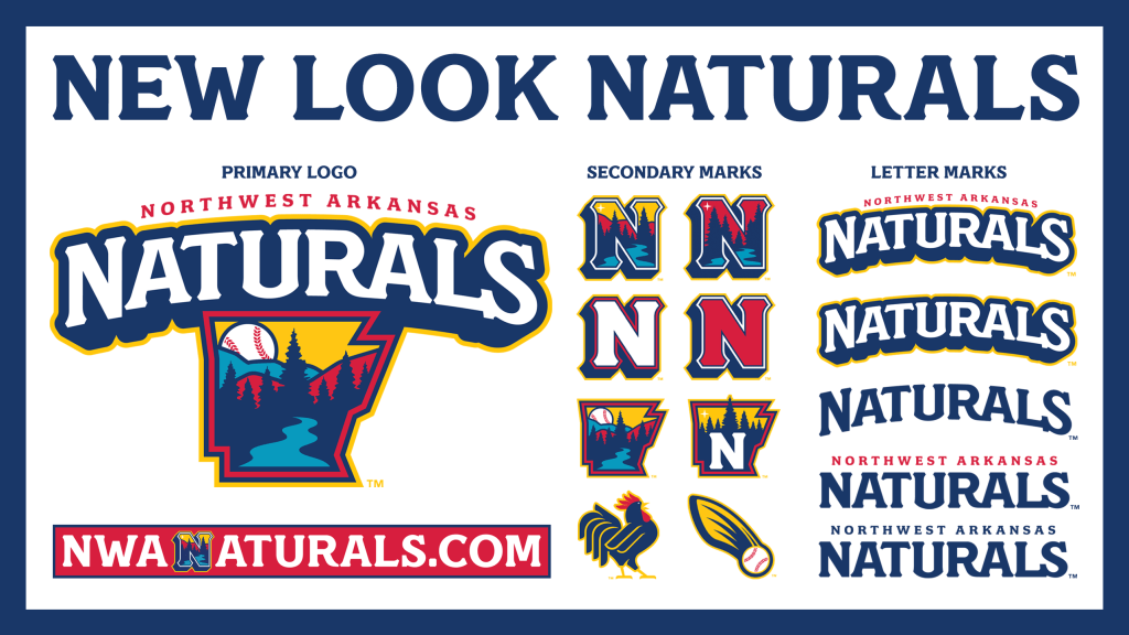
It's an improvement over the last one, but there's still too much going on. The state shape not only has four strokes around it, but they tried to cram in a river! and seven trees! and hills! and a sky! and a baseball! and four different colors!
The shadowing around the word "Naturals" in the primary is also too...blobby? Especially underneath the letters.
Navy, gold, red and teal is quite the exuberant color scheme.
1 hour ago, monkeypower said:
I quite like the primary logo and the top left N, but there's too many logos here.
-
1
-
-
This beauty from Gonzaga in the 1980s popped up on Ebay.
Looks like the Zags went full Expos on the road, as well...
before transitioning to some un-fun Dodger rip-offs.
-
4
-
 1
1
-
-
On 2/24/2023 at 6:35 PM, WestCoastBias said:
While most people do say "I'm a {college name} fan", I can only think of two schools (Roll Tide and War Eagle) that don't say "Go {team nickname}!" as their main cheer/slogan/whateveritscalled
Duke fans lean towards using the school name rather than "Go [team nickname]" -- you'll hear "Go Duke!" more than "Go Devils" or "Go Blue Devils" -- but I'm sure they're not unique in this.
-
On 2/7/2023 at 11:50 PM, Sykotyk said:
Bone Shakers.... What?!
There's no way that should ever be approved.
All are horrible. You have to a) think how kids will perceive it, b) how teenagers perceive it, and c) how the adults at the game perceive it.
Bone Shakers and Sawbones can't be, for little kids. Ghost Hounds could be a cutesy name if it goes casper the friendly ghost way. But, Screaming Alpacas or Rail Frogs seems the 'safe' likely choices. But what the hell does Alpacas have to do with Frederick? I'm guessing Rail Frogs has something to do with rail lines in the area? big port or something?
The reasoning behind the names is in the link in the original tweet.
-
My HS, the Blue Storm, uses the Air Force lightning bolt on football helmets.
-
Hurricanes wearing Raleigh IceCaps warm-up jerseys tomorrow night.
-
1
-
-
The 1970s Pirates apparently weren't afraid to wander off the map, as they also had this script "Pirates" jacket.
The Twins used this script "Minnesota" in the 1960s.
This is probably more due to cheapness than anything else, but the Mariners kept their jackets with the original 70s team wordmark for a few years after they'd switched to the 80s-style lettering on the jersey tops.
-
2
-
-
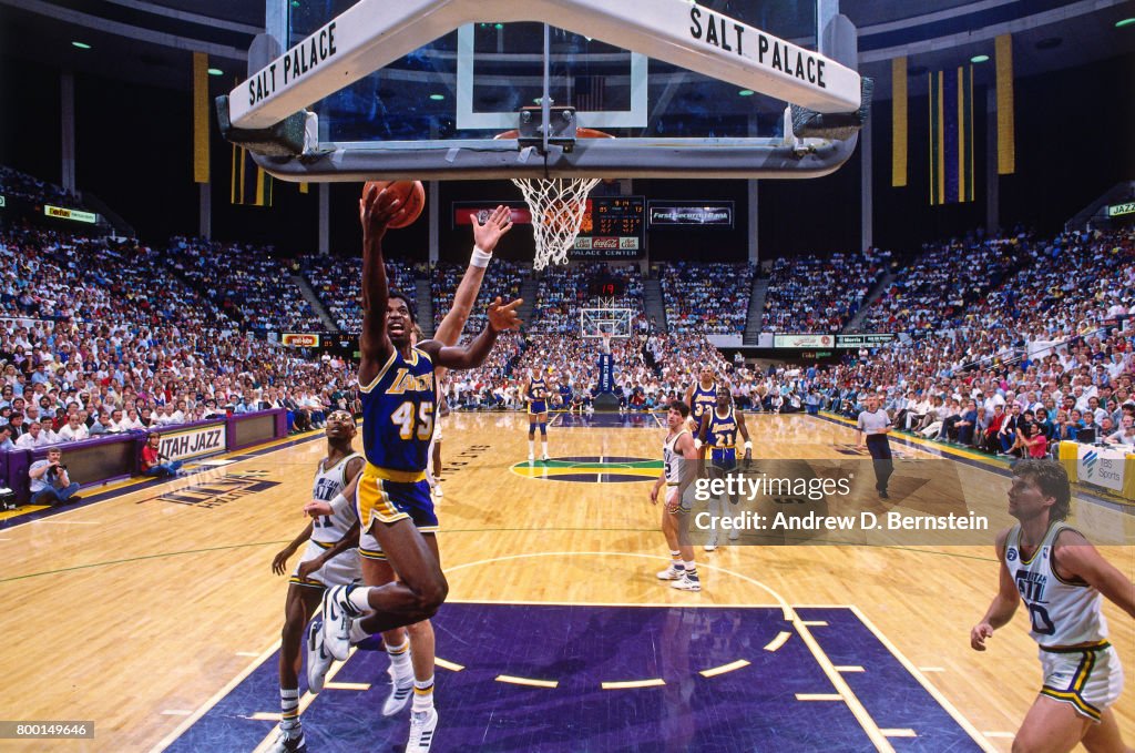
Veterans' Memorial Coliseum in Phoenix was another smaller, older venue used through the early 90s.
The American flag tacked onto the wall horizontally above the scoreboard, rather than hanging vertically from a beam as is customary today, is interesting.
-
1
-
2
-
-
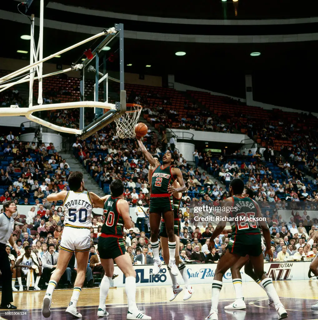
On 11/18/2022 at 3:34 PM, kimball said:
Bernard King in a Jazz uniform during the 1979-80 season. He played 19 games for the team until he got into legal trouble and was traded to Golden State in the offseason. I've only been able to find two photos of him, both aren't ideal, but it's fun to come across them.
Like a lot of NBA arenas that lasted well into the 1990s, the Salt Palace was such a charmingly...modest-looking place.
-
2
-
3
-
-
Yeah, I'm with most of you guys. The chunky "C" is terrible (why wouldn't you use one of the two fonts already in the logo?) and there's something about the way the knight is drawn that feels off. The lettering is really generic, and the shadows underneath look like Morse code. Also, I think they're going for a home plate shape in the background, but the angle of the "point" is wrong - a real plate is close to 90 degrees, not the acute angle in the logo.
As for the uniforms, the home whites would be better with black lettering outlined in blue, not the other way around - "Knights" is hard to read as is. The blues are decent-looking. The road grays are road grays, but I feel like the lettering isn't "tall enough."
For a team whose name lends itself really well to a cool logo and lettering, Charlotte's never really gotten it quite right. They started off pairing a wildly over-detailed knight with the world's most boring "C" (they put the entire thing on their hats), then in '99 forgot what their name was (you're not the Charlotte Horses, guys) and introduced a blotchy equine and a dark, moody forest green and navy color scheme.
Brandiose came around in '11 and showed that when they don't have the chance to distract people with goofiness, their work really just isn't very good. I actually like the colors, but Brandiose has always been just bad, bad, bad with lettering (that "S" is awful, and if you insist on including a crown in the logo, there's gotta be a better way than just slapping it on top of the "H"). The C as a "horse's tail" is silly, and if their GM has to constantly explain what it is, then it's not doing its job as a design element.
-
1
-
-
On 10/27/2022 at 6:42 PM, tscuzzy said:
I'm honestly surprised the NBA let this happen.
This was 55 years ago...pretty sure the NBA's marketing/branding sense hadn't evolved to the point where they really would have cared about this at the time.
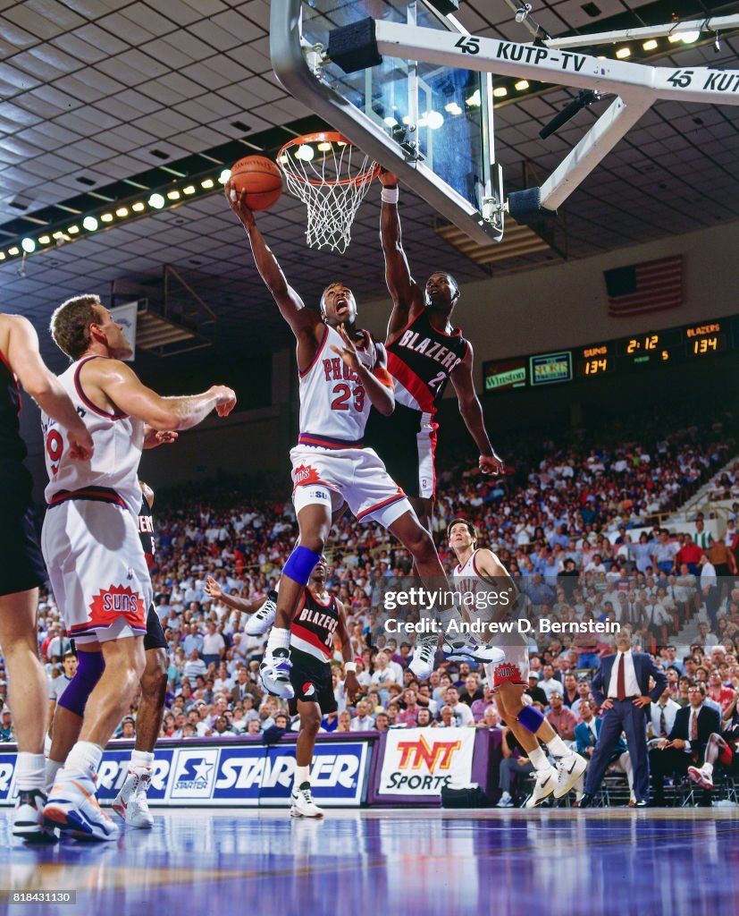
National merchandising was next to nil and most people watched TV in black and white...unless you specifically went to a Rockets-Sonics game, you probably wouldn't know what color the other team was, anyway.-
3
-
-
Eric Lindros wore a Nordiques jersey on a Quebec talk show a couple of years back.
-
3
-
 1
1
-
-
I've watched countless MLB games and had never really noticed this before...do players have leeway in choosing the color of their belts on their own? It was sort of distracting to see the Padres wearing both yellow and black (brown?) belts last night...
-
2
-
1
-
-
On 7/17/2022 at 2:25 AM, Discrim said:
A couple I came across just now...Nevada from about a decade ago, Red Sox-style N + 90s Padres-like jersey lettering (there was also a pinstriped version, but the only pic I could find of that didn't have a great look at the script)
Looks like the Nevada equipment managers are cleaning out the back room, as there's a huge stash of their jerseys available on Ebay, including said pinstripe version and late 80s-early 90s Rangers-style road gray. https://www.ebay.com/sch/i.html?_from=R40&_trksid=p2380057.m570.l1313&_nkw=nevada+baseball+jersey&_sacat=0
-
Because I don't think "College Baseball NHL Inspired Uniform Elements" would make for a very long thread...
I get using this modified Habs logo on a hockey jersey, St. Cloud State, but wow, this looks weird on a baseball uniform:
-
1
-
-
Lake Country of the American Association with the uni unveil. It's not really clear which is for home and which is away. The blue tops are pleasant enough, I guess, nothing to really write home about...the beltloop striping is interesting.
As for the other one, woof...the Rainbow Guts phase jumped the shark about ten years ago, and these aren't even colors that work well together to do the striping. The light-blue-outlined-in-navy lettering looks awful on a white top, and are those navy blue pants? Yuck.
Also, I know sublimated jerseys are cheaper to produce, they allows for more creativity in the design, and they're cooler, temperature-wise, to wear and so the players prefer them...but baseball jerseys with an embroidered design and numbers just look so, so much better and more professional.
-
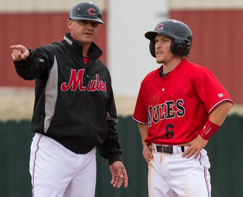
Just stumbled on this one: Central Missouri combining the Reds' C (including a very nice cream-colored button-down) AND a Mets-ish jacket font:
-
1
-
-
So, uh, looks Prairie View also joined Florida International and Wisconsin-Milwaukee on the "PadrePanthers" train at some point...
-
2
-
-
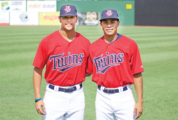
On 4/5/2021 at 5:35 PM, OnWis97 said:
Do people tend to think of these as lazy or do you like them?
I love them. As someone who knows every uniform since I started buying cards i the early 1980s, I enjoy seeing these modern takes. I see them more as tributes than rip-offs.
The entertainingly random ones, I like (why is a school in Mississippi using the Twins' font? Why are the Padres' wordmarks so inexplicably popular?).
The endless take-offs on the Rainbow Guts and the 80s White Sox beach-blanket jerseys, I'm getting tired of, though.
A couple more...
the Gophers' lifting the Twins' old road wordmark:
North Dakota State:
Northern Illinois:
-
3
-
-
Fullerton with the Giants font as well:
Georgia State in the '70s Braves threads:
Jackson State uses this Twins-y script:
-
4
-
-
Dallas Baptist with the Padres wordmark and Dodgers BP hat:
Western Kentucky borrowing the Nats' W:Delaware and Duke have both used versions of the Tigers' D :
-
1
-


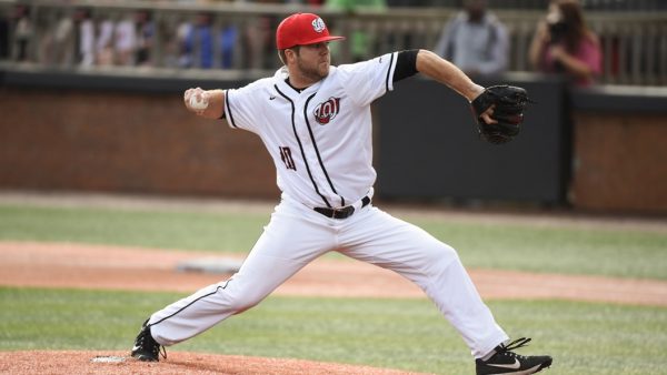
 - Charlotte Knights pitcher Lance Broadway wearing the Knights road uniform during the 2007 season")


MLB 2024 Uniform/Logo Changes
in Sports Logo News
Posted
Looks like they have a blue one as well.