


DJT
-
Posts
182 -
Joined
-
Last visited
Posts posted by DJT
-
-
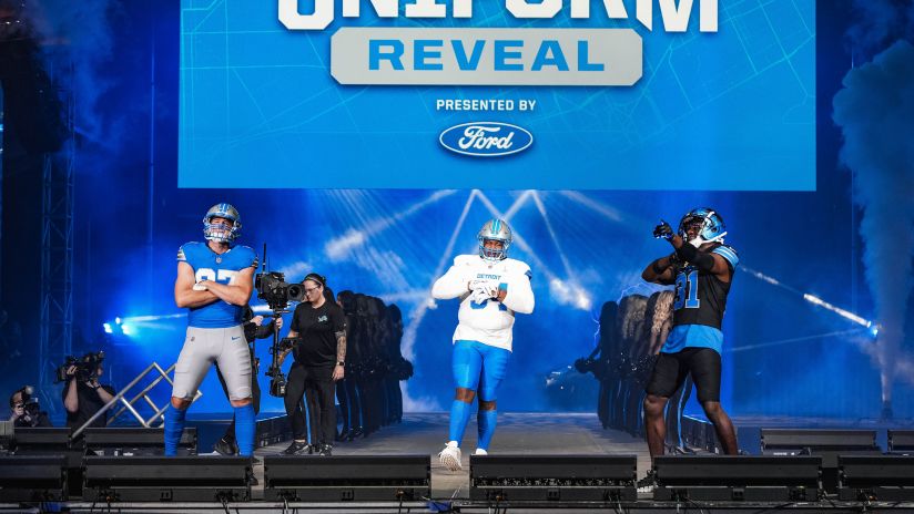
Lets get this one going a little quicker than the Lions one.
I actually like these quite a bit. Really hope the pants don't mess it all up.

-
 3
3
-
 1
1
-
-
Still not thrilled on any choices so far. And I really hope they can crank something out good and fast so it doesn't have to be Utah HC for a year.
Utah Fury apparently is a book series.
Utah Yeti - still not sure how I feel about it
Utah Dragons - same as yeti
Utah Swarm - sounds decent but really don't need another black n yellow
Utah Blizzard - hard no. Avalanche is right there.
Utah Venom - Snakes? Scorpions? Vipers? "here come the Venom on the ice" no thanks
-
1
-
-
Figured i'd follow the rules and start its own thread.
I honestly think this is a great choice. The home set is perfect.
-
Weren’t there supposed to be mountains on the broncos jersey? But I like those.
-
Press conference tomorrow. Also a post by NHL and delta center said name and colors coming soon.
-
30 minutes ago, FinsUp1214 said:
In Smith’s defense, his taste in logos and typography seems to be much more minimal from what I can gather. The Jazz logo and word marks, as well as a lot of thier CounterPoint streetwear merch series, are more minimal in design. Where Smith goes galaxy brain is in color choices, and if I had any worries whatsoever about the brand, it’d be in the potential for a bad color scheme. In all honesty, I don’t think a potential logo for this team is going to be excessively detailed and certainly not AI-esque. I think - key word, think - Smith will keep the logo(s) more simple than not.I think with all the backlash he got from the Jazz rebrand he will have learned his lesson. He’s a smart guy and does listen to feedback. The Jazz didn’t wear the yellow jersey for the 2nd half of the season because people (not me) hated it so much.
-
1
-
-
1 hour ago, CaliforniaGlowin said:
Man has this thread gotten name jacked.
I mean its a pretty big topic for the NHL. A team relocating to another state.
-
3
-
-
I'm still liking the Utah Storm but that would probably open the floodgates to Stormin Mormons.
Utah Gulls I also kinda like since its the state bird. But another bird team.
Utah Yeti seems popular and i'm not sure about it.
I'd expect more surveys to come out asking for input from fans.
-
15 hours ago, MCM0313 said:
I never cared for how those were purple in the front and black in the back, and they’re very late-nineties/early-aughts, vaguely industrial-looking uniforms - but they have a heck of a lot more personality than the junk they’ve been wearing for the past decade-plus (however long it’s been since they dropped purple, really).
I'm not sure why but I loved the purple front and black back. I think there could be modern version of it that would look amazing, if not by the raptors another team.
-
3
-
-
I still like just Utah Golden Eagles. Although then it may be too close to Golden Knights.
I also like the name Utah Range but it’s too close to Rangers.
Sting, Swarm, Stingers, Scorpions, Gulls or Storm would all be good choices I think.
-
1 hour ago, WBeltz said:
Are the Pelicans and Jazz confirmed? Jazz are dropping one of their jerseys this year (presumably next too) but has it been confirmed their doing something different?
I don't think any have been confirmed. Just rumors. Jazz beat writer saying what he has heard and he said "new jerseys" not singular. Conrad said not to get hopes up about a rebrand so i'd imagine it will be pretty minimal.
-
so now the teams with new uniform set next season are:
Clippers (we've seen)
Pelicans
Jazz
-
16 hours ago, Conrad. said:
I wouldn't get up my hopes for a Jazz redesign...
I take this as what I was guessing. Yellow is phased out and replaced by the black as the icon. Then a new statement jersey or perhaps their purple mountain one slides to statement.
-
I’d love to see the Jazz go back to a purple, copper, white scheme. Maybe a little of light blue thrown in. The copper is

-
4
-
-
Supposedly a Jazz beat writer has said that the Jazz will not be bringing back yellow next year. If the 5 year rule is legit I would assume this means the black becomes the icon.
However the beat writer said the rumors are that it will be a mountain jersey presumably in black, purple and white (yay kings)
-
11 minutes ago, CaliforniaGlowin said:
I'm surprised they are revealing it now. I didn't expect it until summer.
They were probably afraid of leaks / wanted to build hype for their pop up / next season.
But like most others are saying this is very well done by the Clippers. I love the jerseys more than I love the new logo. But both are improvements.
-
We know the Clippers are getting a new look.
Aren't the Rockets or Raptors or Pistons? I thought i've heard of another team making changes.
-
The red & blue court was a bit much for the IST but those are the colors of the NBA logo so it makes sense.
I thought there were rumors the Hawks and Rockets may be updating their looks
-
On 11/24/2023 at 3:43 PM, tscuzzy said:
Getting real tired of the "rolled up waistband" look. Can the multibillion dollar sports league let these guys tailor their short length to their liking? It looks terrible
I have several pairs of nba shorts and all of them the internal side of the waistband is super uncomfortable. I roll it like these just to avoid it.
-
these are fine. Don’t care for “crescent city”
-
6
-
 1
1
-
 1
1
-
 1
1
-
 1
1
-
-
Do we know when the Suns are showing their new uniforms? I thought I saw fans/season ticket holders were getting a sneak peek sometime soon.
-
Should have stuck to the new font.
-
4
-
 1
1
-
-
I like the new look and it seems the statement jersey will be purple. So hopefully it’s good and worn a lot.
-
3
-
-
-
10
-
1
-
1
-
/cdn.vox-cdn.com/uploads/chorus_image/image/73289722/BRONCOSUNILEAK.0.jpeg)
:no_upscale()/cdn.vox-cdn.com/uploads/chorus_asset/file/25408154/BRONCOSUNILEAKWHITE.jpeg)


2024 NFL Changes
in Sports Logo News
Posted
Gonna need to see the full set to really have an opinion on these.