


obiwantok
-
Posts
83 -
Joined
-
Last visited
Posts posted by obiwantok
-
-
1 minute ago, WSU151 said:
Agreed.
If you look at that logo, though, there are some really odd white areas (above the bat handles, below the bat handles, around the left shoulder...none of these white shapes go with anything at all in the logo).
It looks like it's a while circle that the baby is coming out of/through. I can see the reasoning, but so little of it is showing, I wonder want the point is. Make it larger or remove it completely; too little shows currently that it's just distracting.
To throw another "this looks like" name into the ring, I thought of celebrity chef Tom Colicchio. The team name is undeniably weird, but for me the logos are more acceptable for a professional team because for a baby, it looks more like a bald adult (the full set of teeth help with this, though if shrimp have teeth, so can infants, I suppose).

-
 2
2
-
-
Vexillological links of interest (didn't see these posted already)!
http://www.cbsnews.com/videos/what-goes-into-a-flags-design/
&
-
1
-
-
The General logo is a stock logo. It's like the tenth image on Google when you search "stock patriots logo".
Pretty sure they took that Generals mark straight from the Jackson Generals. Or at least copied it pretty closely.The New York Collegiate Baseball League has added an expansion team in Rome, New York. The team will be dubbed the Rome Generals.

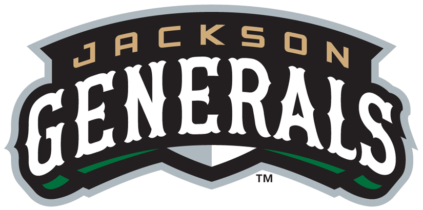
I can't tell if it's the exact same font, just stretched - or just a similar font.
Also, the "Rome" being in another "Western-inspired" font that's similar to (yet different enough from) "Generals," makes me think Rome's is a hack-and-paste Frankenlogo. The illustration (tricorne hat, ponytail) says "Patriot" more than "General" to me. I'm assuming it's lifted from somewhere - but where? (Commence scouring D3, NAIA, and other minor league logos...)
Good catch!- it is the Jackson Generals wordmark, just isolated and then stretched to a little over double the width without adjusting the height. Scaled, it is exactly what the Rome team has lifted. Not cool.
-
That script is so Brandiose. blah. I mean, it replaces baseball's answer to the Toledo Storm, but blah.
You realize that it not a Brandiose project, right? Done by Studio Simon, according to the press release. This might not be everyone's taste, but it's a solid, professional look, with some interesting details (the brush-stroked script, the badge container, the way the teeth fit into the wedge shape of the snarl) which seems in line with their usual quality. Any legitimate critiques with some of Brandiose's projects carry less weight when their name is reduced to a pejorative, especially applied to another firm's work.
-
In one of the worst internet articles ever, Bradenton unveiled the 2014 Florida State All Star Game logo. It'd be great if the article that talks about the logo actually...you know...actually included the logo so we could see what it looked like. But the logo is in tiny form on the team's website.

Originally found here
-
1
-


Minor/Independent/Collegiate League Baseball Logo/Uniform Changes
in Sports Logo News
Posted
Agreed. First reaction: that's not bad, and much more focused than other recent Brandiose work. But then you see some strange design decisions and details that aren't refined to the point that a Joe Bosack or Studio Simon mark would have polished them. For example, the strange water shapes under "Dock Spiders" in the main logo are oddly off center, which is minor, but like the Rumble Ponies' boxer horse having a larger left arm when it should be smaller than the right in proper perspective, is difficult to not see once you notice. In this case, the team site shows another version of the logo when explains that water shape - it's a "DS." But still, why not make sure everything is centered and looks balanced?
Somewhere (perhaps earlier in this thread?) I recall the comment being made that these weird names may have some root in teams wanting a name that can fully trademark. "Baby Cakes" rather than "King Cakes," or "Dock Spiders" instead of just "Spiders." If that's the case, it might explain these choices, rightly or wrongly, as pragmatic rather than aesthetic.