


Bruhammydude
-
Posts
724 -
Joined
-
Last visited
-
Days Won
1
Posts posted by Bruhammydude
-
-
Packers:
Week 1 at MIN: WYG v PWP
Week 2 vs CHI: GYG v WNW
Week 3 at TB: GYG v WPB
Week 4 vs NE: GYG vs WNN
Week 5 vs NYG: GGG TB vs WWR
Week 6 vs NYJ: GYG vs WGG
Week 7 at WAS: WYG vs RRW
Week 8 at BUF: GYG vs WWB TB
Week 9 at DET: WYG vs BSB
Week 10 vs DAL: GYG vs WSB
Week 11 vs TEN: GYG vs WNN
Week 12 vs PHI: GYG vs WWW
Week 13 at CHI: WYG vs OWN
Week 15 vs LAR: GYG vs BoneBB
Week 16 at MIA: WYG vs AAA
Week 17 vs MIN: GYG vs WWP
Week 18 vs DET: GYG vs WSB
-
11 minutes ago, DoctorWhom said:
So what is it with the NFL alway having the Patriots & Bills play each other in the dead of winter?
I wanted to drive up to Buffalo for the game, but of course it ends up being in January as the very last game of the season.
I want to kick "going to an NFL road game" off my bucket list this season, so between Green Bay, Pittsburgh & Cleveland, which would be the place to go to?
I'm obviously biased but Bills facing the Packers is gonna be such an amazing atmosphere at the Ralph.
-
I don't think it's rocket science, I just think that teams who use non-proprietary fonts want to look unique

-
 4
4
-
-
Uniforms I think are done:
Steelers (minus a font change)
Colts
Chiefs
Raiders
Cowboys (minus color fixes)
Bears
Packers
49ers
-
NFL: (minus minor tweaks)
Bills
Browns
Steelers
Colts
Chiefs
Raiders
Cowboys
Bears
Lions
Packers
Vikings
Saints
Cardinals
49ers
-
34 minutes ago, willforgetmylogin said:
So, this could absolutely be nothing, but Russell Wilson released a video yesterday of his offseason preparation through his production company. Now just about any other player I wouldn't give this the time of day, but Russell's media team is infamous for being obsessive in everything they do, in fact note that while there seems to be a ton of bottles around him, all are from companies he's partnered with or sponsored by.
Which makes it at the very least curious what the production company chose to be on screen behind Russell mysteriously blurred out despite the control bar being pretty visible..
I'll let you all be the judge.

Interesting
-
"Having fun is not allowed on my serious message board"

There's not gonna be any new uniform overhauls this year aside from Washington, so it's not unexpected that this would devolve into :censored:posting.
-
 2
2
-
 2
2
-
-
My alternate helmet wants VS my alternate helmet predictions
BILLS: NONE vs NONE
DOLPHINS: NONE vs NONE
PATRIOTS: WHITE THROWBACK vs WHITE THROWBACK
JETS: NAVY THROWBACK vs BLACK ALTERNATE
RAVENS: NONE vs PURPLE COLOR RUSH
BENGALS: NONE vs WHITE TIGER ALTERNATE
BROWNS: NONE vs NONE
STEELERS: NONE vs NONE
TEXANS: NONE vs NONE
COLTS: NONE vs NONE
JAGUARS: NONE vs NONE
TITANS: POWDER BLUE ALTERNATE vs NONE
BRONCOS: ROYAL THROWBACK vs ROYAL THROWBACK
CHIEFS: NONE vs NONE
RAIDERS: NONE vs NONE
CHARGERS: NAVY ALTERNATE vs NAVY ALTERNATE
COWBOYS: WHITE THROWBACK vs WHITE THROWBACK
GIANTS: NONE vs NONE
EAGLES: KELLY GREEN THROWBACK vs KELLY GREEN THROWBACK
COMMANDERS: NONE vs BLACK ALTERNATE
BEARS: NONE vs NONE
LIONS: NONE vs NONE
PACKERS: NONE vs NONE
VIKINGS: PURPLE THROWBACK vs PURPLE THROWBACK
FALCONS: RED ALTERNATE vs RED THROWBACK
PANTHERS: NONE vs BLACK ALTERNATE
SAINTS: NONE vs BLACK ALTERNATE
BUCCANEERS: WHITE THROWBACK vs WHITE THROWBACK
CARDINALS: FAUX LEATHER BROWN THROWBACK vs BLACK ALTERNATE
RAMS: NONE vs NONE
49ERS: NONE vs NONE
SEAHAWKS: SILVER THROWBACK vs SILVER THROWBACK
-
3
-
-
21 hours ago, Silent Wind of Doom said:
@Bruhammydude, it doesn't usually affect anything, but it comes out to 98 banners to not get shrunk by the way the board got scrunched by the new-ish side panel. But you've got a lot to celebrate. I have had to break it into two pics vertically, but if you did that, you'd have to drop the Bucks pic, since you can only have two pics at a time.
Here you go. The only drawback is the lack of the modern Marquette look, but hopefully they'll pick a high finish up soon.
Love this! Thank you!
-
 1
1
-
-
On 2/23/2022 at 12:19 PM, Silent Wind of Doom said:
@Dalcowboyfan92 Dude... So sorry. I never got a notification that there was a reply in here until Crabcake replied (although I was busy and just got back here). It was an easy fix. Here it is:
@Crabcake, I've only now realized that there's been a big error on your sig this entire time. I somehow had the 65 and 74 FA Cups in there twice. Also, you'd previously repped Liverpool's League Cup wins, so I made a version with and without them depending on which you prefer.
@Bruhammydude, I'm sorry but that is tooooooo many. With the updated to the Packers, Brewers, Bucks, and Badgers (never realized how many B's there were), there's only four spots left. Even now, due to the newer board changes that made it so that your current sig is shrunk and blurry.
There are a few ways of fixing this. Perhaps only keeping the National Championships and bowl wins of Wisconsin and the Final Four and up for Marquette or perhaps dropping the wild card wins of the Packers and Brewers?
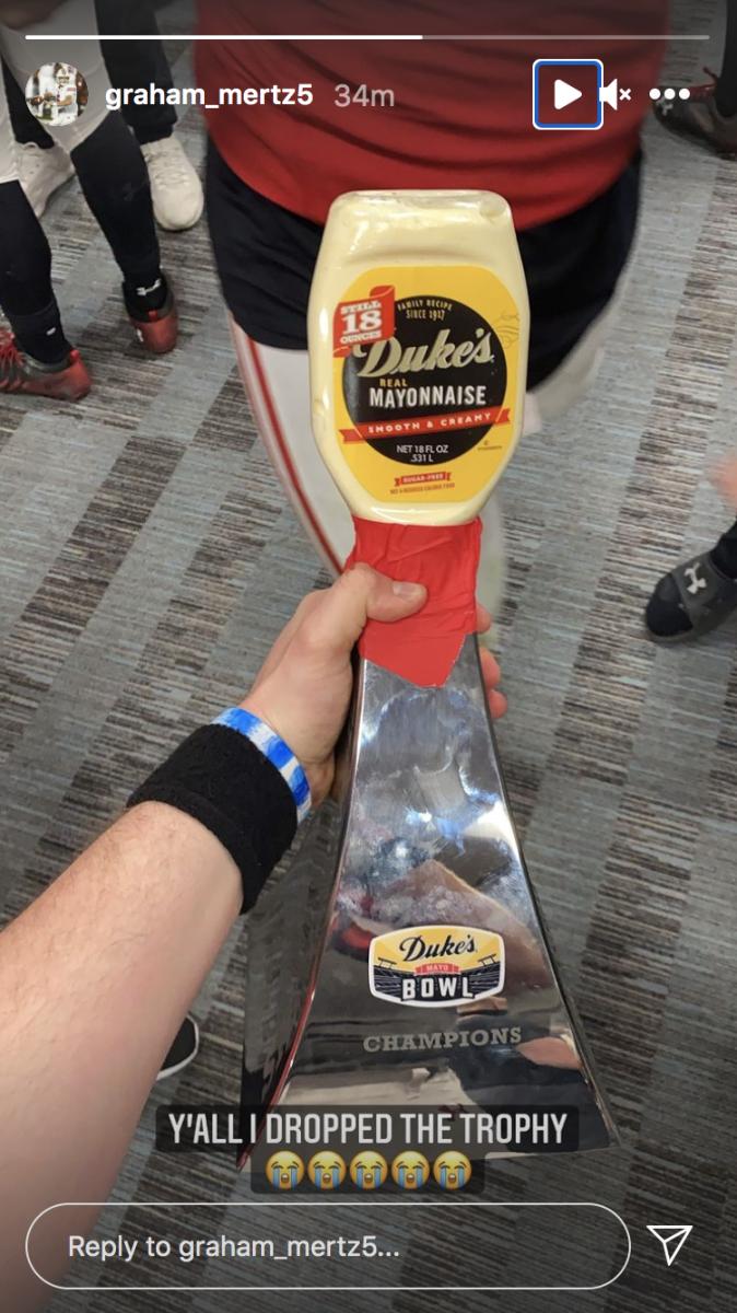
Also, I have the original Mayo Bowl trophy. Do you want the repaired version instead?
My bad, I didn't know there was a limit. I'll keep the bowl games and the final fours, please. Also, I would like the repaired trophy, because I think it would be funny
-
4 hours ago, ~Bear said:
NBC's new scorebug was leaked ahead of the Super Bowl. Not sure how big it'll actually be, because here it looks a little big. However, I do like the new design.
I don't buy this. Where would they put the down and distance? Why is there a giant white shadow below the Super Bowl logos?
-
2
-
-
My ideal Arizona Cardinals would look similar to this, courtesy of @oldschoolvikings
-
20
-
1
-
-
3 minutes ago, BBTV said:
That's a silly take. Tons of teams have lost in the playoffs to teams that they beat in the regular season - even teams that they were way better than. The 2002 Eagles come to mind - beat the Bucs in the regular season, heavily favored at home, were objectively a way better team, but then things happened (most notably Andy Reid being Andy Reid and Donovan McNabb having testicles the size of grains of sand) and they blew it. Nobody can ever say that it was "likely" that y and z would have happened just because x did.
Still felt like this was our year. I was too young for the one in 2010 (yes, I'm still only 17, I've got a long ways to go) and to watch playoff defeat after playoff defeat is soul-crushing. That being said, I do realize that I've had it good being a Packers fan, and so I hate to whine about our failures. But this year just felt special.
-
Looking to update this, since some new stuff has happened. @Silent Wind of Doom
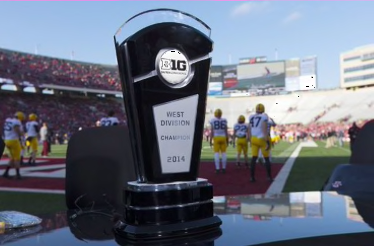
Packers: Add 2020 & 2021 NFC North Championships. Also, if the George Halas trophy could be added in '97, I would love that.
Brewers: Add 2020 Wild Card berth & 2021 NL Central title
Bucks: Add the 2021 CHAMPIONSHIP!!!! Finally I see a Milwaukee team wing a ring in my life. Also a 2020 EC Central title.
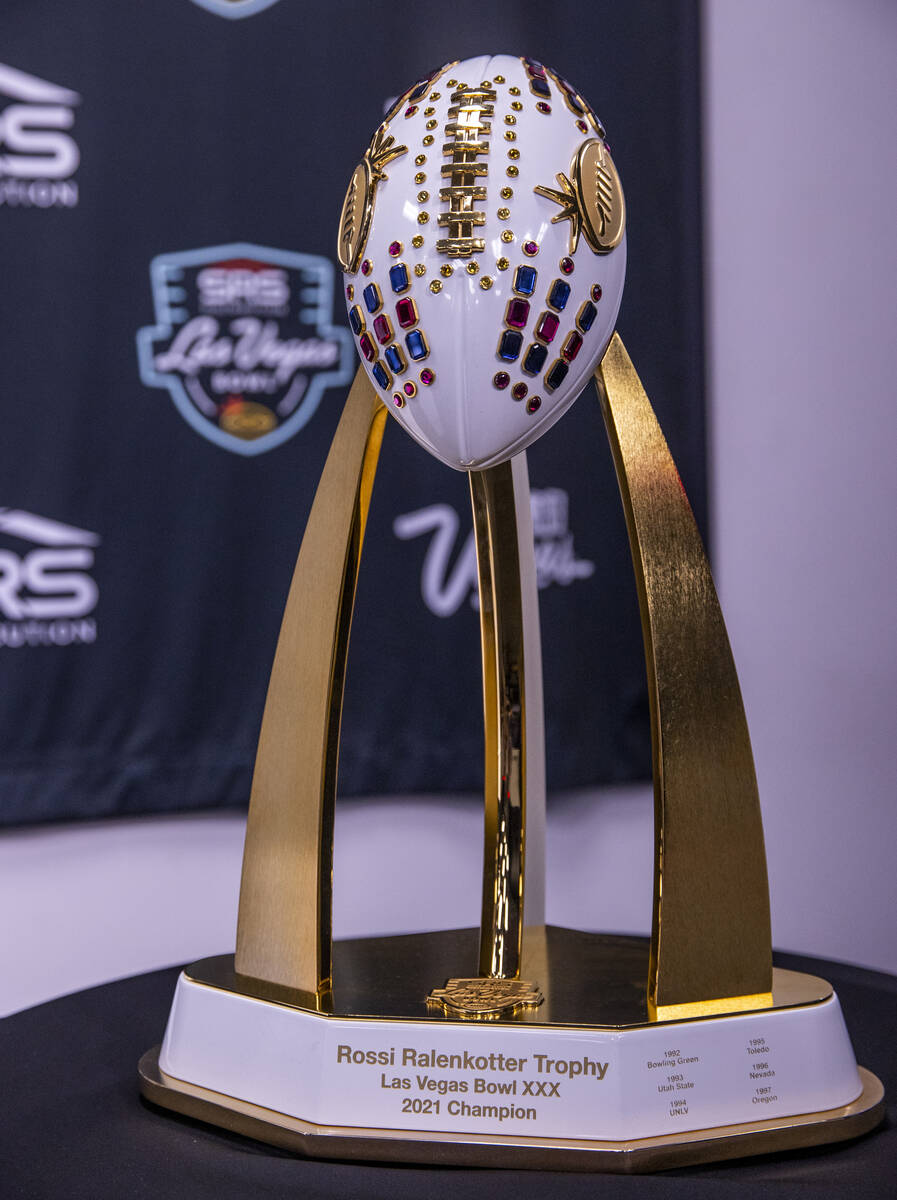
Badgers Football: Add the 2019 B1G West title as well as the Duke's Mayo Bowl win in 2020 (lol), and the Las Vegas Bowl win in 2021 (shown below what I want them to look like))
Marquette Basketball: Got into them since the last time I did this.
Titles: 1974
Runner-Up: 1977
Final Four: 2003
Elite Eight: 1955, 1969, 1976, 2013
Sweet Sixteen: 1959, 1968, 1971, 1972, 1973, 1979, 1995, 2011, 2012
Milwaukee Admirals:
1976 USHL Title
2004 AHL Title
2020 AHL Title (since there was no real champion, and we had the best record)
2006 AHL West Conference Title
2009 & 2011 West Division Titles
2016 AHL Central Division Title
That will be all!!
THANK YOU!
-
My Packers could've had such an easy ride to a Super Bowl win, as long as Rodgers and the special teams didn't implode. We had already beat the Rams and the Bengals, so we were likely to do it again. I just hope this wasn't our last dance just yet.
-
 1
1
-
2
-
2
-
 1
1
-
-
I hope NBC doesn't change their NFL graphics just yet, they have my favorite graphics package across the league
-
2
-
-
They couldn't take the Red Wolves name because of copyright issues, but it was perfectly fine to steal a name from the AAF?
-
2
-
-
-
This is gonna be awful.

-
3
-
-
On 1/15/2022 at 4:21 PM, Bruhammydude said:
My crazy super bowl prediction: 49ers 30 - Bengals 20
I look pretty good right now
-
Best Super Bowl field, in my opinion:
Would love to this this template, everything about it, with updated logos, as a full time look
-
1
-
-
Interesting enough that not a single game this year in the NFL was color vs color (minus the wolf Gray Seahawks), the first of it's kind since 2014. Also, this was the first year in a while that no New Year's 6 bowls were color vs color. With that being said, I feel this one has been long forgotten: (Bears @ Cowboys, 2004)
Also, who remembers the Patriots' silver jerseys?
-
8
-
-
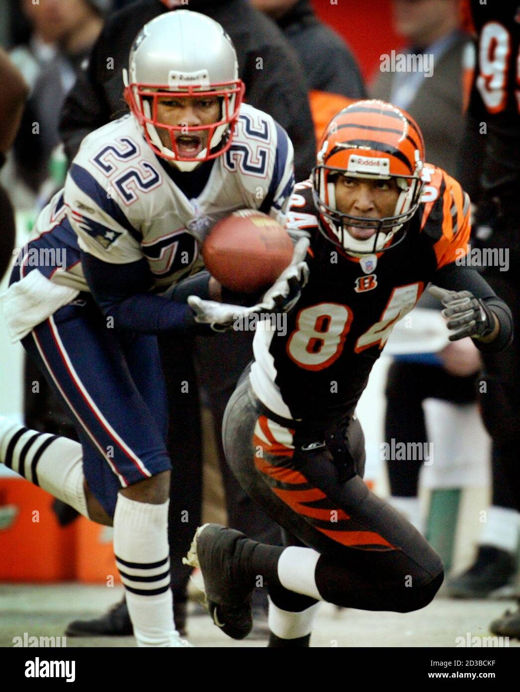
My crazy super bowl prediction: 49ers 30 - Bengals 20
-
3
-
-
Washington should stay as the Football Team, logos and all. I love how it feels retro, which fits a team that's 90 years old. None of the new names compare to what they have now, and the rumored uniforms frighten me.
And while they're at it, bring back yellow pants with updated stripes, please.
-
7
-


NFL 2022 Changes
in Sports Logo News
Posted
Unpopular opinion: The white Pat Patriot uniforms are better than the red ones, and that's what New England should've unveiled today. Plus, you can wear it at home or on the road.