


Froob
-
Posts
931 -
Joined
-
Last visited
Posts posted by Froob
-
-
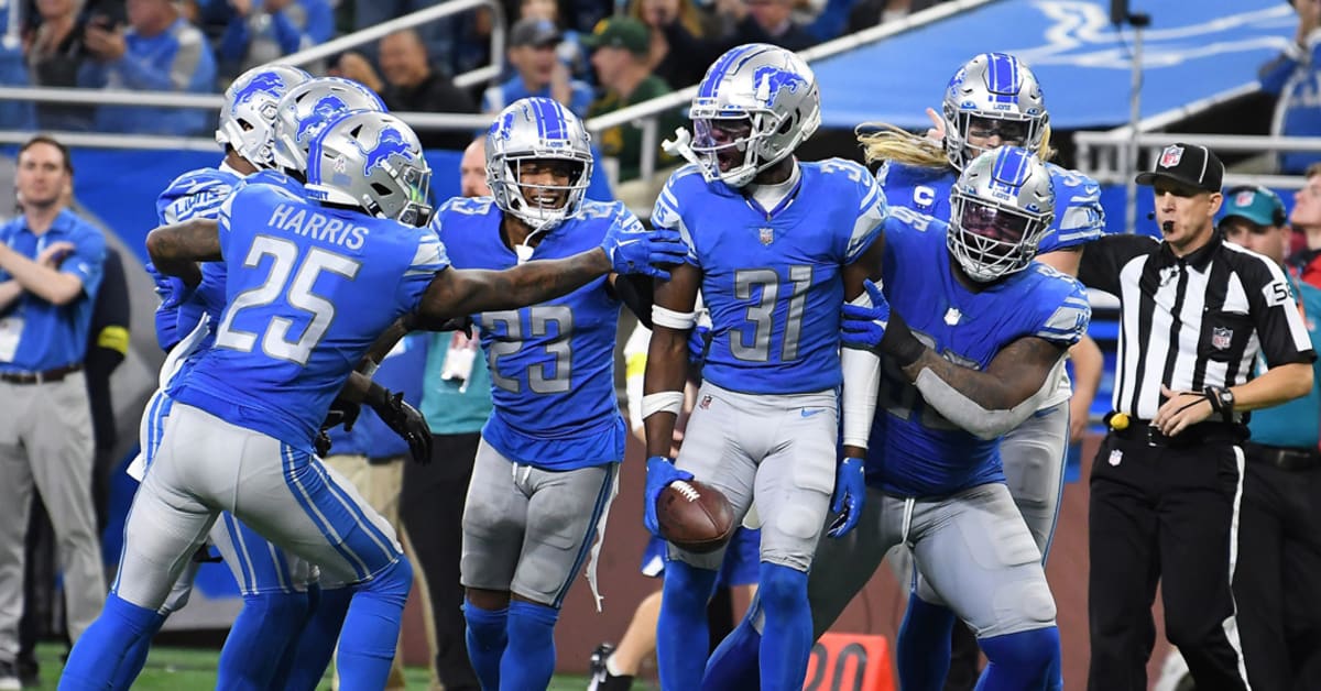
Really is a bummer lions removed the stripes from the blue pants. If they had kept stripes on em and removed the white pants (or added stripes) they are getting A+ (even if they don’t get rid of plain white socks).
-
 1
1
-
-
Was really hoping Houston was going to make their theme navy/red just like their logo. Unfortunately it’s now more navy than ever.
Also the red helmet of last year was way better.
-
4 minutes ago, MCM0313 said:
That’s the safe option, and it usually looks fine. It’s not the only choice, though, and there have been lots of good looks (current Giants, 1997-2002 Falcons, Orange Crush Broncos) that used the secondary color for the number on the white jersey.
Texans was better with red as well.
-
6
-
 1
1
-
-
6 minutes ago, VDizzle12 said:
The colors are superior and would distance themselves from the Bears. But the throwbacks aren't anything special either.
Striping inconsistency drives me nuts and with this set there are 4 different variations.
Cleaned up version with consistencies corrected and modern logo would be very nice.
-
2 minutes ago, MCM0313 said:
They never have been.
I think they should be. I like when the numbers are the same color as the primary jersey.
-
5
-
-
2 minutes ago, fouhy12 said:
The Broncos pulling a Jets and dropping this set at the end of 5 years for a more popular throwback seems very likely to me.
I don't even think the uniforms are THAT bad, but the weird triangle branding is unnecessary, and they will certainly wear ugly combinations. If they stuck to navy helmet, orange jersey, white pants, navy socks, I think they're alright. But they won't.
Bugs me the road numbers aren’t orange.
-
1
-
-
Denver has exactly one good set
Not to do the “these should be the primary’s” for every throwback but cmon a modern version of these would be beautiful. Love the socks.-
6
-
 1
1
-
-
Why did they steal the Chargers sleeve bolt lol?
-
Sheesh, my first reaction as a Patriots fan, we are lucky ours weren’t way worse. Nike is washed up.
-
3
-
-
Stay Coyotes and do a Utah theme re color of the current unis with some more Utah style landscape theme.
-
1
-
-
10 hours ago, tscuzzy said:

when you do a side by side , to me its a clear upgrade, even though its not that drastic. i expect the navy uniform to be a slight update like this one, and the other two to be more distinct.
Red number was way better.
-
19
-
 2
2
-
1
-
-
Texans needed more red, not less…
-
15
-
1
-
-
Jazz need to hire whoever headed this rebrand asap.
-
17
-
2
-
 2
2
-
-
Clipppers hit a home run. They did it all, nautical theme, classic word mark no more black jersey, red is back. A+++++
-
7
-
-
1 hour ago, dont care said:
Wrong
Call it what you want but it’s certainly not the same “gold” as what the Ravens wear.
-
1
-
-
On 1/22/2024 at 5:25 PM, leopard88 said:
It's not about the Vikings wearing gold pants. It's about the Vikings being a purple and gold team.
Gold is a tertiary color, at best, for the Ravens. Any uniform that puts it on equal footing with purple and black will inevitably invite comparisons to the Vikings.
Vikings wear yellow not gold
-
3
-
2
-
 1
1
-
-
Ravens need stripes on their black pants and should keep em.
-
1
-
-
I’m kind of over the Niners white pants thing, they look so good in gold.
-
11
-
-
Awesome move by the Jets. Wonder if a new black set is coming or if that’s being retired.
-
7 hours ago, ruttep said:
That's fair.
Agree to disagree on this one.
Really, I agree with the point of your original post. The Lions' current uniforms should be a modern classic as long as proper combos are worn. I just don't see that happening with how they had their best season in a generation in
 -up combos.
All they need in my opinion:
(Thanksgiving only)
Shame we rarely get white on blue. It’s the best look they have. Unfortunately they wear more blue on blue.
-
1
-
-
3 hours ago, Carolingian Steamroller said:
I know the red helmet is popular but I LOVED this look.
Yeah I actually prefer this look. Need to do the modernized dirty bird
one on right is great
-
5
-
-
I hope Texans go red helmet full time. I think only the chiefs have a red helmet.
-
8
-
1
-
-
Hope they incorporate red more and the light blue isn’t wedged in there like creamsicle was on the Bucs last unis.
-
39 minutes ago, fouhy12 said:
The Ravens have already worn the color rush and have worn black twice; that means they've hit their allotment of alternate games, right?
In theory yeah but think they did color rush and black 3x a few years back (2021?).
-
1
-


 -up combos.

/cdn.vox-cdn.com/uploads/chorus_image/image/71681458/usa_today_19428627.0.jpg)
/cdn.vox-cdn.com/uploads/chorus_image/image/72912934/1799469797.0.jpg)
/cdn.vox-cdn.com/uploads/chorus_image/image/70322790/usa_today_17412506.0.jpg)

2024 NFL Changes
in Sports Logo News
Posted
And navy socks