

.gif.f20f8ca4c4a7b2174a37b93e4494fc64.gif)
MilSox
-
Posts
2,067 -
Joined
-
Last visited
-
Days Won
4
Posts posted by MilSox
-
-
Since you touched on it, I'm curious to know why so many teams in Kansas City (Royals, Monarchs, Kings) have had regal themed names. I know the Kings started out as the Cincinnati Royals, but there had to be a reason why they stuck with that theme when they renamed the team.
-
3 hours ago, CDCLT said:
Not sure if this is a truly unpopular opinion, but I don't like any option of red, Irish Rainbow, purple, blue, whatever. Green and cream for the Bucks. That's it.
I could go for this, except the NBA told the Bucks not to wear cream anymore because it's too close to the color of hardwood and messes with the virtual ads they put on the floor.Yes, I think that's stupid too.
-
 3
3
-
-
11 hours ago, Cujo said:
Logo is an insta-fail for the Bucks choosing blue over lime green
17 minutes ago, Sec19Row53 said:The blue is an accurate depiction of the lakes and rivers on the borders of the state. As I said upthread, it's the reason why the blue is logical
I think it would look better with neon green. But the blue actually makes sense here, which is why I can accept it in spite of my general distaste for blue being part of their identity... one of the few things I don't like about their current look.
-
 1
1
-
-
Not bad. But I feel like the NYC equivalent of Phillies would be Gothams more so than Mets.
-
2
-
-
39 minutes ago, Sec19Row53 said:
I just get thrown off by how everything except the ball is straight lines. It's just jarring.
It does make a logical inclusion of blue, though. I don't care if you 'have to be from here' to know why it is where it is
I'll agree, the ball is pretty unnecessary, but at least its off to the side and not egregious enough to take away from the overall look.I normally don't like blue as part of the Bucks colors, but here it makes complete sense. If someone doesn't get it. Then open up any grade school US geography book and look up the Great Lakes.
-
1
-
-
This is the best logo the Bucks have ever had. In fact I've realized I like it even more than the OG Bango. It has a 60s/70s vibe that's perfect for them and it's a shame they don't utilize it more.

-
 1
1
-
-
3 hours ago, BBTV said:
No non-qb should ever be wearing 7, 12, and maybe 16. Those are the classic WB numbers of the majority of classic QB photos. Seeing Hassan Reddick in 7 makes me want to puke. Even kickers look odd in 7.
a starting qb should be able to take whatever number he wants from anyone, regardless of league rules., unless the number is retired.
I think 7 is a valid kicker number, but otherwise I agree. Those particular numbers on non-QB, even in college, look odd as hell to me. Especially 12. That's THE QB number.
But on the flipside; 17, 18, and 19 look odd when they're not on receivers. Sorry legendary Colts QBs. Blame Harold Carmichael, Charlie Joyner, and Lance Alworth.
-
1
-
-
I honestly wouldn't mind the NFL making its system more like the NCAA. The whole reason the NFLPA fought for this is so that more guys can wear their high school/college number into the pros. I don't see anything terribly wrong with that.
-
10
-
1
-
 2
2
-
-
4 minutes ago, Sec19Row53 said:
Yet is the key word. They haven't assigned him a new number yet.
Edit. I predict he is assigned 19.
I'm all for letting receivers and DB's wear 1-19. But the NFL needs to open up the numbers for kickers and punters or there's gonna be problems. Especially for the Packers who have 3, 4, 14, and 15 officially retired. On top of 1, 5, and presumably 12 being unofficially retired.
-
The Packers just announced their opening day roster in an infographic on instagram. Apparently they didn't assign punter Daniel Whelan a new number and are letting him wear #41.
I tried to think of another time I saw a punter wear a number higher than 19. I had to go back to the early 80s when Bob Parsons wore 86 for the Bears in the and with Pat McInaly for the Bengals who wore 87. But IIRC, they were the last of the guys who played other positions and became the defacto punter. Has a true punting specialist ever worn a number that high?
-
 1
1
-
-
Definitely. Aces, Gamblers, Knights, and Outlaws are all worthy names.
Yes I'm aware that most of those have been names of actual teams, but that shouldn't matter in a project like this.
-
Cards as Orioles might be one your best so far.
-
2
-
-
On 6/21/2023 at 2:29 PM, tBBP said:
That's not a shocker to me at all. I done seen Packers paraphernalia all across this North American landmass. It may surprise some, but there's a surprising contingent in, of all places, Pittsburgh.
That's every major city now. Wisconsin's biggest export for the past 30 years has been graduates of the UW colleges.
I laugh everytime the announcers see a large Packers contingent outside of Lambeau and remark how Packers fans love to travel. More than likely, those fans are transplants who live in the area.
-
Not bad. But I have to believe they'd be the Bisons.
-
1
-
-
16 hours ago, walkerws said:
Do you have $100 dollars and a full size basketball court?
...and a dream.
-
 1
1
-
-
On 8/23/2023 at 8:54 PM, Bomba Tomba said:
Racing numbers with a leading 0 are bad and should not be used
NASCAR for instance has a field of 40 cars, there are 100 numbers from 0-99, and numbers don't get retired. So running out of numbers is not an excuse
Besides, it's unnatural. No one says "I have 03 cats" or "My daughter turns 08 next week"
My dad was a racer and always used 0 when possible. A lot of guys who race on short tracks are in multiple leagues, which makes having a unique number difficult at times. We kept a set of temporary numbers he could affix to his zero when a more senior guy also had zero. 10, 20, 30, etc. were all quite common, so he'd often go 02, 03, etc. (00 and 01 were also pretty common... especially in the Dukes of Hazzard days).I can't say I would have blamed him if he decided to make one of his temporary numbers his permanent one after a big win. Then when he made it to NASCAR (Indy in my dad's case) kept it to pay tribute to his roots. It's better than the alternative, which is affixing a letter (27x, 49y, etc.) which I've never liked.
-
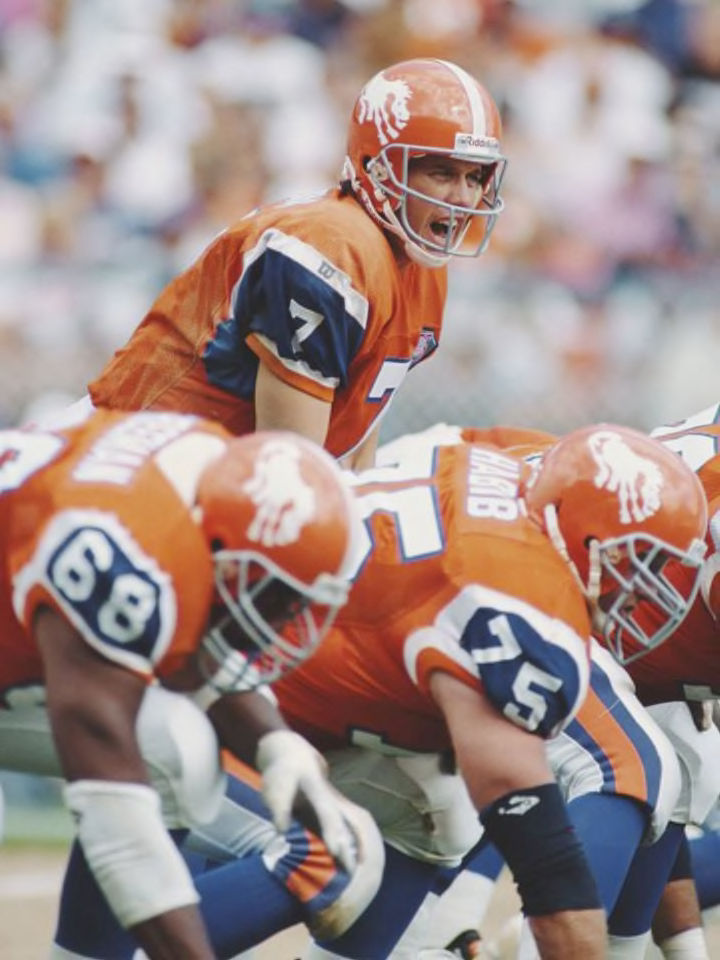
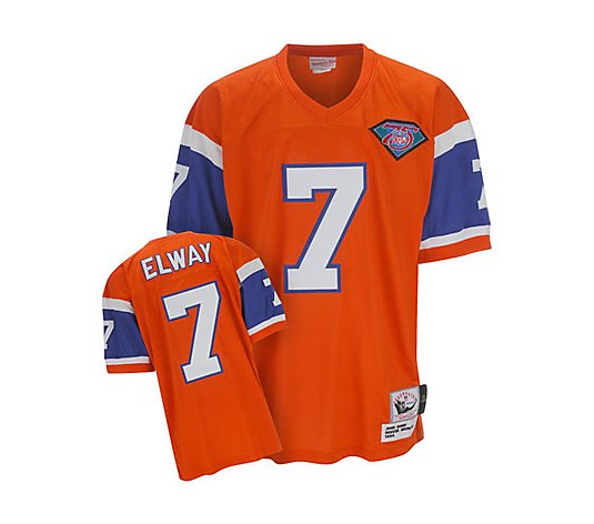
On 5/14/2022 at 1:19 PM, Indigo said:
This is the best Broncos uniform in their history:
Not this:
That's the best jersey they ever wore. Give me that with the Orange Crush helmets please and thank you.
-
3
-
 1
1
-
-
On 8/21/2023 at 2:09 PM, CDCLT said:
Just because, I've checked every Big 5 city.
Boston - Atlantic Ocean
New York - Atlantic Ocean
Buffalo: Lake Erie and Niagara River
Newark - Passaic River
Philadelphia - Delaware River
Baltimore - Chesapeake Bay
Washington - Potomac River
Pittsburgh - Alleghany, Monongaheia, and Ohio Rivers
Raleigh - None (closest is Neuse River)
Charlotte - None (closest is Catawba River)
Atlanta - None (closest is Chattahoochee River)
Jacksonville - St Johns River
Miami - Atlantic Ocean
Orlando - about a billion lakes
Tampa - Tampa Bay
Detroit - Detroit River
Cleveland - Lake Erie
Columbus - Scioto River
Cincinnati - Ohio River
Indianapolis - White River
Nashville - Cumberland River
Memphis - Mississippi River
New Orleans - Mississippi River and Lake Pontchartrain
Chicago - Lake Michigan
Milwaukee - Lake Michigan
Minneapolis & St. Paul - Mississippi River
St. Louis - Mississippi River
Kansas City - Missouri River
Oklahoma City - Oklahoma River
Dallas - Trinity River
Houston - Buffalo Bayou and Trinity Bay
Austin - Lady Bird Lake and Colorado River (different from the Grand Canyon's Colorado River)
San Antonio - San Antonio River
Denver - South Platte River
Salt Lake City - None (Closest is Jordan River and of course the Great Salt Lake)
Phoenix - Salt River
Las Vegas - None (Closest is Colorado River and Lake Mead)
San Diego - Pacific Ocean
Anaheim - Santa Ana River
Los Angeles - Los Angeles River and Pacific Ocean
San Francisco - San Francisco Bay and Pacific Ocean
Oakland - San Francisco Bay
San Jose - Guadalupe River and San Francisco Bay
Sacramento - American and Sacramento Rivers
Portland - Willamette and Columbia Rivers
Seattle - Puget Sound
Montreal - St. Lawrence River
Ottawa - Ottawa River
Toronto - Lake Ontario and Don River
Winnipeg - Assiniboine and Red Rivers (but not Lake Winnipeg, strangely)
Edmonton - North Saskatchewan River
Calgary - Elbow and Bow Rivers
Vancouver - Fraser River and Strait of Georgia
Only five I judged to be far enough away from bodies of water so as to not really be "on" one. Every one of those has bodies of water close enough to them to justify including them as a part of the city's culture if you really want to.
You forgot Green Bay, which is interesting because even thought it was named after a part of Lake Michigan, it's not actually on the lakeshore. It's at the "thumb" of the Bay of Green Bay, so the Fox River is the only major body of water in the actual city.
-
1
-
-
On 8/14/2023 at 3:08 PM, pepis21 said:
l could imagine they gonna try to emulate water on that court.
Uniform itself in my opinion is not good. That pattern on front is awkward and on back for me look more like glaciers because of that white color.
I mean it still works because Minnesota is a very snowy state. Ironically, just south of Minneapolis is the driftless region, one of the biggest regions in America that the glaciers never touched.
But the Bucks already did a lake inspired city edition. I like the Wolves' better because at least blue is a team color (okay, a REAL team color for the Wolves), but it hits on why I'm starting to not like city editions. If teams have to introduce a new one every year, then eventually everyone is gonna run out of things about their city to base a uniform on.
I get that Minnesota is the Land of Lakes, and Milwaukee is on a Great Lake, but are there any NBA teams that aren't on an ocean, lake, or river of some sort?
-
I'm getting Okie State vibes. But the Cardinals wear U Chicago colors, the Bears wear Illinois colors, the Packers used to wear Marquette colors. So I can buy this.
I just wonder what the Dallas team is called in this universe.
-
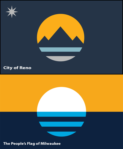
On 7/1/2023 at 4:27 PM, SFGiants58 said:
The Milwaukee People’s Flag is the most egregious offender in this regard. It looks like it was meant for merchandise and not much else.
It’s very much a product of bourgeois white Milwaukee, which happened to be where I hung out the most in the city when I lived there. It also is way too similar to Reno’s actual flag (in the same “merch” style).
The “merch” style of flag very much misunderstands the historical circumstances behind the DC/Chicago/Southwestern flags, leading to an artificial sameness.
Wasn't Reno's flag designed after Milwaukee's... which was the reason for the controversy?
I'd probably agree with the "bourgeois white Milwaukee" comment if I hadn't been around enough to know that's not true. At least not anymore, as that may have been who was behind it at first. But I'm honestly shocked at how many people from different walks of life have embraced the people's flag, or how many places I've seen the people's flag where you never saw the city flag before.
Not saying it would have been my first choice of a design, but at this point there's no denying its place as a prominent Milwaukee symbol. I see it as often as I see the Brewers glove and the Summerfest smile.
-
2
-
-
5 hours ago, iamdaviinci said:
I won't defend the white sun as a great design choice by any means, but it feels like a lot of folks are overthinking it. Bulls aren't red, Hornets aren't teal, Bucks aren't green, etc. Team mascots don't have to be literal to work, and they rarely are. I also think the white sun is an odd point of contention when there are many other, more egregious and fundamental flaws with the uniform design (distracting wordmark, disjointed front number, poor spacing on jersey, lazy design on shorts).
Maybe not in the literal sense, but those colors are associated with those animals never the less. Red is the traditional color used to distract bulls and make them charge, and some actual bulls do have quite a reddish brown hue. Bucks tend to live in forested areas, which are quite green. This was actually a major complaint of mine when they wore purple, which is not a very forest-y color.
Sometimes it works regardless... as with your example of the Hornets. But typically that's because of tradition. Tradition dictates that the ball on the Suns uniform be orange, as it was on the uniforms that inspired them, which is also when the Suns had their biggest period of mainstream notoriety.
The fact that the ball is white doesn't make or break these uniforms for me. But I have to agree it'd look much better orange.
-
3
-
-
On 8/1/2022 at 7:48 PM, Discrim said:
While reading the comments to a recent JaguarGator9 video the other day, I came across a really dumb objection to something I've never heard anyone have a problem with: an apparent fellow Sconnie thinks no one should call the Tampa Bay Buccaneers the Bucs. Because they might get confused for the Milwaukee Bucks.
 I wish I was making this up.
Never mind that the topic was an official's actions before and during a Packers-Bucs game, making it rather obvious the Tampa Bay football team was meant, rather than the Milwaukee basketballers. Never mind that sane people understand that "Buccaneers" is a mouthful, and so find "Bucs" an accepted shorthand...convenient enough that I'd guess "Bucs" is spoken by announcers in every game they've ever played way more often than "Buccaneers". Oh well, dude can have fun with his dumb reasoning.
You'd be surprised. I was watching a Bucks-Mavericks game at a bar upstate and had someone admit to me he was confused why the Mavericks were playing a college team.
Apparently he thought "Bucks" on the lower third was referring to Ohio State. :facepalm:
-
On 7/23/2023 at 7:22 PM, Cujo said:
Yes and no. See also... literally any long time Packer in the uniform of a division rival. Especially the Vikings.
We've come to expect this by now.
-
 1
1
-
1
-


2023 - 2024 NBA changes
in Sports Logo News
Posted
Historically speaking, only Europeans care about the FIBA cup, and Americans only care about the Olympics. This is why Team USA has won "only" 5 of the 20 FIBA cups (still tied with Yugoslavia for the most), but 16 of the 19 gold medals in the Olympiads they've competed in... which includes the most recent gold medal.
I would also remind everyone of the McDonald's World Championship... basketball's equivalent of the FIFA Club Cup in the 80s and 90s. I went to the first ever championship game at the MECCA Arena and watched a bunch of Bucks bench players beat the holy hell out of the Soviets. They cancelled the series because the NBA teams they sent over, which usually weren't even the NBA champs, were beating the piss out of the best club teams Europe had to offer.
I do think Team USA vs Team World would be an interesting, competitive matchup.... and for years I've wanted that to be the format of the NBA all star game. But your average NBA team is still far and away better than their equivalent in any European league and it's not even close. There's a reason why the best European players all play in the NBA. Thus, the NBA champs are the World Champs.