
.jpg.0f5c252fadf476ffce3ae83bbdb37304.jpg)
⋔ 4 ℞ ℞ $
-
Posts
182 -
Joined
-
Last visited
Posts posted by ⋔ 4 ℞ ℞ $
-
-
On 2/19/2024 at 9:06 AM, DCarp1231 said:
The Ravens didn’t even wear the CR this past season, so I’d imagine it’s dead. Which is good, but I will miss it a little bit.
Nah, they also inexplicably skipped wearing their 'ColoRush' uniforms in 2020, too — even after starting out with an undefeated 4–0 record when wearing them from 2016–2019 — but then they returned for both the 2021 & 2022 seasons (two close & inexcusably stupid, costly coaching decisions, which caused those losses vs. GB & vs. BUF), respectively.
In fact, the same thing happened after they debuted the beautiful black jersey with purple pants uniform in 2018. For no apparent reason, it vanished for the next two years — despite a monumental ending in the waning moments of a division-sealing victory via C.J. Mosley, which broke a streak of narrowly missing out on the playoffs over the previous three seasons.
However, that one has been worn once per year during the last three consecutive seasons. Now, it too is an undefeated 4–0, just like the 'CR' formerly was following its first four appearances on field.
Further worth mentioning is the fact that only in the 2018 & 2021 seasons have the Ravens actually trotted out in all ten of their currently existent mix-and-match uniform combinations.
For instance, besides no 'CR' last season, we additionally have not seen my least favorite look of the entire bunch — save for the recent ruining of the white jersey & white pants combo by pairing it with plain white socks/tights instead of black — for a couple of years.
That which I am referring to would be the black jersey with white pants combo. I personally prefer it that way (shelved), since I feel that both other black combos are better, plus for whatever reason the black on white had become a frequent loser in recent seasons.
-
As a Ravens fan, can we get some 2001 OT INT Mike Brown magic from the Bears vs. the Browns this weekend? My apologies to Joe Flacco, but now that he has finally reached that elusive milestone of 100 wins, he can lose out for all I care!
Additionally, may our brothers in purple take care of business against the 'Jungle Bung(ho)les', plus here's hoping for a former Baltimore team to send PIT packing with a third consecutive loss!
Also, bug-eyed / 'BulgEyed' Tomlin & his stupid streak of never having a losing season constantly being mentioned ad nauseam gets on my nerves, as does the fact that out of six current AFC teams with a 7–6 record, PIT just so happens to have the lead over every single one at the moment!

-
 1
1
-
 8
8
-
 4
4
-
-
13 hours ago, canzman said:
The Tennessee
TitansTycoons -
@canzman Hey-lo there, sir. Any chance you can possibly make a correction to the Week 12 Ravens uniform image? After all, they did wear white socks as a team for the first time ever with the white jersey/purple pants look.
The reason I ask is because I like to save the different combos (by season) that you create to a special file folder. I don't post them anywhere — well may have once or twice in the past (including properly crediting you as creator) — but rather just keep them for my own personal viewing purposes & for the sake of memories. However, if I ever did for some reason, then you would of course be rightfully credited for your stellar work.
Obviously, this year is more important than most previous ones in the past, due to the long overdue Ravens template change from Nike 'Speed Machine' to 'F.U.S.E.', so it'd be nice to have each various combination that was actually worn throughout 2023-2024.
Plus, your stuff is way better than, say, GUD's depictions, for instance, what with the attention to minor/minute/minuscule details! If not, it is no biggie. Perhaps I can try as a novice to fill in via MS Paint (LOL). On the other hand, if you were to make the modification, then I thank you in advance, plus just generally speaking I genuinely do greatly appreciate with utmost gratitude all of your perennial efforts!
-
1
-
-
1 hour ago, Carolingian Steamroller said:
Here is what, in my opinion, made the OG Seahawks uniform special:
The helmet.
The other 3 NFL teams that use silver helmets all have a stripe bifurcating them. The Seahawks never did and instead had the rare wrap around logo.
Additionally, the shade of silver was never a speckled or sparkly version as would later be used by the Lions and Raiders. Instead, I always felt it gave off a stainless steel look.
With no stripe down the helmet you got a shining silver crown, even under the artificial light of the Kingdome.You forgot the New England Patriots, who also didn't & don't have stripes down the center of their (sparkly / speckled) silver helmets.
-
1 hour ago, Krona said:
Nice touch by the browns decking out Brownie in all white at midfield
Traditional logo be damned, in general, they should also already reverse both his hat & hair colors, respectively. The stiff-arming elf normally has a brown hat + orange hair, whereas the standing elf (much like the real life version of 'Brownie' the mascot) has an orange hat + brown hair. Not only would an orange hat match the actual aforementioned mascot, but it would also make much more sense to depict the elf wearing an orange hat just like the color of the players' "hats" (helmets).
-
3
-
-
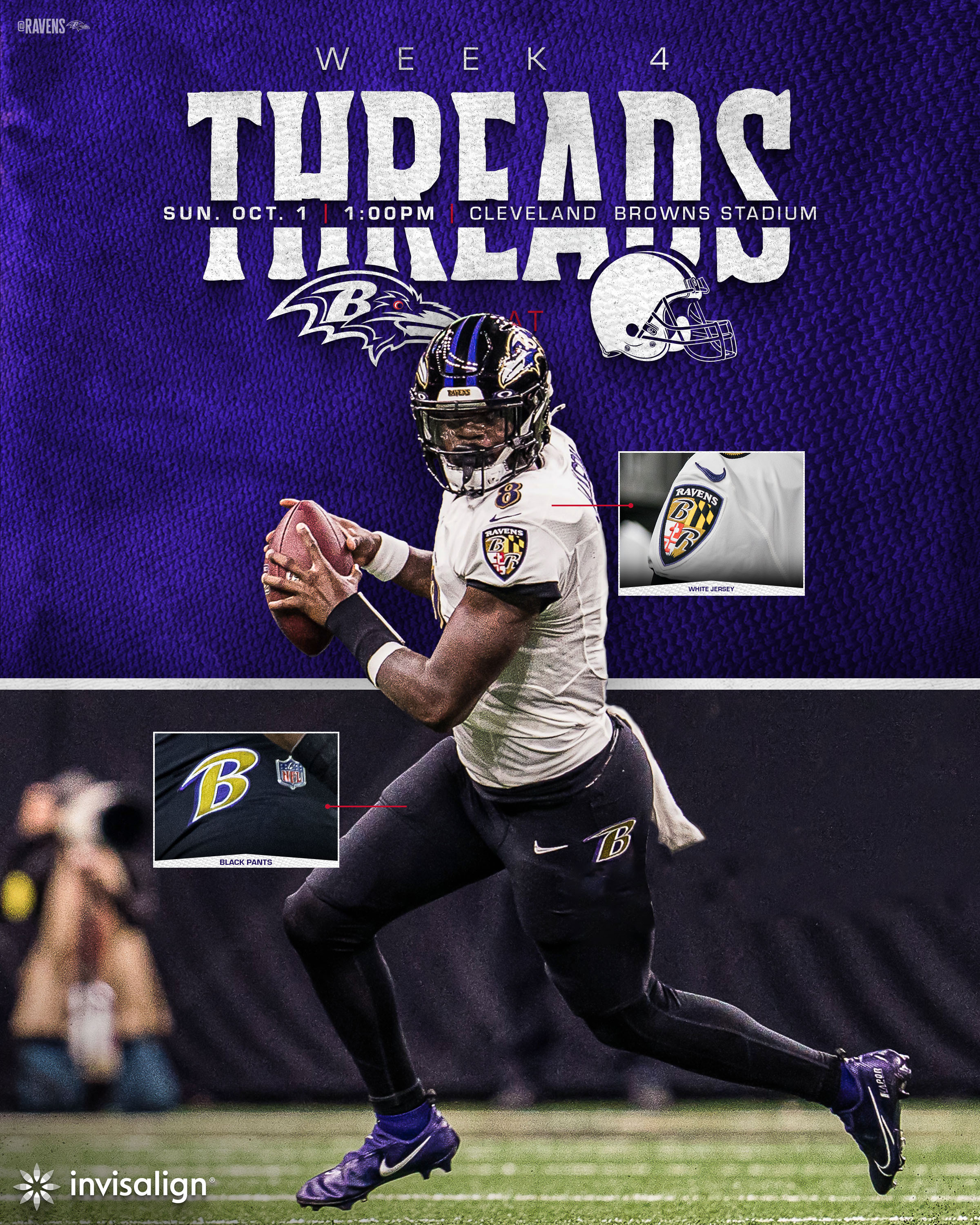
8 hours ago, gothedistance said:
Baltimore wears their purple pants with the white jersey, and I give the best uniform matchup of week 4 to this game.
Unfortunately, the Ravens are going with the white jersey / black pants combo again.
-
 3
3
-
 1
1
-
 3
3
-
-
https://youtu.be/dAE7uOO_4v4?t=30
14 hours ago, MJD7 said:Watching Pitt - UNC last night really reinforces how much better the Rams’ uniforms could be. Just imagine a royal blue helmet with the classic horn:
14 hours ago, ManillaToad said:No need to imagine, it was reality
"Just imagine a royal blue helmet with the classic horn" — MJD7
-
3
-
-
7 minutes ago, oldschoolvikings said:
If alternate helmets must be worn with alternate jerseys, the Broncos would be much better off wearing this helmet with the navy blue jerseys.
That would certainly be better in tune with the snow-capped mountain theme, including more blue — albeit navy, rather than a more aptly fitting royal hue — as sky & a twinkling sparkle of orange sunlight sprinkled amid the intermingled (wintry) mix.
-
On 7/25/2023 at 1:17 PM, tBBP said:
So now the NFL's doing this unnecessary nicknaming of the uniforms?? Geez...
....And yes, other than to gauge fan feedback ahead of their inevitable rebrand [at this point], this is 100% unnecessary. Snowcapped in a city that's dang-near flat as a pancake...aiight...
The Rocky Mountains are flat? Then I suppose it was indeed true "That John Denver sure [was] full of s.h.i.t, man!" Are you sure you didn't take a wrong turn
-at Albuquerque& head toward Nebraska instead of Colorado?-
3
-
-
1 hour ago, FiddySicks said:
They’re the Free Willy team and that’s good enough for me.
I prefer Air Bud: Golden Receiver. Let's all go raid Joey Galloway's garbage can(s) out on the sidewalk in front of his home during Seattle's local neighborhood trash pickup day(s) in scavenging hopes to discover discarded food, such as orange peels — which will inevitably give us magical athletic powers transferred via his DNA, of course!
-
22 hours ago, dont care said:
So give them Vikings helmets? Nah I’ll pass on that one
One game per season is not a big deal, especially considering how their 'Color Rush' uniforms are already somewhat similar as it is (MIN lacking any white details below the neck being the main difference).
Both teams do not utilize a more color-coordinated helmet, however, and both feel out of place with the rest of said alternate uniforms — especially the Vikings' white horn decal.
The Vikings also do not wear gold face masks. For whatever silly reason, they continue to go with black instead of purple or any other logical color that would seemingly make more sense. -
12 hours ago, HOOVER said:
You know, if they introduced an alternate helmet, the above concept would be a way they could revive those Gold pants. Maybe put a Mustard facemask on this baby with a Black stripe down the middle…or something.11 hours ago, j'villejags said:I still want these purple flake helmets for Baltimore to mimic the raven’s flash of purple in the sunlight.
Similarly, I think they could pull off the Oregon iridescent effect as well. Black numbers with a purple sheen.
'BALternate' helmet for 'ColoRush' coordination — either Riddell fashion release from over the years works, such as 2017 'Blaze' (satin purple finish helmet shell + metallic gold face mask) or more recent 'Flash' (glossy purple finish helmet shell + metallic gold face mask). Personally, I probably prefer the satin, since it would seemingly better match modern-day, matte-style, Nike uniform (jerseys/pants) fabrics.
'Blaze' (Satin):'Flash' (Gloss):
-
4
-
-
11 hours ago, Jezus_Ghoti said:
Is it really worse than this? I'm not so sure anymore.
11 hours ago, MJWalker45 said:
Just bring back actual striped socks.
-
2
-
-
13 hours ago, Blast_Brothers said:
They're the only team with a navy helmet and navy facemask.
12 hours ago, TruColor said:*cough*Bears*cough*
See also: Seattle Seahawks & Denver Broncos
[Edit: @WSU151 beat me to the punch. "Great minds think alike."]
-
2
-
-
On 5/5/2023 at 1:09 PM, BBTV said:
Eagles D'Andre Swift will be the first player to wear 0 for them since his usual number (and its reverse) are taken.
On 5/5/2023 at 1:29 PM, MCM0313 said:He should campaign hard to be nicknamed “Agent Zero”. Then monetize that somehow.
Someone on Reddit actually already thought of this, but for 'R0QUAN SMITH' of the Baltimore Ravens, who has changed from #18 to #0. I added the Metallic Gold box in the first image for emphasis on 'Ro' aka 'R0'.
Roquan can now lay claim to being both the best-ever #18 — alas, fellow 'Flock' fanatics of our favorite professional football franchise can finally cross out the name of Elvis Grbac, forever removing him off of this proverbial jersey numbers list — and (de facto) #0, respectively, in franchise history.
____________________________________________________________________________________________________________________________________________________________________________________________________________________________________________
____________________________________________________________________________________________________________________________________________________________________________________________________________________________________________
-
2
-
-
4 hours ago, FiddySicks said:
I don’t think I’ll ever understand the love that old Broncos D horse logo gets. The D kinda just made the whole thing look awkward, and the rendering on the horse itself was ATROCIOUS. I get now that the horse is blowing air/snot out of its nose, but when I was a kid I absolutely did not understand what was happening there. I always thought it looked like someone was trying to tickle the horse with a feather. Now it looks like one of those weird S&M/bondage feathers someone is bothering the horse with. Not a good look. Especially considering that their current helmet logo is MILES better. I don’t like the Broncos at all, but their current helmet logo is one of the best helmet logos in the entire league. People really want to ditch it for that dumb, outdated D logo? Weird.
Funny, as a small child, I used to think it was another horse's tail in front of the bucking bronco, which was about to hit said equine smack dab directly in its snout/mouth.
-
4 hours ago, tBBP said:
That'd be me. What you described is why I rechristened them that going back to at least 2020 if not before. Why? Because for a good solid six or seven years that team has rewritten the book on playing up and down to competition...routinely and somehow repeatedly beating if not blowing out the top teams in the league only to then turn around and get beat if not blown out by the worst...just backwards as all get-out, hence the backwards [re]name.
Oh and it's "Snatit".

I always just assumed it was due to their font serifs pointing backwards as a supposed nod to the state shape.
-
On 3/10/2023 at 1:22 PM, BBTV said:
It can totally work if the third color is black. Other than that, it's probably not a great idea.
Just an FYI: I wasn't the one who responded "Yikes" to both silver & gold being used, just quoted someone else saying that with my own jocular link to a Christmas song called 'Silver and Gold'.
-
On 3/8/2023 at 4:28 PM, FiddySicks said:
I get Carolina having silver but Jacksonville having it initially has always baffled me. Gold AND silver? Yikes. Very happy they corrected that before the first season.-
1
-
1
-
-
18 hours ago, BBTV said:
18 hours ago, oldschoolvikings said:
-
4
-
-
9 hours ago, mafiaman said:
Dolphins full-time throwbacks? I’d even settle for the current set with darker teal and more-orange orange. Oh, and block numbers.
3 minutes ago, Carolingian Steamroller said:Yeah the throwback is a little more green than blue.
I've come around on the current Dolphins set. It's quite nice with the white facemask. In particular, I like the white over white with teal socks. Maybe you could adopt the throwback colors, but that'd be about it.
Aqua*
-
3
-
-
14 hours ago, Chawls said:
The Saints look so much better wearing black socks with the all-white stripeless uniform.
I 𝙈𝙄𝙂𝙃𝙏 (and that’s to be read as a biiiiiig might) go so far as to suggest that this is the uniform combination they should wear with their black helmet.
Too bad they refuse to wear black socks — or even a (matching) gold helmet as of this season — with the alternate white throwback uniforms!
-
1
-
-
On 10/28/2022 at 1:10 PM, PERRIN said:
Here's a super quick sketch of what I'm envisioning
Good, but the gold needs to be on the inside of the black to better match the jersey numbers (just like the gold of the early day Jax Jags, or similar to the role orange plays in the striping pattern of the former & current day Bucs), especially in cases of wearing same color pants as jersey. For instance, picture these with the dual hip gold B's:
Also, on an additional note / tangent, they really need to fix that "Front-Facin' Raven" (granted, in a much better, less squeezed-together, more professionally reworked way than I have). Here's what I mean:
-
7
-


/cdn.vox-cdn.com/uploads/chorus_image/image/61574753/1042111068.jpg.0.jpg)


:format(jpeg)/cdn.vox-cdn.com/uploads/chorus_image/image/6074543/20130103_ajl_as8_310.0.jpg)


 ______________________________________________________________________________________________________________________


2024 NFL Changes
in Sports Logo News
Posted
...and numbers, which I just KNEW they were going to ruin by changing to navy on the white jersey...so predictable, same as Falcons years ago (going from red to black).
Edit: Jax Jags, too (multiple times), from teal/gold/black to (primarily) black — yuck! Surely, there are some other franchises that Nike has modified for the worse in terms of removing color for dullness instead, yet I do not wish to depress myself thinking of them and/or researching at the moment.