


Wade Heidt
-
Posts
390 -
Joined
-
Last visited
Posts posted by Wade Heidt
-
-
Wow. Sad uniform day in Junior A hockey. Big thumbs down to the Estevan Bruins, Yorkton Terriers and Calgary Canucks. All those teams have a history of having some pretty good uniforms. These are unbelievably not good. Though I was not expecting anything good from the Calgary Canucks after seeing the logo and colour change earlier.
-
 1
1
-
-
-
21 hours ago, MBurmy said:
I get what you're saying...oh well, I suppose Boise's now a pretty attractive relocation destination for any AHL team looking to move.
(I wouldn't be surprised if the Canucks bought the Steelheads to move them to the AHL and the Utica Comets to the ECHL).I would be surprised. The Canucks have extended their AHL deal with Utica:
https://dailyhive.com/vancouver/canucks-utica-comets-contract
They have opt out options in the deal. If they were to opt out of the deal to move a team closer to home, would think Boise would be farther down the list. Canucks ownership acknowledged putting a team back in Abbotsford as an option or even in Vancouver at Pacific Coliseum. Have a feeling if they could make it work financially, Abbotsford really would be the most ideal place as there is already a base of Canucks fans there:
https://www.abbynews.com/municipal-election/canucks-owner-says-abbotsford-one-option-for-farm-team/
-
1
-
-
17 minutes ago, monkeypower said:
Sorry for the double (I guess triple post), but the Calgary Canucks of the AJHL (Jr. A) unveiled their new logo and um.... I guess it adds another wrinkle into the discussion from the NHL thread about what a "Canuck" means/represents?

It's not great. For starters, his right hand doesn't appear to be holding the stick and I think it's weird to have the left hand flipped like he's taking a faceoff. Also, his jersey is the Canucks old colours.
And here's a Calgary Tower alternate..
Disappointing. I had a respect for the Calgary Canucks because they had stayed tried-and-true to their logo for a long time and had avoided going with some cartoon logo which can litter Junior A hockey. Disappointed about the announced changes in the colours too.
-
An obvious CFL one that appears to not have been posted yet.
QB Darian Durant played 12 CFL seasons. 11 with the Saskatchewan Roughriders... and his last with the Montreal Alouettes in 2017. The team that beat him in back to back Grey Cups ('09 and '10).
-
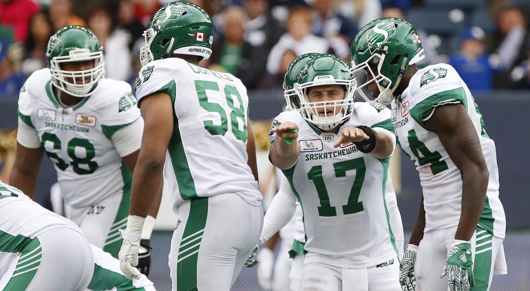
Two teammates who belong in BC Lions orange, but both wearing green this year.
Solomon Elimimian spent all 7 of his prior CFL seasons as a BC Lion. Now with the Saskatchewan Roughriders.
Emmanuel Arceneaux spent all 8 of his prior CFL seasons with the Lions. Still not used to seeing him in Roughrider green this year.
-
1
-
-
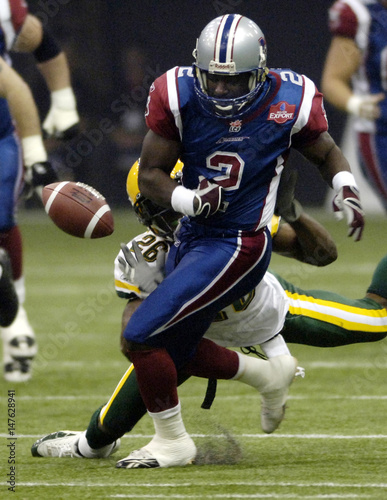
Another one for CFL fans.
It is such a wrong uniform, you can barely find a photos of this Canadian Football Hall of Fame quarterback legend in this uniform.
Tom Clements with the Saskatchewan Roughriders in 1979.
-
This player spent a lot of years in a Laker uniform. Spent one year a little farther north on the West Coast.
-
2
-
-
Here is one for some of the more hardcore CFL fans:
BC-born DT Rick Klassen played 1981-1987, and 1989-1990 with the BC Lions.
Spent one year in between with the Saskatchewan Roughriders in 1988.
-
1
-
-
Alright, time to pick on my favourite football team.
The Saskatchewan Roughriders having the 4 diagonal stripes within their pant stripe on just the left leg. It is annoying. This is a tally of the number of Grey Cups the team has won. There have been 106 Grey Cups and the Riders have been around for all of them. Really silly to put this on the uniform to boast as they've only won 4 Grey Cups in the 106-year period.
Also annoyed that they have the white pants, yet they insist on always wearing green pants with green jerseys for their primary home uniforms.
-
4
-
-
3 hours ago, monkeypower said:
PA changed to their current set in 2013,
Was a fan of returning to the primary green jersey when it happened. Prefer the new logo over the old logo. Did not prefer the Reebok Edge style striping on socks and jerseys. Also would have preferred they stayed with the yellow as a trim colour rather than the switch it to the gold.
-
2 hours ago, M4One said:
It does seem like past teams had a jersey that was more in line with their regular colours. But, it wasn't like the blue and white was completely random, though. The jerseys are also auctioned off and all proceeds go to help veterans, so I'm okay for 1 game out of min. 3, them not looking like how they regularly do.
From the Moosehead website.
The Theme Jersey was designed by the Halifax Mooseheads in conjunction with the Canadian Hockey League. The jersey pays tribute to the Nova Scotia Highlanders (NS Highrs) by proudly displaying their hat badge as our front crest. The NS Highrs are one of only two units from the Maritime provinces that took part in the Landing at Normandy on D-Day in 1944 during World War II. This year marks the 75thanniversary of that event.
Further to the sock striping not wrapping all the way around on the Mooseheads uniform, not sure why, but the it was the same way with the Regina Pats commemorative uniform last year.
The Prince Albert Raiders' sock striping one of the few relics remaining from Reebok Edge uniforms. I would fully expect ( and really hope) to see the Raiders get redesign for their uniform striping next year with the change to CCM QuickLite uniforms.
-
1 hour ago, M4One said:
The CHL Memorial Cup is happening right now. The host, Halifax Moosehead, wore a special, memorial jersey for the opener. Too bad they completed the look with socks that don't wrap all the way around, just like their opponents on the night, the Prince Albert Raiders.
I appreciate what they are trying to do with the commemorative jersey every year, but I am not a really big fan of the host team wearing the one-off uniforms every year. Memorial Cup games are of special significance to a major junior franchise. Tough for a team to get there. Yet the host will play a game in a one-off uniform. Would rather see them wear their regular uniforms and even a regular third alright during the tournament.
This year was especially strange as the Mooseheads were wearing blue and white. Really different from their usual colour scheme. Didn't look like the Mooseheads out there in one of the more important games in their season.
-
With the CFL season coming up (hopefully no work stoppage), got one from that league.
Ray Elgaard only played for the Saskatchewan Roughriders. With them from 1983 to 1996. Better remembered wearing the uniform featuring the wraparound helmet logo and silver and black trim.
First 2 season with the Riders in their older green and white uniforms seem like right team, wrong uniform for Elgaard.
-
1
-
-
1 hour ago, monkeypower said:
So the old Regina Pats jerseys?
Speaking of the Pats as a fan of theirs, it is a tragedy that the team changed their uniforms and wear navy blue now. The right thing needs to happen and the Pats need to go back to the traditional royal blue. They looked so much better just over 10 years ago compared to the unis they wear now.
-
2 hours ago, clonewars2008 said:
While the topic of the Als new unis are still fresh, this is the best Uniform set the Alouettes have ever worn:
Yep - that would be an unpopular opinion.
Best Alouettes uniforms:

Also 1986 not bad - especially liked the road ones:

-
2
-
-
5 hours ago, charger77 said:
I gotta get one of those Raiders jerseys to turn into a Modano jersey!
Interesting coincidence how Modano went from the Prince Albert Raiders to the Minnesota North Stars and wore pretty much the same jersey design.
I prefer the Raiders jersey from Modano's earlier Prince Albert years. Strictly green and yellow.


-
58 minutes ago, monkeypower said:
Man are the Moose Jaw jerseys terrible.


Totally agree. I used to love the Moose Jaw Warriors look in the early 1990s. These uniforms with the team nickname diagonally on the front were great. In fact, many WHL uniforms in the late 1980s and early 1990s were better than they are now.


-
7 hours ago, A_J_H said:
I wouldn't be surprised that the Ice would wear the same jersey design as the Jets, and Moose in the next two years or sooner.
No, that's not happening. Current owners (same ones who are now moving the team) just unveiled this logo and uniform in 2017. They are keeping the name Ice, they will be keeping these uniforms for some time.
-
7 hours ago, philcar1994 said:
From what I've read the owners have sunk their own ship. Trading away players, raising prices within their organization, dropping attendance due to this. I'm sure the team will do better in Winnipeg. They'll be playing out of U of M's hockey arena until a new arena for them is built
U of M's hcokey arena is far from suitable to be a temporary WHL facility. Maybe as an emergency arena for a game. Not as the home arena for a season or two.
-
8 hours ago, philcar1994 said:
Peterborough Petes announces they’re switching back to their Reebok Edge style uniforms for next season, also hints the CHL is moving to the CCM Quicklite template next season.
Also found this, Knights could possibly be getting a new logo next year
(I’m on my phone, couldn’t figure out how to embed photos)
Not surprised about the move the CCM Quicklite. Noticed this year's CHL/NHL Top Prospect Game uniforms were Quicklite.


Unpopular Opinions
in Sports Logo General Discussion
Posted
Many fans may love seeing the BC Lions in orange and black, but I would be all in for them to wear orange and brown again.