


Wade Heidt
-
Posts
390 -
Joined
-
Last visited
Posts posted by Wade Heidt
-
-
13 hours ago, MJWalker45 said:
They last wore stripes in 2015/2016 I believe. They haven't since adidas took over at any rate, so maybe they're new? Either that or they stripped the Reebok marks off and they're only for training camp. I think it's more likely that these are new, because who keeps gear that long and just now starts using it?
Reebok

adidas
They are the old pants. Here is in training camp Reebok logo on them.
-
 2
2
-
-
5 hours ago, the admiral said:
I'll do you one better, they should be wearing black and pink for every game. The team is named after Bret Hart. Does that count for nothing in this crazy mixed-up world?
I 100% support this, would like to see it, but I think realistically the Hitmen won't do it. We've seen their current colour scheme for so many years and feeling I get is they won't be changing it.
-
1
-
-
The Hitmen should be wearing black with pink and silver trim for a regular alternate jersey.
-
1
-
-
4 hours ago, monkeypower said:
The Hitmen unveiled what they're calling their "Great Neighbour Jersey" that they are going to be wearing for Sunday games.
The text on the jersey are the neighbourhoods of Calgary, the bottom of the jersey has the skyline and then different Calgary landmarks/imagery. The patterns of the numbers and the sleeve striping, as mentioned in the tweet, come from the two local First Nations who the Hitmen has done more stuff with in recent years.
I mean... I guess?
Wow. They are going to wear that every Sunday? Something that looks like that should be a one-off at the most. I really don't like it.
-
3
-
-
2 hours ago, monkeypower said:
Don't like the different decals on different sides. I think it'll look fine with the normal aways, but it's going to look out of place with the retros. I don't think they needed to do full retro helmets with the old leather striping pattern, but just the normal helmets would be okay.
Also, I posted a page or so back about the horse logo the Stampeders use on the helmet and jerseys being different from the primary logo (and being SMU's logo) and then they go and change the horse in this helmet anniversary logo to the helmet/jersey horse. So I guess they intentionally are using the different horse logo and are keeping that consistent? I don't know what's going on there.
This looks really good and the general reaction to the dropping of black has been good, so I hope the Stampeders are paying attention. Especially with the Flames going retro and dropping black (besides the alternate), maybe CSEC might be thinking about doing the same for the the Stamps? (But who knows based on CSEC)
Why stop at those teams in Calgary? Love seeing old football photos/footage of U. of Calgary Dinos in just the red and yellow. That would be fabulous!
-
1
-
-
2 hours ago, clonewars2008 said:
I think 2003-04 was the best the NHL has ever looked. Sure we loose a bit with the Coyotes having switched to their boring look that year but this was also the year of the Vintage jersey program so that balances it out. The Mighty Ducks were still around, there were many of the cool Alts still left too. It was a great year and probably a lot more memorable with the lockout the next year but still, the NHL looked so amazing in 2003-04.
I have to respectfully disagree, The early aughts IMO were not the greatest looking years. Seemed like every team wanted to wear navy blue or black if they could. Some teams did Vintage jersey program well (Canucks and Rangers) by having at least matching pants. Some teams Vintage looks were damaged by not wearing matching equipment.
-
2
-
-
58 minutes ago, the admiral said:
1994 was a pretty good year for NHL uniforms. The Original Six looked as good as ever, plus you had the Whalers in navy, the end of the classic Sabres, Flames, and Oilers, an understated but nice Blues uniform, the diagonal Pittsburgh road sweater that many people love, the inaugural Panthers and Mighty Ducks, original Sharks and Senators, and the Nordiques with actual stitched numbers. The Bolts were still a work in progress, but hadn't switched out Honolulu blue for dark royal yet. It wasn't a perfect year -- the Stars looked terrible, the Capitals looked terrible, and I have never cared for the spaghetti-skate Canucks -- but it was about as good as you can ask for.
1992-93 was a fun year if you like uniform changes. New designs from the Maple Leafs, Devils, Penguins, and Whalers. New uniforms for first-year Senators and Lightning. Smaller changes like the Kings wearing black-based numbers on white and Canucks' orange trim becoming more salmon red.
-
On 7/12/2021 at 6:51 PM, Jezus_Ghoti said:
They really gotta go back to white facemasks.
I wonder why the took the Cambridge blue centre stripe of the helmet? It looked great and would look better with the stripe on this helmet.
-
3
-
-
On 7/12/2021 at 5:24 AM, gosioux76 said:
Agreed. I love the idea, but the elk horn just feels too insubstantial to command the space it's trying to occupy. Making it worse are the ends of the chinstrap that partially cover up the helmet logo.
Agree. I think it is clear to everyone that the elk antler needs to be more substantial. We need more antler. Hoping they get it fixed maybe in 2022 after the feedback.
-
3
-
-
3 hours ago, clonewars2008 said:
The Lions best helmet was their 60’s throwback, but the new helmet with stripes I thought was great, no stripes and it’s bland. Plus they need to stick to black pants at home.
a splash of white was a welcomed addition but the black pants add the proper contrast in elements. The orange works well with the away but that was when they had an orange or white helmet.
If Lions are sticking with black helmets, I am for white pants at home. Switch to orange mask. Some jersey adjustment to get rid of shoulder yokes. The home uniform a new look but with a nod to the 1970s look.
-
14 hours ago, nash61 said:
That used to actually exist if you think a decade and a bit more back before Ottawa rejoined.
BC: White
Calgary: Red
Edmonton: Yellow
Hamilton: Black
Montreal: Silver
Saskatchewan: Green
Toronto: Blue
Winnipeg: Gold
-
2
-
-
On 7/3/2021 at 8:20 PM, M4One said:
If it is green, I think that's pretty smart. Have similar colours, yet still be able to have their own identity different from the parent club.
Would also like to see the Canucks use green for an alternate.
Agree with having colours that relate to the club but also having its own identity. Which is why I would have loved to see the AHL team go with black uniforms trimmed in salmon and yellow. Colours of the Canucks back in the Skate logo days.
-
3 hours ago, Dante_X said:
new Gatineau Olympiques jersey for 2021-2022
Thanks for the heads up on this. If there is a new jersey, the organization should have a media event to unveil it. No disrespect to the recruits pictured in the jersey, but this is not the way a team should unveil its new look to its fans.
-
6 hours ago, QCS said:
As announced a couple days ago, the Charlotte Checkers are getting a new logo:
This image can be seen for a split second during the video:
If that's a sneak peek of the logo, the Checkers would be the first team to use the Charlotte crown in their logo. I saw red in the video, meaning a color switch is (sadly) unlikely. I'd love to see a return to the blue and orange of the original Checkers, but I'm very excited to see what the team has in store.
@QCS I see this is your hometown team so you may have more of a pulse on this than I. Are we looking at a name change too? I'm not a huge fan of Checkers as a team name.
-
34 minutes ago, Dilbert said:
So this leaves the two remaining Canadian NHL clubs with their affiliates still in the US, Bakersfield (Edmonton) and Utica (Vancouver). Now if the reasoning behind the provisional move is true I would think Bakersfield and Utica wouldnt be far behind. However something seems fishy to me.
Something I think would be an awesome idea but will never come to fruition. The Canucks need to move their farm team back to Vancouver. Have them play at Pacific Coliseum. Have the farm team wear black, yellow, and salmon red like the Canucks used to before they left the Coliseum.
-
1
-
-
On 10/25/2020 at 8:16 PM, Roger Clemente said:
If I had to guess, that looks like it might actually be Charlottetown's new home jersey as the sleeve and waist striping matches that of the white jerseys (just different order of colors) that I've seen in person two weeks ago when they played the Eagles here.
Yeah, noticed since the posting they have continued to wear the black. Just find it strange because I believe it was just last year that Charlottetown had introduced new uniforms and the gold jersey was the new primary dark.
-
1 hour ago, M4One said:
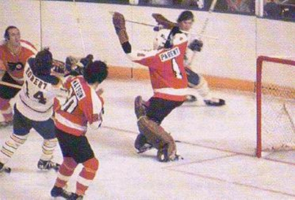
The contrasting name plate started back in the 70's. There's a couple of different explanations I have found online. One is that for the playoffs, both teams needed to wear them for TV. The other is that NBC were doing a game of the week and asked both teams have name plates. I don't know if both reasons are one and the same. Since the Flyers didn't have orange name plates, they stuck the white ones on their road jerseys. This picture is from the 73-74 season. So, there is some history behind the contrasting name plate for the Flyers. Any other team that is does it, does it just for the gimmick.
Definitely agree with you about the orange jerseys. If the Flyers want to do this as a nod to tradition, they should wear the white nameplates with black letters on both the orange and the white jerseys.
It is gimmicky with the Flyers current white jersey, which features the black nameplates with white letters.
-
2
-
-
Question for junior hockey fans back east. Noticed Charlottetown Islanders home opener was last night. Looks like they have new black jerseys but could not find any media surrounding release of a new jersey. This is the new third and they are sticking with the gold jersey as the primary right?
https://theqmjhl.ca/video/charlottetown-had-fun-against-saint-john-sea-dogs-1-islanders-5
-
4 hours ago, kw11333 said:
Also an SFU alumn. Promise most people at the school were unaware of the team's name. We're in last in nearly every men's sport and our women's teams are not exactly winning championships either
I know the school loves having the NCAA designation, but I would be way more interested in following what the football team was doing if they went back to playing Canadian ball in Canada West. Been to SFU football games and would so much rather go to UBC ones because of who the opponents would be.
Would have more of a vested interest if SFU was playing UBC, Saskatchewan, or Manitoba for example rather than Azusa Pacific and Humboldt State.
-
2
-
-
NHL rinks are too standard now. The same old everywhere now. Always a big team logo in the centre of the ice. I miss when centre ice used to to vary more at different arenas. Like how the Oilers had the Northlands Coliseum logo at centre ice and their team logos outside the centre ice circle.
Always yellow kickplates on the boards now. I miss when some rinks had the blue kickplates.
With the CFL, everyone has yellow goalposts now (except Calgary). Miss when many teams used to have goalposts that matched their team colours. Like the green and white goalpost at Taylor Field in the 1980s.
I also miss seeing Rough Riders vs. Roughriders.
-
2
-
-
I miss when All Star uniforms were great looking uniforms and an honourable look an All Star would be proud to wear. Not experimental crappy All Star uniforms that seem to be churned out recently.
-
7
-
-
When team won the Stanley Cup, they used to do laps around the rink with it while handing it off to the players. I miss that.
Now they just stay in the same spot and hand the Cup off to players.
-
2
-
-
The Cranbrook Bucks jersey "unveiling" was like the most under the radar ever. I was trying to keep an eye out for it yet it seems it was easy to miss it.
-
If Boise is playing in Albertson Stadium, it will need some renovation. Stadium can accommodate the wider field but the end zone seating will need to be pushed back.
Since a new field needs to be put it and if I were imaginary commissioner, I would mandate a usual colour green field. Blue field be gone!


:no_upscale()/cdn.vox-cdn.com/uploads/chorus_asset/file/19587010/460681022.jpg.jpg)
AHL/ECHL/Minor/Junior League Hockey Changes
in Sports Logo News
Posted
I had just assumed the Warriors were going to transition to the moose head logo. I like what they went with though.
Having the logo not really match the team name appears not to be an issue in the WHL. Kelowna Rockets have a lake monster as their logo.