


MattMill
-
Posts
396 -
Joined
-
Last visited
Posts posted by MattMill
-
-
We've turned a corner here. This is beyond bad.
Full sublimated jerseys that sort of looks like lettuce, but not really. What a mess that is surely going to get some sales.
-
 1
1
-
-
On 2/6/2020 at 12:05 PM, SportsLogos.Net News said:
BlueClaws add beach-themed alternates
February 6, 2020 - 19:04 PM
The Lakewood BlueClaws, Class A affiliate of the Philadelphia Phillies, have long embraced their location along the iconic Jersey Shore as part of their brand. It’s not just that the team is named for that most delicious part of the […]
Is this the norm with jerseys now? The logo appears to be stitched on by it's edges only. It looks cheap. Gone are the days of real textured embroidery?
The beach ball theme hat works. Jerseys are decent, except for the cheap looking logo application. I've see it with some sublimated jerseys too. So many themes and jersey combos, they go with the lowest common denominator for quality.
-
1
-
-
On 12/5/2019 at 7:03 AM, Volt said:
Looking at this again today, it irks me even more how similar all of the number fonts are. Amateur hour!I think it's the 0s that make it the most obvious. The opening of the O seem to be the same general height and dimensions. In the Nfl and college, many 0s have their own character. These do feel too closely related.
-
9 minutes ago, Jeffery said:
The AAF had better names, logos, and colors, but the XFL won the uniform battle.
Barely won
whats with all the colored shelve/shoulder caps?
so generic, it’s just nearly at the same AAF level.
do they not watch football or see what designs are out there? They make college and nfl look like fashion connoisseurs.
these are horrid.
seattles side paneling is the only sAving grace here.
-
2
-
-
So they had thousands of caps made, also for the typo? I don't believe you.
They also added a pug logo to the already wrong IRON PUGS wordmarked shirt?
That's laying on the lies thick to correct one mistake And 3,000 shirts is nothing.
This is all a ploy.
Was this also a spell check issue too?

INOM PIGS
-
I wonder how much last year's copa gear accounts for that, or even one off event gear.
Next year may see $100 million more. Sadly Brandiose will get their credit.
I'm sad these gimmicks have tarnished the game.
Even star wars night brings out the fans. And those events are cookie cutter from team to team.
Just like MLB, fans aren't buying regular on field gear with much of any regularity. But they'll buy the crap out of special event caps.
-
I see these seemingly screen printed jerseys on the auction block a lot. How’s the general quality? They all look more like t shirts, yet they are bought up pretty quickly
The gimmicks will continue as long as we let them.
-
1
-
-
On 6/23/2019 at 8:14 AM, mjrbaseball said:
Thank you. Why was I not aware of this all these years?!
Second year doing it. Last year, I want to say 12-20 squads with less games. This year maybe 2-3 times that with much games with those identities. It was easy to miss last year. Next year, we may see even more. My area is eating these alternative identities up. I personally hate it. I liked it as a quick one off last year for a select few games. Now they’re consuming teams real identities.
-
1
-
-
1 hour ago, tp49 said:
Baseball teams that for whatever reason have to have their cap logo as a sleeve patch. The most egregious ones are the Dodgers and the White Sox road. The addition of and change to those lessened the look for me. Also included are the Padres, Giants, Angels, etc.
NFL has the Patriots, Falcons, Navy Cowboys, and Panthers, to name a few. I hate the redundancy angle. Good call. There are so many secondary logos and patches team can use.
It's why I appreciate the Eagles, old Titans, and Ravens to name a few who use a different shoulder patch/logo than what is on their helmet. Baseball is a tad more obvious
-
5
-
-
Losing original members because of football mergers is just sad stuff. I can't hold the 40th as any real type of anniversary.
-
1
-
-
Broad pet peeve. Colors that don't exactly match up on ones uniform. It could be a helmets color with the 'same' colored numbers. Or even shoes that should be red but are more cherry red that varsity red. Same goes with undershirts. Lots of smaller colleges mess this up frequently.
I've gotten used to the cowboys different shades of blue.
This can also go towards helmets that shimmer too bright mismatching it's color for a particularly timed game.
But that may be too broad lol
-------
More specific. Never liked the upside down M for the twins wordmark.
I always see the M that I absolutely love as a cap logo. I can't unsee the ugly W.
-
Doesn’t that game involve guns and killing? Not a great promotion or association for kids.
Might as as well have a Marlboro or joe Camel theme night.
Lets get some some beer pong Budweiser themed jerseys set up. ‘Binge drinking night’.
i know there was backlash with this game and the NFL. They ended up getting rid of the jerseys for awhile.
I think theres a reason we dont see call see call of duty, grand theft auto, or halo themed jerseys over these past few years.
-
11 minutes ago, pianoknight said:
Not a fan of the yellow. I liked Baylor's older football uniforms from around 2008.
Between them and Colorado State, who else is dark green and gold?
Just like Pitt ditching their gold and navy (of which they may have only shared with Notre Dame and Navy), they are now using more common colors.
I guess Yellow is 'in'. Looking at wvus yellow set and this one make me a bit sick. Neither should have mono yellow as an option.
They want to call the new color gold. But as far as I can see, it's school bus yellow.
-
1
-
-
Yeah. What a bunch of crap. United we stand. And then we see grey and volt green for basketball. What the heck!!
I actually found their green and old Gold and Vegas gold to be stand out colors amongst all the other color Combos out there. This new set also stands out, but ditch the darn volt. You're either United or this is just all marketing crap that I hope others can see through
And other than trim on the arm and neck hole, that jersey is as bare bones as they come. Not sure that I like it. But it does contrast against the craziness that can be college uniforms.
-
1
-
-
Reminds me of the current Marlins. Lol.
Black on dark or black on black just rarely translates to different formats. The Ray's cap is a bit of a mess from a distance. I have the whole set and in person, the dark green is nice. New Marlins is the same way. Only up close and in the brightest of sun's is there vibrancy.
-
1
-
-
The Medusa's jersey is the worst stitching and plastering I have seen on a jersey in a long time
Not a fan of what is essentially a huge patch stitched onto the front. Reeks of amateurism
-
I guess not all of them may be new logos or names.
Loving the llamas look and jersey.
Some of the caps have logos that are way oversized though.
I counted something like 24 teams using teal or bright teal
A bit of a classic look without throwing the whole logo on the hat.
It's like the early 90s all over again when clothes began to incorporate bright neon hues and colors
Ocelot looks like a Jacksonville Jaguar knock off.
I guess they had extra MLB players weekend material, huh?
The Mariachi's (Albuquerque isotopes) were apparently so popular, they just went with a different color cap
You would think the chicharrone team would be the iron pigs naturally. So a lot of this doesn't make any logical sense.
-
Not bad. Unique colors. I was expecting a brandiose tobacco leaf with eyes. This sort of regular blandness is unheard of.
-
1
-
-
On 2/28/2019 at 8:24 PM, Earl said:
Believe it or not, in the past year and half they've created these:
It's not like what we seen from Torch or on here & Behance but they're still serviceable. Each are improved updates from their previous brands. Where would be your alma mater?
Interesting. Same font. Same embossed lettering with grey glow on the bottom three. Yikes. Do these schools realize they're getting a cookie cutter representation?


Minor/Independent/Collegiate League Baseball Logo/Uniform Changes
in Sports Logo News
Posted
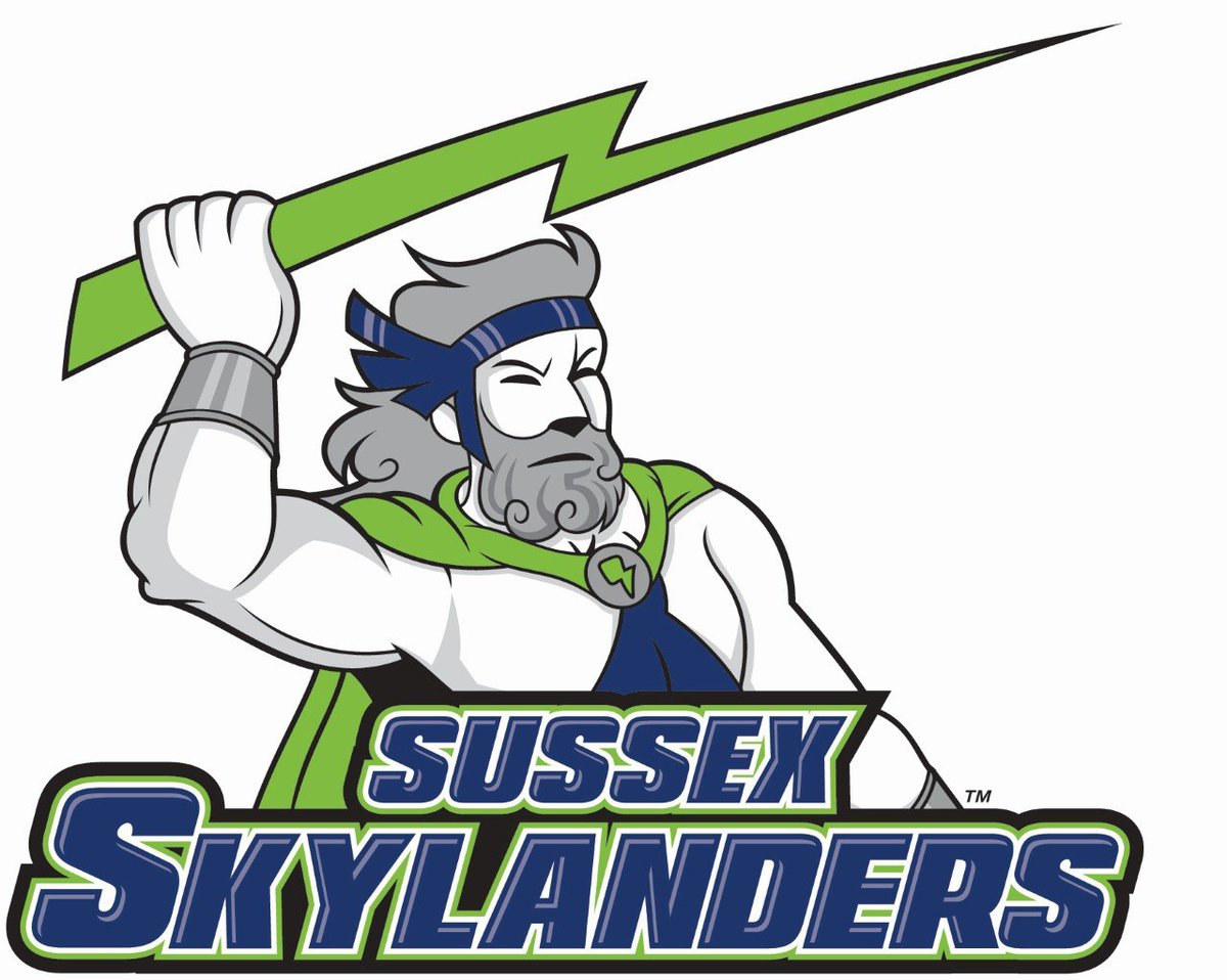
I guess this mascot has been around for awhile.
His name is Henry.
Why couldn't the hat feature a graphic with cartoon eyes, like the restaurant does
They literally took a inside job and went for it.
To think it all started with a taco
An actual graphical depiction.
Now we have a swinging taco thing with legs and a red thing on its head, with no eyes. Like I said. We've turned that corner.
Fresno added eyes to one of their tacos and it was fine
I can't fully explain what I'm seeing now with SA. They had the perfect set just a year or two back. Sad times.