


fbjim
-
Posts
73 -
Joined
-
Last visited
Posts posted by fbjim
-
-
i dig it, there should be more uses of gray that aren't black in uniforms
then again the last time i said i liked off-white colors, the "dishwater" Rams unis came out...
-
 1
1
-
 1
1
-
-
On 2/11/2022 at 10:35 PM, maddybutsports said:
just kinda eyeballing it from the image, all nfl scorebugs (besides espn) will fit in a 4:3 tv aspect ratio with this new nbc bug. life has come full circle
I've heard this is to look better on vertically-oriented smartphone short videos. Kind of funny how things have come full circle that way, yeah.
-
6
-
-
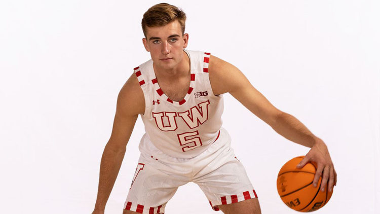
On 11/29/2021 at 3:15 PM, mjd77 said:
This years "by the players" uniform for Wisconsin.

I love the highly underused "big two block letters" look. Reminds me of the old KC Monarchs look that Jackie Robinson once wore in the Negro Leagues.
-
2
-
-
For some reason college basketball (and basketball generally) has been bucking a trend toward smaller graphics and going more and more gigantic. I don't get it, I actually like the NBA on NBC-era "quick flash of the score when someone makes a basket" thing, but even this is much better than what we have now.
-
1
-
-
The "tilted" LA Lakers wordmark from the classic era never, ever looked good, and I have no clue what they were going for by sloping the wordmark that way.
-
2
-
-
New UCI graphics for the World Championships.
Graphics for "official" sporting orgs like the Olympics or various world championships tend to have that sort of neutral, "official" look to them, I think this tows the line nicely between that look and a more up-to-date look than the UCI races have had in recent years.
That said the rainbow stripes motif seems a bit overused. Using it in the speedometer?
-
1
-
-
Gradient is difficult to use, but can be used well, and "it has gradient so = bad" is one of the laziest uniform critique cliches out there.
-
4
-
-
some cycling ones, why not
Laurent Fignon in Gatorade colors- Anything other than Renault or Super-U looks wrong, really, but even Castorama looked alright. As cool as the Gatorade kit was, it's very much not his look.
Peter Sagan in the 2015 Tinkoff colors, prior to him winning the World Championships - Seeing Sagan in a kit other than the rainbow jersey or TDF green jersey is weird enough, but his early years in the bright green Cannondale jerseys were fairly iconic. This, however, was just a weird, ugly kit, and a piss-poor way to display his Slovakian championship. Thankfully he spent three solid years in the rainbow WC stripes after that, but jeez.
Tom Boonen, USPS
Even by weird "Oh, I forgot he rode for them" rookie team kit standards, this is weird.
Alejandro Valverde, Illes Balears
Right team, wrong sponsor. Movistar have rarely changed sponsors, having Reynolds for the 80s, Banesto for the 90s, Caisse d'Epargne for the late 00s, and Movistar for the '10s, but there was an odd period starting about 2000 where they went a bit nuts before settling on the boring, but fairly iconic Caisse d'Epargne kit. This was probably the weirdest of them all.
Stephen Roche, Tonton Tapis
To be honest, not sure this one belongs here, despite how hilariously bad the Tonton Tapis jersey is, Roche is probably the rider I identify most with it. But it's still such a hilarious, weird kit for a rider which generally wore iconic jerseys, like Peugeot and Carrera Jeans.
Laurent Jalabert, Toshiba
Taste went out the window in a fantastic way in the early 90s in all sports, and cycling was probably the worst (best?) affected. Anyway, when people think of Jaja, they think of him riding for ONCE, and not this hilarious monstrosity. Big fan of how the stripes accentuate Jaja's crotch, though.
Greg Lemond, ADR-Agrigel
Potentially a controversial one, because Greg wore this one in his most famous moment- winning the 1989 TDF by 8 seconds over Fignon by eight seconds. But for a rider who's worn some of the most iconic kits in cycling history- Renault-Elf, La Vie Claire, Z-Vetements, the rainbow WC stripes, even his brief spell in PDM- this one just doesn't cut it.
Incidentally, that old Giro helmet logo needs to come back.
-
1
-
-
god that TOUCHDOWN text is like the peak of obnoxiousness. like seriously, what happened to highlighting the scoring team's part of the scorebug, or even better, just updating the score without massive text and logos flying everywhere?
-
Fox seemingly can't decide if they like boxes or tickers better.
-
2
-
-
Oh, and the Rugby World Cup is almost done, and NBCSN appeared to be using the world feed graphics for those.
I rather like these. I do think it's funny that it's another example (alongside FOX's flat graphics fetish, which seems pulled right from the Windows Metro/8 look) of sports graphics cribbing from tech- this "flat layered/textured" look is straight out of the Google "Material Design" playbook.
-
For whatever reason, I really like ESPN's current thing of giving each sport its own look. Being consistent has its virtues but I like a bit of taloring to the aesthetics and looks for each individual league.
The MNF graphics are bad but MNF graphics are always when ESPN gets weird anyway, so I can't get mad about those.
Also, in cycling news, RIP to the Tour of California, AKA the only time I've ever heard commentators repeatedly complain about the on-screen graphics (they used the NBCSN graphics for the world feed, and the Eurosport commentators would constantly complain about stuff like the use of miles, rather than kilometers, and the information overload from the bottom bar endlessly cycling through standings/quotes/news rather than having a "normal" km/time gap display.
(it did get better with the current NBCSN graphics they use for the Tour de France, but their insistence on using a bar rather than doing what literally every other cycling broadcaster did was always funny)
-
the mid-00s ESPN package was "flat with no outlines" and is probably still my favorite ESPN set, and football set ever
really, the main problem I have with the FOX/CBS sets is their continued insistence on a bottom bar rather than a classic-style bug, but the fashion for that one seems to cycle in and out every few years (especially for FOX).
-
4
-
-
ESPN always goes wacky for their MNF graphics, even if they don't work, so I'm at least interested in seeing how they look.
-
I still think it's way too big for soccer. It's like they're still in the HDTV transition era.
-
The "College Hockey" Dallas Stars look is one of my favorite NHL sets ever.
I don't want it to be a trend, but I wish one team in hockey tried to make the NCAA look a thing again.
-
I definitely prefer the smaller form FOX bug to the bar. I hope they use something similar to what their current/FSN's current MLB bugs look like.
Speaking of FSN, and things only I care about, FSN Utah (or whatever they're called, Root Rocky Mountains?) broadcasts the Tour of Utah, and they actually have their own Fox-styled cycling graphics, though they're actually based on the old (2016?) FOX graphics package. It's actually pretty well done, though it does the irritating thing NBC does of alternating between showing KM and miles left. I can get this for showing speed (MPH is easier for US viewers to instantly get than KPH), but every distance-related rule in cycling (no car feeds in last 20k, 3k mechanical/crash rule, red kite at 1k) is in KM, and honestly it's like if you broadcast athletics but used yards instead of meters or something because you assume Americans would find "100m dash" too cryptic.
I always find this kind of thing funny, you see it sometimes with ESPN3's streaming of fringe sports where they sometimes use old graphics packages for fringe sports nobody watches, though nothing beat when they broadcast domestic West Indies 50-over cricket (which even cricket fans wouldn't bother watching, it'd be like deciding to watch AAA Pacific Coast League baseball or something) using a ten-year-old ESPN graphics package.
-
2
-
-
Incidentally, these are the graphics i remember the best from when I started watching, just look at that too-cool-for-school minimalism complete with all-lower case captions. Pure style
Cycling race graphics have been fairly primitive for a long time, due to the difficulty of covering the race over hundreds of KMs of public roads live. Time gaps are actually taken from the camera motorbikes and can occasionally be inaccurate. It wasn't too long ago that even the constant display of distance remaining wasn't always shown - I'd say about 10-15 years, and prior to that you'd have race coverage with no constant on-screen graphics at all.
-
NBC Sports' online package lets you choose between the straight NBCSN feed and an ad-free feed taken from the official world feed. I always like stuff like this, because it's interesting to see how NBC and the official world feed graphics present the same information in a different manner.
-
Some on-point typography from whoever's doing the graphics for Roland Garros.
It does amuse me that the whole flat graphics thing is happening worldwide too. Honestly I expect the next trend to be going back to like, the original FoxBox bug from 1994 and having them be partially transparent to give as much space to the on-field action as possible.
-
1
-
-
I like a good team nickname but I've always hated the "compound noun" one like IronPigs or RailHawks or whatever, those are hopelessly minor-league hockey sounding. Which is fine in minor league hockey but not really for anything else.
Like, Durham Bulls, that's a great name for any sport. Pittsburgh Riverhounds is just a bit bush league.
-
4
-
-
I mean, P/R will never happen except as a closed-circle model among USL/MLS (which is still unlikely) but I don't get what's disgusting about it. We have a bunch of second tier teams which seem to be actually drawing fans and have ownerships who want to get to the top tier. Why not give them a path to do so which doesn't involve them paying increasingly big franchise fees?
(by single-entity I don't mean MLS's specific model, but more the US-franchise model at large where teams act as closed cartels rather than independent entities from the league. which, incidentally, some of the elite European teams seem to be really envying given the constant closed-garden Euro Super League leaks)
-
12 hours ago, SFGiants58 said:
Yeah, no. They're not cringe-worthy or inappropriate. They're dignified, effective, and fit with what the rest of the world does with Association Football. Sporting Kansas City, the FC/SC teams, and Inter Miami are all acceptable and work well for their teams. Even the "United" names are fine (uniting of ownership groups/fans/other associated individuals).
Also, "organic-sounding" is just elitist gobbledy(I am racially insensitive) used by American-style name fans used to demean teams that follow the rest of the world's lead. It's also a fun statement used by "Class of '96" fans to insult supporters of newer teams (that have their crap together from founding).
EDIT: I am sorry about that one, I had no idea that it was a racist term. What I meant to say was "nonsense."
I mean, the rest of the world's lead (excepting Australia and I suppose China) is to have club teams, not teams which are operated via a closed-garden franchise model, which is why the "club names" make more sense. I see this as less "following the world's lead" and more "appropriating the aesthetics of european leagues while still maintaining the closed garden franchise model so we can charge ever higher expansion fees"
-
1
-
-
For reference this was the prior CWC package, featuring a massive banner at the bottom with the batter and bowler's faces. It was not well-received, though I do like the old-style score in the corner (which is how it worked until bottom bars became standard in cricket broadcasting)
-
1
-


:format(webp)/cdn.vox-cdn.com/uploads/chorus_image/image/66811292/143825071.jpg.0.jpg)


Unpopular Opinions
in Sports Logo General Discussion
Posted
The "sand"-colored Padres uniforms were simultaneously great, and a nice subtle tribute to their old yellow uniforms, even if that wasn't the intent.