-
Posts
248 -
Joined
-
Last visited
Posts posted by bcon_731
-
-
5 hours ago, Sodboy13 said:
No, this is just an upcharge strategy New Era has implemented for several years. Slap a couple of patches on the side of an existing 59Fifty and up the price $5-10.
I did see a variant of a new city connect cap for the angels, where the surf board took up most the side panel and no white front panels. Solid red cap with the outline of the “A” in silver.
-
Are these the new city connect caps for the rockies?


-
 2
2
-
 1
1
-
-
Great idea for a thread
-
 1
1
-
-
You’d think they’d do something with green, it’s right there under their nose. Where’d they pull dark blue from? Way to go tho, solid tweak
-
 2
2
-
-
Just found out that Minnesota planned on moving to Birmingham, twice. That design concept would’ve been interesting to see.
*(cough, cough)*
-
 1
1
-
-
-
Not sure if you’ve done this yet but a Racing Stripe Thread. Arizona and Tampa have wide color palette to fool around with.
-
 3
3
-
-
Solid designs, shame we couldn’t see anything like these on the court without be bastardized with all the ads.
-
 2
2
-
-
-
On 11/27/2020 at 2:57 AM, pelicanfan said:
Thank you all for your feedback!
---

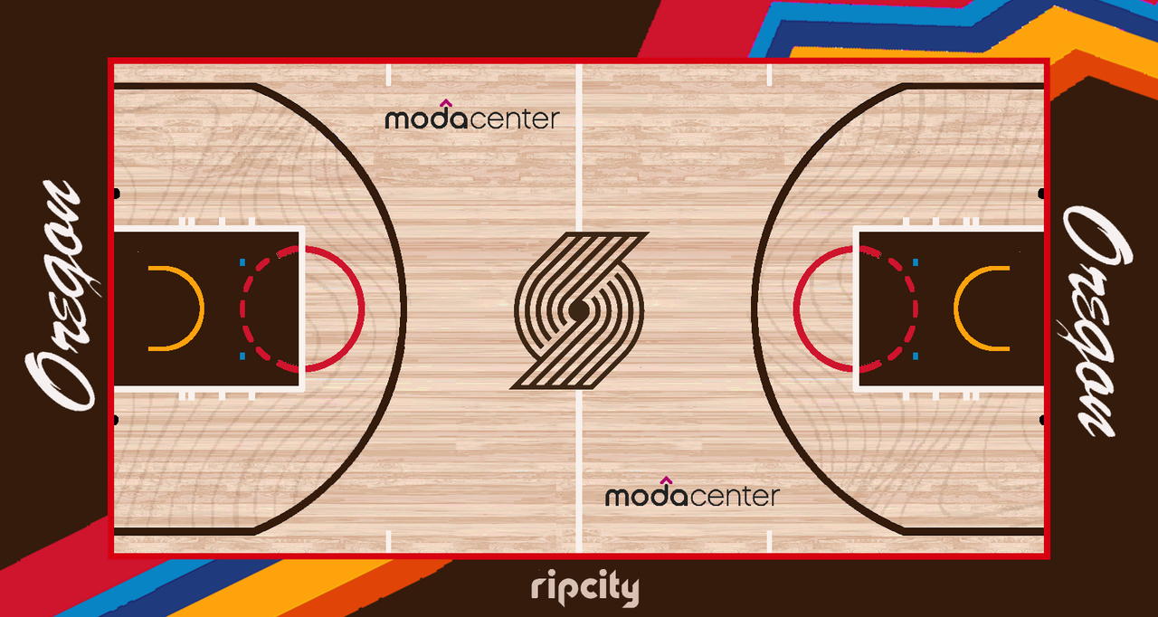
today I made a trailblazers city edition court. Went with a darker wood color just to compliment that brown better and really just have that "woods" naturey look to it. Added some tree lines or whatever they're called inside the arc too. And colorful stripes obviously coming from those stripes on the jerseysUp think eventually they’ll do this style uni but with their primary colors? Could you do a mock up of that? You do great work btw!
-
 2
2
-
-
@MJD7 San Diego needs that yellow uni soon
-
 1
1
-
-
Id give you money rn if you had the pink uni for sale. Looks great, whole set is impressive.
-
 1
1
-
-
@MJD7 Is there a team that you cant resist thinking of concepts and is there anytime thats nearly impossible to think of something for?
-
 1
1
-
-
17 hours ago, MJD7 said:
What type of cursive font are you referring to?
From the most recent set you posted, the two white sets.
-
 1
1
-
-
@MJD7 Have you tried that cursive font for "Los Angeles" I could image it looks huge. Just had the thought looking over the new template.
-
 2
2
-
-
The yellow panel front/red cap looks hella solid. Great concept, would you consider an away set with "Los Angeles" or "Anahiem"? @MJD7
-
 1
1
-
-
@MJD7 great job! that dbacks set is great, especially those teal unis! How you ever seen any dbacks wordmarks in the font of their "A" cap? Not being sarcastic or anything just curious, Ive never seen it but they've always used it.
-
 1
1
-
-
@Cate you nailed the green and red bucks set! Black is a kinda played, but maybe randomly do a blue uni, from their current palette, with the red/green and white.
-
 2
2
-
-
This logo looks NSFW, once you figure it out, you can't unsee it. Why not just keep up with the Jalapeno in the Frontier hat theme, instead of "Remember the Alamo," why not "Remember the Jalapeno." Just lean into the pepper theme not the OBGYN theme. Not gonna lie, if they had abunch of corporate events with OBGYNS at the game, I think time would stop for just a second to revel in irony.
-
 2
2
-
-
13 hours ago, j'villejags said:
I appreciate the C&C everyone! I'll likely revisit this when the new uniforms (and potentially logos) are revealed with an update.
For now, I thought I'd come up with a variation of what I've got so far. My personal favorite was the black set, so I've based the rest of the set on them. Each uniform now has gray pants. (Note: I'm calling them gray, as I don't think the color is quite silver, and I'd like to let the Raiders own black and silver.)
I thought the red gloves and shoes feel like something Nike would do to highlight their product, as red tends to flash against black and gray. I also think it helps differentiate from the Raiders a bit more, while maintaining the overall black/gray aesthetic.
Home
Alternate
Away
Do you think the gray pants work with this version of the red jersey? Or am I forcing it? I tried gray numbers on the red jersey, but I didn't feel there was enough contrast. Instead, I replaced the white stripe on the shoulder with a gray stripe to try to tie them together. Thoughts?
This whole set is solid except that inlay on the white and black jersey numbers. Solid number and the outline looks great! That red one would sellout for sure. GREAT WORK BTW!
-
I just dont understand, the commuting distance. If they were going to Tampa to San Juan, that makes sense. But youre going to travel, make sure all the visas are taken care of, from america to a different country. Just feels like alot of leaps and bounds to compensate not getting a new stadium.
-
 1
1
-


MLB 2024 Uniform/Logo Changes
in Sports Logo News
Posted