


Reyes47
-
Posts
160 -
Joined
-
Last visited
Posts posted by Reyes47
-
-
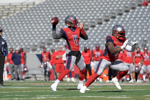
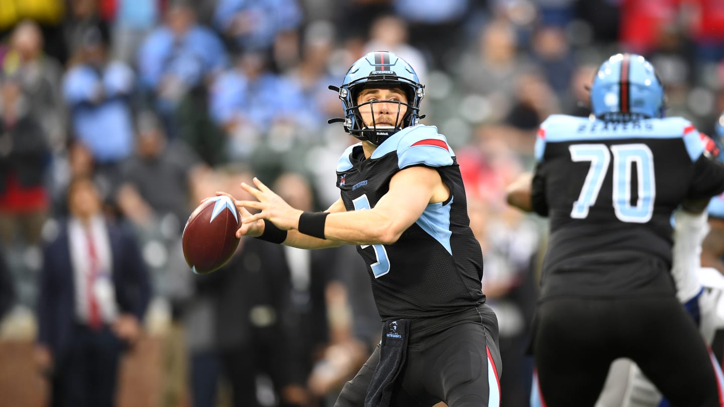
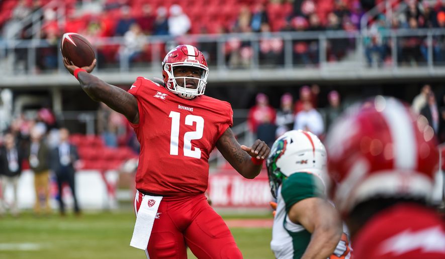
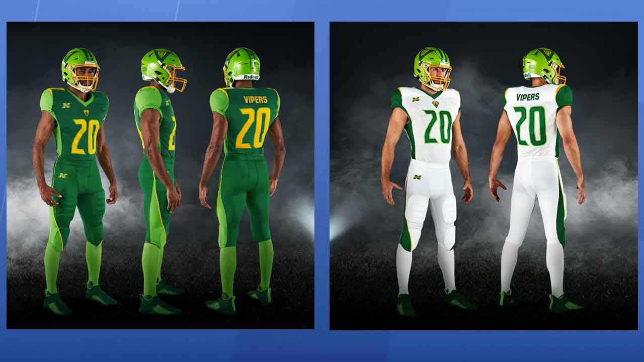
When i first saw a lot of the logos and uniforms early on for the xfl i was pretty split. After watching them live i’ve complied my list for favorite to least favorites
1. St. Louis Battlehawks

2. NY Guardians
3. Houston Roughnecks
4. LA Wildcats
5. Dallas Renegade
6. Seattle Dragons
7. DC Defenders
8. Tampa Bay Vipers
Honestly though I really can’t say i hate any of these. Even Tampa’s I initially hated a lot has kinda grown on me. I don’t think they’re great either but still pretty solid for a start up league
I have seen people say they look like a madden team but i feel any start up football league is inevitable to get that label because it’s just not the nfl which is so iconic and historic anything besides it feels off putting
I also feel they suffer from being ‘too modern and clean’. This goes for a lot of general designs too but now we have established rules and guidelines to make the perfect uniform or flag or logo that sometimes they’re ‘too perfect’ and don’t feel authentic of that makes sense.
Like something about older uniforms’ little flaws really make them like Dallas’ mismatched blues, Green Bay’s giant TV numbers, the raiders somewhat too detailed logo etc. Essentially these uniforms and logos to me feel a bit too clean and lack that grit to it. Regardless i still think they generally look better than the AAF uniforms and logos
-
The 2015 Jags teal uniforms were actually pretty solid especially with black pants way better than their current ones (Honestly considering the half gold isn’t visible in this picture they look really great)
-
 4
4
-
-
I much prefer the Brewers and Pitt’s older uniforms and colors with navy and gold. Yellow is one of my least favorite colors and the blue were way too bright.
-
1
-
-
On 5/15/2010 at 6:07 PM, Lights Out said:
I love those numbers!
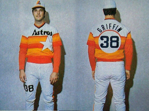
Here's a prototype version of the Astros' Rainbow Guts jersey:
Love that cap logo, and the white crown of the cap!
a bit busy to me but not bad
-
1
-


/cdn.vox-cdn.com/uploads/chorus_image/image/66278404/usa_today_14012850.0.jpg)


Unpopular Opinions
in Sports Logo General Discussion
Posted
I think the Jags previous uniforms were great and much better than their generic create a madden team look. Sure they were a bit gaudy but i don’t mind that. I’d rather have uniforms be too gaudy than be generic. And i liked the two tone helmet