


BenchOnaQUEST
-
Posts
33 -
Joined
-
Last visited
Posts posted by BenchOnaQUEST
-
-
On 6/1/2021 at 2:23 PM, DeluxeGraphicSupply said:

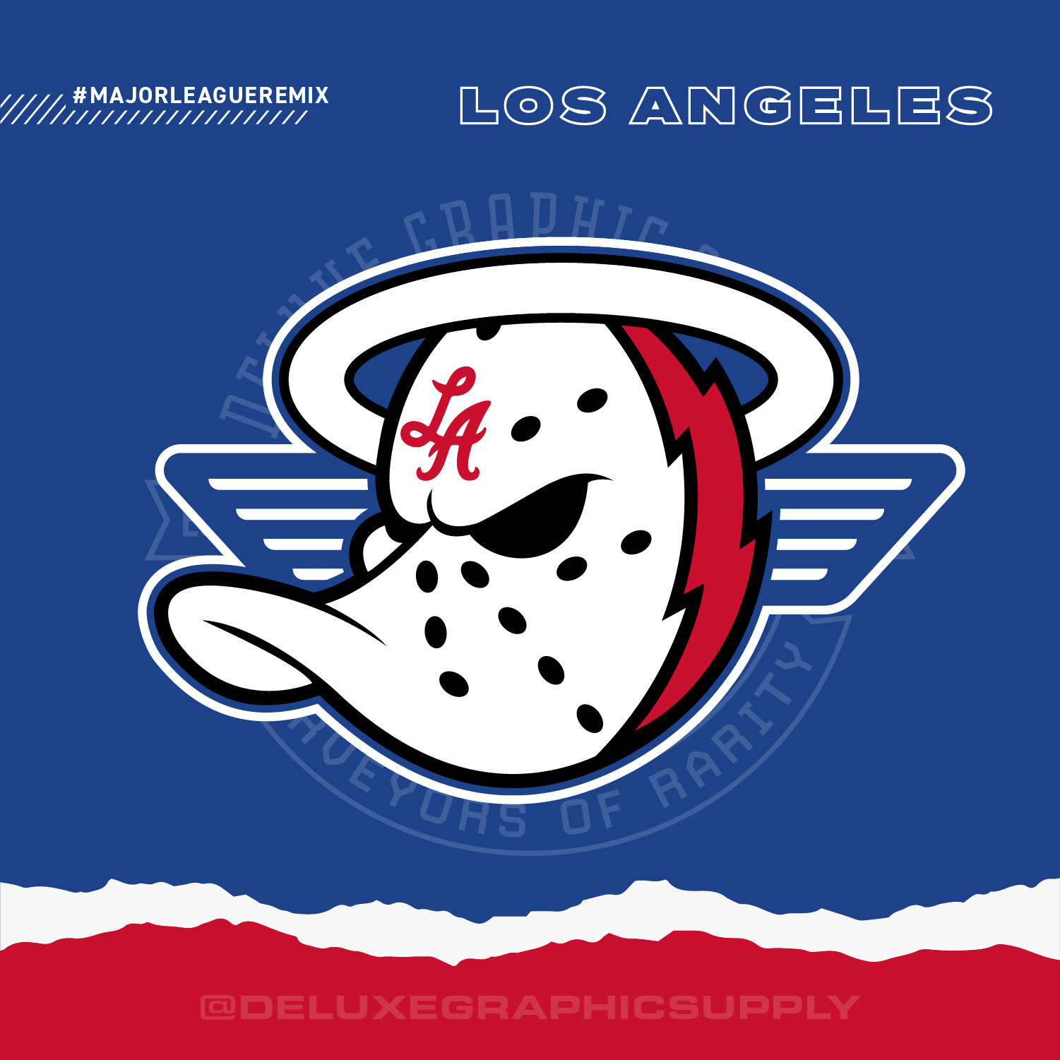
Los Angeles Chargers x Clippers x Anaheim Angels x Ducks
I love your mashups!
Much respect for using an element from the past (OG) version of the Clippers team logo! (The current one looks like garbage, and is arguably the worst of all NBA logos, at the moment).
As a die-hard LA Clippers fan, if I may provide some constructive feedback: in the Clippers x Ducks x Chargers mashup - the Clippers element looks like 'wings' (the way you have it positioned on both sides). I guess you were looking for symmetry.
I understand that you don't necessarily use the entire design of the logo in the mashup, and at times it can be as little as possible...
However, I believe it takes a while for a fan to identify that the Clippers are actually represented in any way.. Just my $0.02.
Anyway, love the project!
-
On 6/2/2021 at 12:14 PM, DeluxeGraphicSupply said:
Fair enough, I do appreciate feedback especially from someone in the region (...)
I may eventually make an LA-Anaheim one with ALL teams together but that would be a monumental task haha. otherwise, the other option would be a 6 team logo for LA and a 2 team logo for Anaheim - not very balanced but then again they do get treated as separate cities. Anaheim folks must alsbe a 6 team logo for LA and a 2 team logo for Anaheim - not very balanced but then again they do get treated as separate cities. Ao have a favorite California football and basketball team I would imagine? Definitely a tricky one
Yeah, I think you should do a 6-team logo for LA, and a 2-team logo for Anaheim. It may not be very balanced, but as you mentioned those are separate cities, each with their own identity.
Awesome work overall!! Just a quick question: what element represents the Clippers in your mashup (Clippers x Ducks x Chargers)?
-
Fantastic mashups!! Can't wait to see the L.A. Clippers one!!
-
I've been a fan of the San Diego/L.A. Clippers since 1998 (that's 23+ years)...
-
Whoa, the alt version with the Vancouver grizzlies roundel looks fantastic!! Great job!!
I honestly don't know if that tribal-like design is specific to the Vancouver region.... Let's hope the Vancouver fans would have more info on the Vancouver Grizzlies logo origin/history.
P.S.
Still can't wait for your L.A. Clippers concept.. It'd be great if you could use the old Los Angeles cursive (or the 2010-2015 LA Clippers logo). The current Clippers logo is a disgrace (and I say that as a Clipper fan).
-
On 4/8/2021 at 11:22 AM, DeluxeGraphicSupply said:
Wow, this is an awesome project!! I can see it requires a LOT of work, to say the least!!
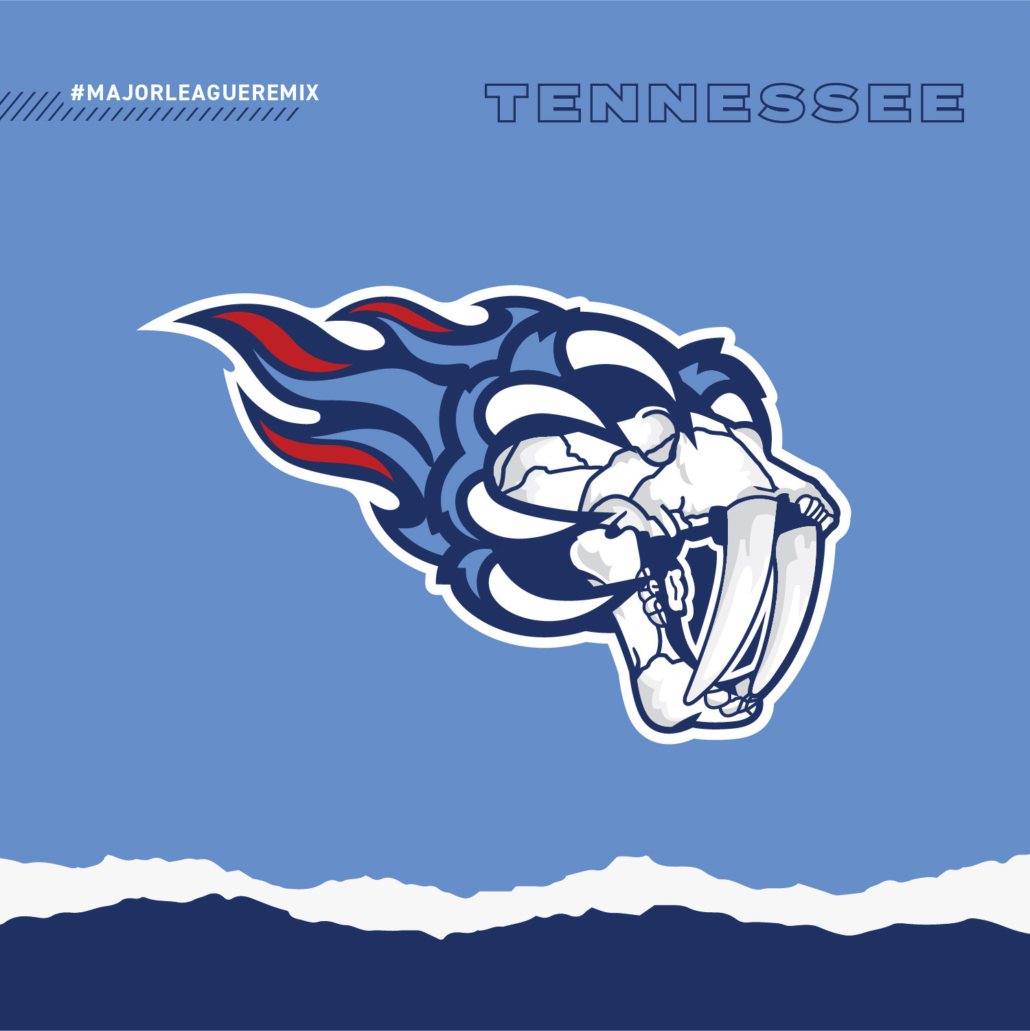
Big fan of the Tennessee combo!!
Yeah, I'd say keep the KC Sporting crest.
Can't wait for the L.A. Clippers.. it'd be great if you could use the old Los Angeles cursive (or thr 2010-2015 LA Clippers logo).
-
 1
1
-

All City Sports Logos Combined - NFL MLB NBA NHL Mashup Design - Pro Teams Put Together
in Concepts
Posted
Ohh, gotcha!!!
I had forgotten about your rule not to incorporate any sort of ball into the design.. Yeah, this limits things even more, you're right.
Btw, I've taken the liberty of sharing your Clippers/Chargers/Angels/Ducks mashup on my "Bench On a QUEST" pages on Fb, Ig and Twitter (I've given you FULL CREDIT, of course). I've tagged you, and I've mentioned you in all posts on the 3 different platforms. I sent you more info via a Personal Message.
Just to confirm: Which element exactly represents the Clippers in your mashup (Clippers x Ducks x Chargers)?
Let me know your thoughts. Thanks!