


zekepalermo
-
Posts
9 -
Joined
-
Last visited
Posts posted by zekepalermo
-
-
Help needed for Coastal Carolina!
Original Edit 11/22/23 Introduced black, added sleeve numbers

The home and away rely heavily on wave shapes taken from the university's logo, but I just don't love how it ended. If you have any ideas, do share!
-
 1
1
-
 1
1
-
-
Arkansas State! Welcome to the conversation.
Original Edit 11/23/23 Added shoulder logo, changed number colors on home/away,
Another fairly simple design as I get more comfortable and continue to better understand how hockey uniforms can be more creative.
The shoulder/arm stripes on the alternate are taken from the Arkansas state flag, which I think is a fun and good-looking nod.
-
3
-
-
8 hours ago, stumpygremlin said:
App State does have a club hockey team. I do like what you did better than what they wear.
My one complaint is that the alternate jersey shouldn't have Yosef on both the shoulders and the chest.
Thanks!
And you're right, small thing I overlooked. The A would probably do well on the shoulders instead. -
In this 14-part season, I will design hockey jerseys design the 14 Sun Belt Conference schools.
Some of these schools do sponsor teams (mostly club), but the goal is design entirely original jersey sets for each one
All teams will get a home, away, and an alternate.
Index
App State
Arkansas State
Coastal Carolina
Georgia Southern
Georgia StateJames Madison
LouisianaLouisiana-Monroe
MarshallOld Dominion
South Alabama
TroySouthern Miss
The first designed team: App State.
Original Edit 11/22/23 Changed alternate jersey shoulder logo
I certainly plan to get funkier with the designs, especially on the alternates, but something about App's branding begs for simple designs. A fourth black jersey with the A instead of Yosef wouldn't be a bad shout, but I wanted at least one with him on the chest.
-
3
-
-
I really think an easy way to make the Magic's brand better (yours and the IRLs) is just to move the wordmark lower so that it is below (but above layer-wise) the shooting star ball.
-
4 hours ago, Blindsay said:
ALRIGHT GO TIME!
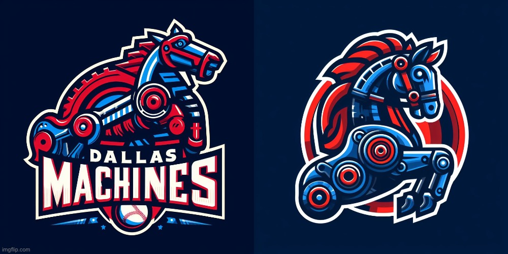
DALLAS MACHINES
STADIUM: AMERICAN AIRLINES PARK:
American Airlines Park is a fictional 44,400 seat open ballpark that serves as the home of the Dallas Machines Baseball Team. Established in the early 2020’s, the ballpark has a rich history of hosting some of the most hotly contested clashes between top teams from the IBL. After several additions and renovations over the years, the park now features a number of unique design elements that give it a distinct edge.
The first noticeable feature of American Airlines Park is its massive, three-level concourse, where fans can roam and get a glimpse of all the action. At the center of the stadium is a two-level press box, with balcony seating elevated above the field of play. This gives members of the media an unparalleled view of the action. Above the outfield lies a white neon-lit sign, highlighting the branding of its corporate sponsor.
The second feature of the stadium that stands out is its unique seating, which is broken into two distinct levels. There is an upper level for general seating, and a lower level for the more expensive ticket holders. Additionally, the park features a premium seating area, with oversized chairs, that have an unobstructed view of the diamond.
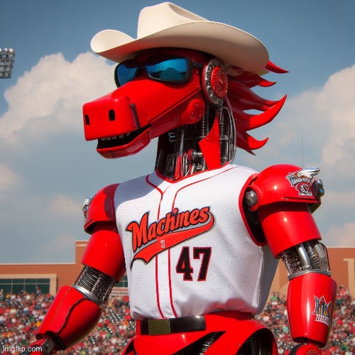
In addition to its unique seating, American Airlines Park features several unique quirks and features. In the left center field, you can find the “Mac & Cheese” machine, a favorite of all the ballpark fanatics that line up at the entrance. There is also an old-fashioned scoreboard in the center of the field, and a water fountain feature in the main concourse. Finally, the park has a unique view of downtown Dallas, giving fans an amazing backdrop for watching the game.MASCOT: CHILI THE MECHORSE:
Chili the Mechanical Horse is more than just the lovable mascot of the Dallas Machines Baseball team. Chili's story began not too long ago, when a team of brilliant inventors and engineers gathered to create a unique marvel of modern technology, a mechanical horse unlike anything ever seen before. As the project came to a close, Chili was unveiled to the team and instantly became an important part of the Dallas Machines Baseball team family.
When the team needed a new mascot, they unanimously voted for Chili to be their mechanical steed and outfitted him with a bright orange and blue jersey, complete with a shining number 47. His days consist of leading the team to victory on the field and cheering on fans throughout the stands. Aside from his mascot duties, Chili is also a valued member of the team, and helps to maintain order and organization in the locker room before and after games. His lively spirit brings a presence to the park that is both motivating and encouraging.
That being said, Chili can sometimes get a little too ambitious for his own good; he occasionally finds himself overstepping his boundaries while trying to help the team. Yet, despite his mischievous acts, the Dallas Machines are always grateful for their mechanical horse loyally cheering them on- win or lose. Chili's story will continue with the team each and every game day, as long as the Dallas Machines are playing baseball.JERSEYS:
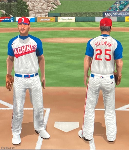
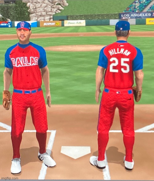
HOME:
AWAY:
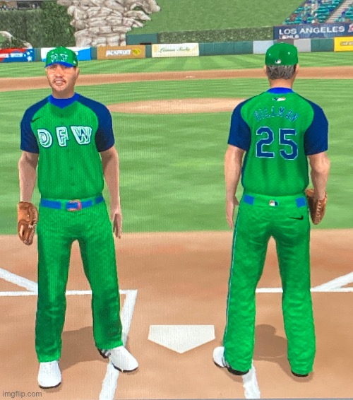
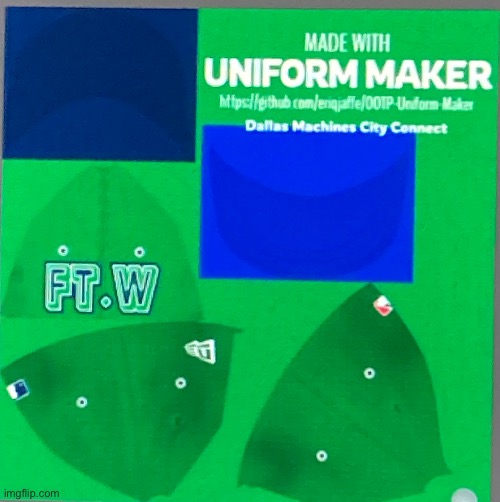
CITY CONNECT:
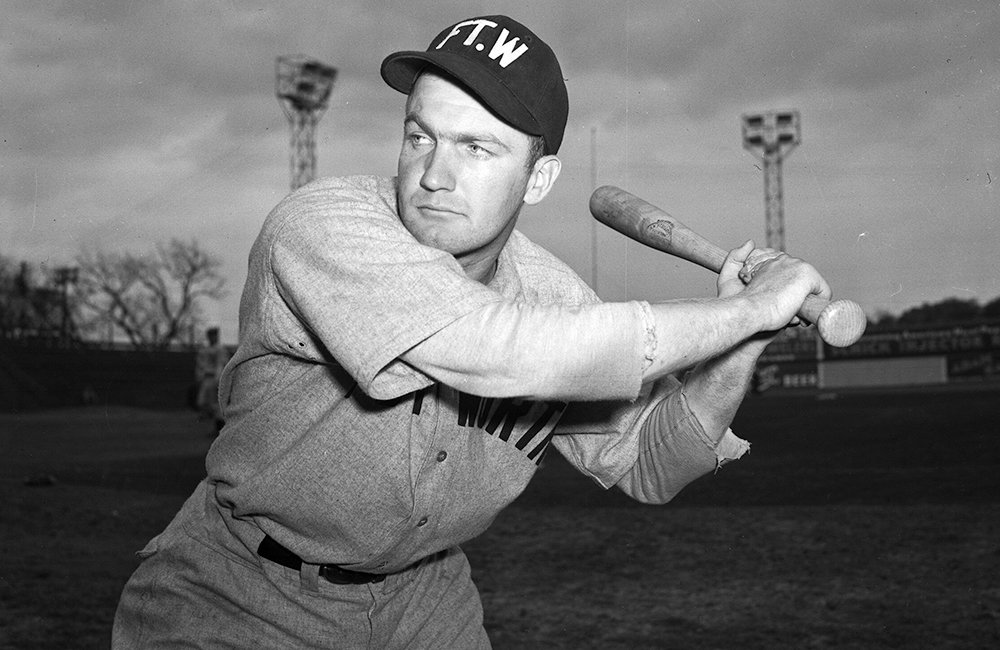
Ah the City Connect has a little bit of lore behind it; LEGIT LORE! Outside of it having colors of other Dallas Teams and a shoutout to the Airport, the Cap is a Homage to the Fort Worth Cats minor leagues
Alrighty that’s it for now. As for the feedback issue, Just give me feedback on the jerseys as that’s a human thing I can fix. Give feedback on the AI if you want, but you don’t have to. The jerseys are the main event.
Also one last thing, did I get the colors right? Would I make more sense for the colors to be like a black and grey to represent the mechanical aspect of it or is the color scheme fine as-is? I was struggling with the identity of this one
This is just a far better version of the Mets minor league team Binghamton Rumble Ponies
-
1
-
-
I think the Browns mascot had to be inspired by Hard Knocks legend Bob Wylie
-
On 11/16/2023 at 6:20 PM, Green27 said:
Wow, they absolutely crushed this. Fun word play, character-based, and great looking uniforms.
This leaves Double-A Mississippi as the only holdout in the Braves' system with the same name as the MLB team. Really looking forward to that change.
Also leaves St. Louis affiliate Springfield as the only Double-A team left with the same name. Do the right thing.-
2
-


Sun Belt Conference as Hockey
in Concepts
Posted
Georgia Southern! Kept it pretty minimal to parallel the very basic football jerseys.
Cuffs on the home and away are meant to mimic the gloves used to handle birds of prey like the eagle.
I like how the candycane fauxbacks turned out, although I would love suggestions on how to make the nameplate (GATA for all players) pop a little bit more!
If you've left a suggestion on a previous design, I recommend checking it out again; I've made some updates!