

johne9109
-
Posts
1,535 -
Joined
-
Last visited
-
Days Won
6
Posts posted by johne9109
-
-
Good job on the Pats uniform. The home and away are a good melding of the current set and the Brady era uniforms. I also like the use of the Bledsoe era uniforms. I wish we would throw back to those
-
Cleveland Cavaliers
The Cavs are another 4 uni set; mainly due to the Cavs current set being so bland. The Cavs white uniform features an altered wordmark that changes the net pattern inside of the V to motion lines a la the Dodgers. The Cavs are also another team that do not have a gray uniform. I instead went for a jersey that features wine red as the main color and is then paired with gray pants. Their black Statement uniform is their alternate while their City Edition from 2020-21 becomes the City Connect

-
On 4/14/2024 at 8:18 PM, FrutigerAero said:
This is a clean look for a baseball team, love how it's just black and white
Thanks! Yeah it has White Sox vibes in a way
-
Chicago Bulls Full Set
The Bulls get a white home and gray away while their red Icon uniform is made into their first alternate. The second alternate is the black Statement uniform which translates pretty well into a black pinstripe baseball uniform. The City Connect is based on their 2017-18 City Edition.
-
 1
1
-
-
6 hours ago, RTrain61 said:
Holy hell man, these sets are awesome. Especially Charlotte and Atlanta
Thanks!
-
Charlotte Hornets
The hornets is another 4 uniform team. Their white pinstripe home gets a teal away counterpart. The teams purple Statement uniform becomes the alternate while the 2020-21 City edition becomes the City Connect uniform
-
1
-
-
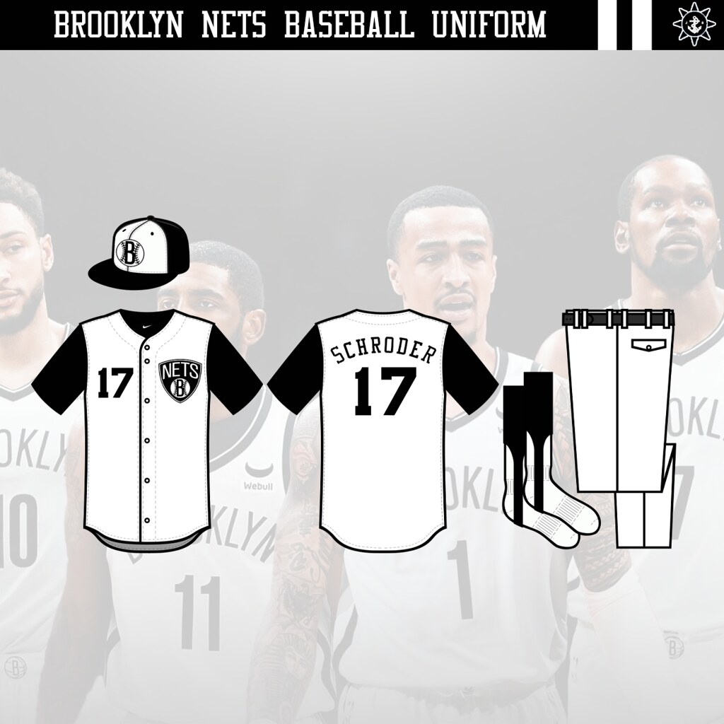
Brooklyn Bats (Nets)
Here is the full set for Brooklyn. They too get a grey away to go with the white home. I then decided to make their Icon uniform into an alternate and skip their Statement uniform as it felt very redundant having 2 black alternates that would end up looking very similar. For the City uniform I went with their 2019-20 City Edition.
-
 1
1
-
-
This is exactly what the Stars should be wearing
-
1
-
-
I've decided to also go back and do full sets of uniforms and will do so going forward. Because these are baseball uniforms each team will have a white and grey uniform, unless the grey really does not work, then 1-2 alternates that adapt the Icon and Statement uniforms, and lastly I will adapt one of the teams City edition uniforms. The MLB has kept their City Connect uniforms so I decided to look back an choose the City Edition that best embodies that teams location. Here are full sets or the Hawks and Celtics
Home and away get the white and grey treatment. The first alt is the Hawks Icon uniform and then their black Statement uniform is their 2nd alt. For the City uniform I went with their 2022-23 uniform as it kept with the Peachtree/Peach State vibes with the colors and logo, but I really liked the Atlanta script they used.
Celtics also get the White home and Grey away and their Icon and Statement uniforms as alternates. If I was going for my favorite I would've used the Celtics 2019-20 City uniform, but I think their City edition from last year really embodies the team and their legacy with it's ode to Bill Russell.
-
1
-
-
9 hours ago, Bomba Tomba said:
Is it just me or does the Avs maroon look the same shade as the Ducks purple in the image
They are pretty close,but it also kind of works with the Rangers and Caps sharing colors and then there being a linking color between the Ducks and Avs. Stadium games like to do weird stuff like that sometimes. It wasn't intentional
-
9 hours ago, Bomba Tomba said:
Perfecto
The header still says Nets however
I left it saying Nets just because that is still the team I technically made a uniform for
-
Here's a quick one off. I was looking at NHL Outdoor Games and I saw the 2020 Stadium Series was at the Air Force Academy football stadium, but the uniforms had no ties, reference or even slight nod to the fact that they were at a military stadium. So that game the idea of a set of Outdoor Games that were at similar locations and had those nods to the military branches. Now I did not want to go overly military; just taking the teams design elements and adding in elements and nods to the military
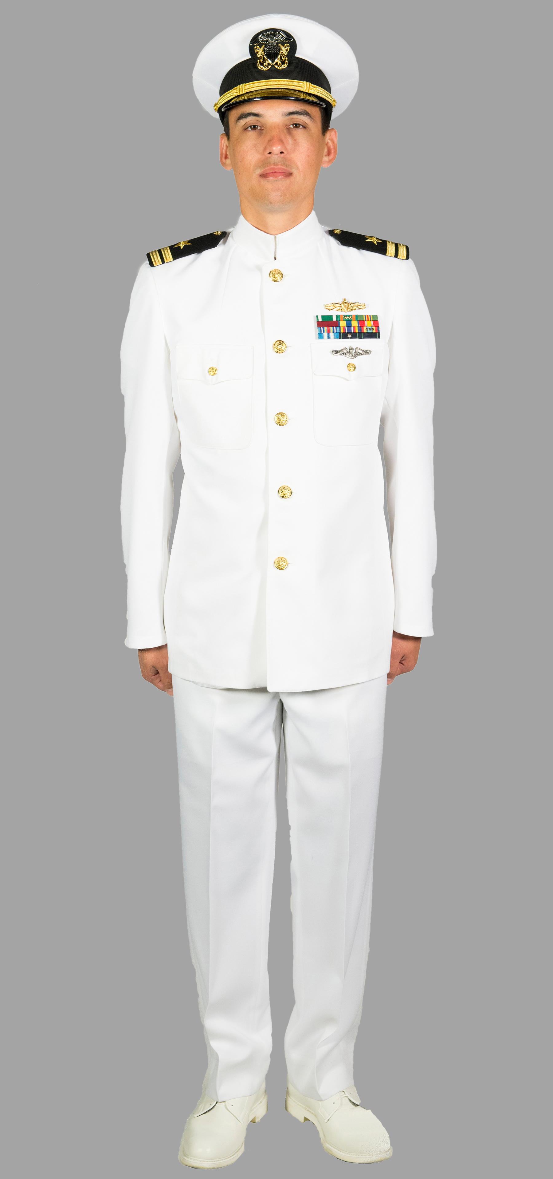
First is the New York Rangers vs Washington Capitals in a take on the classic Army Navy showdown. I envision this game being at Michie Stadium in New York hence the Rangers. For the uniform I took cues from the Army's dress blues. I used the darker blue from the Rangers alternate for the jersey and equipment and then the Rangers traditional blue for the shorts. The logo is a melding of the Rangers shield and the Army Black Knights logo. Their opponent is the Washington Capitals; being the closest NHL team to Annapolis. The uniform shoulders replicate the ranks on an officers dress whites with some added striping to fill out the uniform. The logo is taken from the Naval Academy logo which doubles as a W. It then gets some Capitals stars and a banner and wordmark added below
The second matchup sees the Anaheim Ducks take on the Colorado Avalanche at Petco Park. Now I know I said it would be at military stadiums, but the Marines don't have collegiate teams anymore and I knew I wanted to do a white uniform for the Avs. If we really wanted to keep to the theming the game could return to Falcon Stadium in Colorado, but the Padres are a very pro military team so I could see it still working. For the Anaheim Ducks I color blocked the uniform in come different ways similar to parts of multiple Marine dress uniforms. I also promoted the yellow/orange that is in the Ducks anniversary logo as the Marines prominently use yellow as well. Speaking of that logo I decided to use it here as it replicates the roundel logo used at Marine Corps Recruit Depot. The Avs take their cues from crest of the Air Force Academy crest. I doubled the mountains form the Avs alternate uniforms an centered the C. The pattern of the Air Force crest is replicated on the jersey, but in the Avs colors.
Just a fun little exercise. Comments and critiques are welcome!
-
1
-
-
Here are the Brooklyn Bats. Thanks all for the input
-
1
-
-
Chicago Bulls
Another pretty straightforward one. The jersey gets black and white striping paired with a red under shirt, socks and hat.
-
11 hours ago, Bomba Tomba said:
Bats? Both the things you hit balls with, and given the team's black and white color scheme, the flying mammals also fit
I like that and it's short and sweet like Nets. I think I'll try that
-
Charlotte Hornets
While I ponder the Nets here's the next team. You know the Hornets had to get the pinstripe treatment.
-
2
-
-
15 hours ago, Bomba Tomba said:
I like the change of the basketball into a baseball, but the Nets name still makes zero sense in a baseball context
5 hours ago, BlueMoon18 said:Probably the nets behind home plate?
I didn't even think of that TBH. I guess we could go with the Nets behind home plate. Unfortunately the only other name the team has gone by was the Americans and that does not fit their current motif at all. I also can't think of something baseball related that has the same ring as the Nets, but I'm open to suggestions
-
Brooklyn Nets
The Nets I decided to do as a sleeveless jersey; mostly based on the fact that their normal jerseys are very plain. So I took the Nets logo changed the basket ball to a baseball and put that on the front of the jersey and then did the same with the cap logo
-
4 hours ago, BlueMoon18 said:
ATL: Love the idea of making the cap logo a baseball ATL, but I feel like their current primary (without the circle of text around it of course) would make a better one.
BOS: Similar case to Atlanta, good idea, but a better logo could be used (just the clover in this scenario).
Also, after you finish this, could you do some of the city uniforms from years past? I feel like some of them could be better baseball unis than basketball unis (i.e. ATL's from this year)
I did that logo for the Hawks because a lot of MLB cap logos tend to be/involve letters. I could try both them and Boston with the different cap logos.
I think I might go back and do away, alts, and city editions
-
Boston Celtics
The Celtics, like the Red Sox, are a very traditional team and don't experiment much with their uniform. So I went with a very traditional baseball uniform with green striping and a green cap. I went with the clover logo on the cap as it felt more baseball logo than the Celtics logo with Lucky.
-
2
-
-
Atlanta Hawks
I went pretty traditional with the Hawks putting their current wordmark on the front with a yellow and red striping on the sleeves and placket. The hat logo is their current alt logo that is featured on the waistbands of their shorts, but I swapped the basketball design for a baseball stitching
-
1
-
-
New Series. This is my latest entry in crossing over sport teams into another sport. This time I will be taking NBA teams and turn them into MLB uniforms
- Atlanta Hawks Full Set
- Boston Celtics Full Set
- Brooklyn Nets v 2.0 Full Set
- Charlotte Hornets Full Set
- Chicago Bulls Full Set
- Cleveland Cavaliers
- Dallas Mavericks
- Denver Nuggets
- Detroit Pistons
- Golden State Warriors
- Houston Rockets
- Indiana Pacers
- Los Angeles Clippers
- Los Angeles Lakers
- Memphis Grizzlies
- Miami Heat
- Milwaukee Bucks
- Minnesota Timberwolves
- New Orleans Pelicans
- New York Knicks
- Oklahoma City Thunder
- Orlando Magic
- Philadelphia 76ers
- Phoenix Suns
- Portland Trail Blazers
- Sacramento Kings
- San Antonio Spurs
- Toronto Raptors
- Utah Jazz
- Washington Wizards
-
Washington CommandersXGinuwine
the final entry for the NFL is the Washington Commanders and R&B singer Ginuwine. With the Commanders stencil W logo it was the perfect swap for a somewhat similar G that Ginuwine uses.
-
14 hours ago, TrueNorth13 said:
Took a bit of a break over Easter, but we are back. Going one at a time now.
The Colorado Avalanche
I could never change their uniform template from what they use now. It's wayyyy too solid of a look. I did tweak it though. In what could be an unpopular move, I shifted away from the classic A Avalanche logo and brought back the foot! My favourite logo. I love the classics. The C mountain state flag look is on the shoulders, but the foot comes back and is the full time primary now. The changes to the home are small, white replaces grey in the striping, and snow capped mountains are featured on the waist. An idea I saw from another design either on instagram or the Post 2 Post video. They had the snow on all the mountain peaks, I thought maybe just one would do the trick. Burgundy takes over as the main equipment colour, a decision I think looks way better than the blue. The away uniform brings the amount of striping back to their original jerseys in this style, but again, white takes over for grey. There's not much else to add other than I wish the Avs would at least bring the foot back in some capacity. I'd even take a one off specialty uniform.
I think the Avs do need to update their logo, but the foot doesn't work as a main logo and I love the foot logo. Everything else looks great and in a way modernizes a very 90's design


NHL Utah - The Ryan Smith Way
in Concepts
Posted
God I hope they don't go as lazy as they did with the Jazz