


chakfu
-
Posts
1,243 -
Joined
-
Last visited
Posts posted by chakfu
-
-
31 minutes ago, VikWings said:
As far as city jerseys go this one looks decent. Love the colors.
Is this the first NBA spanish jersey that is translated?
Of course, it's a city jersey, not a Latinx heritage jersey
-
Not bad, should have included Appollonia somehow
-
8 hours ago, Chawls said:
How would we feel if Washington changed their colors to blue, black, and bronze á la the Capitals and Wizards old colors?
I'm typically a big fan of fauxbacks...but I kinda think Wizards should have stuck with that identity.
That said, I think they should stick with Commanders, colors and logos are fine, just need to make the unis more cohesive eventually.
-
 1
1
-
-
8 hours ago, oldschoolvikings said:
Sure, because brown facemasks were all the rage back in 1946.
Since historically accurate with no face mask is impossible, I think brown is fine.
Bigger question is, should there have been a helmet stripe at all? Easy one to mock up. Or I can just cover the stripe with my finger.
-
5 minutes ago, Brave-Bird 08 said:
Nike can't not touch a uniform without going full gradient lately
HOWEVER, I am a big fan of this application. Purple and black are close enough that it's not super gaudy, it's a call back to a previous set while being different.
and I like the wordmark play here
Yeah. The gradient is subtle and works. Being "experimental" it makes sense as the alternate, leaving black as the primary - but with purple trim. I like the whole set except for the wordmark on the statement.
-
3
-
-
It's good except for the wordmark. Wish either this or the black had the full Sacramento wordmark and the other kings. I can understand not wanting the same wordmark for all 3. Somehow the black next to purple on the regular ones with the script evokes mitch Richmond, tiny Archibald, Phil Ford dark blues and I like it.
-
1
-
-
36 minutes ago, bowld said:
Imagine this helmet with white jersey and blue pants, in a 1PM sunny game @ SF.

The love the helmet! I hate gray anywhere but baseball roads. Matte gray does not evoke silver.
-
2
-
 1
1
-
-
They definitely flashed purple at the end of the video too.
-
1
-
-
Interesting that purple/black stuck over their "classic" r/w/b - since they never owned it. Sky blue was Interesting but short-lived. Too many moves and name changes to stick. Makes me think Clippers could do the same.
What other color changes really stuck in recent memory?
Tampa Bay Bucs
Mavericks lack of green
LA Kings
Mariners
White Sox finally settling on black - another case of r/w/b not bring missed
Nets, black still hanging on by a thread
others were soonish after expansion
Memphis Grizzlies
Arizona Diamondbacks
Tampa Bay Rays
-
1 hour ago, chakfu said:
Nobody needs Grey except for baseball teams on the road
And Ohio state
-
2 hours ago, tBBP said:
I doubt they'll do it at this juncture, but I would love to see the Kings take on a new colorway. At the very least, get back to black and purple...that gray never has looked right for them.
Oh and that Kings script...if they use it again, I hope someone took to cleaning it up.
Nobody needs Grey except for baseball teams on the road
-
1
-
 5
5
-
-
I would simply add yellow and blue stripes above and below the silver stripes. Simultaneously downplay the silver with homage to the flag.
-
I thought the rumors of darkened red and use of orangey yellow were very plausible. And, in combination with gray/silver and flag blue, could have been much better than the overemphasized gray and Buckeye resemblance.
This really reminds me of the short lived Browns overhaul:
- Attempt to add novel elements in the framework of a traditional design, including:
- chest wordmark
- oddly placed wordmark - better on sleeve than on pants, I guess.
Needs more shoulder and pants stripes IMO. That could have been the place to add silver plus flag colors without overemphasizing any of them. A touch of those colors while still being traditional red/white would have been my vision.
-
4
-
-
20 minutes ago, bowld said:
I have to think @TruColor was lied to at this point. Nothing about this leadup tells me its going to be Maroon/Orange and Silver.
Didn't the teaser video have a gray/silver box and prominent yellow/orange flowers?
It's all about how they impleme them , to avoid looking like USC or tOSU
-
5 hours ago, BBTV said:
The college lines made the floors look like those high-school fields that have football markings with soccer lines over top of it or lax or something. They serve absolutely no purpose in the NBA so other than to save money there's no reason for them. They just make it look like they couldn't afford their own court.

The lane looks too square without them.
-
On 1/3/2023 at 10:39 AM, gosioux76 said:
I'm willing to offer a hare-brained conspiracy theory:
Recognizing a need to completely divorce themselves from prior branding, the Commanders unveil an intentionally terrible set of uniforms they know nobody would like. The idea being that when time passes, and these uniforms remain odious, their fans will begin to clamor for the old look. By that time, calmer heads will prevail and will no longer tie a uniform design to the offensive nickname, allowing the classic look to return (a la the Buccaneers) but under the new team name. Major Tuddy is just foreshadowing.
Naturally, this assumes that Daniel Snyder can think strategically and employ some degree of cunning. Which is why this is a hare-brained theory.
Interesting that the Bullets/Wizards stripes did the same thing. I get the nostalgia and usually pine for similar fauxbacks but the Bullets 1920s men's swimwear stripe look is the worst vintage identity ever...yet iconic...love/hate for me. Wizards uniforms were probably better than any Bullets look actually
-
1
-
-
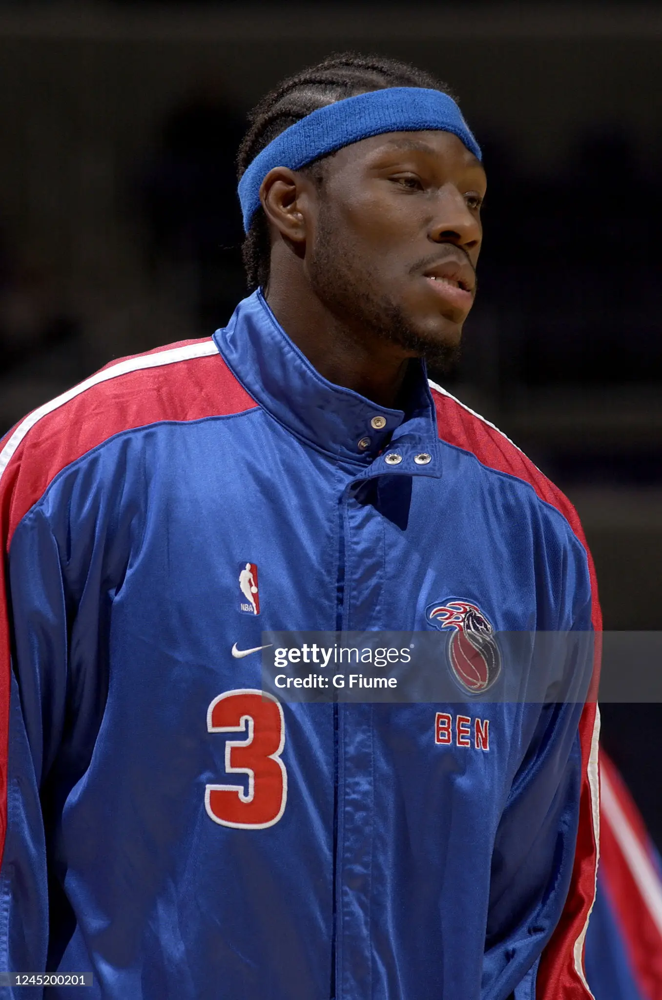
I Keep expecting to see Michael Redd in these Laker jerseys.
-
11 hours ago, Digby said:
Those two are tied, the human brain can't possibly remember them both at the same time.
Actually the Orlando one might be more forgettable because I literally did forget about it until finding it again by accident during an unrelated thread here, a couple years ago.
Utah 2 tone blue is forgotten intentionally. That Magic set is forgotten unintentionally.
This should be a warning against bringing back light blue. Just go with OG Mardi Gras colors and be done.
-
3
-
-
6 hours ago, truepg said:
To me, they took and changed everything that worked in that uniform. The white letters gave it the needed visual depth, and those triangles on the shorts really worked as a darker two-tone being navy. The stars are a fitting addition, I guess. Other than that, this used to be the Nuggets' best uniform of the regular rotation, now with the made tweaks it reminds me of a cheaper McDonald's All-American uniform look.
I don't want any Nuggets jersey that's not rainbow skyline and I want a deep dive oral history of its origin
-
On 9/2/2022 at 11:28 AM, FiddySicks said:
So, the Hot Water Clippers? Is that right? Why? What was even the point of that?
They did a nice job getting themselves out of hot water
-
On 8/29/2022 at 2:49 PM, projectjohn said:
I know those days are sadly over, what with economies of scale from templated designs, but it's a shame. I remember Nike had still had some degree of individuality on warmups as recently as the early 2000s when they had the contract for 8 teams. Both the Celtics and Pistons had classic style warmups at that time.
Remembering the higher quality of the Nike 1.0 days was a big part of the reason I was excited when they got the NBA deal in 2017, but unfortunately it's been a disappointment.
Economy of scale...for runs of 15-20 pieces in freakish sizes...for multimillionaire employed by billionaires. I don't get it. It's not like warmup jackets are a big merch seller either right?
-
3
-
-
On 8/12/2022 at 1:09 PM, WestCoastBias said:
Finally, the Wizards look like the Wizards again. Stop trying to be the Bullets and bring these back full time!
This identity was solid and highly underrated. Bullets stripes are iconic but frankly awful. Reminds me of 1920s men's swimwear.
Wouldnt mind blue gold primaries with rwb stripe alts.
-
14 hours ago, gosioux76 said:
I don't think I need to spell out how logos evoking horsepower and car exhaust pipes are more symbolic of the automobile industry (for a team called the PISTONS) than a large, red basketball that just says "Detroit Pistons" in the middle.
I didn't say the color teal represents the name more. I said the uniforms, which include the logos.
I still say the ball and circle from the 80s are a cross section of a piston in a chamber.
...because that's the only interpretation that makes it seem acceptable
-
3
-
-
8 hours ago, chakfu said:
I've got a great idea to sell Idaho, Montana, and the Dakotas to Canada.
2 hours ago, the admiral said:Resource extraction? Never heard of it.
Fix the senate and make a few bucks at the same time
-
 1
1
-


2023 - 2024 NBA changes
in Sports Logo News
Posted
Whatever happened to the salt palace?