


AFirestormToPurify
-
Posts
913 -
Joined
-
Last visited
-
Days Won
2
Posts posted by AFirestormToPurify
-
-
33 minutes ago, CreamSoda said:
Why would I honor a team that is currently playing in New Jersey? A team that played only 7 years here and with no success?
Or I can about a team that Joe Sakic and Peter Forsberg actually played for. A team that has direct franchise records associated with it.
I perfectly understand your reasoning and I respect it. But I still think it's nonsensical for the Avs to wear Nordiques gear. Feel free to disagree. I personally think that when a team moves to a different city and change their name they should wipe the slate clean but that's just me I guess
Especially in the case where the old name had geographical and/or cultural references (North Stars, Nordiques, Rockies etc), the re-localized team wearing the old uniforms would look dumb. Like, could you imagine if the Canadiens moved south of the border, changed their name and then 20 years later the US based team rocks a Club de Hockey Canadien de Montreal sweater as a throwback. Insanity, even if just for a game or two. Would make more sense for the hypothetical new Montreal franchise to honor the city's past imo.
But again, I understand why some people wouldn't agree with me on this particular take
-
 2
2
-
 1
1
-
-
10 minutes ago, PlayGloria said:
Great post. As much as i loved seeing the Nordiques jersey return, it felt weird to me. I feel the same way when the Hurricanes wear a Whalers jersey. It's a feeling that, if we loved these teams so much, why did we relocate them in the first place.
Team relocating is just such a gut punch to the city that loses the team.
Yeah it rubbed me the wrong way is how I would put it into words. Like I didn't hate it I just thought it was kinda dumb. I guess the Canes wearing Whalers jerseys should also have rubbed the wrong way especially since I dislike the Canes but at least they kept the colour scheme intact and there's no geographical/cultural symbol on the Whalers jersey that makes it weird for a team in NC to wear it
-
18 minutes ago, ColeJ said:
As a man from Alabama, living in Texas, hearing Colorado referred to as the south is lowkey hilarious.
Not gonna lie, I just looked it up and it's definitely more in the middle than I remembered lol. Either way. You can be pedantic all you want, there's nothing nordique about the state of Colorado
-
2 hours ago, CreamSoda said:
nah, as an Avalanche fan for 26 years, I can more about the Nordiques history than I do about the Rockies.
The Avalanche have no ties to the Rockies.....
Sure but what makes more sense, a team in southern (edit: not THAT southern apparently) US Colorado honoring a past franchise by wearing the jersey of a team called the Northerners filled with French fleur de lys OR a team in southern US Colorado honoring a past franchise by wearing the jersey of a local defunct team called the Rockies for the Rocky Mountains and with a logo that resembles the state flag?
I personally found it a little disrespectful that they even chose burgundy for the fleur de lys on their RR when blue is part of their colour scheme. Well maybe not disrespectful but I think it made no sense at all.
I hope next year's RR is a steel blue based pre-Edge jersey with burgundy (the original mid 90s lighter shade of burgundy for extra throwback points and more obvious difference between those and the current jerseys maybe?) sleeves and black gear
-
2
-
-
3 hours ago, gsn93 said:
Montreal's was just a blue palette swap of their current red jersey so there is precedent of the teams doing simple color swaps of their current looks. I mean the whole year designations were all arbitrary and didn't even match in most cases anyways (Like Detroit's was 1998 when their jerseys haven't changed since the mid '80s or similarly the Flyers being from 1995.) so who cares.
I think the years were in reference to a Cup or at least a Cup final appearance in most cases
5 hours ago, PlayGloria said:Neither team should change a thing. Gorgeous.
Mostly agree as both teams look great but I am the only one who misses the yellow numbers?

-
11
-
-
19 hours ago, Kevin W. said:
Switch the shoulder patch out for the shoulder patch from the 2013-16 alternates and you have perfection.
I would say that the Ducks barely qualify as BFBS considering that they ditched one of the best looks in the history of the league to satisfy Brian Burke's West Point fetish.
Right, not gonna lie, I kinda forgot the Ducks lol. But I thought BFBS only applied when a team unnecessarily added black to their scheme (KINDA LIKE THE FLAMES DID :^)), not when a team completely rebrands and even changes their name?
And what's taking them so long to go back to their original jerseys? Shouldn't they have gotten the hint by now?
-
2
-
-
2 hours ago, PlayGloria said:
In fact, I would go one step further and say that teams should follow the Calgary route and eliminate more black or navy that is only in the color scheme for trim purposes. Sort of like the Chargers eliminating navy from their primaries. I love the powder, yellow, white scheme for them.
For example, the 49ers don't need black. The eagles don't need black. The dolphins don't need navy. All NFL examples, but you get the point.
There's no BFBS team anymore in the NHL, especially now that the Avs have dropped the black gear and away name and numbers
The one team that could mayyyybe drop navy is St Louis but I think their current uniform set is a modern classic and should be left alone. The Oilers also look better in navy and should leave royal and orange to the Islanders who balance those colours much more tastefully but then again I know that's an extremely unpopular opinion around these parts lol
-
2
-
-
Black doesn't work for the Flames. The pedestal jerseys sucked, the early 2000s jerseys sucked a little less but would have been better with red gear and flaming white C on the red jersey at the absolutely least. The Edge flag jerseys were monstrosities, the cowboy Edge alternate also sucked, they've never looked better than they do now. Both Blasty jerseys were alright as alternates imo because they went in a totally different direction. But still. They got it right the first time
Between the Blackhawks, Devils and Senators and Hurricanes to a lesser extent, there are too many red & black teams already
I will die on this hill lol
-
1
-
-
30 minutes ago, dont care said:
So you like the older Buffalo because it looks like it’s suffering from dementia? I think you are looking for a different word
lmao. Doesn't it meant the same thing as mad or deranged or insane? Cause if so, yeah, that's totally what I meant. That buffalo is giving you the stink eye and you pee your pants. As far as corny 90s angry animal logos go, it's always been one of my favorites
24 minutes ago, Ridleylash said:It's also less complex and therefore easier to reproduce, so from a branding perspective it is an improvement.
Yeah, yeah, I know. Every logo needs to be an emoji now but I still think it looked better before and I really hate that trend. Call me a boomer, I don't care. Things were better when artists didn't have to worry about their logo not looking too detailed and weird when shrunk to the size of an ant
25 minutes ago, Ridleylash said:Black fire does actually exist, though getting it naturally would be difficult;
Oof now you're reaching ahah
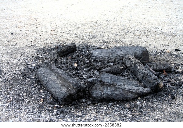
25 minutes ago, Ridleylash said:Besides, I would think using colors to effectively say your fire-based hockey team burns so hot they leave ashes and charcoal in their wake would be a good thing, wouldn't it?
Not when it's their logo that is black and looking like a burnt out, extinguished flame ;^)
Now maybe if they added jumbotron graphics that made the opposing team's logo look black and burnt (burned?) when they score a goal or win a game, now that could fire up the twitter crowd lol
-
37 minutes ago, dont care said:
Took away 2 unnecessary shades of gray
On paper maybe. On the jersey it was not an issue at all imo. I liked the "bug eye" better. It made the buffalo look furious and demented lol. New one looks neutered
30 minutes ago, Evanderder31 said:Is it just me or do the Calgary Flames look better with black than no black?
Just you. Black has never made sense for a team called the Flames. Maybe if they change their name to the Calgary Charred Remains, then sure, black is fine
-
3
-
-
Am I the only one who thinks the "updated" goat head sucks? It looks soul-less and corporate now, like when the Dolphins and Jaguars switched to their current logo. There was nothing wrong with the original logo
-
10 minutes ago, dont care said:
What’s garish garbage about it?
Everything.
-
1 hour ago, dont care said:
First off learn the difference between “not being mad if that’s what the patriots went with” and “this is what the patriots should be wearing.” I’m not even saying it’s better than the current uniforms, (take away monochrome at home and it’s basically perfect) I’m just saying if they came out with it INSTEAD of the uniforms they are currently wearing I’d see the ties to the 90’s uniforms and it would bring back some nostalgia and I wouldn’t be mad with them going with it. Does it have flaws? Yes, mostly the side panel, but when you are coming from a uniform where the side panel was one of the largest flaws you the cancel each other out in a way.
I think it's the usual garish garbage that is fine for AS/PB games and nothing more imo, but I was mostly surprised that so many people were in agreement with you
NFL fans really confuse me sometimes. I can't wrap my head around the fact that the Rams are derided almost everyday here for their uniforms and that the same people wouldn't mind the Pats wearing this monstrosity
Is it because everybody hates the Pats? lmao
-
 1
1
-
-
19 minutes ago, BBTV said:
Don’t generalize.
Aren't you the poster who hates any football jersey created after 1970?

-
2
-
1
-
-
Wait I thought people on this board hated rounded fonts with triple outlines (Eagles) and in italics, gradients (Rams), vertical piping (any Reebok era redesign) and random spiky stripes near the neckline (Jets)
Those jerseys are a combination of everything wrong with football jerseys and this is what the Patriots should be wearing?
I don't get it
-
3
-
 1
1
-
-
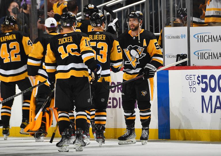
1 hour ago, WSU151 said:
Penguins don't need the top yellow stripe on their socks. Should just be white/black/yellow stripes. You can kinda see it here:
That's not an unpopular opinion, that uniform is a mess
-
2
-
-
16 hours ago, DTConcepts said:
This year’s all-star jerseys have leaked.
Wow an ASG jersey that actually looks good for once
9 hours ago, Ridleylash said:please be the 2004 red jersey, please be the 2004 red jersey, please be the 2004 red jersey

Ah yes, the Calgary Charred Remains. They finally got rid of black and look like a team called the Flames should, I hope they keep the black to a minimum, as a trim color at most.
I could make an exception for last year's RR though lol. Flaming C in black makes no sense but I like Blasty
-
3
-
-
23 hours ago, VancouverFan69 said:
Another one of the bad 90's trends in NHL uniforms besides the BFBS movement was the removal of pants stripes.
That's interesting. You're absolutely right and I can't believe I never noticed that. In 1990-91 only two teams had solid pants, the Bruins and Flyers. By 1999-2000, 20(!) teams had stripe-less pants. 15 teams currently wear solid pants with their regular uniforms which makes sense considering many teams went back to 80s uniforms full time. Unless we count alternate jerseys, then it's 12, which is still pretty high
Safe to say it was a 90s trend but we still feel the lingering effects lol. I bet I would have similar results if I counted solid coloured gloves vs gloves that had contrasting fingers, back rolls and cuff rolls
I've pitched the idea before but it would be cool if there was a "uniform trends throughout the decades" thread
-
2
-
-
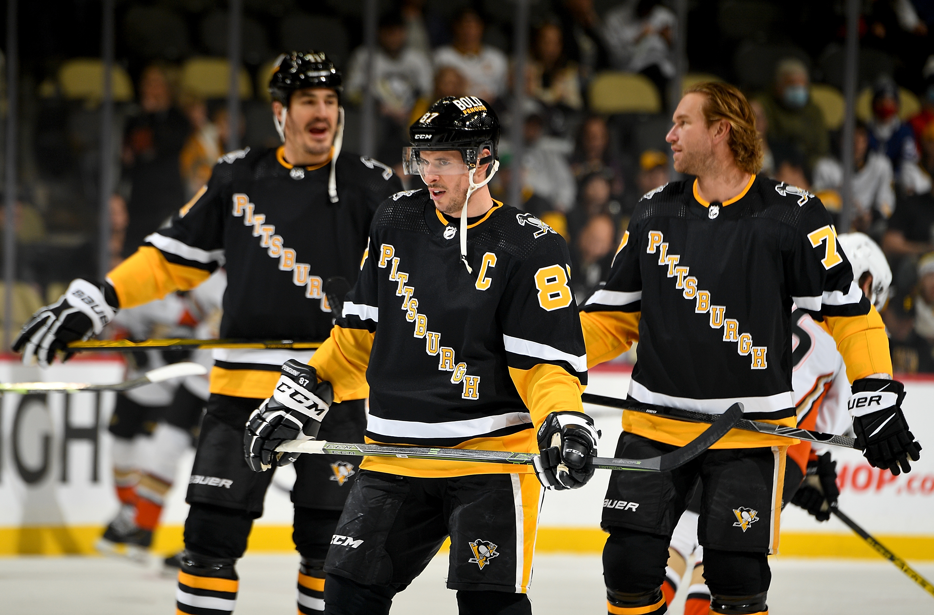
1 hour ago, spartacat_12 said:
Rather, my issue with the Pittsburgh set is that the wordmark doesn't match the number font at all. Either switch the numbers to double-outlines + dropshadow, or change the wordmark to a single outline.
True. That's also something that bothers me a lot. No outline on the name, one outline on the numbers and two outlines on the logo, that's just nonsense!
-
38 minutes ago, BBTV said:
Monochrome hockey uniforms suck
Now that's a statement that definitely belongs in this thread lol
-
2 minutes ago, SFGiants58 said:
Nah, the Penguins’ 2016-present home/road set is perfect. The skating penguin should always be front and center, no angled wordmarks and no alternate logos.
I don't like like the stripe on the pants, they could have kept the 2000s rounded font as I thought it looked cool and they were the only ones who used it and the sock striping could definitely be improved to be more in line with either the waist or sleeve striping. Good starting point but far from perfect, the stripes are all over the place
Their AHL team were onto something with those socks. Maybe a little too busy but better than 3 thin stripes that are repeated nowhere else on the jersey or pants
-
1
-
-
21 minutes ago, Lights Out said:
Couldn't disagree more with everyone. Cascading letters on the front is already the Rangers' thing, and it just looks wrong for the Penguins anyway.
You have a point but I have no problem with that personally because not a single person in the whole world would look at those Penguins jerseys and mistake them for the Rangers. Other than the diagonal letters, the jerseys don't have anything else in common
At the same time, when they switched to black and yellow it made sense because those are Pittsburgh colours but the Bruins thought it was their thing and looked wrong for them, at some point there's only so many things you can do without looking like you're copying other teams
I never cared much for the skating penguin myself, maybe because I grew up with Robopen
I guess what I'm trying to say boils down to, I'm glad I'm not in charge of picking what the Penguins should wear cause I'd have no idea
They've never truly had terrible jerseys (other than the early Edge uniforms) but they've never had great jerseys either imo
-
1
-
-
On 12/11/2021 at 9:50 PM, hormone said:
Just watched the penguins who debuted the new alternate. It’s just a black version of the white reverse retro. I’m underwhelmed. It’s not as nice as the regular blacks, it’s redundant to have two blacks, and whoever made the decision to drop the golden triangle on the skating penguin on this, the reverse retro, and the gold alternate deserves to have their food from the microwave piping hot on the edges and stone old in the middle.
Counterpoint: The 90s alternates are better than the 80s throwbacks that should have never been promoted to full time and the yellow alternate made my eyes bleed
-
2
-
-
3 hours ago, GT Designs said:
Nike owns Bauer
What is this, 2007?
https://news.nike.com/news/nike-completes-sale-of-bauer-hockey
They still own a few trademarks but there's absolutely no way Nike was involved in the design of those gloves
And I'm actually not even sure it was Bauer who decided to put the flag on the gloves, every other brand (CCM, Reebok, Eagle, Easton, Warrior etc) does it so it leads me think that it was maybe at the request of the IIHF or the teams themselves. They even make sticks with flags and country colours on them! Either way, not a Nike design element


College athletics identity changes
in Sports Logo News
Posted
https://news.sportslogos.net/2022/01/28/nebraska-cornhuskers-update-herbie-husker-logo-to-avoid-alleged-white-supremacist-gesture/college/
I hate this. It's always been the "bellissimo!" or "okay" sign. Why are they giving this tiny group of losers validation by acknowledging their hijacking of a perfectly fine and harmless hand sign?
Where was the outrage when the Bloods starting using that hand sign?