


AFirestormToPurify
-
Posts
913 -
Joined
-
Last visited
-
Days Won
2
Posts posted by AFirestormToPurify
-
-
Wow those are extremely underwhelming and I'm being polite cause this site doesn't allow swear words
What kinda moron in the front office decided it was a good idea to unveil a bunch of crappy second rate Vegas gold era Penguins/Golden Knights hybrids that look NOTHING like a Bruins jersey should look like to celebrate such a milestone? Makes no sense to me. Seriously, take the logo off and can anyone tell me with a straight face that it looks like a Bruins jersey? The shade of gold sucks, the black socks suck, the font sucks and even the alternate kinda sucks. I hate the numbers in the logo, it looks very cheap and something tells me they're gonna wear brown helmets with those cream jerseys and it's gonna make the whole thing look even more amateurish, like a minor hockey team that can't afford two sets of helmets. The only good thing I have to say about that new set of jerseys is that they're only gonna stick around for one season. Thank god
And I'm not even saying this as a biased Habs fan, on the contrary, I've always thought the Bruins had nice jerseys. I expect more from them!
Why couldn't they just wear a bunch of retro jerseys throughout the season and wear a patch on their regular jerseys the rest of the time?
-
 2
2
-
-
The Alouettes pulled the old switcheroo on us and now it's the red pants that are worn with the white jerseys

Not bad, better than red on white I guess, but the combo I really want to see is navy on white
-
5
-
-
On 8/19/2023 at 9:42 PM, Chewbacca said:
Today’s game between Ottawa and Montreal is quite interesting. Ottawa is wearing white at home and Montreal is wearing their red alternate uniform on the road. I like the red jersey for the Alouettes but I don’t understand why they wouldn’t wear the navy or white pants instead of monochrome red.
Strangely, I think I prefer mono red. The white pants don't really mesh well with the rest of the uniform. And I'm really starting to miss the helmet with the huge all-over logo. The new helmet stripes still haven't grown on me
Navy or red socks would have helped I'm sure
-
3
-
-
56 minutes ago, tBBP said:
They need to quit playing around with people and just bring back the original [Mighty] Ducks sweaters and be done with it already....
Ish ain't difficult, Anaheim...stop tap-dancing/pussyfooting around with folk and give us all what we REALLY want back!
We want the version in the 3rd picture, not the one with the plain eggplant gear and most certainly NOT the one with the placeholder black gear though!
-
On 6/26/2023 at 2:55 PM, Chromatic said:
Interesting read. I was born in the 90s so barely remember it but a lot of this stuff does seem extremely familiar after reading about and seeing it again.
I wonder what kind of permutations and misappropriations we'll see when 00's nostalgia starts rearing its head.
I dunno but I think Hot Wheels Decades did a fantastic job
Early 2000s
Late 2000s
-
58 minutes ago, BuckDancer said:
Didn't even realize they didn't update the socks. Looks terrible now. Would it have killed them to add a black stripe that goes all the way to the bottom of the sock?
The sock striping going all the way down to the ankles is a terrible 90s trend (started by the Ducks and Panthers in 1993-94) that needed to die 15 years ago. It looks inferior to traditional mid-sock stripes 90% of the time but especially on white away uniforms as the players look like they're wearing knee high socks with short shorts. /rant
Should I post this in the unpopular opinions thread? lol
-
How come Montreal's new alternate hasn't been leaked/released yet??

-
Yup, the contrasting nameplates still suck
Overall, the only improvement here is the new shade of orange, everything else is a downgrade, especially the disgraceful powder blue sponsor patch
-
2
-
 1
1
-
-
18 hours ago, Ark said:
The Johnny Canuck logo sucks. He looks like he's frolicking through a patch of flowers
Now that you mention it... lmao
But you're right. The back leg should be extended instead. It doesn't even look like he's skating. It's like they hired a designer who had never seen anyone skate before or seen a hockey game. Even the way he's holding his hockey stick looks wrong
Can a photoshop expert give it a try? I'm sure it would look a thousand times better and less silly
I've always liked the idea of the logo but not necessarily the logo itself. Good idea, bad execution. Now I know why!
-
 1
1
-
-
4 hours ago, TenaciousG said:
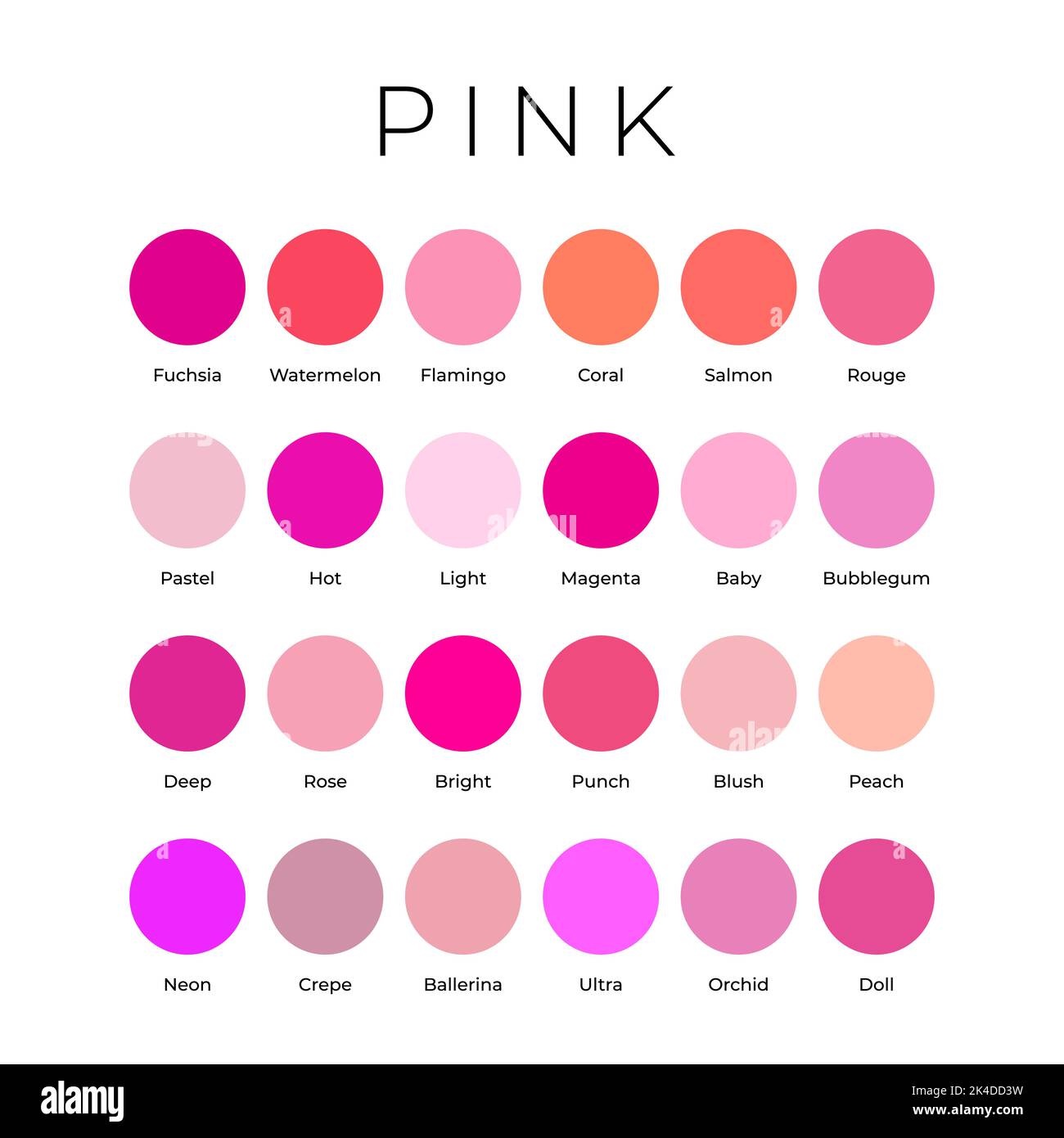
It’s a good accent color, salmon would be fine but it wouldn’t allow the eye in the logo to pop as much.
I see what you mean, I should have been more specific. I meant a bright, punchy pinkish-orangey red, not a muted, dull one. Something like this here. I wouldn't be against "watermelon" or "coral" either. It could have been another colour they would have claimed as their own in the NHL
-
1
-
-
-
4 hours ago, officeglenn said:
So the Alouettes announced their home game themes today, and buried in the notes about the July 1 "Family Game" is a little nugget about unveiling a third uniform (see below). Not sure if it means they'll be worn during that game or just unveiled at some point during it. Here's the announcement in French; interestingly it isn't mentioned in the English-language announcement.
They better be good cause I just bought a pair of tickets lmao
-
5 hours ago, Nordiks_19 said:
Carolina vs Dallas would probably be one of the most visually pleasing Stanley cup final ever
Meh, only when the Canes are at home
-
10 hours ago, Chromatic said:
I like the Jets jerseys. The primary logo is horrifically bad and really feels like the logo of a team that moved and changed names overnight, so needed a new crest asap. I like the concept behind the shoulder logos, but not the execution.
I really like their script logo, how it reminds you of skywriting, but shouldn’t be the primary.
Most importantly though, I think the double blue colour scheme is great, and it would be a tragedy if they ditched it to be another blue and red team. I would like it if they ditched red entirely to add some more distance from Seattle.
Agreed except for the last part. It's Seattle that needs to ditch the red. Salmon would be perfect for them
-
1
-
 1
1
-
-
7 hours ago, PlayGloria said:
I mean, there are like 3 franchises in every major sport that have the winning traditions as your beloved Habs. The rest of each league is a hodge podge of a few special championship years (or close to it). To compare all franchises to the candiens is honestly not even fair considering many of their championships came when the league had way less teams and was dominated by Canadian based teams. For a fan base to look upon a jersey with fondness because it was worn during one of their peak eras is totally valid in my book. Doesn't mean they have to wear them for eternity.
Just for the record... its been 30 years since the Habs last lifted the chalice.
I thought we were talking about the Devils? Who said anything about the Canadiens?
Comparing the dynasty-lite 1995-2003 Devils to the 2007 Sens or Sabres is just hilarious, sorry
By the way, even if you don't count pre-1967 Cups, the Habs still have the most by a landslide lol
-
Just now, DTConcepts said:
they wore them for their one and only stanley cup finals appearance so yeah?
...Winning?


-
 2
2
-
-
14 minutes ago, DTConcepts said:
If teams only stuck with their winning looks, the Sabres would still be wearing the Buffaslug, the Senators would be forever using their toga jerseys
Winning?
-
1
-
2
-
-
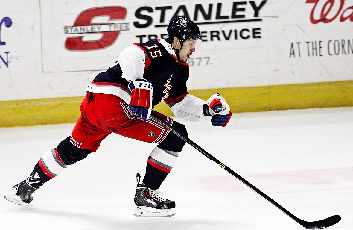
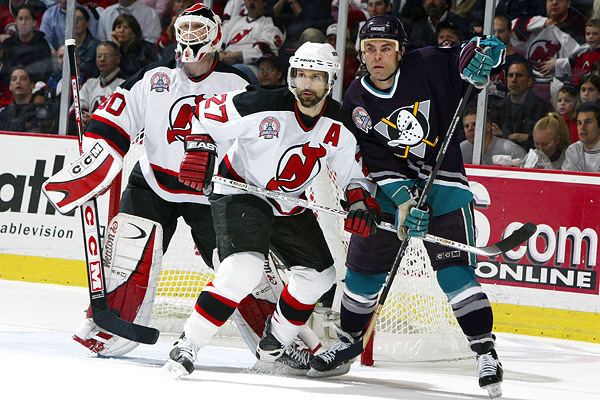
34 minutes ago, chcarlson23 said:
Looking at those photos the Devils old white sweater is actually a little disappointing. It feels like way to much black, when it should be a little more red heavy. I guess that’s why I like the wider stripes on the new set, but the lack of tail stripes is awful. They look like freaking nightshirts on the players…
The red numbers really popped, though
-
5
-
-
32 minutes ago, monkeypower said:
Also before we get too far off the Devils, underrated Stanley Cup Finals jersey matchup.
I miss those Mighty Ducks jerseys so bad
And for what it's worth, those Devils uniforms were basically perfect when you think about it. I wouldn't have changed a stitch, not even the weird squared off shoulder yokes. Maybe not the best looking jersey ever but there was absolutely nothing wrong with them, and no way to improve them either. The color balance was perfect. Down to the black fingertips on the gloves. Nobody cares probably but I thought that was a fun quirk. They only changed a few minor things and ended up ruining the whole uniform
-
7
-
 1
1
-
-
7 hours ago, BuckDancer said:
and the panthers drop their current unis with that weird looking car shield emblem for a logo on a half way around the world chest stripe and go back to the leaping cat as their logo as it always should have been
True. We can definitely agree on that. Their RR1.0 would be the basis for their full time home and away uniforms if it was up to me
7 hours ago, BuckDancer said:At least the sens have some sort of historical grounds of wearing something like that, as dated as it may be, unlike the panthers and their current inferior look.
Nah, the current Senators are an expansion team from the 90s. They can claim those 1900s Stanley Cups all they want, it's not the same franchise. I've never liked any of the =O= stuff anyway. It's fun as an outdoors game jersey worn once every 5 years but definitely not as their full time look imo
-
2
-
 1
1
-
 1
1
-
-
5 hours ago, Bmac said:
The Sens could definitely pursue something closer to an old time hockey club aesthetic with hints of the current identity. According to Icethetics, this idea was at last explored:
That kinda really looks like a Panthers jersey. Hard pass
-
1
-
 4
4
-
1
-
-
19 hours ago, JerseyJimmy said:
speaking of the Leafs, here's one for ya: I like this logo
This one always looked like MTL to me lol
-
5
-
-
6 hours ago, Ark said:
This logo is very overrated sorryThis. It's just a soulless, Disney XD-ified version of the original
-
3
-
3
-
1
-
7
-
-
Honestly I don't even hate gray as the base color for an away set but if any team could pull off that gimmick (with perhaps even a charcoal home set?) it's Hamilton, not BC
I would have preferred an orange-heavy uniform but oh well. Still a major improvement over their previous set


/cdn.vox-cdn.com/uploads/chorus_asset/file/13178915/56136552.jpg.jpg)
/cdn.vox-cdn.com/uploads/chorus_image/image/61840537/246893.jpg.0.jpg)


 - An intertwined TML in blue, white, and silver SportsLogos.Net")
2023-24 NHL Jersey Changes
in Sports Logo News
Posted
FTFY