


DeluxeGraphicSupply
-
Posts
65 -
Joined
-
Last visited
-
Days Won
1
Posts posted by DeluxeGraphicSupply
-
-
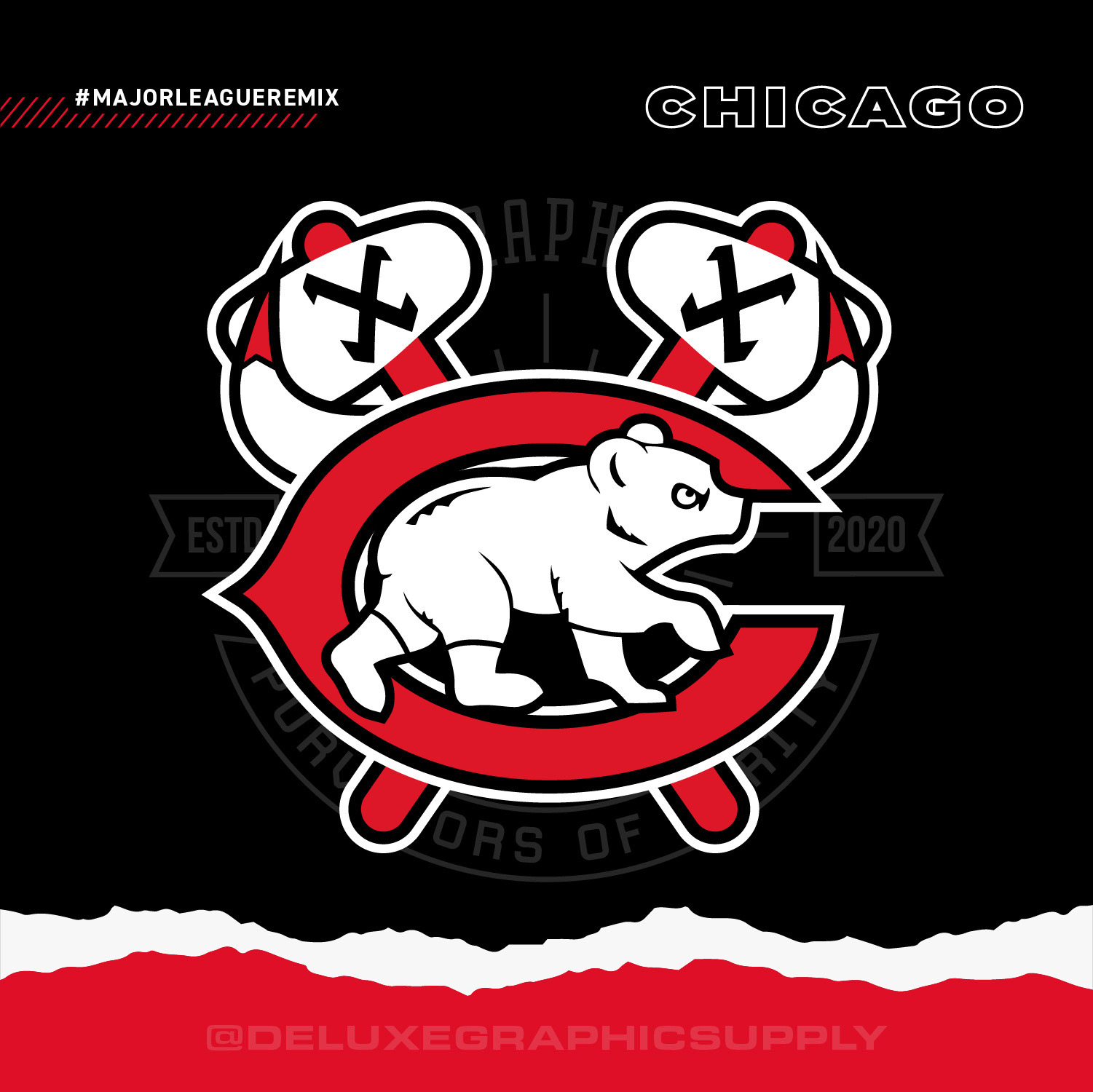
Felt very inspired and found new motivation to complete the Chicago version.
The original project started with a Chicago logo mashup but I did it in a way that was more artistic, changing the elements drastically (the feathers are a different shape, the face of the bear is different, I added the hat).
In this new version, I follow more strictly the theme I had with the other cities: Only used elements from the logos, using alternate logos if necessary. Elements have only been slightly modified to fit the mold of the rest of the logo (take note of the X's from the Sox logo). Most important of all: I have both the White Sox and Cubs coexisting in harmony!

Chicago Bears x Cubs x Bulls x Blackhawks x White Sox
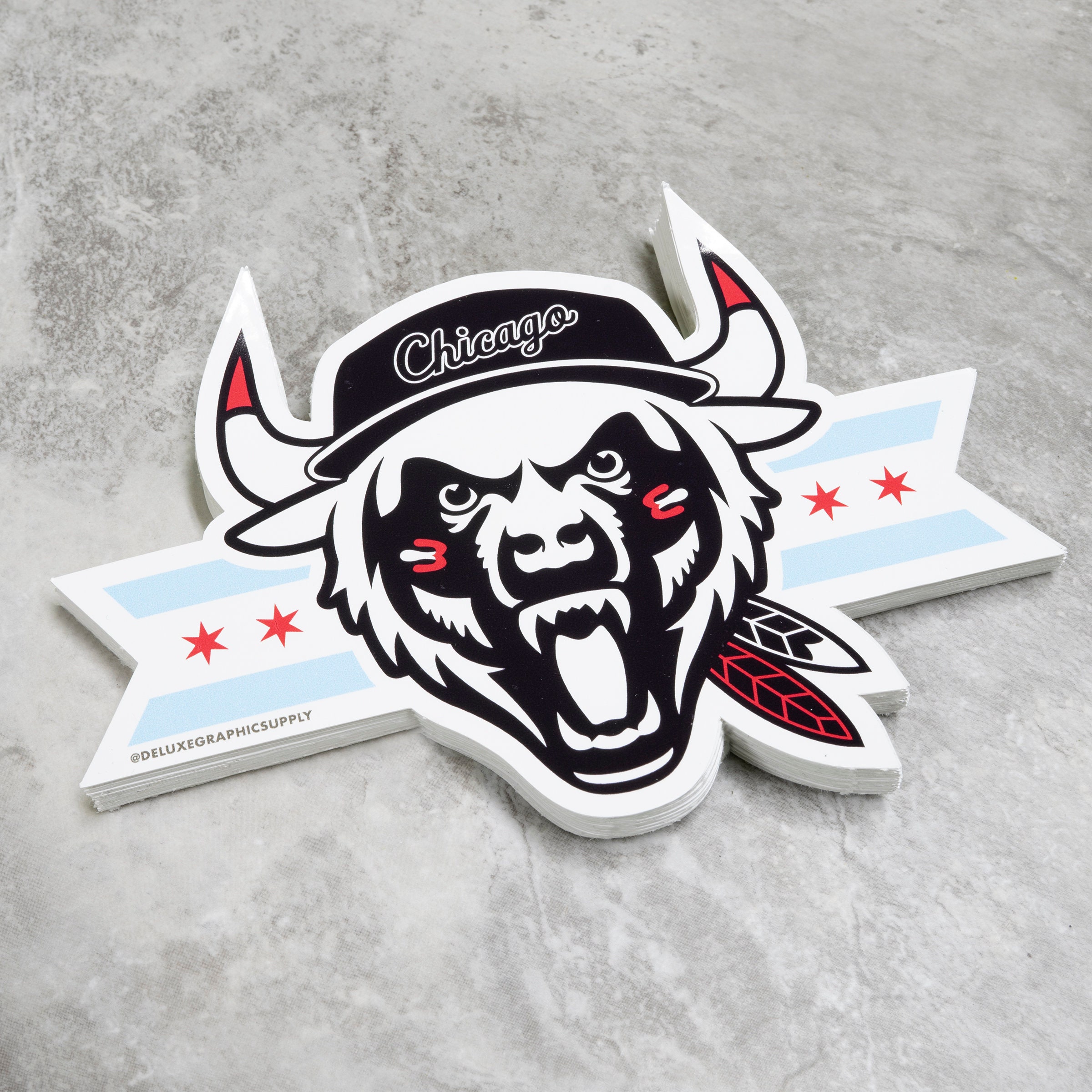
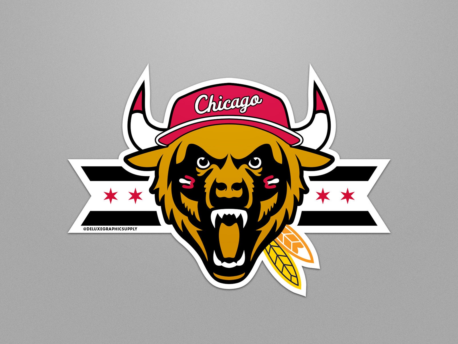
for reference, here is the original version (along with some color alts):
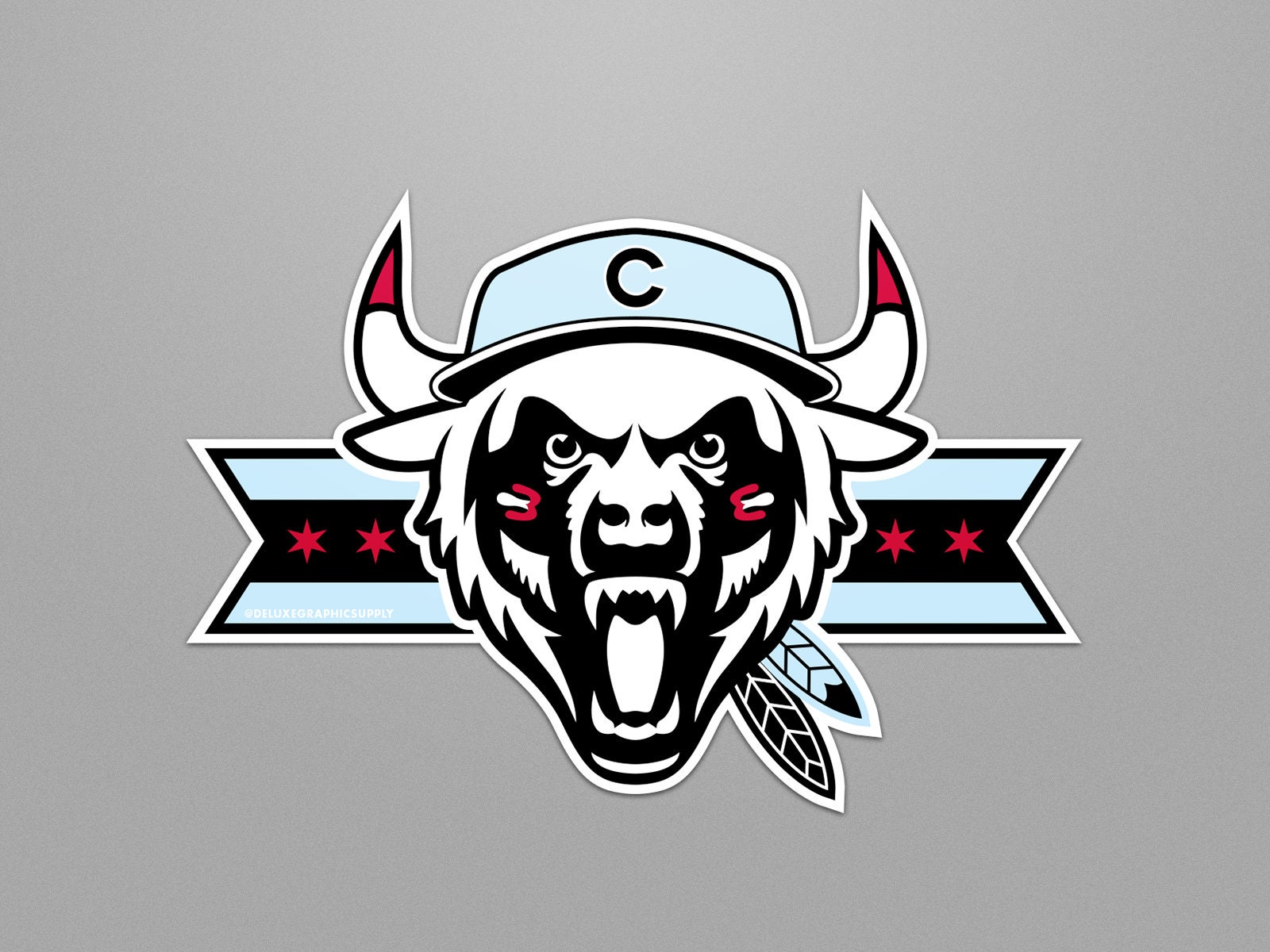
Also, for :censored:s and giggles: here is my original original version that I started off with back in like 2013! 10 years in the making, its really hard to believe
-
 1
1
-
-
I came by to bless the thread with a new logo! A little late but better late than never! Now that Washington has finally adopted their new name and logo and even played a season, I wanted to tackle the sports logo mashup.
Washington Wizards x Capitals x Nationals x Commanders
Now that all my logos have been complete I am open to some suggestions on what to do next!!
Here are the cities with at least 2 teams that have not been done yet:
- Columbus (Blue Jackets/Crew)
- Montreal (Canadiens/Impact)
- Orlando (Magic/FC)
- Portland (Blazers/Timbers)
- Utah (Jazz/Real Salt Lake)
- Vancouver (Canucks/Whitecaps)
-
 2
2
-
The shape of the head seems wonky.
When it comes to sports logos I think of one thing: does it intimidate? or at the very least does it evoke maturity/seriousness/royalty (or other feelings of positivity and respect)Look you want constructive feedback, don't make the logo a laughing stock.
What is my suggestion then? Go in a different direction altogether. Why reinvent the wheel? Make a hovercraft! Mimicking a design that has worked in the past won't necessarily bring success. It's always the ones who push the envelope that get people excited- kind of like when the White Sox upgraded their logo decades ago and never looked back. This is especially true when there isn't anything inherently wrong with the current Cardinals logo.
Keep on designin'-
3
-
-
Hey everyone, just checking back in after some time. I hadn't really revisited this project as I completed almost all of the logos - all the major ones anyway. I'm disappointed to see that a lot of the images are no longer linked or don't load properly.
I am planning to create the Washington logo now that the Washington Commanders have selected their name. I will share this logo along with a collage of all the logos once I get to them.
Other than that I am proud to announce that all of my logos are now available as stickers! Please check them out if interested. I am still open to suggestions or custom color combinations. I own my own oversized sticker printer so the sky is the limit. I will possibly make shirts as well! Here is the link to my Etsy shop: DeluxeGraphicSupply | EtsyIf anyone is interested in helping me promote my designs in your respective cities, I am open to creating a business connection! deluxegraphicsupply @ gmail.com.
Stay tuned for more -
On 10/9/2021 at 10:51 AM, BenchOnaQUEST said:
I love your mashups!
Much respect for using an element from the past (OG) version of the Clippers team logo! (The current one looks like garbage, and is arguably the worst of all NBA logos, at the moment).
As a die-hard LA Clippers fan, if I may provide some constructive feedback: in the Clippers x Ducks x Chargers mashup - the Clippers element looks like 'wings' (the way you have it positioned on both sides). I guess you were looking for symmetry.
I understand that you don't necessarily use the entire design of the logo in the mashup, and at times it can be as little as possible...
However, I believe it takes a while for a fan to identify that the Clippers are actually represented in any way.. Just my $0.02.
Anyway, love the project!
I appreciate the feedback, especially from a true fan of the teams. I wholeheartedly agree with your suggestions, the reality is that the Clippers don't have a very strong brand and the elements I can choose from are very limiting. I contemplated using the San Diego Clipper 'sails' logo as well but just felt like it was thrown on there rather than worked into the design. My rule is to try to not incorporate any sort of ball into the design - so this limits me even further. I can continue to make a few other versions of it and hopefully one clicks!
-
New Orleans Saints x Pelicans
-
6
-
-
Colorado Rockies x Avalanche x Denver Nuggets x Broncos
-
4
-
-
Purple Rain Edition - Colors Sampled Directly From Prince's 1984 Film/Soundtrack Cover
-
6
-
-
Cincinnati FC x Reds x Bengals
-
3
-
-
10 hours ago, ChiCity95 said:
Do you think you can post the 2D versions of your Chicago mashups? I know you have 3D versions already posted, but I want to see what they look like in 2D with a background.
Sure, although I am actually working on a new version of the Chicago logo- reason being this particular version includes elements that were completely made up and not part of any other logo (the hat, the fur on the sides of the head). Nothing that I make will probably top that logo as I had been thinking about that design for years before I finally decided on it but for the sake of sticking to the theme of this series, I will have to create a new one and possibly a version with both baseball clubs. I will add the OG Chicago Beast at the end of the series though as well.
-
1
-
-
On 8/13/2021 at 9:54 PM, GoCubsGo said:
I’m in love with it! Looks amazing and you found a good way to get the twins in there without making it obvious!
Yes! it was tough to do, as I do with every logo, I try not to make it about the team but rather the city. Twin's text logo would not work and the twins just felt like it would take too much space/focus and wouldn't work as well with the other elements. The bridge is significant as the Twin cities are divided by a river!
-
On 8/13/2021 at 1:26 AM, Silence of the Rams said:
What no Purple Rain version
 . In all seriousness this is clever
You know what, great idea! I was beginning to think to myself that I haven't created an alt color scheme version for any logo since Miami Vice. I will do that! and thank you!
-
1
-
-
Minnesota Vikings x Wild x Timberwolves x Twins
-
13
-
-
Buffalo Bills x Sabres
-
3
-
-
1 hour ago, LA Fakers+ LA Snippers said:
Wow, you included the Guardians who just released their logos last week.
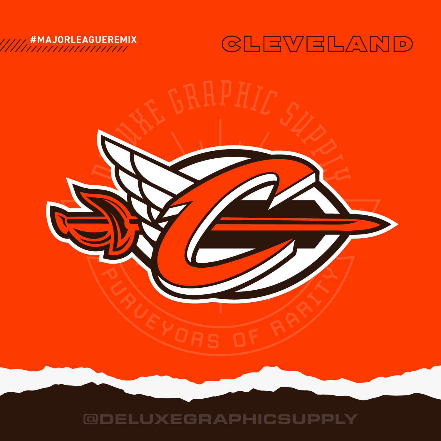
I can’t imagine having to rearrange the whole thing because the Indians changed their name.Haha that is correct. Their logo has not been released in vector form yet so I had to carefully retrace it. And no, I intentionally left Cleveland towards the end, knowing they may change their logo. I bumped it up to this week to be closer to the announcement they just made. Now I only face a dilemma with the Washington Football Team as they will likely not announce the new logo until next year.
So the only logos I have left are Buffalo, Minnesota, New Orleans, Denver, Cincinnati, and Washington. I'll have a long gap of time between the release of Cincinnati and Washington as I have been completing one a week (since February)-
3
-
-
Cleveland Guardians x Cleveland Cavaliers x Cleveland Browns
-
5
-
 1
1
-
-
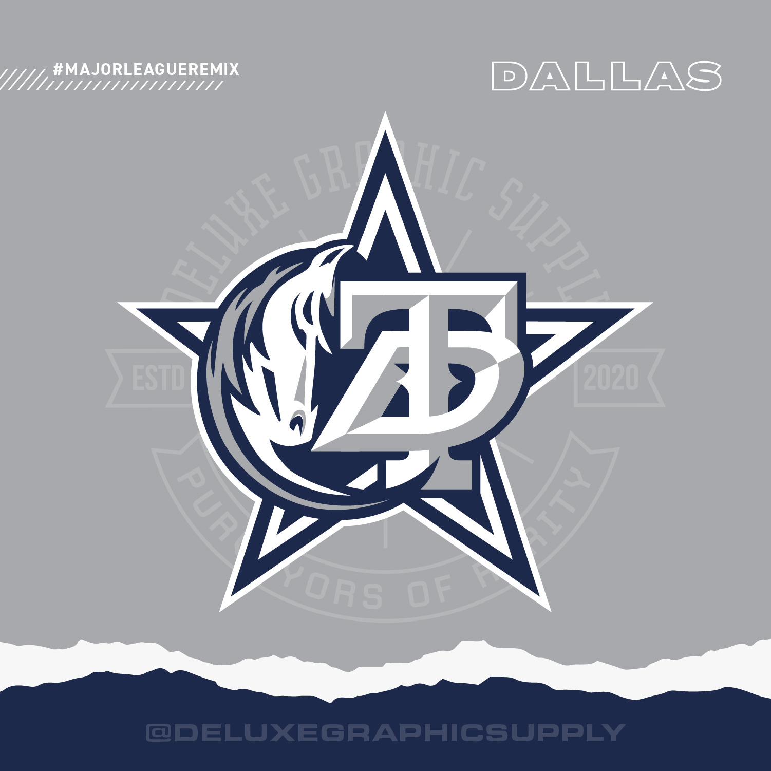
Dallas Cowboys x Mavericks x Stars x Texas Rangers
-
9
-
-
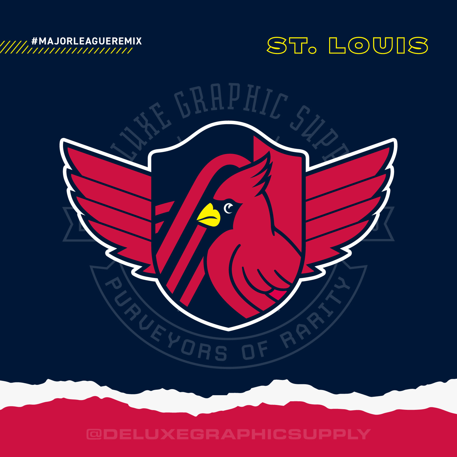
I also just realized this week that the Atlanta Thrashers are no longer a team
 . I think it still looks fine with the Thrashers logo incorporated. Thoughts/
-
St. Louis City SC x Cardinals x Blues
-
6
-
-
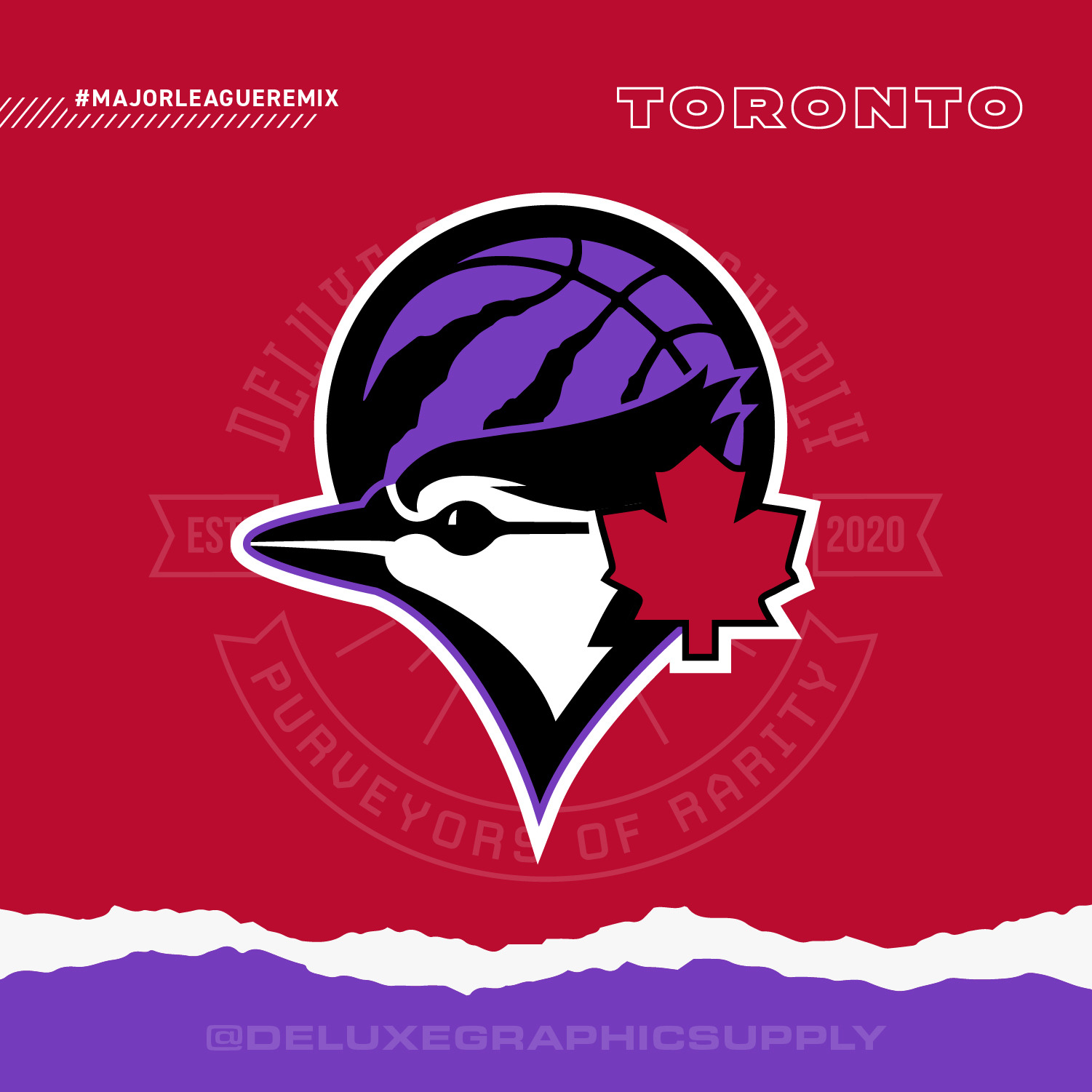
On 7/9/2021 at 2:52 PM, LA Fakers+ LA Snippers said:
It’d be better if you kept the design the same and just made it all blue and white.
So I am just on the fence about it as everyone else. I believe the red. white and blue has been overdone so many times and is more closely related to the US flag so whenever a team has a unique color to them, I try to use that. With that said, I went with the purple since its a huge part of the Raptor's identity history and they brought it back for this season with their special edition jerseys. A solution would definitely be to just make it blue and white, perhaps also keeping the black. Afterall, blue is the color of 2/3 of the logos used so it should take priority. Once I am done with all of the logos, I will be going back to make revisions. I will also try the current Toronto Maple Leafs logo, but as I mentioned in an earlier comment, I don't necessarily pick the current logo, only the one that helps make the overall design seem more sound, this current leaf happened to fit perfectly in that spot but I will try it out anyway.
-
Toronto Raptors x Blue Jays x Maple Leafs
-
3
-
-
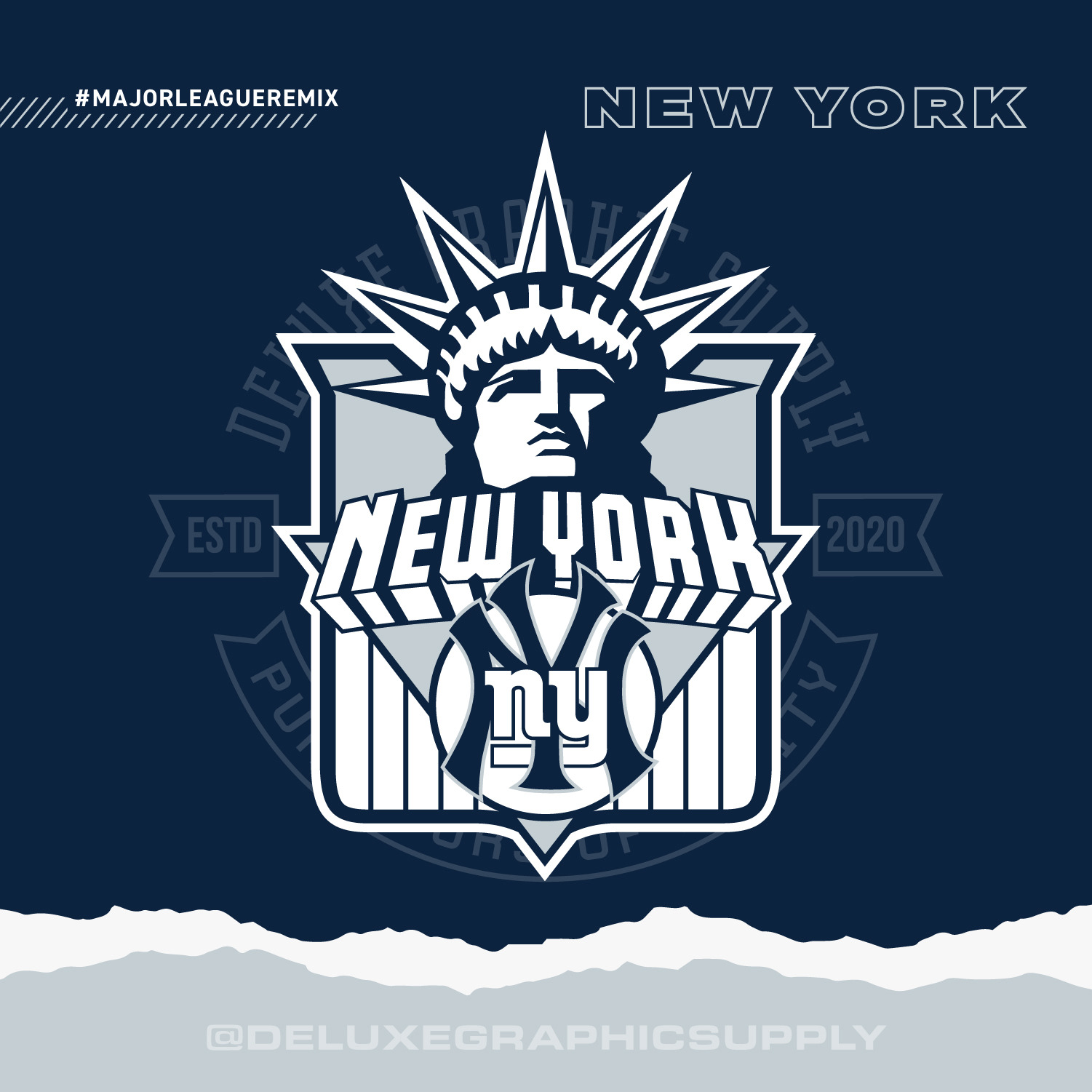
New York Yankees x Knicks x Giants x Rangers
-
3
-
 1
1
-
-
18 hours ago, Silence of the Rams said:
Very Very Clever
Thanks!!

-
9 hours ago, jgamarra2511 said:
Born and raised from Anaheim/OC, I can declare that we NEVER associate ourselves as “Los Angeles”. And even people from LA can agree that the two areas are completely different! Keep the concept as JUST the 2 Anaheim teams (Angels & Ducks) and I’m totally sold!
Fair enough, I do appreciate feedback especially from someone in the region - I hadn't received any feedback on my decisions to split all the southern California teams down the middle with 1 of each sport prior to me creating it, I did think my reasoning had some merit (Clips and Chargers have origins in San Diego, way south of LA and of course Anaheim is also south of LA, although the Angels used to play in LA and still have LA in their name - so perhaps I can rename it to SoCal? do you think that would be a little more appropriate (this way they stay together but aren't associated with LA. I get it, I'm from Illinois, and a lot of southern Illinoisans hate getting lumped in with Chicagoans).
I may eventually make an LA-Anaheim one with ALL teams together but that would be a monumental task haha. otherwise, the other option would be a 6 team logo for LA and a 2 team logo for Anaheim - not very balanced but then again they do get treated as separate cities. Anaheim folks must also have a favorite California football and basketball team I would imagine? Definitely a tricky one
-
1
-


All City Sports Logos Combined - NFL MLB NBA NHL Mashup Design - Pro Teams Put Together
in Concepts
Posted
Wow I don't know how I missed that news but you're right, they are moving.
Looks like I gotta update Vegas! I will wait until we see if they end up updating their logo.
I will likely keep the Oakland/Bay Area logos the same with the Elephant.