


YELDARBfield
-
Posts
1,138 -
Joined
-
Last visited
Posts posted by YELDARBfield
-
-
Looks like WB will use the "100" as a window into these stories. "Brand New" article LINK with more examples

-
 1
1
-
-
4 hours ago, Digby said:
Ah yes, Johnny Cash, such an important figure in the history of Nashville soccer
Could always be worse. If I were an NSC fan, I would take this 1,000,000 times over a Florida-Georgia Line collab.
-
5
-
 2
2
-
-
16 hours ago, spartacat_12 said:
I mean FIFA is one of the greediest, most corrupt organizations in sports, and even they see value in keeping the World Cup kits ad-free.
I'd bet they do that to keep their FIFA-level sponsors happy. Would hate to piss off Coca-Cola and their massive check by letting Pepsi sponsor the French kit.
-
2
-
-
14 hours ago, Ferdinand Cesarano said:
The inexorable increase in franchise values began long before uniform ads. Jeff Smulyan of Emmis bought the Mariners in the late 1980s. He lost a ton of money for several years, and then made it all back — in vast multiples — when he sold the team to Nintendo, which itself eventually sold the team for more than five times what it had paid for it. Smulyan liked his experience so much that he wanted to go around again, staging an ultimately unsuccessful bid to buy the Nationals.
Broadcast rights fees alone are enough to power the rise in franchise valuations for the forseeable future. And, for as long as that is the case, losing money in these top leagues is actually impossible.
QuotePlus, in order for a franchise's value to matter, the owner looking to realize that value would need to sell the franchise.
That is no obstacle. There are many, many super-wealthy people who would be willing to buy any of the teams in the big five leagues. This applies even to MLS, the smallest of the top leagues, the one that has arrived most recently to that stature, and a league in which the teams are not even independent entities. People sometimes claim that MLS is some kind of Ponzi scheme; but the truth is that the league turns away more suitors than it accepts.
This is all well and good, but one cannot run a business by just buying and selling it. You have to have liquid money to pay your people, make capital improvements, and so forth, a point that you omitted and ignored from my previous post.
-
1
-
-
12 hours ago, Ferdinand Cesarano said:
But for the NBA and Major League Baseball and the NHL and even MLS, in which losing money is literally impossible due to the constant increase of franchise values, uniform ads are nothing other than pure vile excess, worthy of unqualified condemnation.
Your post is generally true, but this part is tenuous. Losing money is difficult at the major league level of pro sports but not impossible. And relying on "increasing franchise values" as the reason why teams shouldn't sell a type of advertisement ignores the reason why a franchise's value increases. The ability for a team to sell a sponsorship worth millions of dollars is one of the things that makes the value rise.
Plus, in order for a franchise's value to matter, the owner looking to realize that value would need to sell the franchise. "Value" is not liquid; cash from sponsors, broadcast partners, ticket & merch revenue, et cetera is.
That said, I do agree that uniform ads are excessive, especially for the Yankees of the sports world who are historically and continually valuable and not as likely to sell large portions of stake in the team. But the horse is out of the barn. Professional sports as a whole is excessive.
-
1
-
 1
1
-
-
19 hours ago, GDAWG said:
It's a solid helmet, but another missed opportunity to bring back (some version of) the iconic wheel design.
-
4
-
-
2 hours ago, VampyrRabbit said:
That just says the colours will remain blue and green. Says nothing about the shades of the two colours, or the numbers of shades. Just that the Sounders will still have blue and green as their main colours.
Correct. "EBFG" is how the colors are referred to primarily in supporters' chants and such. The official names of the shades are Sounder Blue and Rave Green. Have to assume that the exact shades are on the table.
-
1
-
-
21 minutes ago, Bill0813 said:
Aberdeen ironbirds
[ image ]This was just their theme jersey for 2022. Aberdeen will wear this logo on a cap in 2023:
Not sure what their jersey will look like. Some teams have released jerseys, while others are waiting.
-
58 minutes ago, Dilbert said:
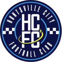
Nashville SCs MLS Next Pro club joining next season will be playing in Huntsville, Alabama. Huntsville City FC has been unveiled.
The font NSC uses is still so bad at smaller sizes, and this is further proof. Team name is nearly illegible, and it's not even used for the main (redundant) initials.
Plus, the colors and four-pointed star is giving LA Galaxy. Circle and checkers reminds of the last Columbus crest.
Still cool that Huntsville is able to repurpose the old Joe, though!
-
1
-
-
1 hour ago, DG_ThenNowForever said:
Stadium deal for what? Since when do the Titans need a new stadium?
According to ESPN, reno for Nissan Stadium would cost $1.8B over 17 years in order for its condition to be "kept on par with other sports venues built around the same time," a provision it its lease. This new stadium would be $2.2B all at once, and it would open up a promised $500M from the state.
Considering they want to build this between the current stadium and I-24, thus killing their largest parking lot during construction, the transition period would be an absolute mess as far as fan experience goes.
-
2
-
-
(dp, but turned useful)
Grizzlies baby blues are official now:
-
9
-
-
New court in Memphis:
(via The Daily Memphian's report on new SRO tickets at FedExForum)
I think I preferred the old wraparound apron stripe look from the past few years more, but this is solid. Definitely like the more full wordmark look on the baselines, too.
-
5
-
 1
1
-
-
On 7/9/2022 at 10:55 PM, chcarlson23 said:
They seemed all but ready to ditch the yellow too with the navy, black, and white alternate, alongside the “revealed” (idk the full story on it) matching white version.
I’m so glad they turned it around and emphasized the yellow instead…
Long story short, then-Chairman David Freeman was big on the darker look and pushed for the checkered alt + exploratory white jersey. Before he could pull the trigger on the full-time rebrand, Herb Fritch and Tom Cigarran (among other owners) took control of the board and went gold.
Going gold was the right move, IMO. Though I wouldn't mind a Reverse Retro version of that navy & black alt.
-
Lowkey love the Apple TV+ baseball graphics, even if they are aggressively simple and Apple-like:
(Pardon the UI shadow on the second shot.)
I do wish they had placed the base diagram between the teams and put their logo in the top-right corner or something. And I didn't get a shot of it, but there's always a plain white text stat, usually live "Reach Base Probability," in the lower-right.
-
4
-
-
On 3/11/2022 at 12:31 PM, Est1980 said:
Next badge shouldn't use black outlining or lettering. Just stick to team colors and they should be alright.
Agreed in principle, but that would likely involve darkening the blue to navy for contrast.
-
Just a quick note re: the Stadium Series game. Noticed something interesting at the pregame tailgate:
Looks like there was an attempt to make at least the sleeve numbers look "distressed" like wood type print. Didn't get a shot of the back of this inflatable, but it may be safe to assume those numerals would've looked the same.
I'm really curious though, would adidas accomplished this effect with something other than tackle twill?
---
New SCF logo looks awesome. Can't wait to see the full package!
-
5 hours ago, fbjim said:
For some reason college basketball (and basketball generally) has been bucking a trend toward smaller graphics and going more and more gigantic. I don't get it...
I assumed this trend is the networks' attempt to make their identifying graphics "easier to read" in mobile video applications, whether it's for live streaming or social media consumption.
This is the same reason why the current NFL bug on FOX (and Marquee's initial scorebug for Cubs games) is centered horizontally -- so people can still see it and get proper context when a highlight is cropped square on Instagram.
-
3
-
-
Starting to really appreciate the Bally Sports double-wide scorebar-ticker-chyron:
-
5
-
-
35 minutes ago, IceCap said:
That's part of the problem. Sports design these days is all about jerking off over how many "references" you can fit in.
Yeah, sure, a building in the Dallas skyline has green lights and the jersey is black and neon green.
It still looks bad though. Design has lost the plot. It used to be "what looks good?"
Now that comes secondary to "what's the reference?"
Not everything has to mean something and not everything that means something is good by virtue of meaning something.
Post of the Year, IMO.
Breaks down most NBA one-year jerseys, the SmAsHViLLe sweaters, etc. perfectly. It'd be different if these looks were independently attractive. These designs don't exist in a vacuum, but whoever is making the design decisions can't assume that everyone who sees a jersey "gets" every reference.
-
7
-
-
The Memphis Grizzlies retired #50 for Zach Randolph tonight, and the banner looks like a platinum record:
I can't find a photo online, but this actually matches the FedExForum suite (and office?) signage, which looks like a little gold record at each door.
-
3
-
-
1 hour ago, Digby said:
OTOH, locals are more likely to see the connection (and, if they have taste, think this application of it sucks)...
From what I've seen from folks in Nashville, this is exactly right. And it doesn't help that actual locals see this as a continuation of the city of Nashville's tourist/interloper look and culture. The local reaction has been similar and compared to the "Predal Tavern" disaster from early 2019-20.
-
18 minutes ago, Digby said:
Has the team acknowledged the Hatch Show Print influence formally? That's the kind of obscure local reference detail to make the NBA City Edition proud. Can't blame Nike for this one!
THIS THIS THIS
As @andrewharrington said, Hatch Show Print is within spitting distance of Bridgestone Arena. And yet for whatever reason, the Predators did not reveal the sweater at HSP or mention them by name in any press/social release. They didn't even use a country track for the initial unveiling video! It's like if the Nets had released their City Editions last season without mentioning Basquiat, or the Sounders not playing any Hendrix when they revealed their purple kit.
QuoteShould've screenprinted the jersey then, the effect is lost with the medium.
Correct. The effect looks okay on the "PrEDs" collar mark, but it does not translate to a cut-and-sewn crest. HSP style is more than just goofy font. They overlay colors (like that Ringo poster), always look somewhat distressed due to the wood blocks, and they very, very, VERY rarely print on a primarily dark background like navy blue. The Preds have the perfect base in their gold for a HSP-inspired sweater, and they decide now is the time to attempt the navy jersey a large number of fans have wanted as a regular alt for a decade.
Would've been better off sublimating HSP-style words and graphics into the gold stripe and doing a two-color tiger head or guitar pick for the crest. This solid color block approach just does not translate at all.
I swear, this freaking team makes it so hard to be a fan sometimes. I'm just glad it doesn't say "SMasH VegAS."
-
6
-
-
On 10/27/2021 at 6:30 PM, panthers_2012 said:
I'm getting strong Savannah Bananas logo vibe
Is it just me?
Not just you. Both marks were made by Dan Simon.
-
Savannah's ECHL team is officially the Ghost Pirates.
-
3
-


MLB 2023 Uniform/Logo Changes
in Sports Logo News
Posted
My understanding is both teams must "contrast" tops and pants, so a road team cannot wear white pants if the home team is wearing white pants.