


YELDARBfield
-
Posts
1,138 -
Joined
-
Last visited
Posts posted by YELDARBfield
-
-
Found this on the /r/baseball post about the new Bally bug:

Can't even see the score when MLB Network takes the regional feed. It's all just *chef's kiss.*
-
 4
4
-
-
As far as the in-game GFX go, agreed to all of the above. Freaking Sinclair at it again.
I don't mind the motion graphics in general. It's clean with a bit of shine. But that scorebug/ticker thing is an abomination. The only thing they got right was making the score and clock so big and prominent.
-
1
-
-
Dark color hockey sweaters with white shoulder yokes look stupid. I want to like the Captials' new alternate, the Avs' navy "Rockies" set, or even the Lightning's original and RR sweaters, but I can't get over the color imbalance that my mind sees.
IMO, the only good "dark" jersey with white shoulders is the Pens' 2008 WC sweater, and that's only because its base is such a light blue. The difference in value isn't as stark as the examples given above.
-
1
-
-
2 hours ago, RyanMcD29 said:
This might be another hint towards what's to come on Sunday, too
[video removed]
There is way to much going on here, IMO:
Paint streaks, realistic beveled "plastic" renderings, outline mode logos on flat team colors, rotating cubes, and team name the plainest sans font possible. Feels like an El Camino swerving across six lanes of traffic, stylistically speaking.
-
5
-
-
4 hours ago, AstroBull21 said:
I think we mightve seen a teaser of the "remastered" Nashville Sounds set to be released later today. This video of the Titans showing support was on Twitter today with what I assume might be a new hat:
https://twitter.com/nashvillesounds/status/1063133530560098306
Correct. That hat & logo were showed off by a local sports radio station on Tuesday:
-
1 hour ago, AstroBull21 said:
Yellow probably
47 minutes ago, Still MIGHTY said:And yeah, if they ever do it, it'd be gold.
The ACTUAL Conference Champs banner is already gold. If they're going to continue the different colors for different banners route, then they've run out of colors.
My solution w/o redoing every banner:
WHITE - Division
NAVY - Presidents' Trophy
GOLD - Western Conference
SILVER (shimmer fabric!) - Stanley Cup
-
1 hour ago, AstroBull21 said:
Is it gray? I thought it was white...
It's definitely grey:
Which makes me wonder, what color would an eventual Stanley Cup banner be?
-
1 hour ago, Still MIGHTY said:
Regular Season Western Conference Champion Nashville Predators.
I'm a Preds fan, but this is ridiculous, borderline embarrassing.
IMO, the only acceptable banners are:
- Stanley Cup
- Conference (PLAYOFF) Champs
- Presidents' Trophy
- Retired #'s
Put all of the Division titles on one banner. Anything else is superfluous.
Other than the weird and unnecessary grey banner, these do look good.
-
4
-
-
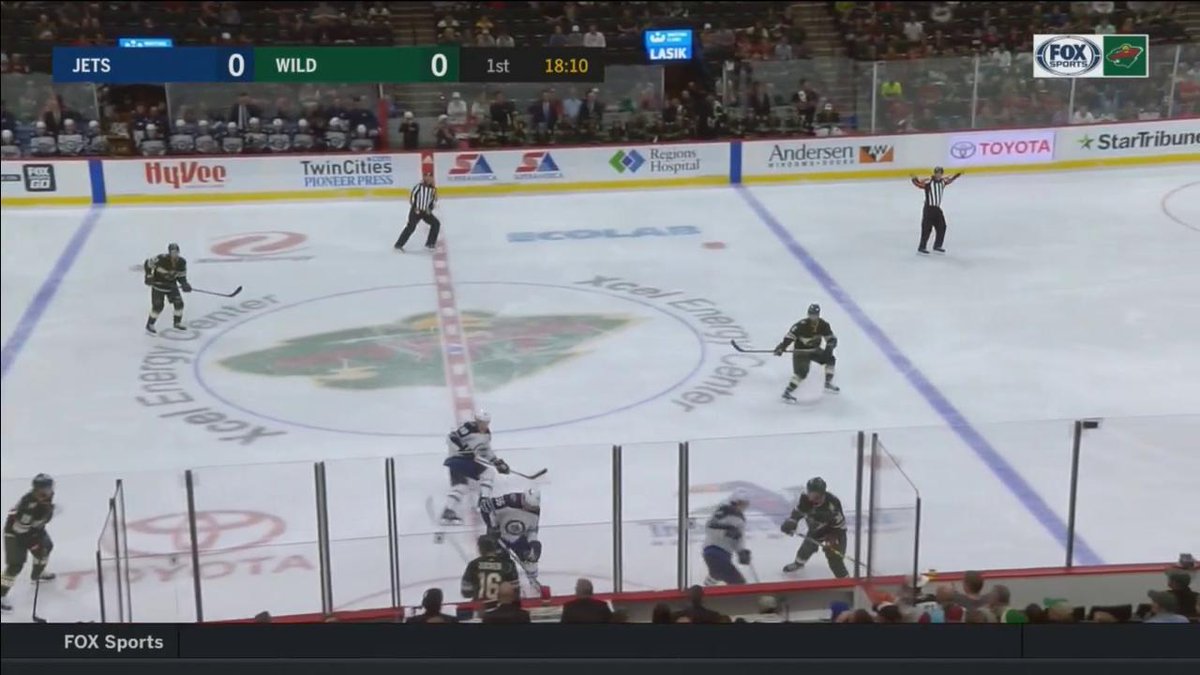
On 10/4/2017 at 12:43 PM, CreamSoda said:
Last time I saw the new Fox bug, they were keeping track of shots for both teams the whole game. In a large grey box beneath the score. Way too big and completely unnecessary.
The Preds' broadcast has been using the shot counter tonight, and it nearly doubles the height of the graphic. Not a fan.
Also saw this setup while they ran an (enormous) ad for Chevy. I much prefer this smaller box with just the abbreviations. Pardon the crappy photo.

EDIT: So when there's a 4-on-4 situation, the bar gets LONGER, putting that info and clock to the right of the game clock. Ridiculous. Love all the supporting graphics (bumper scores, player comparisons, lower thirds) but the hockey score bar is just ham-fisted.
-
6 hours ago, buzzcut said:
The transition to hockey sucks.
That's not great... Any clue how the PP display looks?
-
Looks like the new Fox look will be used in regional basketball broadcasts.
Really interested to see how it transitions to hockey, normally a box bug in the upper-left corner.
-
On 8/8/2017 at 1:24 PM, Bradbury said:
Considering this team is (at least part-)owned by the same folks behind the Savanna Bananas, I think we know the winner already.
On 8/9/2017 at 8:01 AM, raysox said:I've said Macon Bacon would be my minor league team name for years, think that's grounds to sue?
@raysox, you might be able to sue for a hat?
-
1
-
-
23 minutes ago, Ark said:
People think Nashville's new uniforms are terrible, apparently because there is too much gold or not enough blue.

I love them, there is just enough gold.
It's less about the proportion of the colors and more about distribution. Nearly all of the navy is on the cuffs and hem, which makes the sweater itself (AKA, the piece that sells) look super plain. Move that blue on the elbow or shoulders, and it would look more interesting.
Agreed that the full uniform looks good with "just enough gold."
-
1 hour ago, Brian in Boston said:
Baseball is returning to Luther Williams Field in Macon, Georgia. Specifically, a summer collegiate outfit in the Coastal Plain League. The team has unveiled the five finalists in its "Name the Team" contest. They are:
Macon Bacon
Macon Heat
Macon Hits
Macon Noise
Macon Soul
Frankly, based upon these candidates, I'm of the mind that they should have simply resurrected the Macon Peaches name sported by teams in the South Atlantic League, Southern Association, Southern League, and Southeastern League for 42-and-a-half seasons.
As of now, only the Macon Bacon moniker has been registered with the United States Patent and Trademark Office.
You can provide the team with feedback about the team name finalists at http://www.maconbaseball2018.comConsidering this team is (at least part-)owned by the same folks behind the Savanna Bananas, I think we know the winner already.
-
3
-
-
18 hours ago, Xamboni said:
Ignore my Canadian ignorance, but does Tennessee have a lot of oil?
Not to my knowledge.
12 hours ago, Ark said:How many grizzly bears are there in Memphis?
IIRC, the Memphis Zoo has three in residence, along with two pandas and some polar bears. Apparently, black bears used to roam the Mid-South, and the story of Teddy Roosevelt refusing to shoot a baby black bear reportedly happened in North Mississippi.
7 hours ago, Bobster said:According to the documentary known as 'The Beverly Hillbillies', yes!
The Clampett family was originally from the Ozarks, so Northern Arkansas and into Western Missouri. The original truck from the "documentary" lives at the College of the Ozarks in Branson.
-
10 hours ago, Ark said:
The Tennesse Titans should still be the Tennessee Oilers
The Titans is a very generic identity. The Oilers is classic in every way. The Lakers did the right thing by keeping that name when they moved to LA.
I wouldn't necessarily call "Titans" generic in this context. Nashville has long been called the "Athens of the South," and has been home to a full-scale replica of the Parthenon since 1897. Plus the alliteration is nice.
However, I probably would've been fine with keeping "Oilers."
-
1
-
-
As long as North American leagues don't get as crazy as European hockey leagues for example, I'm totally okay with jersey sponsors. The NBA's approach looks fine and fairly unimposing so far. Yes, some sponsor logos could work better with the teams' looks, but they still look better than the WNBA. Same goes for the NHL if they eventually add jersey sponsors. If they stay roughly the same size as a commemorative or captain's patch, I'm fine with it. Just don't slap a billboard below the crest or under the back number.
Same goes for the New Era logo on MLB hats. It doesn't offend me. Let the manufacturer get their due.
-
3
-
-
Two developments in the SPHL today. First, the Columbus Cottonmouths are suspending operations for 2017-18. The statement says, "the league is in the final stages of securing new ownership," and plans for that franchise to make a comeback for 2018-19.
Second, the Fayetteville FireAntz announced a press conference for next Friday, May 12. New ownership + half-price merchandise = likely refresh of a look in dire need of one.
-
6 hours ago, buzzcut said:
The Norfolk Admirals are hinting at a new affiliation to be announced next week. They may also be plotting a return to the AHL. Stay tuned.
Their release says they are announcing new NHL and AHL affiliations, and they squashed the notion of moving up twice on Twitter. They've also already announced their home schedule for the ECHL season. They aren't leaving the 'Coast anytime soon.
However, they have been using a logo progression graphic everywhere with '?' over '2017.' Their site also has no logo in the header. My money is on a new/recolored logo to match the new parent club(s).
-
1
-
-
So it appears Lowell is pulling exactly what Vermont did with "Champ" a few seasons ago. That definitely will not be confusing...
-
2 hours ago, ColorWerx said:
Added additional graphics to the project on my site - Memphis Redbirds (PCL): 2017-present
LOVE how they did the roundel. Hadn't seen that mark until now. Frankly, that would be on the jersey sleeves instead of the primary.
-
1
-
-
7 hours ago, DaytonBlue said:
I feel like they are trying to emphasize the "authentically Memphis" image by putting Memphis on the home jersey. Hope the rebrand helps with attendance. As a former Memphian now in St. Louis, I didn't realize how much I'd miss the Redbirds until I moved.
6 hours ago, Gothamite said:That might work just a little better if they didn't have a huge St. Louis logo on the sleeve, the only blotch on an otherwise sterling set.
That and if all of their prior home jerseys didn't say "Memphis" on the front. I recognize that consistency, but that "Redbirds" mark is just too good to ignore.
-
1
-
-
Memphis absolutely nailed it. Literally the only critique I have is that gorgeous "Redbirds" script, with the feathery detail on the 's' tail, is only featured in the primary logo. That beaut deserves to be on the front of a jersey by itself.
-
3
-
-
The Redbirds have since posted two more similar videos: one with the Memphis Blues, the other the Memphis Red Sox (Negro Leagues). So I think jumping to the name change conclusion is a bit premature.
Trinity Baseball Holdings owns the majority share of the Redbirds, as of maybe a year ago. They also own the Charleston Riverdogs, who re-identified via Studio Simon this season. When Memphis refreshed in 2015 (IIRC), the Cardinals owned the team outright and did everything in-house. STL still has some stake in the team, but not enough to go full in-house again.


Sports Graphics Packages, Historically
in Sports Logo General Discussion
Posted
To be fair, this is a function of poor timing by the Ducks' crew rather than the new Bally "look." I saw this type of tombstone graphic used all the time by the Preds on FSTN, but it was always during a timeout and over a bench or fan shot.