


Jungle Jim
-
Posts
1,563 -
Joined
-
Last visited
Posts posted by Jungle Jim
-
-
It's probably been posted here before, but this is the best Bengals concept I have seen:

-
 14
14
-
-
21 hours ago, pianoknight said:
That's a dumb thing to object to. It's a great look, visually, and it's not like Kentucky has some Penn State-level history of tradition with their uniforms.
Oh, I think the main source of the objection is the belief that it's not a great look. I've yet to read an article where a fan or player praised them. Reactions such as these are more typical...
12 hours ago, WSU151 said:This is the same guy who thinks the awkward/bent UK logo is better, right?
Mitch's taste will be pretty awful until they bring back the big block K.
That's right, the UH logo. We also got the "stapler wildcat" logo at the same time. I don't see that used much, which is a good thing.
-
1
-
-
11 hours ago, pianoknight said:
Perhaps an unpopular opinion, but I like the blue and white checkerboard pattern for UK.
They may have stolen it from Tennessee, but when I think of blue and white checkerboard patterns I immediately think of Secretariat, horse racing and the Kentucky Derby.
You are right on both accounts. The checkerboards are an homage to Secretariat, and they seem to be very unpopular among UK fans.
 I referred to them as the "Tennessee checkboards" as sarcasm. AD Mitch Barnhardt has taken a stance that they're not going anywhere and it's not up for discussion, so I guess it's settled for the foreseeable future.
-
2
-
-
Kentucky will wear 13 combinations in 13 games. All will include Tennessee checkerboards. About half of them will look good. All 13 will have looked better without the checkerboards. #StubbornMitchBarnhardt
-
5
-
-
Who wants to go on Twitter and inform Dan Issel he's dealing with counterfeit jerseys? In his defense, he's probably not the one who obtained the jerseys or who is running the promotion, but you'd hope there would be someone in his circle that would recognize these for what they are, and what they are is horrible. Bottom photo posted for comparison.
I was going to nitpick on "Colonel's", but I suppose if one Colonel owns them...
-
These have probably been posted, but it's not practical to search and find out. From 1975 until about 2000, I knew about everything there was to know about the Cincinnati Reds, but I had forgotten that George Foster played for the White Sox. I was aware of Parker's time in Milwaukee, but it still doesn't seem real.
-
1
-
-
Tony Perez in his short stint as Reds manager in 1993

-
2
-
-
I guess I'm the opposite. Like you, I have fond memories of the Redbirds in the 1980s at the old Cardinal Stadium (bad as it was) and these make me nostalgic in a good way. That being said, it would probably have made more sense to go with something closer to Reds colors rather than paying homage to a franchise that left town and that is an affiliate of the Reds main rival.
-
Don't tell me if this is the new logo for the Louisville Bats.

This would meet the definition of change for the sake of change. Not a fan...at all...
-
The name, "Super Bowl."
Its got history now, but it just sounds really corny when you think about it.
Why? It's so super. You know...groovy. It's far-out, man.
-
The current New York Jets is feh. They should bring back the 1980s logo, personally.
Agree, and I'll throw the NY Giants in there, too, along with the Pittsburgh Steelers and the Yankees road jerseys.
-
This Cardinals cap logo (1940-55):

That's not the Cardinals. The cap was from the St. Louis Browns, the ancestor of the current Baltimore Orioles.
That logo is way off-center.
-
Anybody remember the time the Bengals had little tree branches on their shoulders instead of tiger stripes?

-
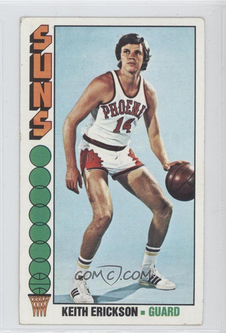
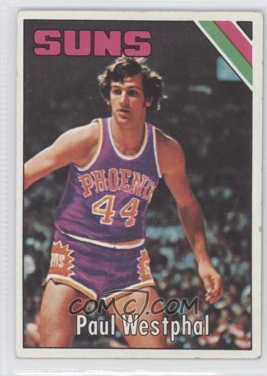
I was Googling earlier this afternoon and found this prototype Phoenix Suns jersey from the early '70s. I am assuming that it was around the time they switched to their famous Western Font style. Does anyone have any info on it?

It also made me interested in finding other prototype jerseys in the Big Four. I am aware of the Nordiques and a Padres jersey from the '90s. Does anyone else have any they want to share here?
The one they actually wore was very close...


NFL Changes 2021
in Sports Logo News
Posted
Oh, I agree. I was referring more to the overall design, but I didn't make that clear. That being said, I wouldn't be repulsed by these in mono black. Monochrome is less offensive with a new design than it is when tried with a classic look like the Bills or Chiefs.