


Echo
-
Posts
481 -
Joined
-
Last visited
-
Days Won
3
Posts posted by Echo
-
-
19 minutes ago, PurpleHayes said:
Lions president Rod Wood says that the team’s forthcoming new unis will be “one of the great uniforms” in the NFL.
Lions president Rod Wood has "one of the great porno names" in the NFL.
-
 4
4
-
 1
1
-
 1
1
-
 12
12
-
-
2 hours ago, TheOatsMustFlow said:
The problem with gradient helmets is the execution…

This just looks like whoever was painting it got distracted halfway through and forgot to finish it.
-
2
-
1
-
-
Salt Lake Sister Wives
-
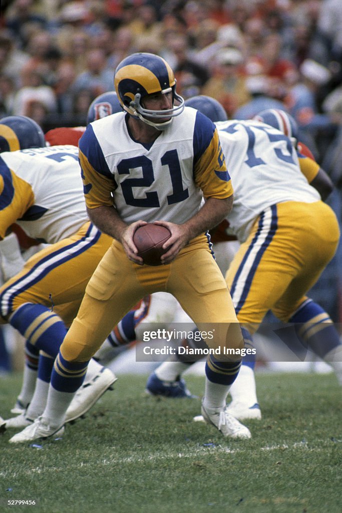
1 hour ago, Silver_Star said:
Quarterback, John Hadl wearing #21
Is he wearing Norm VanBrocklin's old pants? Look how faded they are compared to his linemen.
-
1
-
1
-
-
16 hours ago, JustABallCoach said:
But how many fire emojis would you give them???
-
1
-
-
6 hours ago, M4One said:
Carolina Hurricanes are polling season ticket members about possible new logos. I know some people don't like their current primary, but none of these would be an upgrade.
I...actually don't hate the top right. Might not be strong enough to be a primary crest, but it might make a nice shoulder patch.
-
5 hours ago, M4One said:
3 Canadian legends. Mario Lemieux, Sidney Crosby, and Jaromir Jagr.
Man. Jagr really did play for everyone.
-
4
-
1
-
-
I'm not much of a jersey guy, but I have a pile of hats from teams that I couldn't care less about, I just liked the logo or the colors. Most are either defunct NHL logos (most of which have since been brought back to life) or minor league baseball logos that I thought were cool. I have a couple Whalers caps, hockey Rockies, Canucks skate, Coyotes kachina, Isles fisherman, Golden Seals, the OG Jets, a Thrashers hat which sadly doesn't really fit me too well and a couple more like those. MiLB I have a couple Buffalo Bisons, Albuquerque Isotopes, Rocket City Trash Pandas, Burlington Sock Puppets. Also a couple soccer teams, Portland Timbers, Celtic, Man Utd. I probably have around 50 hats in my current rotation.
-
2
-
-
17 minutes ago, HailGoldPants said:
A few years ago, I too wondered what this would look like, so I threw together a quick mock-up. I felt the same as you though, the powder socks really take away from powder pants:
This wouldn't look bad with gold socks, but knowing they wouldn't be able to resist the siren song of powder blue mono I hope they never do it.
-
9
-
1
-
-
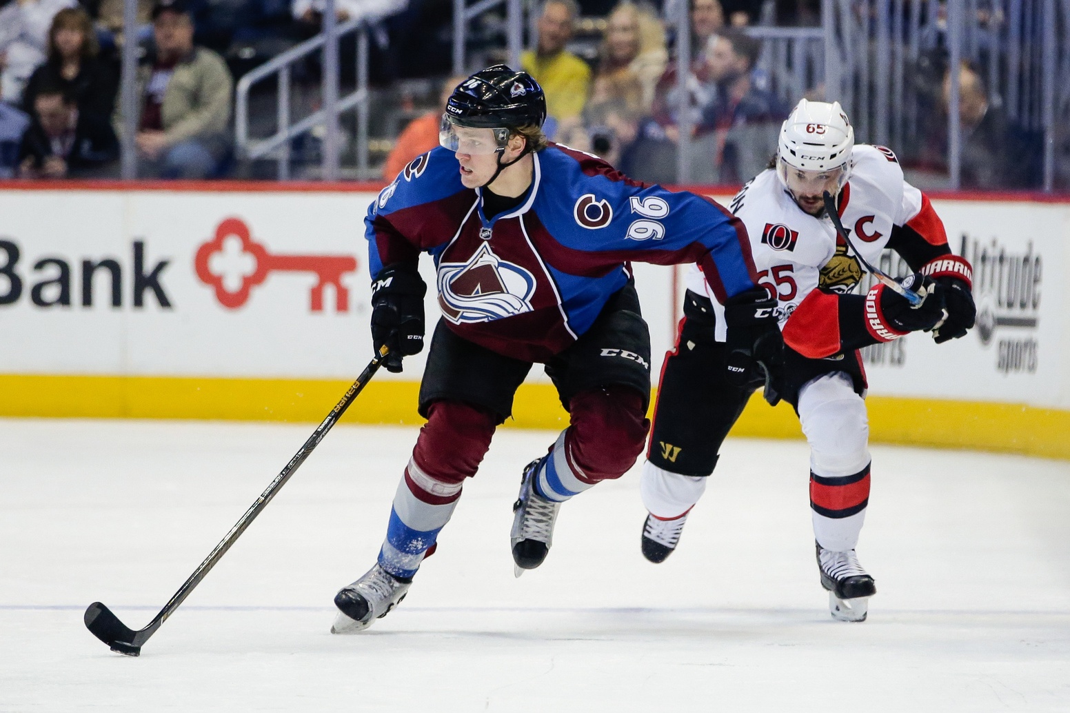
5 minutes ago, ruttep said:
Mikko Rantanen in the Avalanche's 2008-2017 uniform:
That atrocity is everybody's wrong uniform. Actually makes the Sens' Edge mess look decent by comparison.
-
3
-
-
5 hours ago, ruttep said:
They don't, they absolutely love it. That's the problem.
That's the CTE talking.
-
37 minutes ago, burgundy said:
They were unveiled with both pairs of white pants available.
Even with the white pants Elway doesn't look too happy there. He's got kind of a "maybe I should have signed with the Colts" look about him.
-
1
-
4
-
-
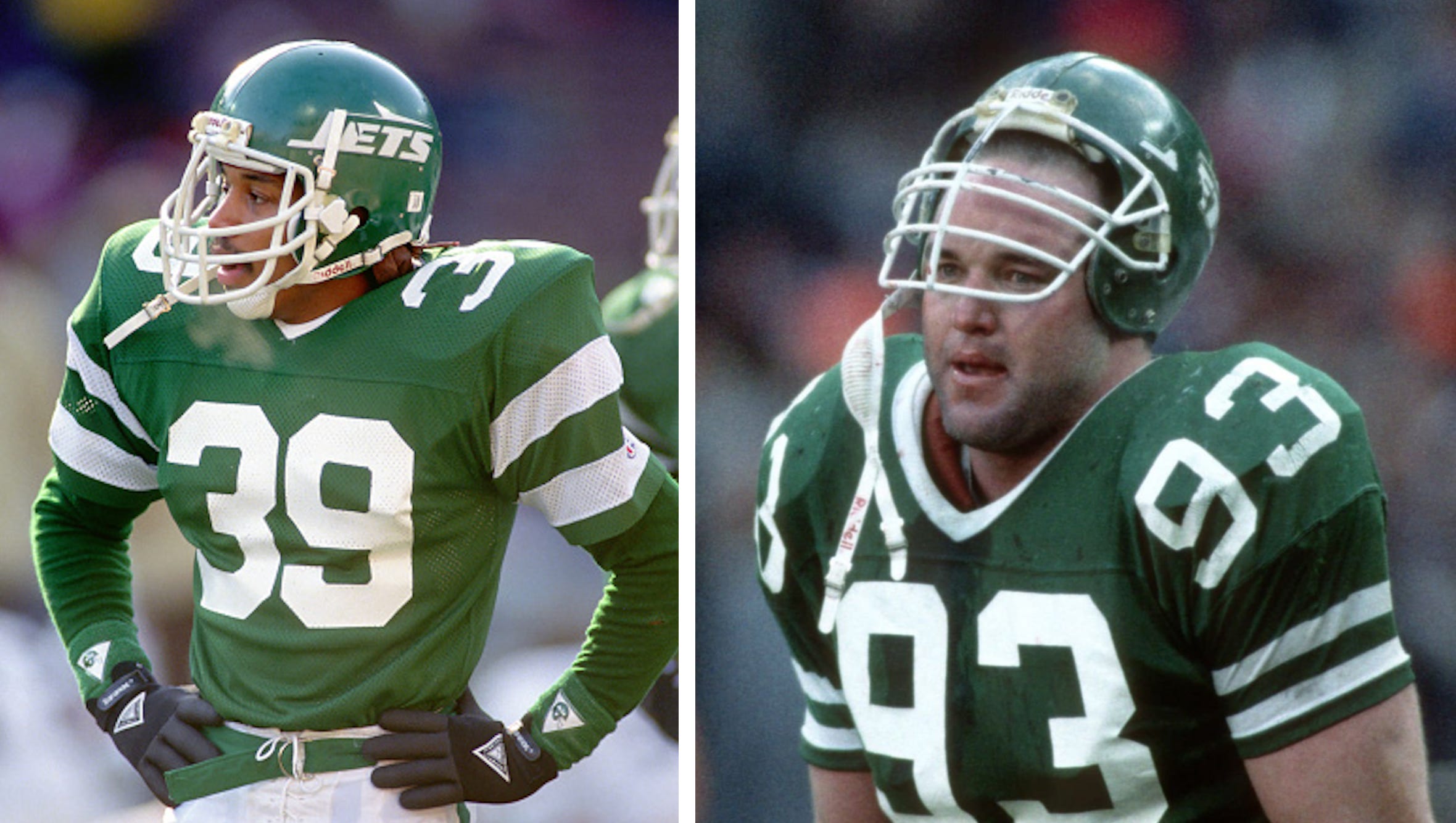
Old football uniforms had to be gaudy. It was the only way to tell the teams apart when the players were all caked in mud.
-
8
-
-
On 2/14/2024 at 8:28 AM, GrayJ12 said:
Why don't you make the jersey the mid 90's one Shaq wore instead of the modern day one? I hate when teams do this.The Sabres did this with their Ryan Miller banner. Miller wore black and red for the first couple years of his Sabres tenure, and navy blue and gold for the last couple. Either would have been fine for his banner. Instead they made his banner royal blue and gold, which he only wore for a few games as an alternate and once in a Winter Classic.
-
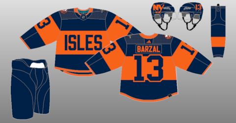
10 hours ago, ruttep said:
They haven't posted any gear for the Islanders yet
There are no pants for the Islanders. They're just gonna Donald Duck it. Hope it isn't too chilly out.
-
1
-
2
-
6
-
-
20 hours ago, DrunkKidCatholic said:
Will be excited to see an updated modern version of this.
Fun fact: They chose those TV numbers specifically so the astronauts on Skylab could tell the players apart.
-
1
-
3
-
-
6 hours ago, riccirulesall said:
2013 but i get your point.
putting on some stripe weight for the long winter (rebuild)
I was referring to the entire Edge era of the NHL, not just San Jose's stripes.
-
1
-
-
7 minutes ago, riccirulesall said:
probably going to be something similar to the rangers new alt, but i would prefer if the gradient went from teal to white down the sleeves (from the elbow) rather than the normal striping split up into more lines
edit: or like this, great concept @Puckguy14
That makes up for all the hem stripes we lost in 2007.

-
1
-
1
-
6
-
 1
1
-
-
They don't want you to be able to change names/numbers. They want you to buy a new one.
-
2
-
-
12 hours ago, JohnnyCowboy5 said:
Ridiculous that someone can even claim trademark on a team that hasn't existed in 100 years.
-
5
-
-
3 minutes ago, Survival79 said:
5280 is the number of feet in a mile.
Mile High. As in how high you'd have to be to think it was a good idea to put "5280" down the side of your team's pants.
-
5
-
15
-
-
40 minutes ago, spartacat_12 said:
The Pittsburgh Penguins won back to back Stanley Cups in '91 & '92, then changed their uniforms for the '93 season. They came close to completing the three-peat, finishing 1st overall in the regular season, but got upset in the playoffs. It could have been an even rarer instance of back to back championships with different logos/uniforms.
The Pens also won the Cup in 2016 wearing Vegas gold and then switched to athletic gold and won it again in 2017.
-
4 hours ago, kiwi_canadian said:
Its back up and running.
Sometimes, swearing at Customer Service works.
-
1
-
-
3 hours ago, Ark said:
I wonder if those would have been called trash bag uniforms if they had been worn in an era when baggy clothing wasn't the style.
Probably. Because that's where they belong.
-
1
-


/cdn.vox-cdn.com/uploads/chorus_asset/file/10136535/901327248.jpg.jpg)


2024 NFL Changes
in Sports Logo News
Posted
Didn't Fanatics already do transparent uniforms for MLB?