


oldschoolvikings
-
Posts
10,494 -
Joined
-
Last visited
-
Days Won
192
Posts posted by oldschoolvikings
-
-
45 minutes ago, kaleb_girod said:
Ohio State definitely appeared to be using a dark gray last night than normal for their jerseys and pants. Their helmets usually match pretty well for their other games, but they looked like the Lions Color Rush last night with a darker gray. I don’t believe it was a case of different materials and lighting. For comparison:
So you think they had an entirely new set of pants created that are a slightly darker gray? For this once a year combo?Not out of the question I guess, but seems surprising.
-
2 hours ago, OnWis97 said:
It’s my (admittedly hyperbolic) label for them after the NCAA apologized for slapping them on the wrist. US sports media clearly wanted them to remain a power and while it’s not as much the case today, they felt like America’s team for a few years.
You could just consider having James Franklin as your (apparently) forever coach to be a pretty significant punishment.
-
 5
5
-
 1
1
-
-
1 hour ago, OnWis97 said:
Even with all that’s going on at Michigan, I can’t root for America’s Team today. Hopefully if Michigan loses it’ll be to Ohio State.
Wait … who exactly is America’s team, here?
-
So Michigan has to go the next three games without Harbaugh stumbling around the sidelines with that dopey confused look on his donkey face?
So where exactly is the punishment?
-
3
-
-
Every time Louisville is on TV I’m stunned at how terrible they look. It seems like every time they’re wearing something brand new I’ve never seen before and it’s inevitably just as awful as the last thing I saw them wearing. What a dumpster fire of a visual brand.
They need to start over with that big goofy bird they have painted at midfield and burn everything that came before.
-
6
-
 1
1
-
-
Forget the conspiracy theories about the Chiefs. Somebody tell me why the Cowboys seem to get to play the Giants about 4 times a year.
-
1
-
-
Doesn't it seem like the Cowboys play the Giants about 4 times a year?
Carolina vs. Chicago
Indianapolis vs. New England
Cleveland vs. Baltimore
Green Bay vs. Pittsburgh
San Francisco vs. Jacksonville
New Orleans vs. Minnesota
Houston vs. Cincinnati
Tennessee vs. Tampa Bay
Detroit vs. LA Chargers
Atlanta vs. Arizona
NY Giants vs. Dallas
Washington vs. Seattle
NY Jets vs. Las Vegas
Denver vs. Buffalo
-
The Lions were making no attempt to match the grays. They actually have two different hues of gray in their color scheme. Even on the blue jersey, the numbers are light gray with a dark gray outline. So their alternate jersey isn't supposed to match the helmet. The helmet is supposed to match the lighter gray pants/numbers/stripes of the blue jersey, not the darker gray alt jersey. Sure, it sucks, but not because the grays accidentally don't match... that's on purpose. It sucks because it was/is a terrible idea.
Ohio State is attempting to use the same gray throughout. If you don't think it works, that's more a function of the plastic painted helmet gray not looking the same as the fabric jersey/pants gray.
So it's just another example (of hundreds) where the helmet color and the uniform color read as slightly different. It has absolutely nothing in common with the Lions' mismatch.
-
7
-
 1
1
-
-
13 minutes ago, DCarp1231 said:
Pre-2023 correct*

Lions gray jersey does not = Buckeyes gray jersey.
-
5
-
-
3 hours ago, DCarp1231 said:
Ohio State suffering from Detroit Lions syndrome. Wearing an all grey uniform that is no where close to the shade of the helmet.
Incorrect.
-
2
-
-
24 minutes ago, Dynasty said:
Too bad Fields hasn't been able to break the Ohio State NFL quarterback curse. Maybe Stroud can do it.
I give you Les Horvath, Los Angeles Rams.
-
New alt...
-
3
-
-
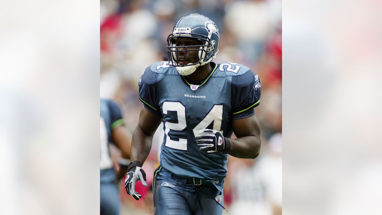
1 hour ago, Cujo said:
Fan stuck in the past: "The original, tired and lazy looking Seahawks logo was better!"
First, I’ll state again that I believe the current Seahawks logo is a stronger mark for a football team than the original.
But, how exactly are we supposed to let it slide that you would claim the logo designed by the Native American artist who studied multiple specific cultural references and delivered a logo that embodied the history of the region is somehow lazier than the logo that someone came up with by taking that original mark, shaving off all the specific native aesthetics, and making it generically meaner?
Seeing how the original design came about and calling it lazy just starts to feel like full on trolling at this point.
-
5
-
5
-
-
4 hours ago, _RH_ said:
Interesting. To me the original is clearly inspired by the local native art, and therefore vastly superior.
The original logo was really cool because it directly referenced Northwest Native-American art. Meaning... directly referenced it.
It was blocky and raw in an intensional way. You cn see it in the thumbnails and iterations it went thru...
I think the current logo is a better sports logo, specifically (despite the cliched angry bird look) but there was something cool about the old one that's been lost.
-
14
-
 1
1
-
1
-
-
2 hours ago, Sport said:
I was 15 when these debuted so I thought they were the coolest thing in a long time. I played the Seahawks all the time in NFL Fever on XBOX.
They have not aged well in retrospect, but I still prefer them to the 2012 update. That slate blue was fun.
At the time I thought the Seahawks uniforms were both stuffy and boring and they were the third silver helmet, blue jersey team. I was in favor of the change.
I agree that slate blue uniform was better than what they currently wear. If they had worn them blue over white like this...
...it would've been a perfectly serviceable early 2000's update. (That was when pretty much every team dumped their better looking color schemes for something dark and kewl.) But it's hard for me to see the sombre blue as somehow more boring than their original color scheme, even with that bad Kingdome lighting.
Still it's better than what they wear now, just based on the idea that boring monochrome is superior to ugly monochrome.
2 hours ago, Sport said:-
3
-
-
14 minutes ago, leopard88 said:
Not on this issue. I would have chimed in to the same effect if you hadn't beaten me to the punch.
Yeah, I was being sarcastic. I’m absolutely positive that when the Seahawks went from that gorgeous Royal and Kelly color scheme to the depressing dull blue pajama look it wasn’t just me and you who considered that to be a major step back.
-
5
-
-
1 minute ago, oldschoolvikings said:
Double post
-
Two things.
First, of course the modern cut of uniforms make it less possible to simply import an old design forward. I’m assuming that when most people say that a team should just wear their throwback permanently they mean an updated version. The Chargers are a perfect example. They obviously started with the idea that the 60’s look was great starting point and updated the parts that wouldn’t still work as well. When I say a team needs to return to an old look this is what I mean.
Secondly, it’s obviously a case by case thing. Some teams have a throwback that’s fun to see once or twice a year but should probably just stay in that category. (San Francisco, Detroit, the Giants, Dallas, Tampa Bay, New England.) Other teams would be smart to use their clearly superior older uniforms as a jumping off point for a modern update. (Tennessee, the Jets, Miami, Minnesota, Philadelphia, Seattle, Atlanta.)
-
10
-
-
54 minutes ago, Cujo said:
**At the time the uniforms were changed, they were all welcomed. Nobody EXCEPT FOR OLD SCHOOL VIKINGS was like "Ahh the Seahawks look worse now!"
Corrected.
I’ve always been a lone genius, true.-
1
-
1
-
-
Tennessee vs. Pittsburgh
Miami vs. Kansas City
Minnesota vs. Atlanta
Chicago vs. New Orleans
LA Rams vs. Green Bay
Washington vs. New England
Seattle vs. Baltimore
Tampa Bay vs. Houston
Arizona vs. Cleveland
Indianapolis vs. Carolina
NY Giants vs. Las Vegas
Dallas vs. Philadelphia
Buffalo vs. Cincinnati
LA Chargers vs. NY Jets
-
8 hours ago, Cujo said:
At the time the uniforms were changed, they were all welcomed. Nobody was like "Ahh the Seahawks look worse now!"
You can’t be serious.
That’s exactly what I said.
-
4
-
1
-
-
Well, after everyone pretty much forgetting again that the Colorado Buffaloes even exist, I bet that they didn’t expect to get back in the headlines by having their copious amounts of jewelry stolen from the locker room while they were taking their latest beating.
Can’t make this stuff up.
-
4
-
-
5 minutes ago, Ted Cunningham said:
Would anyone miss the Houston Texans beyond "Their logo was pretty clever"?
No.
-
1
-
-
3 hours ago, Sport said:
It's the inevitable conclusion of mixing and matching disease. The Panthers did the same thing yesterday wearing their white pants with their dark jerseys. "Let's wear these pants and these jerseys because we can" with nobody there to say don't do that. Items never designed to be worn together now forced into the same look and, unsurprisingly, looks worse than if they'd gone with the uniform as it was designed and meant to be worn.
The funny thing to me is the Cowboys refuse for decades to wear anything with the white jersey other than the dumbest looking green silver pants, but will f*** the brand with the new white pants and white helmets with no thought at all. They can never just look good.
Agreed. The Cowboys' usual occasional navy blue outfit is just boring. Consistent, but boring. But the navy jersey over the (totally unnecessary) white pants is boring, top-heavy, and slapped together. The standard white is a jumble of too many colors, but at least they look like the Cowboys.
I repeat... the only
Cowboy colors they need...
-
9
-


/cdn.vox-cdn.com/uploads/chorus_asset/file/11708351/usa_today_10481768.jpg)

:no_upscale()/cdn.vox-cdn.com/uploads/chorus_asset/file/22507318/75709282.jpg)


 Cowboy colors they need...
College Football 2023
in Sports Logo News
Posted
As it turns out, you are correct, sir.
https://ohiostatebuckeyes.com/news/2023/11/7/ohio-state-to-wear-gray-uniforms
"Ohio State has worn various alternate versions of its uniform 33 times since 2009, including jersey/pant combinations of white/gray, scarlet/gray, white/white, black/black, gray/gray and scarlet/scarlet.
The newest alternate uniform will feature steel-gray jersey and pants, a slightly darker shade than the traditional uniform pants, and will feature Ohio State's home stripe pattern on the sleeves and pants. The jerseys pop with scarlet numbers and white edging on the front, back and shoulders, in addition to scarlet Big Ten and Nike logos, and the primary Ohio State logo at the crest of the chest.
All-gray socks will complete the look. The team will wear its traditional helmet."