


SDX
-
Posts
708 -
Joined
-
Last visited
Posts posted by SDX
-
-
Absolutely awesome Atomic. I owe you a beer.
-
Will be a miracle if anyone can ask but this place has done it before, can anyone identify this V. It's all i've been given to try and source the original.

-
Any of my fellow font gurus about to identify the font used for Davidson's image below?

http://dribbble.com/shots/490105-California-USA
Specifically the "California" font, but I really enjoy both. Thanks in advance!
Just DM fraser, sure he'll tell you
-
Can anyone name this font

-
Ive seen this font a lot, anyone help?

tha looks like PT Banana split especially the S
-
Cheers
-
Can anyone identify this one, the g is quite distinctive.

-
-
Davidsons sports logo inspriation thread has some great animals you could use for inspiration and practice.
-
What font is the estimated weight/volume 'e' found on packaging/

That might just be a custom mark. I first noticed it when I went to England 20 years ago.
Upon further research, I stumbled across this:
Estimated SignOne product-labelling requirement of the European Union is that prepackaged liquids conventionally sold by volume or mass may have an estimate of the weight of the liquid also printed on the label. What the sign means is that the stated volume or mass complies with specific rules concerning permitted average and maximum deviations from the stated value. As that organization consists of countries that use many different languages, a unique symbol has been developed to aid recognition. Other laws have been passed to use this symbol for a few rare additional purposes. The estimated sign looks like a minuscule "e". But its exact shape is as much geometrically specified as any of the projects to construct letters of the alphabet during the Renaissance. No other minuscule "e" is permitted by law. This sign has been added to the Unicode list of characters, among others, just as the symbol for the Euro has been, and can be considered a new basic character in a typeface. It is character U+212E (℮).
And more can be found here.
what a b*tch, this has been driving me mad for months everytime i've had to use it, and its so easy to find using Character map<embarassed Smiley>. Thanks a lot mate
-
What font is the estimated weight/volume 'e' found on packaging/
-
dafont.com has plenty of those kinds of typefaces.
Cheers Geordie, Nicked a couple from Da font already just wondering if anyone knew any other ones.
-
Kind of a reverse find a font question. I am doing a project for which i need a font that looks like it has been coloured in by a pen / marker, kind of a sketchy look.
similar to this stlye:

-
Anyone?

the o's are the a/d from danube though no look identifying the other letters
-
Anyone?
-
Here is a great tutorial for using the pen tool for beginners. Not sure where i found it so i have uploaded it onto my site.
-
Anyone recognise this font. The V is very unique

Anyone any clue??
-
Anyone recognise this font. The V is very unique
-
Right guys i need an ID on the 'Base' font, its for a brand expansion with work and the company who did it originally went bust so we can't get in touch for artwork or fonts etc. I think its a rounded version of Futura thats been skewed. Though if anyone can get it exact that would be great.

Hydro is Dax Medium (the tail on the "y" has been lengthened manually)
BASE is Dax Medium Italic
Cheers Fiasco is it a free font or a commercial one?
-
Right guys i need an ID on the 'Base' font, its for a brand expansion with work and the company who did it originally went bust so we can't get in touch for artwork or fonts etc. I think its a rounded version of Futura thats been skewed. Though if anyone can get it exact that would be great.
-
In Inkscape how would I fill in the portion that is circled in red? I've tried, but can't figure out how.

Never used inkscape but just draw a path that fits the shape and fill it
-
does anyone know where i can find a template of the new FA Premiership font? i like to try make pictures on the computer with me and my mates names on em?
I would also like to know about this font
Here are some pictures!


I further this, I would LOVE to know this font!
Thanks!

No chance its owned by the premier league
-
Can you identify the 2 ringed fonts. i think the top one is SF Fedora or soemething like that no idea about the other one

-
Any help with the ALL and ANES would be appreciated.
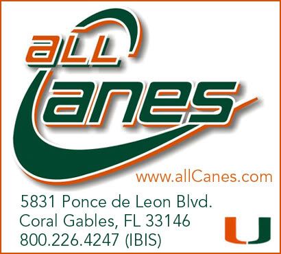
that font is called bauer i believe

2023 F1 Liveries
in Sports Logo News
Posted
It's all down to the new weight rules, teams are saving every bit of weight they can and thus using less paint.
The average F1 car has about 6kg of paint on it and getting rid of that can give them an extra 0.18 seconds per lap.
We did some work on a race car and used a single coat system and it ended up helping it win a medal at the X games.