


Gordie
-
Posts
4,520 -
Joined
-
Last visited
Posts posted by Gordie
-
-
I think the original name-change feature/poll wasn't built into the forums, but was associated with the CCSLC's sim hockey site, which Yzerfan also built and maintained when it was on the same server as the forums.
At some point, I believe Chris switched servers and the sim hockey site wasn't transferred with the forums, so the name-change feature was lost.
-
 1
1
-
-
Anyone know this font:

I've seen it before and I just can't figure it out. It's driving me nuts!!!
Might be Friz Quadrata. Your sample is rather small and rough.
Condensed version of Optima/Optima Nova maybe? (Bold or semi/demi)
-
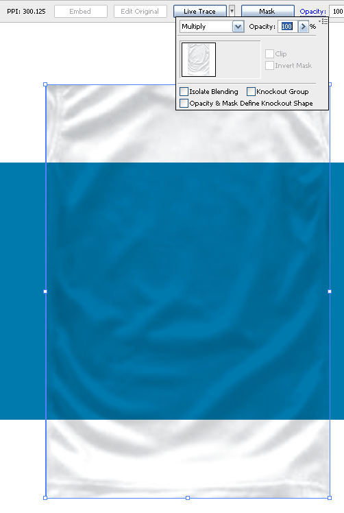
Just to be clear -
The texture is created in your photo editor, then saved as a .jpg, and is not transparent at that point.
You apply this image over your jumper in Illustrator with opacity set to 'multiply', at 100%.
-
Opacity setting - try 'Multiply' instead of 'Darken'. (And slide the percentage from 0 to 100 and back to see which setting is correct)
-
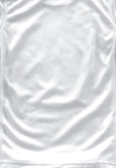
- Find an image of a solid-coloured shirt made of the material you want to simulate. (I used a red polyester soccer jersey)
- Using an image editor (Photoshop or whatever) desaturate the colour so you have a grayscale (black & white) image.
- Next, adjust the brightness and contrast so that the highlights of the wrinkles are white and the flat areas are pale gray. The darkness of your shadows will depend on the material. For polyester, you want a bit more contrast than you'd have for a duller material like cotton or wool. You may have to play with these settings a bit until you get the desired effect.
(Any areas you don't want visible should be coloured white so that they're fully transparent when you overlay the texture on your jumper.)
- Save your texture.
(I used CorelDRAW for the following steps, but they ought to work in Illustrator as well)
- Open up an existing jumper and add your texture image.
- Place the texture atop your jumper, and adjust the size and position.
- Set the texture image's opacity to 100% - Darken. (Play with the opacity settings until you're satisfied with them.)
- Mask the area of the texture outside the borders of your jumper so it isn't visible.
- Done?
-
main text

UNFORGETTABLE?
Looks like different weights of Klavika. (UN - Bold, FORGETTABLE - Light)
-
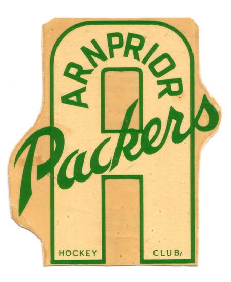
This is a 1960's era decal for an Ottawa-area Junior 'B' hockey team, so the fonts may not be recognizable, but I thought I'd take a chance before vectorizing it.

-
Well I hope I got the right thread to post this since this is my first post. Don't want to start on the wrong foot here. I friend refered me to this site from another forum thinking someone might be able to help me here.
Does anyone know the font that the Univerrsity of Maine uses for it's numbers on their hockey jerseys?
I've been trying to figure this out for the longest time but can't pin the exact font down.
This is the thread at another site with a little more info on this request.
I hope someone might have a answer.
Thanks for your time.
Looks a lot like the Pittsburgh Penguins' numbers.
Try downloading the zip file of Eriq Jaffe's NHL fonts, located here:
Gordie, gosh darn it , I think you are right! The ends of the numbers has that point on it and from the numbers I've looked at so far, all looks good.
Did that come to you right away or did you have to research a bit?
Thanks so much.
No problem.

Pittsburgh's numbers are pretty distinct, so I'm sure just about any NHL fan could have pointed you in the right direction.
-
Well I hope I got the right thread to post this since this is my first post. Don't want to start on the wrong foot here. I friend refered me to this site from another forum thinking someone might be able to help me here.
Does anyone know the font that the Univerrsity of Maine uses for it's numbers on their hockey jerseys?
I've been trying to figure this out for the longest time but can't pin the exact font down.
This is the thread at another site with a little more info on this request.
I hope someone might have a answer.
Thanks for your time.
Looks a lot like the Pittsburgh Penguins' numbers.
Try downloading the zip file of Eriq Jaffe's NHL fonts, located here:
-
A little info here, JP:
http://www.infinitescale.com/pdfs/SuperBow...0_Press_Kit.pdf
(2nd page, just over half way down)
"The NFL developed typography specifically for the branding of Super Bowl. It exists in the
Super Bowl XL logo and each respective element of the system. The font is called
Endzone."
-
does anyone know the torino 2006 winter olympics font? you can get a good picture here thanks
Looks like a variation of Neuropol, with modifications to the numbers.
The Torino Olympic Committee has also used a similar font, Nedian, in some publications.


Ask A Moderator
in Forum Policies and Announcements
Posted
Looks like you're thinking of SyPhi (sp?), who later changed his username to his actual name, Phil. Great guy from Winnipeg.
Spyboy's from Minnesota, and runs the Third String Goalie blog. If you're into hockey sweaters, check it out.