


whitedawg22
-
Posts
1,629 -
Joined
-
Last visited
-
Days Won
1
Posts posted by whitedawg22
-
-
13 minutes ago, Earl said:
UNC Greensboro unveils brand new Spartan: http://www.uncgspartans.com/ViewArticle.dbml?DB_OEM_ID=32200&ATCLID=211767250
OLD
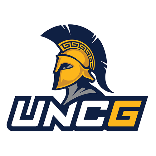
NEW


The new logo makes the spartan head much more recognizable from a quick glance - the 3/4 view of the old logo looked a bit like a blob. Still, I generally dislike logo-above-name combination marks, because they look minor-league. And I can't shake the feeling that the logo would have been better if they dropped the person (the eye/neck/shoulders) and just used the helmet.
-
 1
1
-
-
1 hour ago, -Akronite- said:
I saw this cap a few days ago as well.
Obviously it's used all over the place but this one surprised me. Knew the Maroons were the first though. Do they still use it/have ANY sports?
Yes, it's still Chicago's primary athletic mark. http://athletics.uchicago.edu/landing/index
They still compete in football, too, although at the D-III level, a far cry from when they were a national power in the early 20th century. They use the wishbone-C as their helmet logo, although it looks like a skinnier version than the Bears and Reds use:

-
2
-
-
16 hours ago, johnnysama said:
^ Who's that?
Alex Fernandez, the former Marlins pitcher, pitching for Pace H.S. in Miami.
-
1
-
-
On 7/14/2018 at 7:56 PM, Ferdinand Cesarano said:

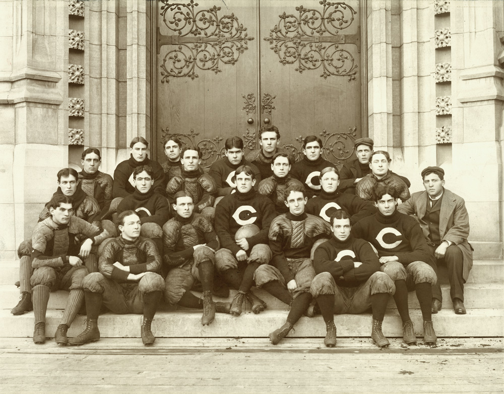
The progenitor of all the "wishbone C" logos was the University of Chicago Maroons, who were wearing it as far back as 1898:
-
2
-
-
Another piece in the Spurs-Raptors trade... I don't have a picture of Danny Green in a Raptors jersey, but we can agree that this is the wrong uniform for him:

-
1
-
-
On 7/16/2018 at 11:48 AM, Gothamite said:
I disagree - this is pretty bad.

The basic idea is good, but there's just too much there. The baseball seams in the eyes are especially egregious. The two uses of stars are also odd. I even think it might be better with one-color lettering instead of adding an outline to that font with its fairly busy serifs, or at least flip it to make white text with a red outline. The whole thing becomes a mess at smaller sizes.
Maybe the inclusion of red in his eyes is supposed to indicate that that TOMcat is HIgh.
Edit: I see I was beaten to this joke. Credit to NicDB.
-
On 7/15/2018 at 11:08 AM, Ice_Cap said:
I disagree. The ULL fleur de lis is far too detailed. It looks like it came from the late 90s/early 2000s. Too much unnecessary shading.
The Saints’ fleur de lis isn’t perfect. It’s got two too many outlines for starters. Still? The overall design is solid.
I usually dislike double- or triple-outlining, but I think it works well with the Saints' logo. It used to have a single outline, and it looked rather plain. I much prefer the Drew Brees version to the Bobby Hebert version:


-
5
-
-
19 hours ago, Chawls said:
ULL (University of Louisiana at Lafayette) has a better fleur-de-lis logo than the Saints.


I like how the middle spike and band are independent pieces in the ULL logo, but the beveling is driving me nuts. It's like an Escher piece.
-
1
-
-
1 hour ago, C-Squared said:
I haven't kept up on this thread to know if this was posted already, but I came across this fascinating Michael Irvin jersey this morning:

The Northwestern Cowboys.
-
6
-
-
On 6/25/2018 at 1:11 PM, BroncoBuff said:
On the other hand, you gotta kinda hand it to teams that sell out for their colors and banish the white at home. For example, you won't find a thread of white anywhere when the Trojans and Wolverines play home games:

This is even more true now that Michigan has switched to Jordan brand - they changed the helmet bumper and chinstrap colors to blue:

-
6
-
-
A twofer - O.J. Simpson and Jim Plunkett as 49ers:

They never actually played a regular-season game together. O.J. was traded to the 49ers in March 1978, and the 49ers released Plunkett in the 1978 preseason.
-
2
-
-
5 hours ago, NicDB said:
I kinda suspected Grand Rapids/West Michigan had little motivation to move up, and now it's confirmed. At the AAA level, they most likely wouldn't be a Tigers affiliate, which is probably their biggest selling point right now.
I don't know if people really care about that (although admittedly I'm not a big baseball fan). When the team started, it was an A's affiliate, and it seemed to be relatively popular right away.
-
15 hours ago, NicDB said:
As an outsider, I'm really not seeing what makes Grand Rapids so different from any different from all the other cities of consequential size that all have their own assortment of craft breweries and brewpubs. Besides, with the real Brew City right across Lake Michigan, it just comes off as poor taste. Milwaukee never tried to step on Detroit's toes and call itself something like "Engine City" despite being home to Harley Davidson and AMC.
Technically, the Whitecaps are in a suburb a good 10 miles outside of Grand Rapids, but that was news to me fairly recently too.
I wonder who a Grand Rapids/West Michigan AAA club would affiliate with though since I doubt the Tigers would ever leave Toledo. Selfishly, it'd be nice to have Brewers prospects within driving distance again.I can't speak to other cities, but Grand Rapids was voted Beer City USA in a number of national polls from 2012-2017. Nothing scientific, but it at least gives the claim a color of legitimacy. Founders is one of the biggest microbreweries, and there are a number of other GR breweries that are significant on a regional level. With regard to Milwaukee, I'd argue that it was the most significant brewing city at one point back in the pre-craft era, but is now far behind with regard to influential breweries - there's Lakefront, and that's about it.
Also, the Whitecaps are in a "suburb" in name only - Comstock Park is certainly part of the Grand Rapids urban area. I work in downtown GR and can see the stadium from my office on a clear day.
-
12 hours ago, NicDB said:
Beer City... seriously?
The nickname isn't just an invention for this jersey - it's something that Grand Rapids markets around.
-
On 6/2/2018 at 12:00 PM, CRichardson said:
Who, outside of Tampa Bay and the Original Six themselves, is playing Original Six Dress-up and isn't using a look that is derivative of an earlier look in the team's history?
I like classic hockey uniforms, so I don't mind, but one could argue that Dallas, Edmonton, Minnesota, Buffalo, Carolina, Florida, Winnipeg, Vancouver, and the NY Islanders currently have O6-style jerseys as their primaries. All of those teams have simple striping (shoulders and waist only), primary and secondary colors only, and no more than two colors other than white. I'm not sure how you'd define "Original Six Dress-Up," but those elements are probably part of it.
-
8 hours ago, NicDB said:
Take away the disco collar and this isn't a bad uniform. I wouldn't mind seeing a fauxback version of this on a modern template.The uniform looks nice overall, but it's a little incongruous to have the ultra-modern "SOX" logo on the cap and the ultra-retro "CHICAGO" font on the jerseys.
-
19 hours ago, MCM0313 said:
The Miami Heat looked their best in the mid-to-late 1990s, once they had added the red alt to their original white home and black road uniforms. All their sets since have been decent updates on the original uniforms - they've kept a visually consistent brand - but the originals plus the red alt, the successors to that set have not yet caught up to it. That Mourning-Hardaway red alt is easily in my top 10 NBA jerseys ever.
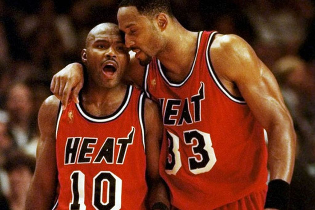
The problem with these jerseys is that the white drop shadows are the highest-contrast element on the jersey, and are the first item to catch your eye. So the dominant design element of the jersey is a weirdly-shaped white block, rather than the team name or the player number. These would have been more visually appealing if the white and black on the number were inverted.
-
5
-
-
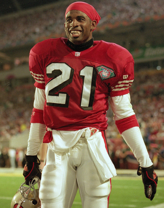
9 hours ago, BringBackTheVet said:
Truth. I actually think that the Falcons look like the wrong uniform for him, even though that's where he became a star. He just got sooo much more TV time playing for SF and DAL.
I cannot believe he was only in SF for one season - that's actually the jersey I picture him in at first when I think of him and I could swear he wore the 94 throwbacks, regulars, and even the 96 redesign. I know it's not true, but my brain somehow has those memories.
Well, he won DPOY and the Super Bowl for the 49ers, who were one of the most widely-covered franchises in the 90s. So he got about as much exposure out of that one year as possible.
-
1
-
-
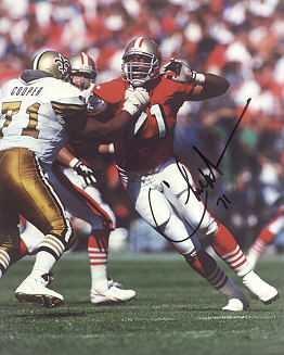
3 hours ago, fgoodwin said:

Former Cowboy Ken Norton Jr as a Niner.
I thought about including this one, but Norton actually played 7 seasons in SF versus 6 in Dallas, so I'm not sure it's the "wrong" uniform.
-
1
-
-
A few mercenaries from the 1994 San Francisco 49ers Super Bowl team:
Gary Plummer (played most of his career with the Chargers)
Rickey Jackson (played 13 of his 15 years with the Saints)

Deion Sanders (played only one year as a 49er)
Charles Mann (played 11 of 12 years with Washington)
Richard Dent (played 12 years with the Bears and only one with the 49ers)

Toi Cook (played 7 years with the Saints, only two with 49ers)
Bart Oates (played 9 years with Giants, only two with 49ers)

-
1
-
-
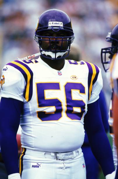
12 hours ago, DouglasQuaid said:
Which version? I like when they had the darker helmets before 2002.
I couldn't disagree more. Not only did the darker helmets not match the purple of the uniforms, but they sometimes looked almost reddish in direct sunlight.


The new helmets fixed both of those problems, and the metallic color added a little visual pop to the uniform as well.

-
5
-
-
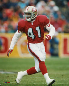
6 minutes ago, Wildphil33 said:
Chris Doleman
Nice! This one took me a moment to think of the difference.
-
2
-
-
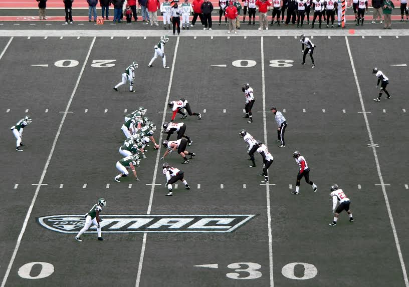
On 5/7/2018 at 9:53 PM, CaliforniaGlowin said:
That grey turf is dope though, I love non-green turf.
It's all right conceptually, but looks kind of dingy during an actual game. It always makes me think something is wrong with my TV's color balance.
-
3
-
-
23 hours ago, MCM0313 said:
O RLY?
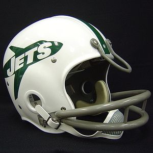
Yes, and their 80s-90s logo incorporated a jet as well. Lots of teams have logos that depict their nickname. But when someone says that Jets is "a name that should have some very interesting design possibilities," that seems to refer to the uniform, rather than just the helmet logo.
Also, that logo is garbage.
-
2
-


Players in the "wrong" uniforms
in Sports Logo General Discussion
Posted
That's pretty awesome - I never knew he played for the Cowboys. And it turns out that he didn't in the regular season, just during the 1975 preseason.
Also under wrong uniforms for Zorn: the Packers and Winnipeg Blue Bombers.