


whitedawg22
-
Posts
1,628 -
Joined
-
Last visited
-
Days Won
1
Posts posted by whitedawg22
-
-
12 minutes ago, MDGP said:
Yeah, it's probably black. Under blue lighting (assuming it's true RGB blue) a blue jersey almost certainly wouldn't get that dark. Red would look considerably darker under blue light (depending on the shade), and would have historical precedent, but come on, that's not happening. In theory the green in honolulu blue would make it darker under blue light but I can't imagine it would be that dark.
So that leaves black or an uber darkhorse navy blue, which would also have historically precedence. But like red, I can't imagine the Lions ownership would ever go in that direction when black is on the table.

Of course, the above could all be rendered entirely moot by a variety of factors affecting how the room and the set are actually lit.
The Lions' current uniform is far from perfect, but getting rid of black was the best thing they did. Never forget that Matt Millen added black to the uniforms because he wanted the team to look more like the Raiders. The Lions should never do anything to bring back the memory of Matt Millen.
-
 9
9
-
 2
2
-
-
1 hour ago, Cujo said:
Predicting the Jets will revert back to these in ten years.
These uniforms never looked right on a modern template, and jersey sleeves have gotten even smaller since the Pennington years. In the original 60s jersey, the "inner" stripe was a true hoop that went all the way around the arm, and the white sleeves were actually sleeves rather than shoulder caps.
With tiny modern sleeves, the white had to be moved up further onto the shoulder, leading to the truncated inner stripe and even a little cutout from the white shoulder cap.
It
This just looks bizarre and wrong. If they bring this back, they should modernize it to fit modern templates instead of trying to just paste a look that was designed for full sleeves onto a jersey with essentially no sleeves.
-
5
-
 1
1
-
-
29 minutes ago, Brave-Bird 08 said:
Y'all, all the Texans have to do for a "throwback" is wear red socks with the blue pants.
Would much improve the look, too. The all-navy looks boring.
-
9
-
 1
1
-
-
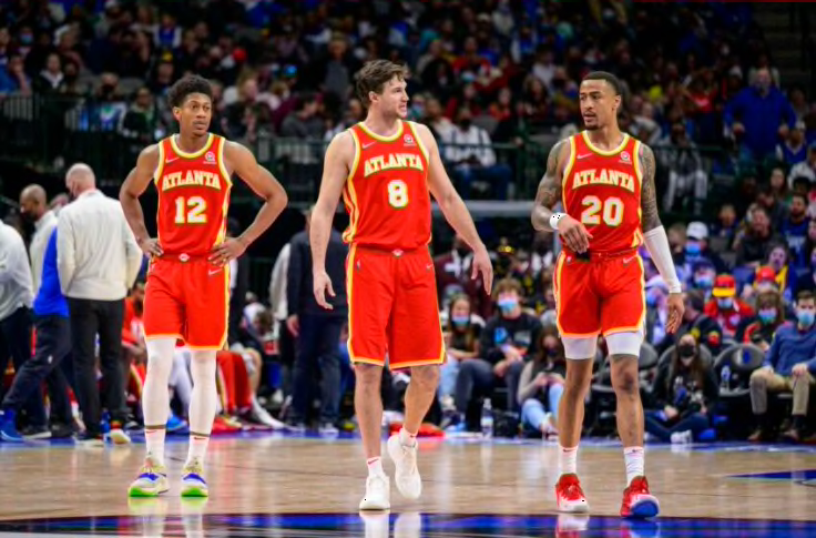
On 7/19/2023 at 2:43 PM, Brave-Bird 08 said:
I don't like the Hawks uniforms. The striping on the side is too busy, the font is lifeless, not a fan of the white jersey saying "ATLANTA" instead of "HAWKS" and the logo on top of the stripes on the shorts looks like a sticker because the line width thickness doesn't agree with the stripes (the logo should be sitting on the front of the short leg where it can breath instead of on top of the stripes).
Going to a classic look was smart but they're pretty forgettable.
This is essentially my problem. They're completely generic uniforms that don't reflect the excitement of the city. In addition, both the white uniform and the red uniform have yellow bordering white in a number of spots, which makes me feel like I'm watching that ghosting effect that old CRT TVs used to have if not tuned properly.
-
2
-
-
12 hours ago, Jimmy! said:
They’re also the only team to play in the AFC and NFC championship games…I think.
If you're limiting this to AFC and NFC (not pre-merger NFL), I think they're the only team to play in both conferences for more than a year (the Bucs were in the AFC for their inaugural season, and the Seahawks were in the NFC, before switching for their second seasons).
-
On 7/19/2023 at 9:33 AM, Lights Out said:
Another Adidas downgrade. Although really, they should have never ditched these.
The early-2010s Adidas uniforms inevitably look like crap due to the super-stretchy material they used. It looks like this player has saggy breasts and a backpack. It's tough to focus on the design elements of the jersey when the player silhouette is this bad.
-
1 hour ago, MJWalker45 said:
It feels like they're parodying a Bob Seger song.
I think it's a reference to the first verse of "Mary Jane's Last Dance," by Tom Petty.
https://www.azlyrics.com/lyrics/tompettyandtheheartbreakers/maryjaneslastdance.html
-
4
-
-
On 7/14/2023 at 12:48 PM, Lights Out said:
The Hawks and Rockets already coexisted with red and gold for a few decades, so it's not like that couldn't possibly happen again.
The Hawks will also change in a year or two. Partly because their current set is ugly, and partly because that's just what the Hawks do.
-
 2
2
-
 1
1
-
6
-
 1
1
-
-
5 hours ago, henburg said:
I really hope they just do the right thing and adapt these faithfully, but I could potentially see them putting a slight twist on it and having the Tennessee Oilers patch on the jersey like the team wore while it first was playing in the state-
To be pedantic, the Tennessee Oilers never wore THAT jersey while playing IN the state of Tennessee. The two years they were the Tennessee Oilers, they only wore white at home. They wore the blue jerseys once during the 1997 preseason at Dallas, twice during the 1997 regular season at Miami and at Dallas, and didn't wear them at all in 1998.
-
4
-
-
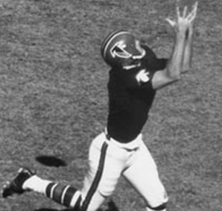
20 hours ago, fgoodwin said:
Tommy McDonald (RIP) as a Dallas Cowboy

Here's McDonald as a Ram and a Falcon- note his trademark lack of a facemask, even in the late 60s:

-
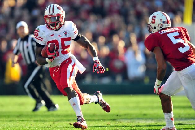
14 hours ago, WBeltz said:
I feel like Under Armour has dropped the ball with Wisconsin's football uniforms. I know you can do so much with a red & white color combo, but I absolutely LOVED this combo when they were with adidas.

The black stripes and facemask are gross. That said, I do like red pants for Wisconsin - it just looks much better if they're all red-and-white:
-
5
-
-
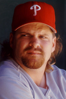
On 9/15/2018 at 10:55 AM, BringBackTheVet said:
I used to think it was just a relativity thing, meaning that of course players looked older to me when I was younger than them, but those same players should appear younger to me now that i'm older than them, but that's not the case. I don't know if it's just that they treated their bodies differently (or not at all), or drugs, partying all the time, or what, but lots of athletes from even as recently as the early 90s look 10-15 years older than they are (by today's standards.)
It could also be the hair styles. If you got rid of the mustaches on the players, maybe their faces would appear to be their actual age? Or if you shaved the sides of the horseshoe-bald guys like as is done today, maybe that helps?
Let's just look at John Kruk from as recently as '94, compared to another Phillie with similar hair style.
Kruk is and Werth are both 32 in these photos. Granted, Werth isn't a fat pig (albeit a pig that was a hell of a hitter), but he looks considerably younger than Kruk, even if he too looks to be older than his age.

Y.A. Tittle was 37 years old in this famous photo:

I used to think that was so old. Now I'm six months away from that.
-
6
-
-
4 hours ago, Magic Dynasty said:
I really don’t like the Packers jerseys (both home and away). IMO the yellow is too bright: it goes poorly with the dark green, and doesn’t contrast enough with the white. I also think that the stripes, especially the collar stripes, are just too busy. Take away the small stripe in between on the sleeves, and just remove the collar striping altogether.
I think the Packers jerseys are much better now than in the early 90s.

Back in the early 90s, they had a more drab green and a lighter but more mustardy yellow, and it looked dingy. The current forest green and brighter yellow look much better, in my opinion.
-
1
-
-
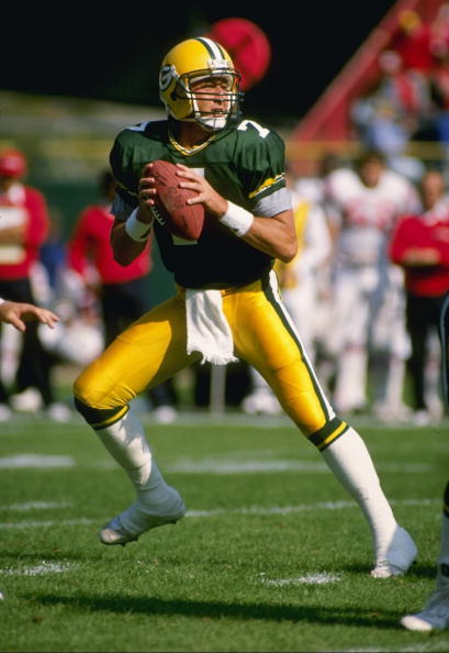
19 hours ago, fgoodwin said:
John Hadl as a Packer
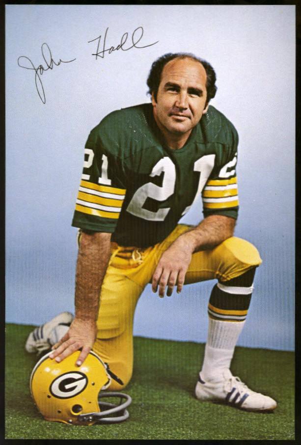
It's tough to imagine this guy being worth two first-round picks, two second-round picks, and a third-round pick.
-
12 hours ago, CaliforniaGlowin said:
That tiger shading is dope!
I think the exact opposite - I love the design, but think it would have been stronger with just one shade of orange instead of two.
-
2
-
-
11 hours ago, johnnysama said:
Unrelated, but I couldn't help but notice the yard markers being every five yards there.
LSU does this too, but they're the only FBS team that I know of that does this.

-
1
-
-
23 hours ago, fgoodwin said:
HOFer Larry Allen as a Forty-Niner

This is doubly "wrong" because for most of Allen's two years with the 49ers, they wore their 1998-2008 set with the drop shadow numbers. They only wore the uniform Allen is wearing for two games - 2007 vs. Arizona and 2007 vs. St. Louis (the game this picture is from - you can see the shoulder of a Rams player). Here's Allen in his more standard 49ers uniform:

-
2
-
-
12 hours ago, Ark said:
I really like these uniforms BECAUSE OF the Reebok Edge piping.


The balance of yellow and blue is perfect.
That's certainly a perfect post for this thread, because holy smokes are those things fugly. The color balance is fine, but the design is awful.
-
3
-
-
On 8/21/2018 at 8:42 PM, stumpygremlin said:
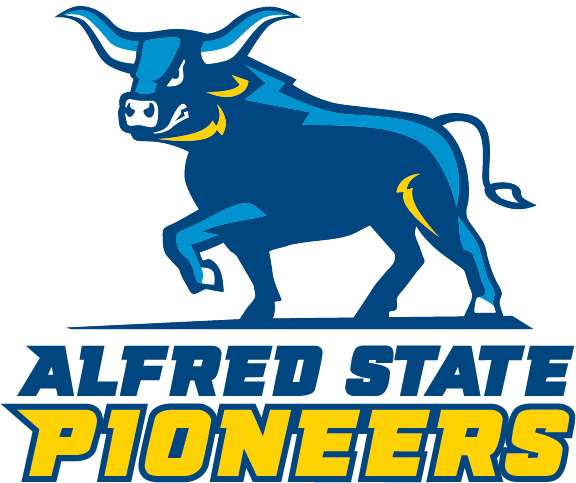
New logo for Division III Alfred State, not to be confused with the cross-town Division III Alfred Saxons
I don't mind the design, but I think it would be better if some of the light blue and yellow highlights were switched. The yellow is easily the most striking part of the design, but it seems to highlight what should be the least important lines - the neck and the front of the thigh.
-
2
-
-
1 hour ago, MJWalker45 said:
It depends on what sports are involved. Ohio State is in three conferences due to women's hockey and men's volleyball not being Big Ten championship sports. Smaller schools (Div. II & III) are similar based on sports like swimming/diving, lacrosse and field hockey not necessarily being played at all the member institutions of the primary league.
Jacksonville used to have some excellent basketball uniforms:

-
2 hours ago, agentrygraphics said:
Hmm...interesting choice of names. An upgrade from the mouthful of a name that it had...but when I see "American Rivers" my first thought does not immediately go to "Iowa", y'know?
The conference now includes Nebraska Wesleyan. The shape of Iowa is defined by the Mississippi River to the east and the Missouri River to the west, and Nebraska Wesleyan is just across the Missouri River from Iowa, so the name makes sense.
-
2
-
-
17 hours ago, Section30 said:
This is the old UCONN logo, this is the old husky on the jersey I was referring to.
I know the "sad husky" is an old UConn logo. I was saying that the melting husky that Northeastern used to use is the second-worst husky logo of all time for any team.
-
16 hours ago, Section30 said:
They better keep the old husky head for their hockey jerseys.
That old husky head looks like the husky is melting. It's the second-worst husky logo of all time.

-
4
-
-
1 hour ago, fgoodwin said:
Jim Zorn as a Cowboy
That's pretty awesome - I never knew he played for the Cowboys. And it turns out that he didn't in the regular season, just during the 1975 preseason.
Also under wrong uniforms for Zorn: the Packers and Winnipeg Blue Bombers.


/cdn.vox-cdn.com/uploads/chorus_asset/file/22698705/78197499.jpg)


2024 NFL Changes
in Sports Logo News
Posted
That's an improvement, but I still think it looks dumb to have a truncated stripe that only spans the top of the shoulder. The 60s version had synergy with the different circular shapes; this just looks like someone accidentally started adding another stripe and stopped halfway through.
If they bring a set like this back, they should modernize it to simply have the white sleeve caps but no additional stripe. There just isn't room on modern jersey cuts for multiple shoulder stripes/panels.