


GFB
-
Posts
4,606 -
Joined
-
Last visited
-
Days Won
10
Posts posted by GFB
-
-
Did we ever come to a consensus on the “Canes logo looks better rotated 180°” idea?
-
 1
1
-
 1
1
-
-
Did the bottom of the 3 fall off? Woooooooof.
-
1
-
-
mAkE tHe NuMbErS mOrE sPiKy
-
2
-
-
that’s a mockup template, nothing fanatics related
-
4
-
-
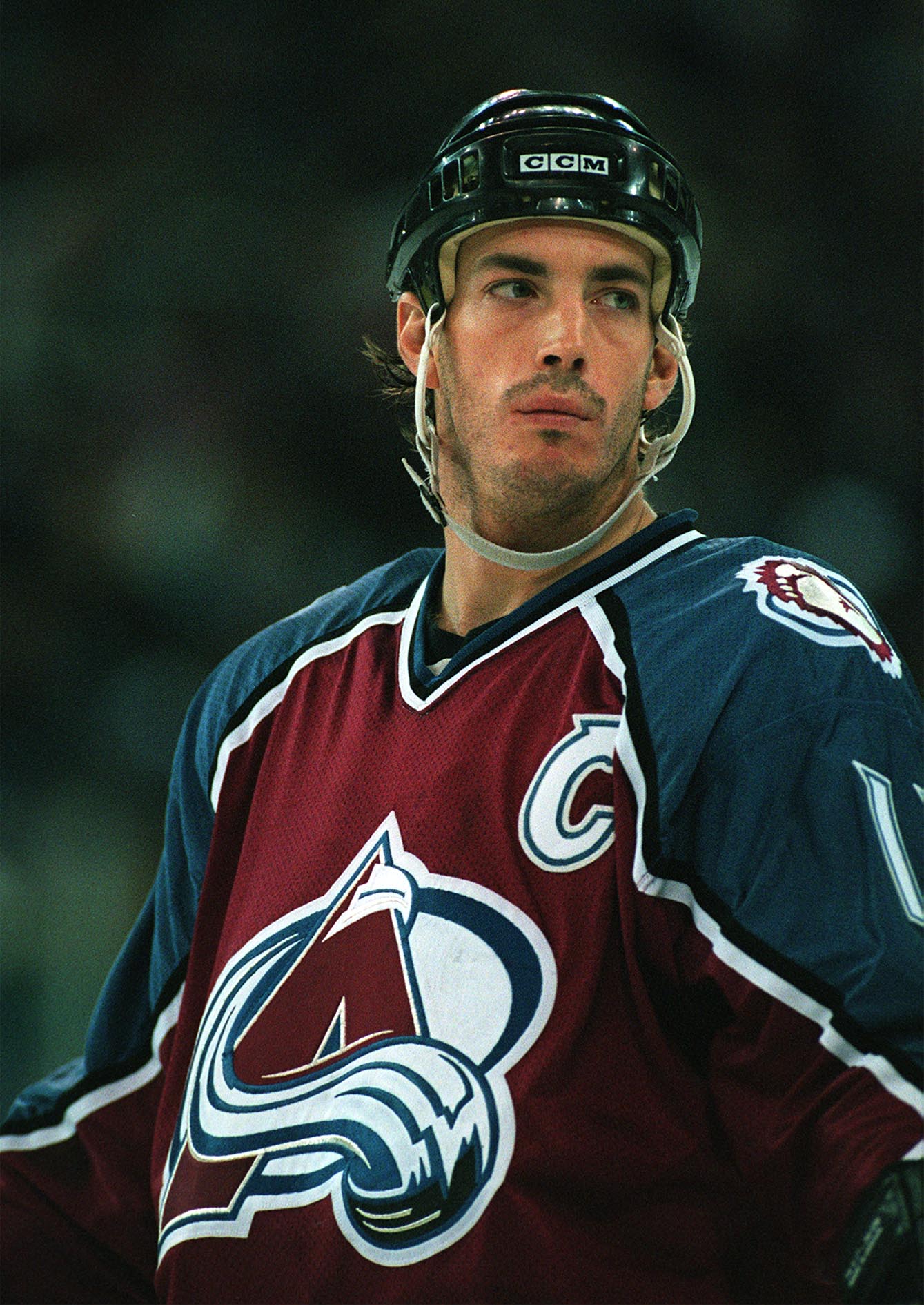
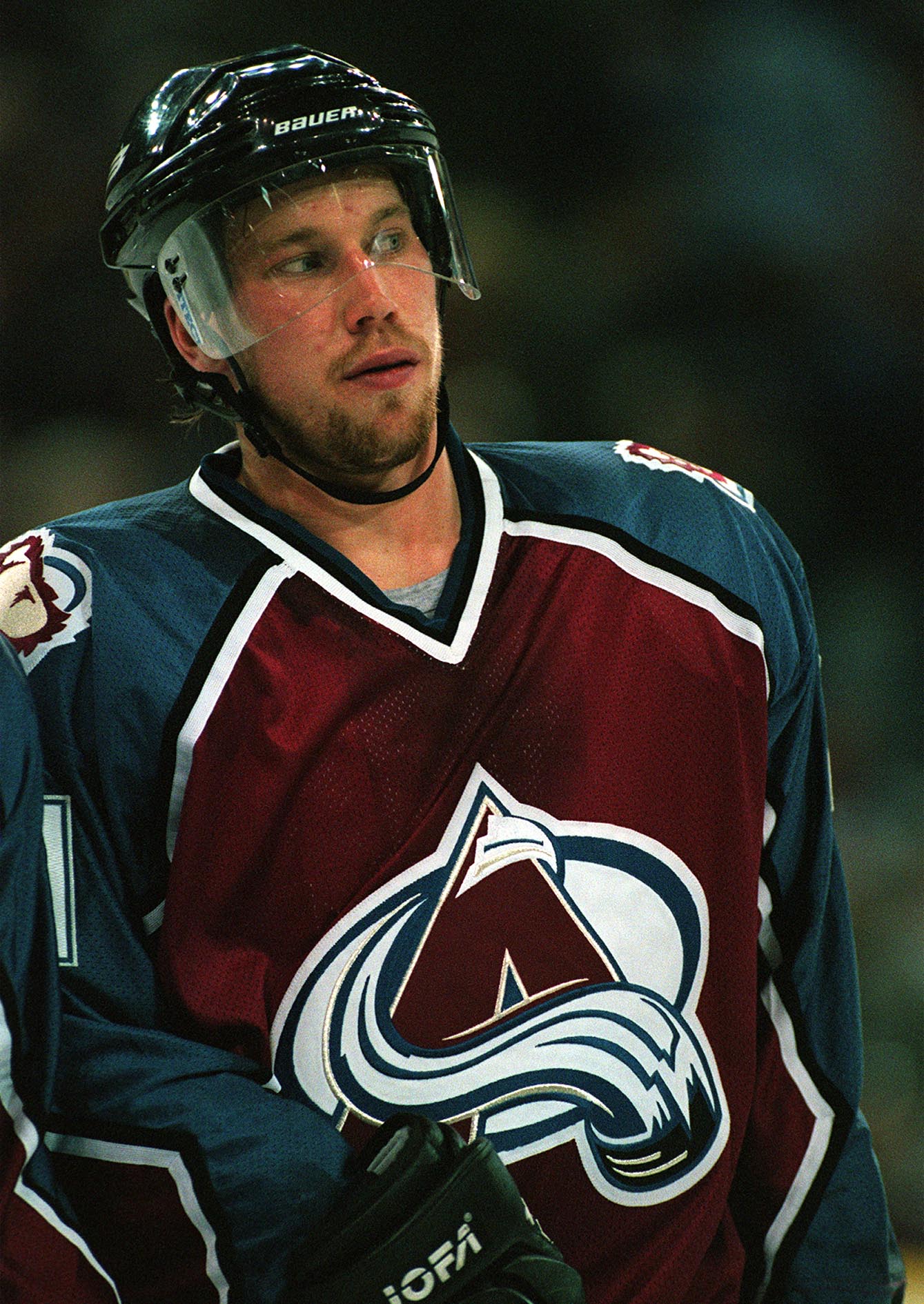
Here are the two ways I would "fix" the Avs without the black, but I don't know if they are great solutions:
A ) Darken the blue and shift the hue toward a blue-green:

I understand this probably isn't close to the actual original shade of blue, but in my memory and nostalgia (trading cards from the 90s and Wings/Avs rivalry tributes) this is how I remember the Avs:
By pushing the blue into more of a "blue-green," it both warms and darkens the look considerably... So when I see images like this, with the blue lighter and closer to royal, it immediately feels colder and more jarring (which may be a good thing for the Avalanche, depending on your view):
I think something like a darker version of the mid-00s Seahawks, or a slightly more blue-shade of Eagles midnight green would be the sweet spot:
B ) Darken the burgundy and shift the blue hue slightly toward a blue-green:
Look, if the Ducks don't want to use this color scheme full-time, a slightly twisted variation would work for the Avalanche.
We're not going to go full-jade and the Ducks "plum" is a shade or two closer to violet than the Avs burgundy, but no one has ever said that the Mighty Ducks uniforms were unbalanced or awkward. Again, this might not be a realistic option with too much history between the two teams, but from a pure aesthetic point of view, I would be a big fan.
-
6
-
-
the old logo is from the "beats by dre" era of the early 10s while the new logo actually has some modern character and that 't' could easily be used as a stand-alone icon for an avatar or app icon
-
2
-
-
22 minutes ago, gsn93 said:
I really dislike the notion of "team won a championship in 'XYZ' uniform" as the end all be all answer to anything uniform change related.
I agree, and add Vegas as a supporting point of this line of thinking as well.
-
2
-
-
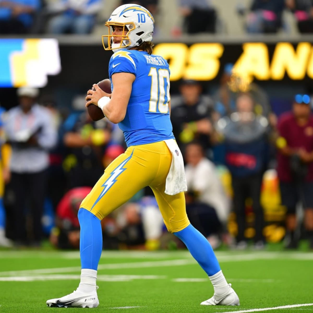
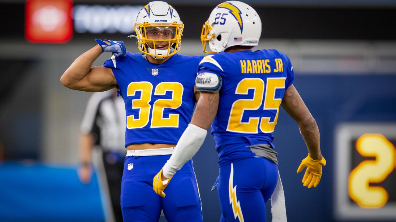
On 3/5/2024 at 5:01 PM, Carolingian Steamroller said:
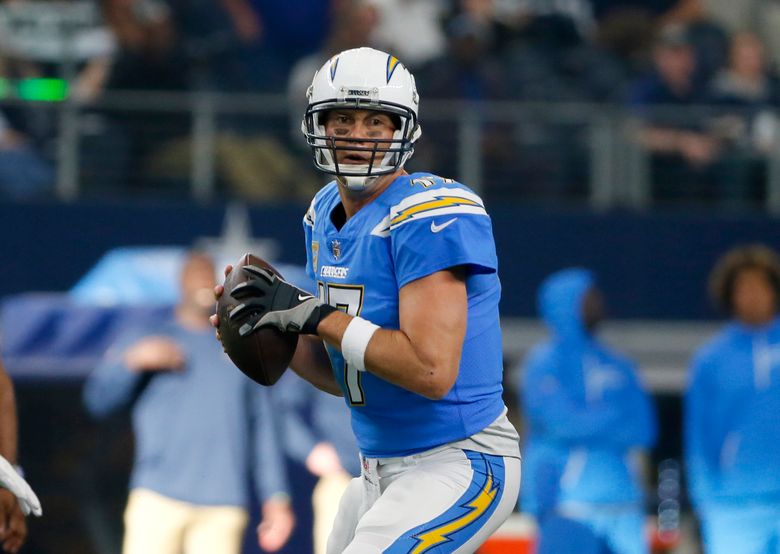
If there was one thing I'd be curious about, it would be using a darker shade of blue as the outline color on the bolt, just as they had in the 60's. (and maybe also ditch the outlining on the numbers)I prefer the logic of the current bolts (disregarding the navy alternates, which intentionally break these rules):
1) Is the lightning bolt placed on a yellow surface?
If no, the bolt is yellow. If yes, the bolt is white.
2) Is the bolt placed on a blue surface?
If no, then the bolt's outline is blue. If yes, then the outline is white.
People forget how disjointed the Chargers were for so long with different bolts on different surfaces with different rules and they couldn't get any form of logic or consistency:
That was the one thing I appreciated about the 90s look: they made a decision and committed to the bit (white bolt, outlined in blue and then gold, always on a blue surface):
-
11
-
 1
1
-
-
3 hours ago, MJWalker45 said:
I hope it's just lighting, but I'm pretty sure it isn't. I'm also not a fan of those maroon/plum pants.
Feels far more likely like that's UA's stock shade of "dark red" and they aren't going to go to the effort of finding a "plum," or even more of a Mississippi State or Texas A&M "maroon."
-
2
-
-
3 hours ago, DCarp1231 said:
Looks like maroon and white pants have been added to the Panthers uniform rotation and a new logo on the pants as well
That Under Armour shade of plum makes me very sad
-
2
-
-
On 3/3/2024 at 12:58 AM, bushy said:
What do you guys think of these minor edits ? Just added an outline to the wordmark.
The red and navy uniforms look good, but if the red and blue are separated by a white outline, then the biggest proponent of why they chose navy instead of royal blue goes out the window (that being navy contrasts with the mid-tone red better than royal, another mid-tone).
As for the white uniform, the double outline is a bit too muddled and works better un-outlined in my opinion.
-
1
-
-
34 minutes ago, tBBP said:
Not too much of an inversion...they just made the navy background of the badge white for this kit (and added a CITYRED border). I'm going to presume it was to keep emphasis on the CITY banner. Not really a justification, but more a clarification.
That said, that would have been a great kit to apply CITY's alternate mark to:
THAT badge, truly inverted (white for CITYRED and CITYRED for navy), would have been a big winner.
The "inversion" is that they flipped the highlights and the shadows... the dark parts of the crest are now light and the light parts are now dark. They "ghost logo"-ed their own crest.
It's a little less egregious because it's a symbol and not an illustration, but the crest has less visual weight and is more intricate when inverted.
-
2
-
-
2 hours ago, tBBP said:
CITY change kits in action on the pitch last night:
That dose of color is really needed. That said, it not illegal to wear contrasting shorts, MLS sides. This one could really use the CITYRED shorts (and the primary kits could use navy shorts).
All in all, I still really like these.
What kills this kit for me is that they inverted the colors on their badge for some insane reason... Instead of having a red crest on a white shirt, it's a white crest on a white shirt.
Dumb.
-
3
-
-
2 hours ago, henburg said:
I like the current logo, but I really enjoy this concept done by Twitter user @lolwtferic that emphasizes the proportions of a Clipper ship in a more traditional way. Well, it's great except for trying to cram the "LA" into the top sail at least.
This looks like an emblem embossed on the button of a pair of blue jeans.
-
2 hours ago, cdreed said:
Agreed... Very surprising when they had spent the last few years seemingly courting an inner city-style look and are now moving even more inner city to Inglewood.
Plus the Lakers are perhaps the preppiest team in the league. Trying to out-prep them feels like a shift from winning over the living, breathing Los Angeles community to trying to poach some of that Lakers-dominant Hollywood market.
Maybe they can pull it off with the new arena and some on-court success, but that's a tall, tall order for a franchise with their history in my opinion.
-
21 minutes ago, tigerslionspistonshabs said:
Can anyone do a quick and dirty mockup with orange in the place of red?
via @Conrad.
-
23
-
11
-
-
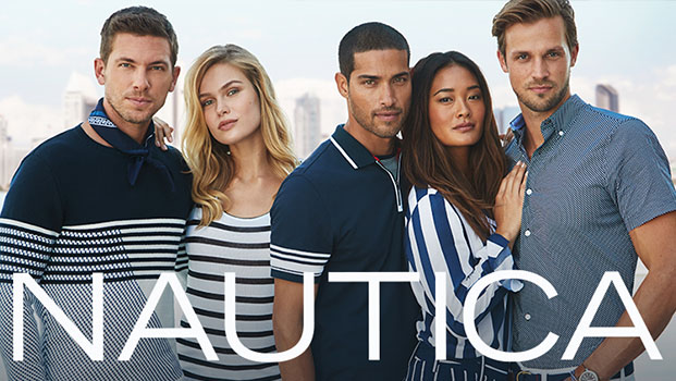
There's a lot to like here... the typography is excellent as always and the primary mark with the ship-ball-compass emblem hits a sweet spot of being able to immediately pick out all three elements without a single one being too forced or heavy-handed.
On the negative side, I don't care for the heavy reliance on navy/nautical blue. It's a design choice that makes sense in the context of the direction, but the Clippers have been tied to light blue and royal blue for so long and the darker blue isn't clicking for me. Even the almost entirely navy blue court and logos are giving me flashbacks of Nautica or a knock-off Tommy Hilfiger:
Again, it makes total sense if you're going in this preppy sailing/nautical direction... which would certainly be a choice, but I just don't see the team leaning enough into that direction to establish it as a long-term identity in the modern NBA.
-
1
-
-
1 hour ago, tBBP said:
Wanna stop by for a second to say to all those who swear up and down that yellow should never touch white: take a good look at this. 1) it ain't illegal, not even in the "rule" of tincture; and 2) when done right it can be mighty effective. (Also works for a team with a nickname inspired by space...)
The adidas stripes are single-color, so the yellow-and-white rule doesn’t quite apply here. If the stripes or numbers were navy trimmed in gold, then it’d be a “violation” of the rule (not really, but you get the picture)Regardless, that’s the best Galaxy kit in quite some time. I’m on record saying I prefer the Galaxy when they emphasize gold oand as a non-sash fan (more Real Madrid-ish directions), the “ghost” sash accomplishes both.
-
58 minutes ago, VampyrRabbit said:
The back of the shirt is the lighter shade of burgundy, which is why the shorts are that colour.The back of the shirt should be the darker burgandy as well then... doesn't change the principle , imo.
-
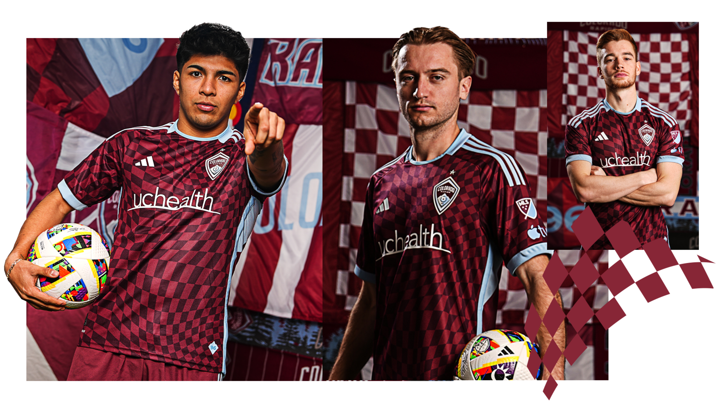
27 minutes ago, aawagner011 said:
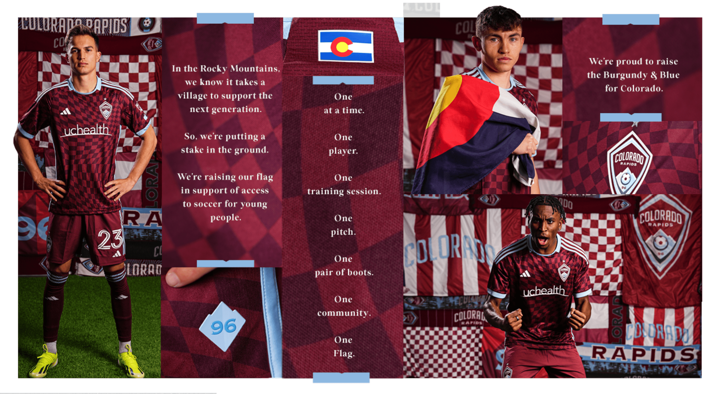
Colorado: it’s fine. I don’t mind the checkers. But I think their brand is a bit stale. Didn’t they have a kit with contrasting sleeves (either white or light blue) a while back? I think that could be a more signature look, and preferably with contrasting shorts, too.
I dislike it when the shorts match the lighter color in a tonal pattern. This top (which is perfectly fine) needs dark burgundy or light blue or even white shorts.
-
3
-
-
Yeah, surprised to see the hate on the Sounders look. Kit of the year for me.
-
5
-
-
11 hours ago, GDAWG said:
Vrabel seems to me like a guy who doesn't want to deal with NIL or the Transfer Portal on a daily basis.
I agree, but Ohio State is one of the few programs in the country where they would support him with a GM to manage the roster and transfer portal, coaching assistants who double as ace recruiters, and a Head of NIL to deal with collectives where Vrabel could just be the football coach.
-
1
-
-
2 hours ago, GDAWG said:
Mike Vrabel taking a year off is something. I wonder if he will be commentating games or if he would be good at it.
Ryan Day's seat might combust if Ohio State doesn't have an undefeated type of season with that roster.
-
Because then it wouldn't clash or read against the three giant letters? The NOB is single color and the number is 2-color drop shadow, so the effect is mirrored on the front and back.
-
7
-


/cdn.vox-cdn.com/uploads/chorus_image/image/65574061/161022317.jpg.0.jpg)


:format(jpeg)/cdn.vox-cdn.com/uploads/chorus_image/image/1555287/untitled__62_.0.jpg)
:format(jpeg)/cdn.vox-cdn.com/uploads/chorus_image/image/53094323/116614775.0.jpg)


2024 NFL Changes
in Sports Logo News
Posted
I don’t think that’s going to be the case as the coaching and on-field apparel has been mainly black for sometime with blackout logos being normal.
Black is simply a popular color for apparel, especially for big guys.