


GFB
-
Posts
4,611 -
Joined
-
Last visited
-
Days Won
10
Posts posted by GFB
-
-
4 hours ago, dont care said:
I really don’t know why the current logo gets so much hate. I like it far more than the old logo. It looks fiercer, contains all the colors, has more depth being 3D
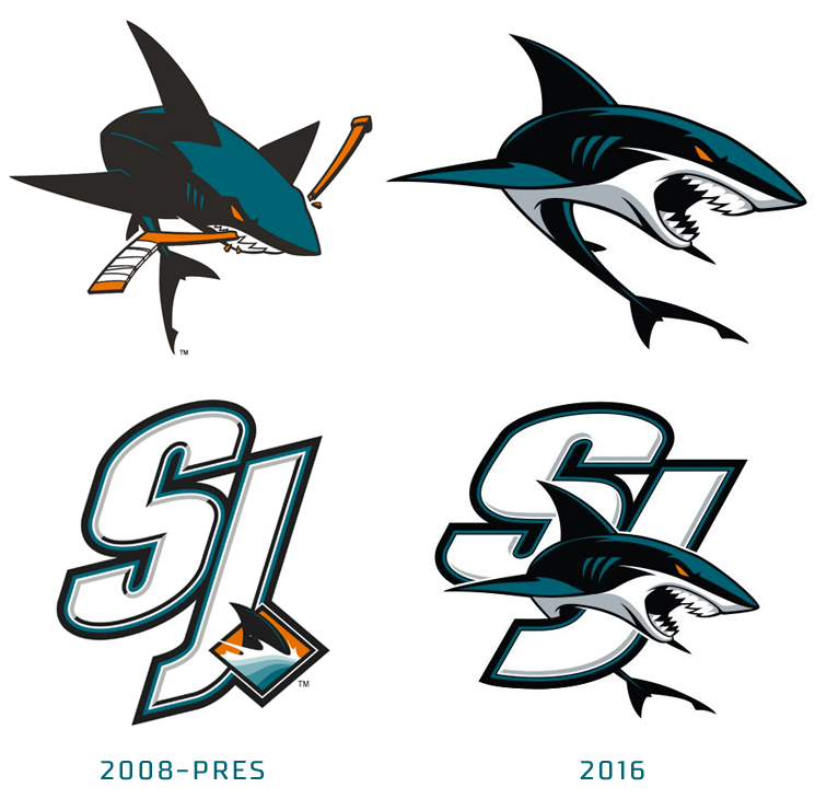
It's the style of the cartoon for me. The shark is so overexaggerated, with those thin outlines and edgy shapes. The nose is too sharp, the top of the body is too flat, the way the teeth are illustrated as two white sections instead of individual triangles... it takes me back to a very specific time in the mid-aughts when that style was everywhere:

And the funny thing is, when the team went back to the drawing board, the team didn't think they went far enough down the "anime" route:
I don't believe the original crest is some wonderfully drawn shark either (like LIU or the old Clearwater Threshers)... but it does look more like a "real" shark, and frankly the understated nature of the original appeals to me more than either of the hyper-aggressive cartoons that followed.
-
 3
3
-
 1
1
-
-
The Sharks are an updated crest (fourth time's the charm!) from a perfect look. Oh, and a metallic silver middle stripe would be better. And black pants and maybe gloves for the teal jersey away to break up the mono-teal look. I also wouldn't hate bumping up the brightness on the shade of teal a bit, as it's gotten darker and darker over the years...
Now that I think about it, the original sweater is still undefeated:
-
3
-
-
17 hours ago, ruttep said:
I cannot understate how much I like the new (old) shade of orange more.
Disagree with your point, but if you're going to make a side-by-side comparison between the old and new, don't use a super washed-out photo as your comparison point:
-
I'm a Michigan fan and I find the Conner Stalions stuff objectively hilarious.
-
 1
1
-
-
Colleges should be wearing their school colors and not creating "City Connect" uniforms, so this is good thing in my mind
-
12
-
1
-
 1
1
-
-
While the logo is simpler, the entire brand direction is the exact opposite of "blanded the f*** out."
If you tell me with a straight face that the new branding is more "bland," then I'm never going to be able to convince you of anything.
-
5
-
-
Just now, VampyrRabbit said:
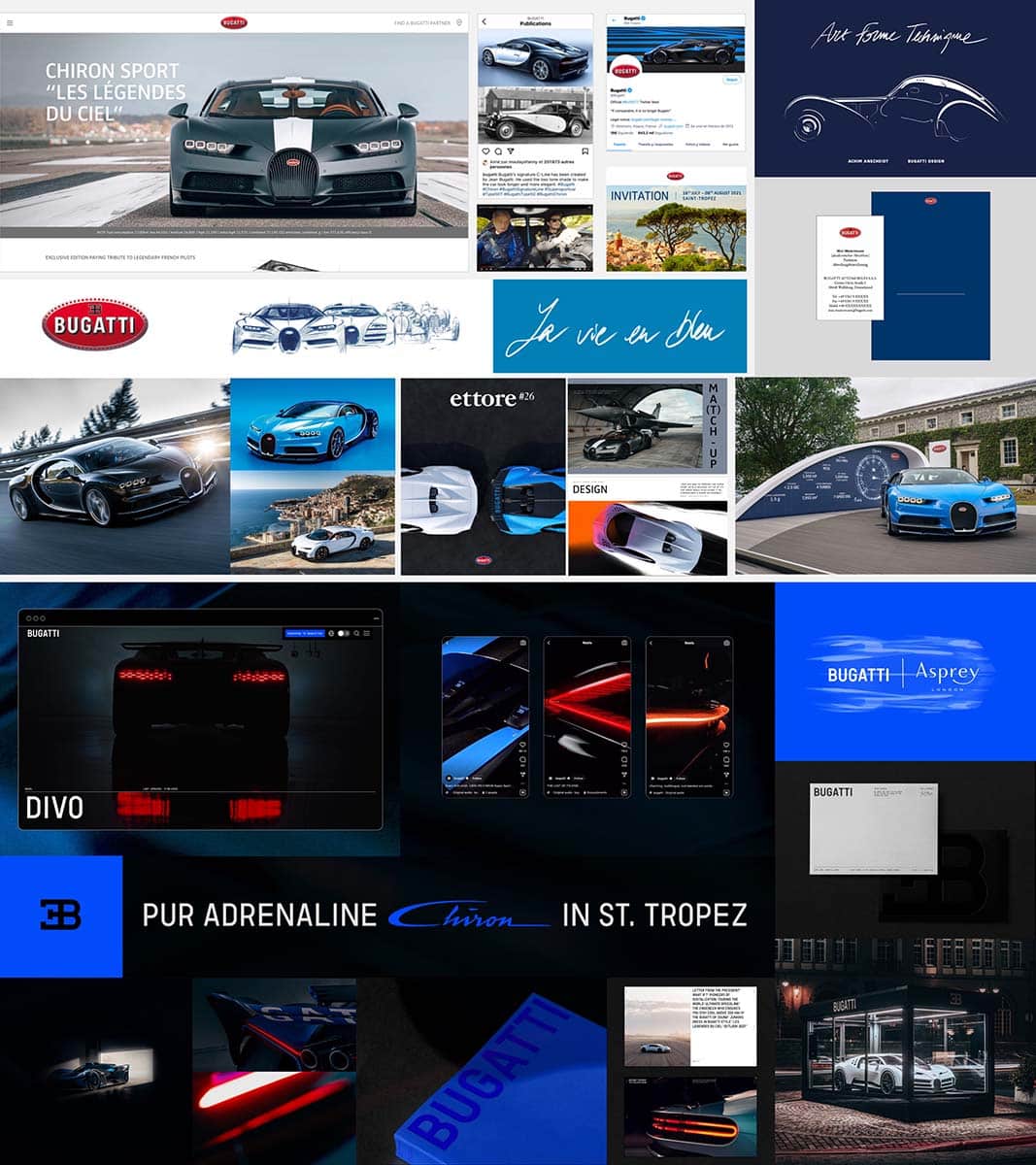
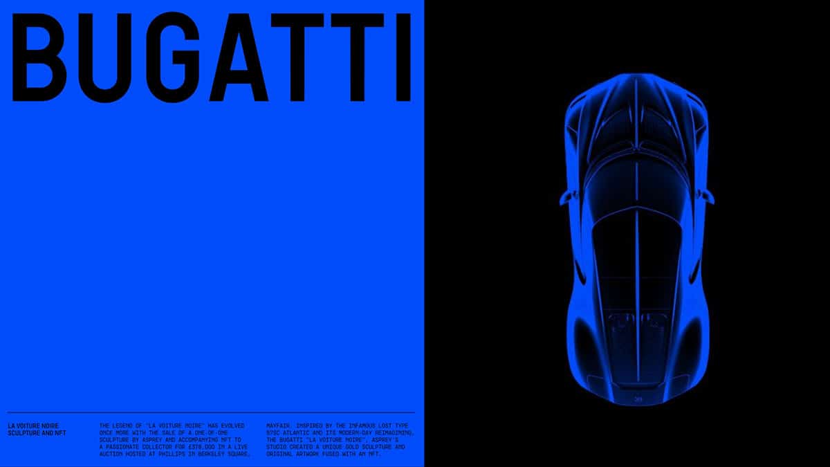
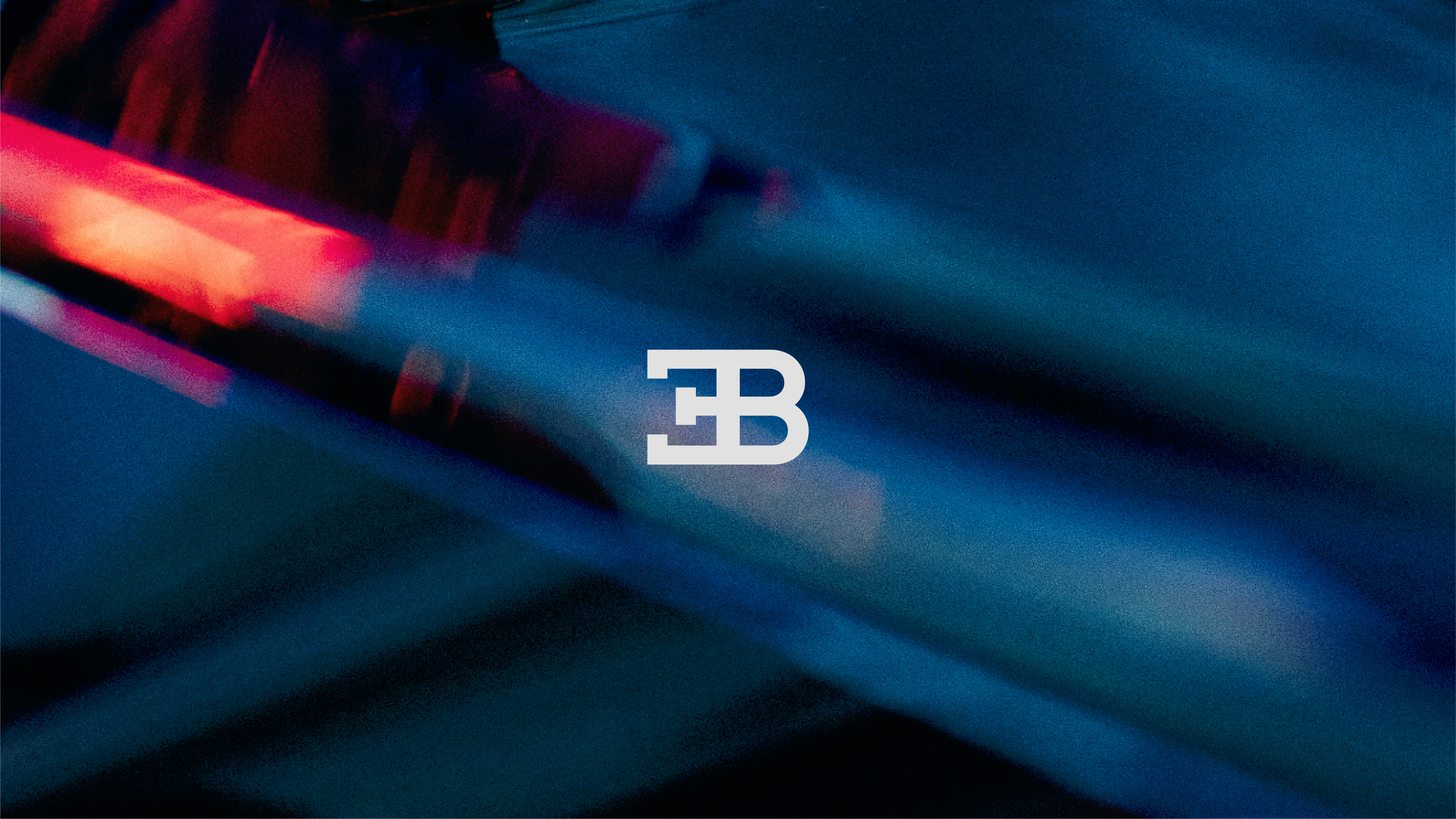
Problem with this update is that it not only gets rid of everything except the font and the EB monogram, it's also part of a trend that would have, quite simply, been anethema to Ettore Bugatti. The last word when you think of Bugatti, of the cars it has made, is minimalism.
Again, that's a rudimentary interpretation of the brand direction. You say it's minimalistic and therefore fundamentally opposed to the vision of Bugatti; I say it's restrained on purpose to highlight and allow the opulence of the car photography and lighting textures to shine through. If the branding was as visually stimulating as the car, there's a real argument to be made that you're only muddying the water.
It's why the best football helmets (Bengals, Eagles, Rams, Wolverines, etc) work better when they are allowed to be the centerpiece of the design with restraint, instead of having to compete for attention against loud/busy jerseys and pants.
There is absolutely a time and a place to wring your hands about a brand going way too vanilla... Johnson & Johnson is a great example. But there's a clear vision and purpose to this rebrand and, considering what it's replacing (again, there's not a lot of actual replacing being done, just clean up work), it's probably an upgrade.
Even if you don't care for it, it's far from "professional robbery" as so many posters in this thread have stated.
-
8
-
2
-
-
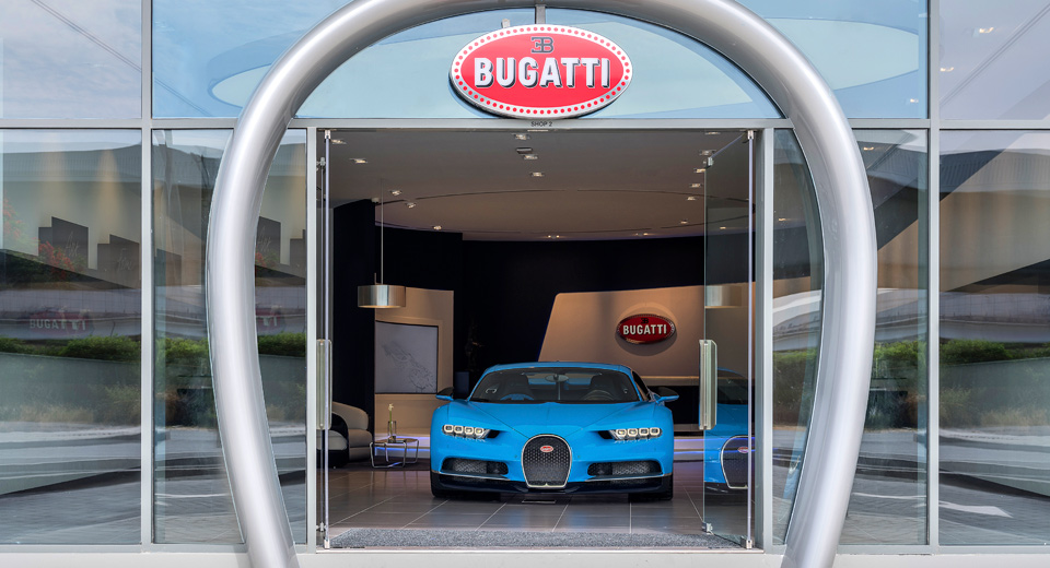
I'm all for the hysterics any time a classic logo gets updated, but the Bugatti badge has always been fugly and without seeing any of the new direction in context (the actual car badge, marketing materials, website, etc), this could absolutely be an improvement.
EDIT: Yeah, stop taking branding opinions from dumb car enthusiasts seriously... this is great. Going from red to blue is a bold choice, but red is already synonymous with Ferrari and yellow with Lamborghini, so the blue gives them something to own.
-
10
-
1
-
1
-
-
57 minutes ago, gosioux76 said:
I'm never one for the macho notion that uniforms need to look tough, but I was reading a news story from 1996 in which Trent Dilfer said something to the effect of his linemen looking and feeling inferior in wearing those uniforms playing such a tough and aggressive game. From that perspective, I can kinda see it. It makes you wonder whether the uniforms didn't contribute to those years of being a laughingstock.
Nothing from the lips of Trent Dilfer requires serious consideration.
-
1
-
-
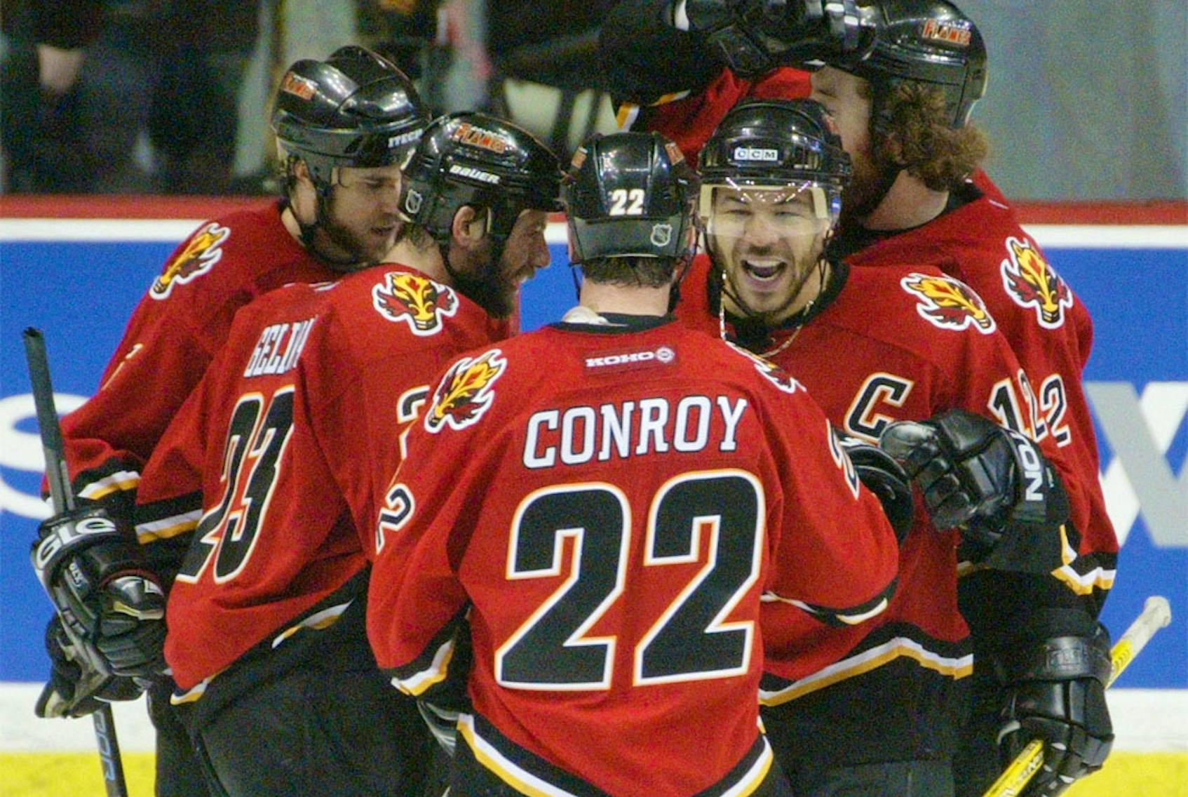
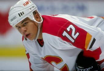
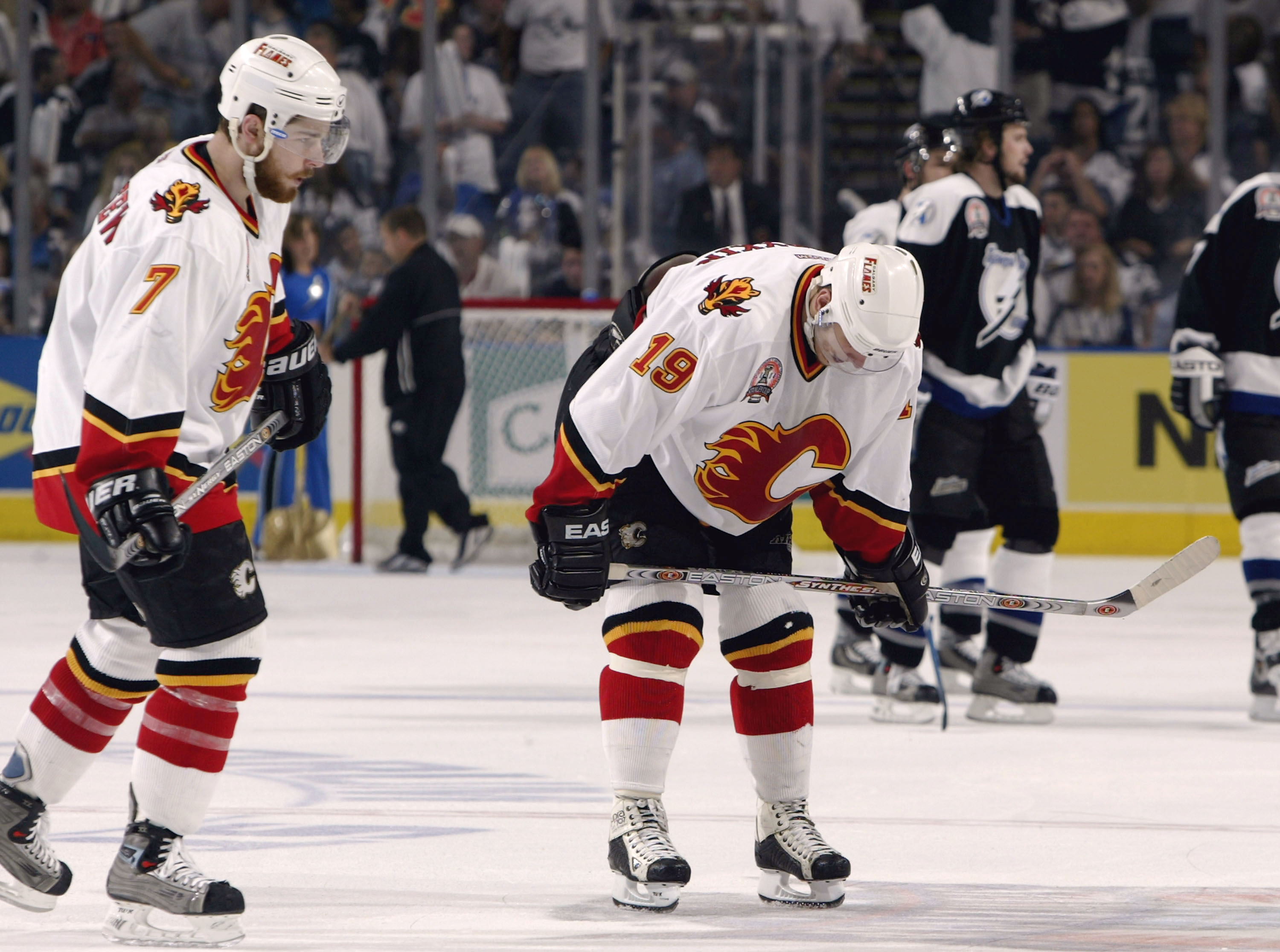
I will forever go to bat for this specific Flames uniform:
The colors are sharp and balanced. The sweater has this "charred" or "burned out" effect for a team named after fire. The uniform actually utilizes the yellow/white/black striping pattern found on the 90s set in a way that's actually appealing.
The problem with this uniform set was the dull white uniform and how the black outlines completely nuked the bright colors and "glowing red-hot" effect to the crest and numbers that makes the Flames old/current set so enjoyable:
I would enjoy it if the Flames brought back that 2004 red uniform as their alternate uniform and wore it a couple of times throughout the year to change things up as it does all the things I want from the Flames: it keeps the team in red sweaters with the flaming-C crest, yet it's different enough with the black equipment to give it a completely different vibe.
-
10
-
2
-
-
On 9/16/2023 at 8:02 PM, tBBP said:
That's pretty much how it goes for any serif/slab-serif typeface...this one is no different.
Grainy image, I know, but this is (what I believe) what the Eagles team font started from, Dharma Slab. Notice the similarities in series between the two character sets:
Now of course none of that explains the ultra-extended ear (terminal?) of the 1 in the Eagles' set, but it does give a reference point for the rest of the glyphs.
The only problem with this theory is that Dharma Slab was first published in 2011.
-
2
-
-
I really do not understand the constant pining for Vanderbilt’s old black star… that’s one of the most generic create-a-team logos I’ve ever seen.
The new brand, while simple, at least has some character to it.
-
8
-
 1
1
-
-
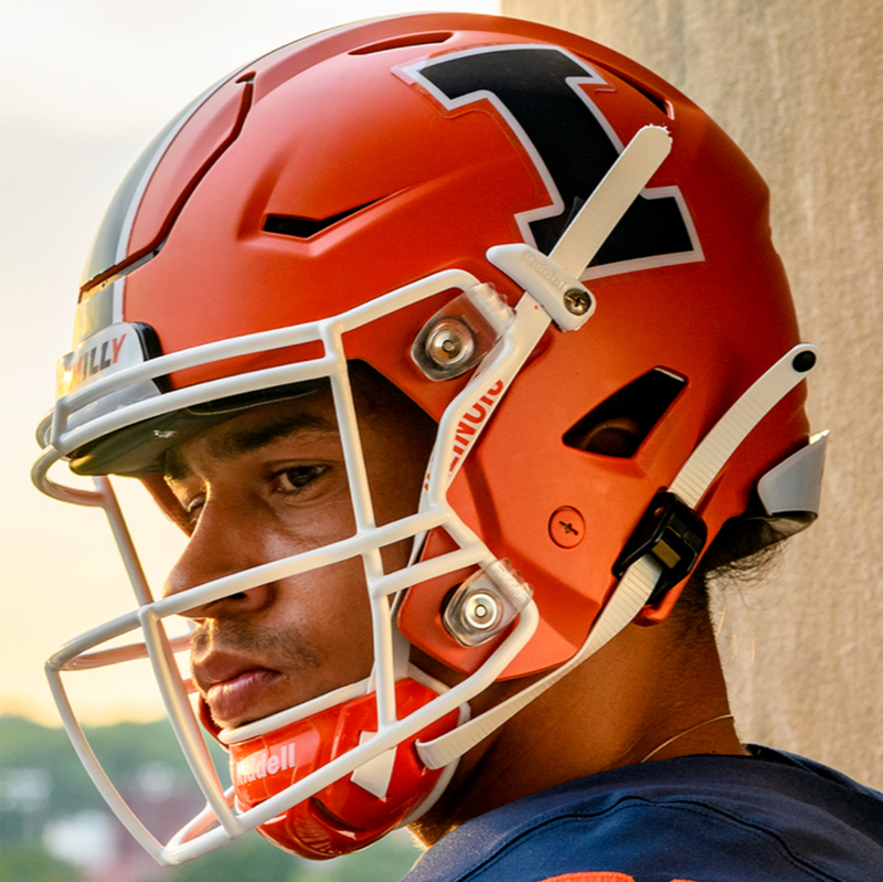
I realize I'm late to the Illinois vs. Syracuse debate, but the difference between the two schools should not be which school wears vertical stripes and which school wears horizontal stripes; it should be which school has a logo on the helmet and which school does not (or simply numbers).
Syracuse:
Illinois:
-
5
-
-
The Blackhawks crest/sweater proves that having colors or contrast not found in the sweater can be a net positive and not a problem to be “solved”
-
9
-
 1
1
-
3
-
-
Did anyone else catch the wordmark the Minnesota Wild were using at the draft with the pine tree inside the W? Is that new?
EDIT: For context:
-
3 minutes ago, MJWalker45 said:
If they paired this with blue pants, it would be a decent uniform. With all grey, it's just not as good a look as that helmet deserves.
...I thought this too, but then I remembered that the blue pants have silver stripes and those wouldn't match the dark grey jersey either, lol
-
2
-
-
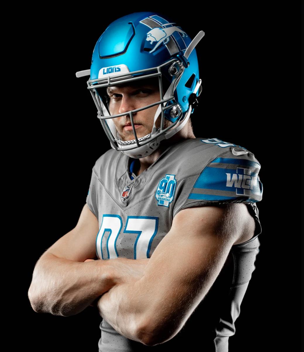
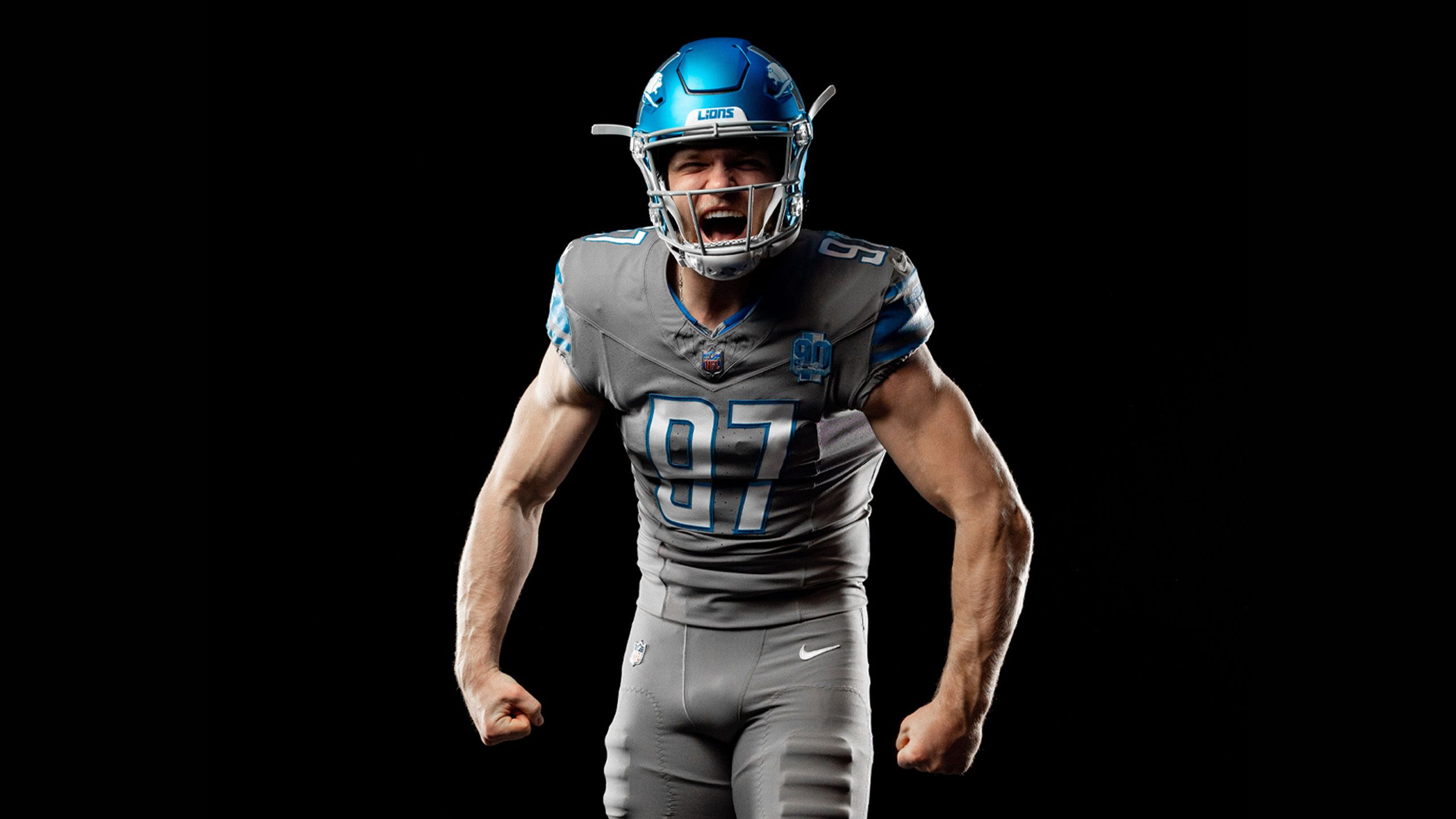
The helmet shell/finish is surprisingly sharp, especially in natural light:
However, I really question the goal of rushing this alternate helmet out now (vs waiting for next year) and pairing it with such an ugly uniform... If they had to unveil the helmet this year, it would have made far more sense to unveil the helmet shell for 1954 throwbacks (which would have made sense considering that the team is celebrating their 90th anniversary this season) and then add a decal to the helmet next year should they choose to.
...because this is perhaps the ugliest uniform combination in football:
-
11
-
-
Johnny Canuck is a cartoon. Exaggeration is perfectly acceptable.
Next you’re going to tell me that penguins don’t wear gloves or skates or that the Padres swingin’ friar is never going to hit for power because his base is off.
-
24
-
-
They're going to go by "Revs" just like the Volunteers go by "Vols"
-
3
-
-
Oops
-
2
-
5
-
-
It bothers me that the keyline on the Flyers' primary logo is almost twice as wide on the left side of the wings for no reason at all.
Really, this isn't a Yankees-style problem where multiple versions of the logo are iconic... just round-off the sharp lower-left corner of the wings on the jersey crest and extend them out a bit and then use it for everything.
-
4
-
-
Commanders has never clicked with me... It has always felt like the dollar store version of the ideal Generals, or the diet alternative to Admirals or Colonels. The brand currently feels.... empty and void of any kind of imagery or symbolism for fans to latch onto.
Are they asking their fans to dress up and cosplay as American soliders coming into the game, the way Raiders and Lions and Bears and Eagles fans do? To their credit, the mass majority of red-blooded NFL fans have more common sense than that when it comes to stealing valor or making light of the troops.
If any of the above is actually true, it's is a funny twist of fate in my mind; because at the time of the unveiling, my gut reaction to the Commanders moniker was that the team was using the American armed forces as a human PR shield in an attempt to quiet the loudest parts of the"They'll always be the 'skins to me, no matter what cancel culture has to say" fanbase... because who is going to speak out against honoring our bravest men and women?
-
5
-
-
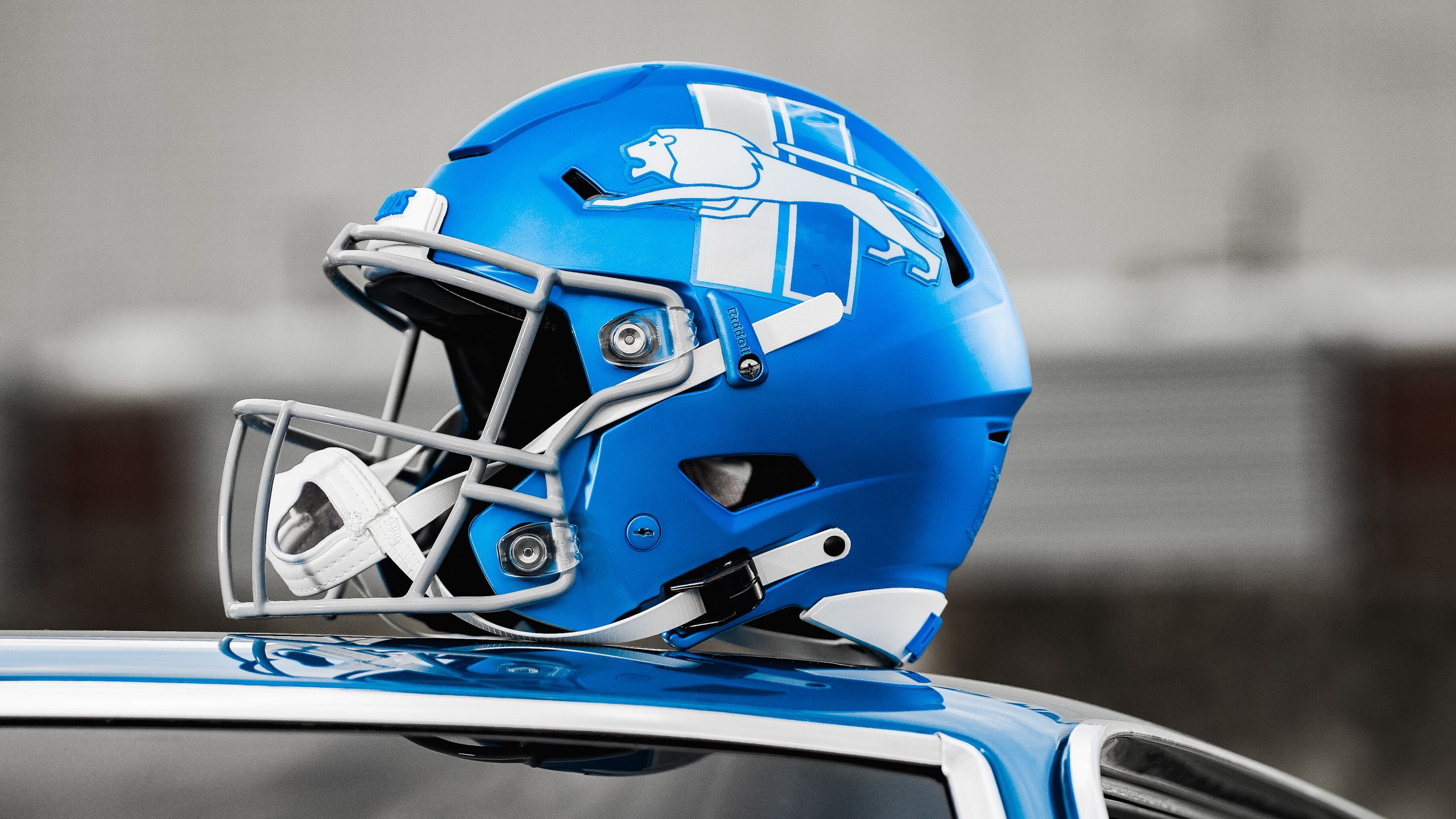
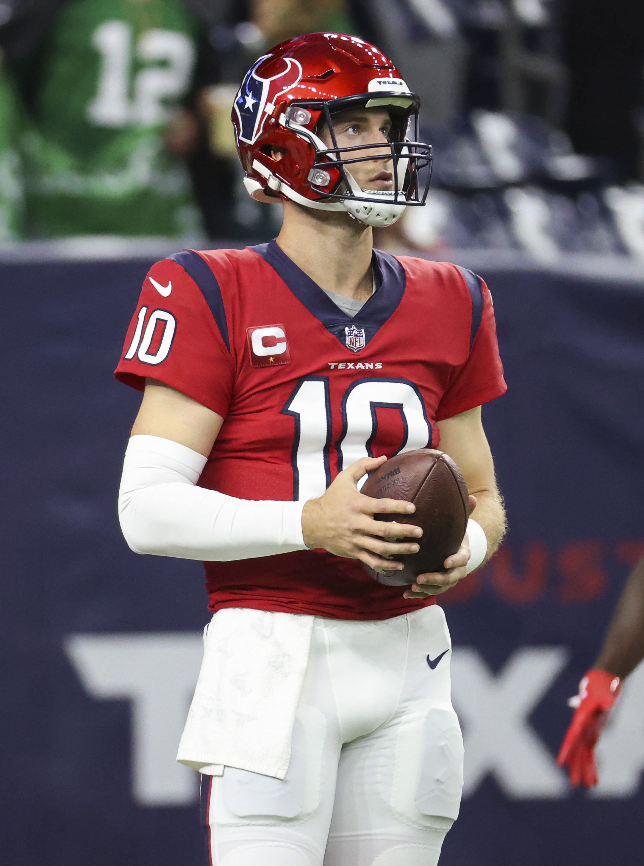
I hate the finish on the red Texans helmet... it's too dark and the finish shifts the shade of red too much toward orange.
-
7
-
1
-
-
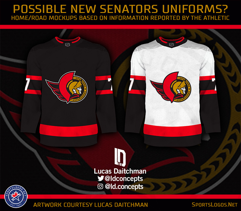
On 4/11/2023 at 10:57 AM, spartacat_12 said:
I liked the updated 2D when they unveiled it, and have a St. Patricks Day hat with the logo on it. Most of the fanbase however, seemed to never fall in love with it. When discussions about the logo were happening leading up to the rebrand, anytime I'd see someone suggesting they use the updated 2D instead of the original they'd quickly be shot down by the majority, so I can see why the team went the safe route and brought back the old one relatively unchanged.
I think the ideal logo is something in between the two. I like the cleaner, bolder lines of the updated version, but it also felt like it was missing something without the coming from the back. Something similar to the logo on this concept/mockup would be great.
The updated 2D is so much better balanced than the 1D or anything with the wings. It has the Ottawa flag/cape tie-in and you can center-align the circle crest with the center of the sweater, unlike the 1D, which is right-dominant and off-centered.
-
5
-


2023-24 NHL Jersey Changes
in Sports Logo News
Posted
If the Sharks just updated the original crest in the same style that they updated the original shoulder logo for the current uniforms, they'd be cooking with gas: