


Survival79
-
Posts
2,752 -
Joined
-
Last visited
-
Days Won
1
Posts posted by Survival79
-
-
45 minutes ago, DCarp1231 said:
How hard is it to just do a “C” with the shape of the state you play in? Jeez.
Like this?

-
 4
4
-
 3
3
-
 1
1
-
-
57 minutes ago, ATLJ said:
Apparently new Atlanta kit. Matches advertising they had about the third kit.
46 minutes ago, ATLJ said:Yea, this is horrible. No defending it. I'm sure some people will like it, which is fine. But this isn't really a kit design, just some text.
Like it? I love it!
Does that make me crazy? Possibly.
-
1 hour ago, Brave-Bird 08 said:
Unless I am having a Mandela-effect moment, that cat looks awfully similar to a popular cartoon cat though I can't put my finger on it...
Brak?
-
 2
2
-
 1
1
-
7
-
-
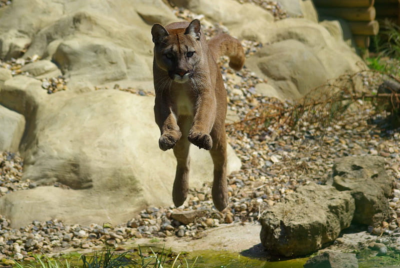
On 7/30/2023 at 4:37 PM, Survival79 said:
If only it were that simple. The feet on this panther are a :censored:ing travesty.
13 hours ago, andrewharrington said:I dunno. Adding a bunch of detail back there doesn’t seem right, either.
I didn't think that the old feet were all that bad.
-
8
-
-
On 7/28/2023 at 3:59 PM, Nordiks_19 said:
Now bring this panther as their official logo instead of the boring one they have
If only it were that simple. The feet on this panther are a :censored:ing travesty.
-
1
-
 1
1
-
-
1 hour ago, Old School Fool said:
Nobody told me the Knicks are changing the shade of orange and grey. It sucks.
New York Knicks Alter Colours for 2023-24 Season
-
3
-
-
5 hours ago, cajunaggie08 said:
Oh neat, a phrase no one in Tennessee ever said.
You're my boy, Blue! would have made everything alright.
-
1 hour ago, TruColor said:
I wish they could have used the proper wordmark however (check out the 'U' in 'Buccaneers" for example):
I also wish they had used the proper colors, and also provided the version of the logo that was used for marketing. (Different than was used on the helmets.)
Which colors would have been proper? The 1977 through 1979 colors?
Is the marketing logo the one used on the logo slick that you posted?
-
On 7/12/2023 at 11:42 AM, gosioux76 said:
Good lord, those Buccaneers uniforms are gorgeous.
The logotype is incredible too.
-
2
-
-
1 hour ago, flyersfan said:
a visibly rectangular patch with your wordmark on it is a disgrace

-
1
-
2
-
1
-
-
22 hours ago, NH4 said:
The sword is supposed to be “flame-bladed” but it looks more like a water sword.
"The wavy blade refers to the rippling water of the Hackensack River and the waves FDU student-athetes [sic] make on the field of play."
-
 1
1
-
-
On 7/5/2023 at 10:58 AM, monkeypower said:
While we're still DuckJacked, two things I remember seeing in an internet post years ago that want to take the temperature of.
What about the W's in the tape for Walt Disney?
-
1
-
2
-
 1
1
-
-
19 hours ago, tBBP said:
If anything, I'd say they should stroke the inside of that yellow circle...form a rim around those spokes. From there I could take or leave keylining the exterior of the wheel, but yeah...defintiely needs that black inner stroke.
-
8
-
-
On 6/28/2023 at 11:29 AM, SFGiants58 said:
While I’m not for oversimplification, the trend of double outlines looks very out-of-date, even tacky now.
The Centennial crest is nearly perfect. Perhaps add a black outline?
It's jarring when you see the Centennial crest next to the "current" crest. There's no way they go back to the "current" crest, right?
-
5
-
-
8 hours ago, fouhy12 said:
The stockiness of the WILD wordmark makes me want to pronounce it as willed in my head.
-
1
-
-
40 minutes ago, DCarp1231 said:
-
8
-
-
1 hour ago, aawagner011 said:
Here are some better quality photos.
Worst batting helmet in major league history? I recall we had the Mets blue and black helmet about 15-20 years ago but this is worse.
-
3
-
-
4 hours ago, BadSeed84 said:
When Buffalo looked like Buffalo and Houston looked like Houston.
 And you knew who you were then / Girls were girls and men were men
-
4
-
-
The ad patch bar has now been set ridiculously high.
-
3
-
-
1 hour ago, NYCdog said:
First appearance of the Texans new Old English wordmark for the 2024 rebrand?
Some other items from "The Wild Collective" on the NFL Shop.
-
1
-
-
-
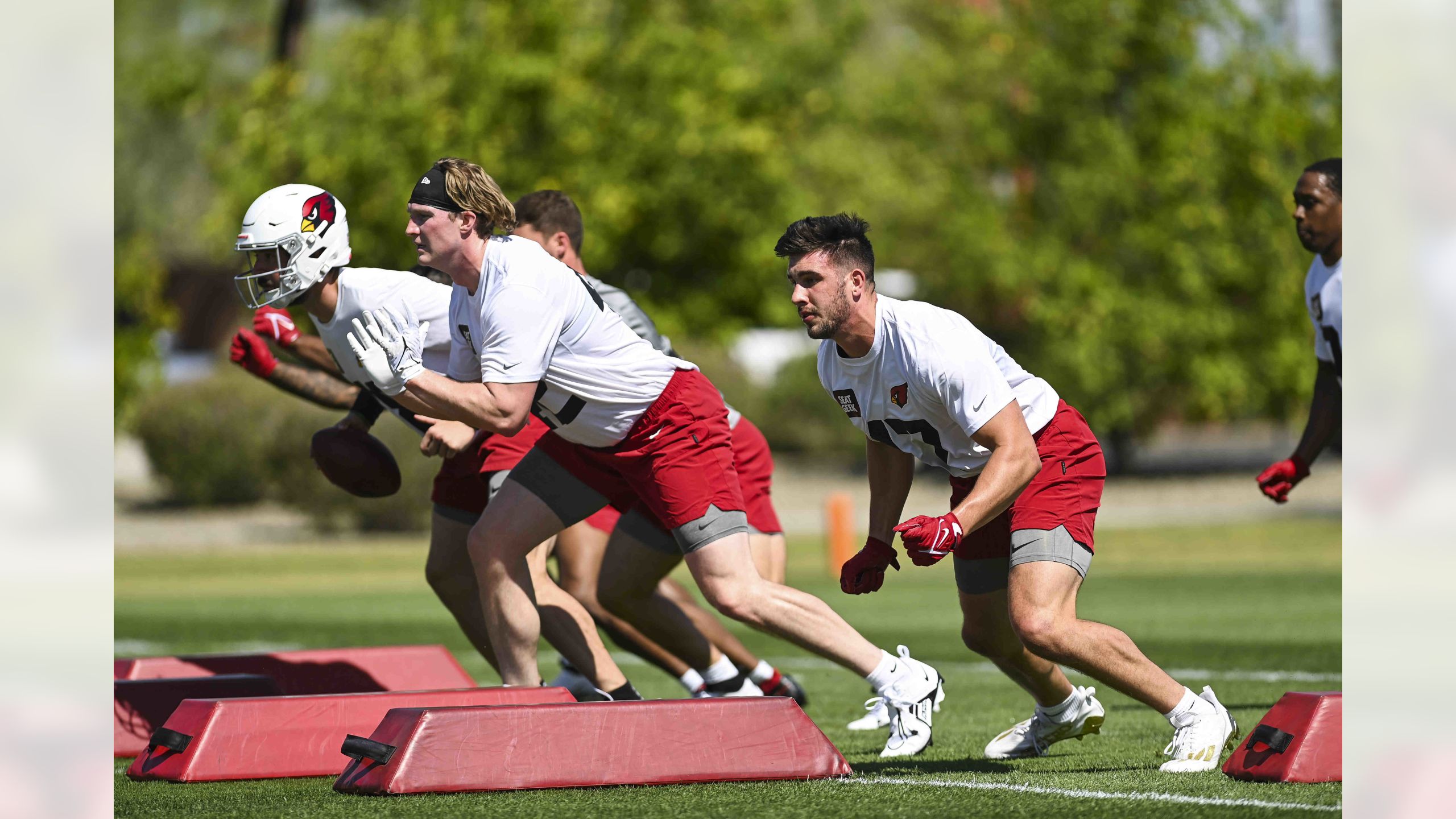
28 minutes ago, TheOatsMustFlow said:First look at a new Cardinal helmet in natural lighting. Looks the same.
-
1
-
6
-
-
14 minutes ago, Kg54mvp said:
Ben Stiller is, and always will be, my favorite Charlotte Hornet.
-
3
-
1
-
3
-
-
3 hours ago, BadSeed84 said:
Maybe they'll replace the jersey logo with the primary logo?
-
1
-


NFL 2023 Changes
in Sports Logo News
Posted
Michigan quarterback Devin Gardner to wear No. 98 for the rest of his Michigan career