


Survival79
-
Posts
2,750 -
Joined
-
Last visited
-
Days Won
1
Posts posted by Survival79
-
-
32 minutes ago, Conrad. said:
Don't think I've seen anyone mention it, but does it bother anyone else that the 'L' in the center logo and the 'L' in the baseline logos have a different width to the bottom horizontal stroke? Not sure why they changed it for the baseline logos...

Of course it does!

To make it even worse, the L in the alternate logo doesn’t match the L in the center court logo or the L in the baseline logo.
-
 1
1
-
-
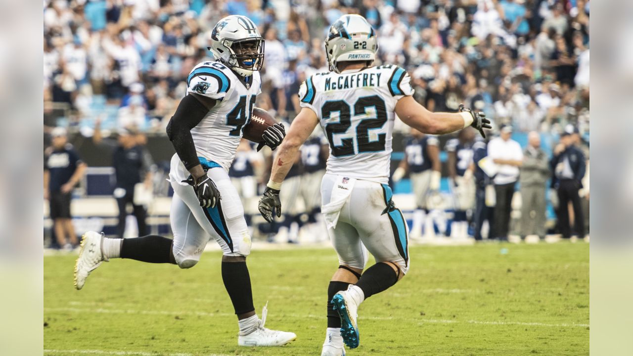
51 minutes ago, tBBP said:
Time out—where was I when this game was played? This is the first time I've seen the Panthers wear black socks with their away whites...
September 9, 2018 (home game):
October 30, 2022 (road game):
-
1
-
-
11 minutes ago, MJWalker45 said:
It all depends on your definition:
intersectin American English
(ˌɪntərˈsekt)TRANSITIVE VERB1.to cut or divide by passing through or acrossThe highway intersects the townINTRANSITIVE VERB2.to cross, as lines or wires3. Geometryto have one or more points in commonintersecting linesSo the XFL's foundation is the cutting or dividing of dreams and opportunity?
-
3 hours ago, MJWalker45 said:
The XFL Championship Trophy features a football above a gold-treated “X” that symbolizes the XFL’s foundation as the intersection of dreams and opportunity.
Except the "X" doesn't, you know, intersect.
-
 1
1
-
-
17 hours ago, CardsFan79 said:
That video is very moving.
I sure hope that they start every home broadcast with this. It is incredible.
-
2
-
-
19 hours ago, MJD7 said:
I mean…
This is pretty much the definition to me of an “eyesore.”More like the definition of a sight for sore eyes.
-
3
-
 1
1
-
1
-
-
3 hours ago, Webhamster said:
It's funny because I remember the outrage around here when the Roman concept was unveiled around 1992. But, like anything, people warmed up to it.
If you think the outrage in Ottawa was bad, you should have been on these boards. ABSOLUTE BLOODBATH.
-
1
-
-
1 hour ago, ramsjetsthunder said:
Are there any photos out of the players wearing the new helmets? Literally every photo I see they're either holding it or it's not present. Great way to display your uniform. Smh
It'd be nice to see the helmet under stadium lights or natural light. I wonder how noticeable those silver flakes will be. Right now they just look like overspray.
-
4
-
-
On 4/21/2023 at 7:43 PM, DTConcepts said:
On 4/23/2023 at 10:57 PM, BuckDancer said:
Something like this, but with a different font?
-
7
-
1
-
 2
2
-
 1
1
-
-
13 minutes ago, FinsUp1214 said:
Yeah I noticed ESPN suddenly using the bear head site wide last week instead of the wishbone C. I wondered if something was up. I wonder what the reason for the switch was, it’s interesting that it was pretty much done without a peep.
Good catch. I just checked a handful of websites and ESPN is the only one that uses the bear head.
-
1
-
-
1 minute ago, WSU151 said:
Someone mentioned that the C and bear are interchangeable as primary logos. Defeats the purpose of "primary" but c'est la vie.
They were both previously listed as primary marks, but now they are not.
-
7
-
-
Has this been discussed yet?
-
8
-
 1
1
-
-
Miss me yet?
-
2
-
2
-
 4
4
-
8
-
-
5 minutes ago, bobt said:
This coach is really odd He also needs a shave. Now he wants to strip?
Are we sure he isn't a Dierdorf?
-
2
-
-
2 minutes ago, j'villejags said:
Hopefully Buffalo Bill is not modeling the uniforms.
Would you flock me? I'd flock me. I'd flock me hard. I'd flock me so hard.
-
5
-
-
I swear that was the opening beat to Goodbye Horses.
-
1 minute ago, j'villejags said:
Survival is our Dillon Brooks. He’s poking the bear(s).

I promise I won't do it again... in this thread.

-
1 minute ago, HOOVER said:
This almost sounds like they swapped Cardinals into the Panthers press release.
-
1
-
1
-
3
-
-
TEMPE — The Cardinals will have a (slightly) new look this season, but it's not a dramatic change, and perhaps not one most people will even notice.
When Nike started making NFL uniforms in 2012, the red they used was the one in their color book that most closely matched the Cardinals' color, but it was not an exact match. In recent years they have added more colors to their color book, so they now have a closer replication that is more in line with the team's red – Cardinal red.
The color correction coincides with Nike's shift to a new uniform technology. While there have been reports that other major changes were afoot, the team is not dropping black from the color scheme or making any other drastic re-designs.
-
2
-
8
-
1
-
-
9 hours ago, MDGP said:
**** THIS POST IS NOT A LEAK NOR A PREDICTION ****
One thing that's interesting to me about all this, assuming that the information TruColor has received is correct, is that the new color scheme will be more like the St. Louis Cardinals color scheme of the 1960s (top colors vs. the current color scheme on bottom) with the maroon color and yellow that's a bit darker.
- 1960 Through 1979
- Potential New Colors
- 2005 Through Present
-
-
2
-
4
-
-
3 hours ago, oldschoolvikings said:
Didn’t TruColor say maroon and orange pages ago?
Enough with the copper guesses already.
-
13
-
-
13 hours ago, DCarp1231 said:
Something similar to this?
-
9
-
3
-
1
-
-


MLB 2023 Uniform/Logo Changes
in Sports Logo News
Posted
MLB’s Latest City Connect Leak: A Hilariously Bad Orioles Jersey