


Survival79
-
Posts
2,752 -
Joined
-
Last visited
-
Days Won
1
Posts posted by Survival79
-
-
-
58 minutes ago, AgentColon2 said:

-
 1
1
-
-
45 minutes ago, TruColor said:
The new Cardinals unis are going to be way more "outside the box" than the Commanders...
CLEAR. SIDE. PANELS.
-
 2
2
-
2
-
 12
12
-
-
I'm going to be very disappointed if someone from the board isn't currently on the way to those coordinates.
-
4
-
9
-
-
Mets to get rid of 'Phillie colors' on new jersey patch
Steve Cohen saw all of the memes about the new New York Mets' sponsorship patch and decided he needed to make the change.
"They're Phillie colors," Cohen said. "They should be more Met-appropriate."
After a call with NewYork-Presbyterian, the Mets will be tweaking the new sponsorship patch -- the team's first. The patch, which was red and white, will now sport a more team-friendly look.
Fans on Thursday poked fun at the patch and its sponsor, especially because of the large group of players -- including Justin Verlander and Edwin Diaz -- currently on the injured list.
Cohen did not reveal when a new patch would make its debut on the Mets uniforms, but the team will play with the Phillies-colored advertisements on its sleeves during Friday's home opener at Citi Field.
-
3
-
3
-
 2
2
-
-
10 hours ago, Ferdinand Cesarano said:
The last A's manager to wear the white coaches' cap was the guy who got rid of it, Billy Martin.
Bob Melvin, April 17, 2018:
-
3
-
-
7 hours ago, logo-maker said:
I wouldn't mind them wearing full purple hats, too (at home).
Don't forget to include a purple batting helmet.
-
8
-
2
-
 1
1
-
-
So... from this to this?
It's not as drastic as I thought it would be. Although it sounds like the colors will be distributed differently in the new identity.
I always imagine the Cardinal Red being so much brighter than it really is.
-
10
-
-
Alone? Do they not see the TRƐ right next to it?
-
2
-
1
-
3
-
-
-
5 hours ago, infernoqueso said:
I think it is cool to have a little flair that you will only notice if a team wins the stanley cup, or scores a goal.

-
6
-
-
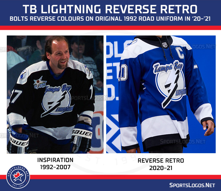
On 2/26/2023 at 1:33 PM, Kramerica Industries said:
So frustrating. Take those two sweaters plus the white one, swap out the original logo for the current logo, and the Lightning have their three sweater combination that they would never have to change again
(Replace the current blue used below with the original Honolulu Blue. And add the victory stripes.)
23 hours ago, tBBP said:Perhaps something like the 1984 through 1996 Honolulu Blue?
The Lightning initially used the same blue (and the same silver).-
5
-
-
2 hours ago, dont care said:
No the lines are pretty different.
14 minutes ago, GriffinM6 said:It's the same basketball, it just has the lines uncovered in the center.
-
9
-
-
On 2/18/2023 at 5:12 PM, GriffinM6 said:

-
5 hours ago, LogoFan said:
Found this...it explains the features in the Vipers' primary. I'm kind of speechless that this kind of minute explanation is even necessary. Whatever happened to simplicity?
https://www.fox5vegas.com/2022/10/31/las-vegas-xfl-team-be-named-vipers/
-
2 hours ago, adsarebad said:
please tell me that is not real?

Unfortunately, it is.

-
 2
2
-
-
3 hours ago, cajunaggie08 said:
Oxy is officially the jersey sponsor on the Astros uniforms for the next 7 years. For those who dont know, its an oil company (Occidental Petroleum)
What a bunch of oxymorons.
-
1
-
2
-
-
On 1/23/2023 at 12:26 AM, ebod39 said:
oh no, the humanity!
Exactly!
-
2 hours ago, bowld said:
Anyone else think that when shown side by side the old version just looks outdated? Obviously the collar is crap but the white in the logo makes the logo seem off now when compared to the new one-
I'm glad I'm not a Canucks fan, because this would drive me crazy.
-
1
-
 2
2
-
-
-
14 hours ago, Cujo said:
"TURNS"

That's nice.
I can fix that problem.
-
7
-
1
-
 1
1
-
-
Anyone else no longer receiving a notification email when your content receives a reaction or mention?
UPDATE: It seems to have resolved itself. Notification emails finally showed up, just significantly delayed.
-
17 hours ago, MJD7 said:
Here's a comparison of recreations I've attempted making of both:
A combination of the two might be ideal.
16 hours ago, Survival79 said:Replace the win on the right with the win on the left.
-
2
-
-
57 minutes ago, MJD7 said:
Here's a comparison of recreations I've attempted making of both:
A combination of the two might be ideal.
Replace the win on the right with the win on the left.
-
2
-


NFL 2023 Changes
in Sports Logo News
Posted