


tajmccall
-
Posts
2,862 -
Joined
-
Last visited
Posts posted by tajmccall
-
-
3 hours ago, Lights Out said:
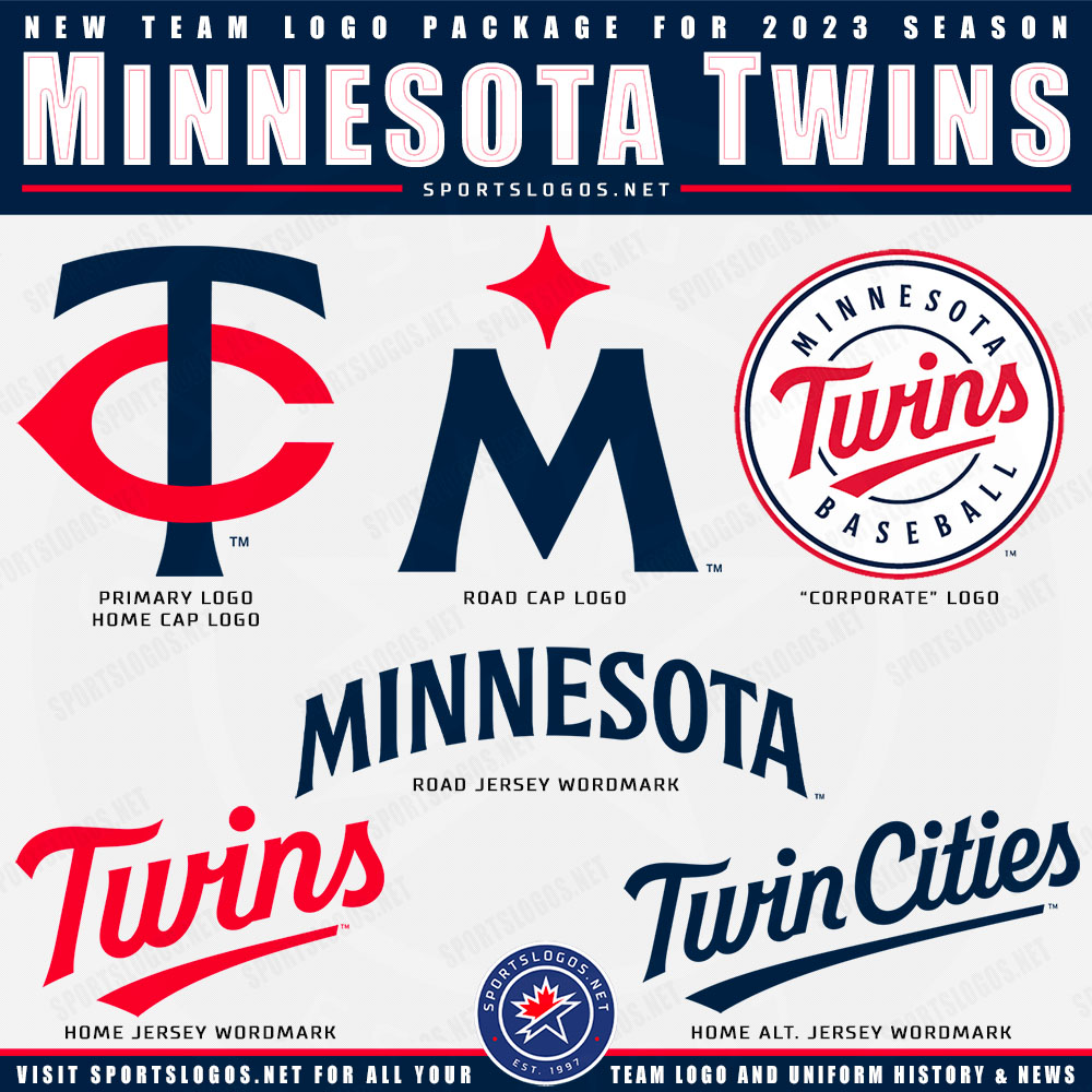
Well, that explains why it looks like the Twins' rebrand - it's the same designer.
Wolff seems to have a particular style. I also noticed that several of the soccer team logos he's designed have Art Deco-style typography that's very much in the same vein as the Clippers' new text font.
I'd say its more 'Retro Minimalist' But its very clean and a very timeless look layered over some modern minimalist sensibilities.
Its nothing new, but its a refined nod to old, while feeling fresh and updated for today. I'm here for it. -
4 minutes ago, PaleVermilion81 said:
This is the last I'm going to post on this kit. As a MNUFC fan it just depresses me and I'm letting it go and counting down to the 2026 replacement (and hoping we have a manager by then). But this is literally all I see when I see the new kit:

Plus
Equals
Well i would at least buy this remix.
-
 1
1
-
 6
6
-
-
Those Canada jerseys are some of the worst i've seen in sometimes. In terms of design, legibility and overall aesthetic. Absolute disasters.
-
4
-
-
21 minutes ago, namefornamesake said:
Look at the roundel.
good catch.
Also they used the same or a similar font to the Mariners alternate jerseys and the North Star logo with the M is kind of Mariners for me as well - but as a Twins fan i see this as an absolute upgrade.
That will be abandoned in 10 years for another round of throwbacks to the 87-00s mashup.But I really mostly like it, and i'm usually a hater of pinstripes not on the yankees. I'm glad they kept if off the homes. They already own us, we don't need to also look like them.
Expect Minne and Paul on the City Connect jerseys next year. Just a guess
-
1
-
-
Maybe the worst ranking in ESPN history, which is saying something.
https://www.espn.com/nhl/story/_/id/34829213/ranking-all-32-nhl-reverse-retro-jerseys-2022-23
-
2
-
-
4 hours ago, mjd77 said:
Just once, I'd love to see a player come right out and say a new uniform is crap.
Chris Sale was pretty demonstratively and publicly against the old White Sox collar throwbacks. Even took it to the level of destroying the whole roster’s jerseys so he didn’t have to wear them.
https://www.gq.com/story/chris-sale-pitcher-uniform-meltdown
-
7
-
-
On 5/23/2022 at 1:10 PM, Lights Out said:
As far as the draft hats are concerned, literally anything is better than the bootleg gas station hats that Adidas was putting out in the late 2000s.
I'm pretty sure the target audience for these things was the same demographic that only watches college basketball because "they play defense, unlike the NBA."

Gas station hats is a fantastic description of these clown shows.
-
On 2/2/2022 at 9:09 AM, CS85 said:
There are countless high schools around the country that exist on a shoestring budget whose uniforms and identity are more original and well-executed than this, and I think I know why:
This is what happens when you let a rich idiot design a football team's identity. This whole brand reeks of some young, full of crap aristocrat asking his dad to buy the Mercedes F-150 Tungsten Limited Denali Platinum Reserve pickup that gets .04 MPG, putting in cheetah pattern leather upholstry, hanging some truck nuts off the back, and then selling it 3 years later with less than 1000 miles and the sale paperwork still in the glove compartment after he drove it to class a few times blaring Florida Georgia Line and donning a '47 brand Alabama cap and a Carhartt jacket so he can impress a cheerleader he plans to rufee at the next barn party.
They don't understand what a football identity is, they don't understand how branding a sports team works, they don't comprehend cohesion in uniform elements, they don't respect tradition from a uniform perspective, they don't know what they're doing in the least. They throw money at it and get all the options, slapping every possible football-y college trend possible at it in hopes that it gets some decent marketing response.
It's all a complete and total failure, orchestrated by frauds and executed by fools.Can confirm once you get doing bigger level jobs, more "visionaries" think they also understand design, or worst, design by committee.
The only thing you get is something that nobody likes, but nobody hates.
There isn't much to hate about this (the white jersey is up there,) but its devoid of anything to like.This to me reeks of design by committee. When I read Snyder's wife was in charge of uniforms, I knew it was going to be a :censored: show.
-
2
-
-
On 1/4/2022 at 11:56 AM, tajmccall said:
I have a feeling the name is going to be something extremely stupid. Its Washington DC - i expect them to overthink it and pander to someone. I assume the Military will be the ones who get that honor this time out.
Its almost certainly going to be Commanders. And its going to be stupid as hell.
Gotta take the poorly rendered W on this call, FOLKS.
-
4
-
-
1 hour ago, nuordr said:
They should have used this the last 2 years
Agreed. Or at worst kept the helmet stripe.
-
3
-
-
I have a feeling the name is going to be something extremely stupid. Its Washington DC - i expect them to overthink it and pander to someone. I assume the Military will be the ones who get that honor this time out.
Its almost certainly going to be Commanders. And its going to be stupid as hell.
-
On 3/31/2019 at 6:36 PM, Quillz said:
Supposedly the Hawkeyes have had this "alternate" logo since 1999, but it was in fact an attempt to modernize the primary and was never implemented.
It really is terrible. The spacing of black and yellow between themselves is all over the place, and just creates a visual riddle for the eye.
Young designers - when you're making (especially 1 & 2 color) logos, consistency in spacing between elements is crucial. It doesn't need to be the same by any means - but it should have some uniformity. The five main elements (4 parts and oval) are all over the place. It looks like a messy room.
-
4
-
-
On 2/28/2019 at 9:24 PM, Earl said:
Believe it or not, in the past year and half they've created these:
It's not like what we seen from Torch or on here & Behance but they're still serviceable. Each are improved updates from their previous brands. Where would be your alma mater?
These would be bad FANTASY logos.
Only nepotism could get that place the work it does. Its consistently piss-poor.
I'm in the industry, I hate :censored:ting on other people's work, but its frustrating when others can do so much better, for so much less money.
-
7
-
-
How many times have they rebranded in the past decade?
That said, I like it. Really like the Sounds script.
-
1
-
-
On 7/12/2017 at 9:39 PM, Silver_Star said:
RAM IT. KNOW HOW TO RAM IT. AWESOME!
-
Looks pretty good. My Avatar seems to be gone, but that can be rectified.
-
Whoops. Probably should have just played a season and gotten the merch sales for the orange and saw how it went before overreacting to a few hundred angry emails.
-
And the unnecessary double stroke, a 90s staple!
-
WELL I THINK INDIAN MASKOTS R RONGG!
No but seriously, here is a good read. Much better than the same argument, by the same players, only in a different forum.
Enjoy! Choose for yourself!
-

The duds that got me into jersey design as a kid. Still love em.
Even liked these pants.

-
2
-
-
This has turned into "look, guys play for different teams."
Which...gets...this
Ok thats it, i'll stop. For now.
-
this is what an hour of boredom at work makes.
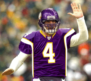
Thanks. I've always wondered what Jeff Garcia would look like as a Viking.
It actually looks more like Todd Bouman, but I wouldn't expect you to catch that.
-
this is what an hour of boredom at work makes.
-
Um.
Yah.
You understand that's an ultra-shady thing to ask, right?
Thats like asking a bunch of musicians the best way to download music.
Good use of forethought there.


Los Angeles Clippers Rebrand
in Sports Logo News
Posted
Cool lockup of the clippers logos.
I think the Carnival Cruise ship in the crosshairs isn't a great mark, but the rest of it is very strong. You can minimize that global logo pretty easily, like most NBA teams do.
Sidebar - anybody else find if odd that the NBA has requirements that the GLOBAL icon is the one that relies on the most English/words. Seems to me a Global icon should be the most symbolic and easiest to digest is your brand. Seems like a giant waste to insist every team shoehorn their (often long) team / city names onto a logo. The NFL and Soccer have no issue with this and their logos.