jgiff17 Posted August 6, 2013 Share Posted August 6, 2013 Add a grey face mask and they're good! No really I like it the colors scream Miami I hear the Miami vice theme music and I hear will smith start rapping...so maybe not the greatest but I'm glad the drop shadow is GONE! Link to comment Share on other sites More sharing options...
phutmasterflex Posted August 6, 2013 Share Posted August 6, 2013 What is this "tramp stamp" you guys are all talking about?The words on the top of the behind.Ah. Makes sense.Google.com is your friend, too. Slightly off topic: Is there any particular reason why the HOF game counts as a 5th preseason game for the teams involved? Seems like the smart thing to do would be to just eliminate a road preseason game from the participating teams' schedule.Because the HOF game is four days before everyone else's first game. There's a disadvantage of having an almost 10-day gap between the HOF Game and the second week's game. Go A's! Link to comment Share on other sites More sharing options...
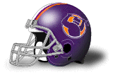
Gr3g3 Posted August 6, 2013 Share Posted August 6, 2013 Needs much more orange. Number font is terrible on certain digits. Tramp stamp is embarassing. Link to comment Share on other sites More sharing options...
Jt0323 Posted August 6, 2013 Share Posted August 6, 2013 Personally I love the logo.Love the helmet, minus a few issues. I wish the orange was more prevalent. I hate that you can barley see the Orange on TV. They should have atleast had the orange stripe the same width of the blue. Personally, I wish they got rid of the middle blue stripe and had it Aqua and Orange Link to comment Share on other sites More sharing options...
rafmed Posted August 6, 2013 Share Posted August 6, 2013 Make the orange double in size than the blue in helmet and numbers, probably a little more dark the aqua, and remove the tiny dolphin on the sleeves, probably stripes would look better there. The logo has grown on me, I like the helmet a lot, again, just make the orange double the size of the blue. Link to comment Share on other sites More sharing options...
Midway Posted August 6, 2013 Share Posted August 6, 2013 The number font bothers me the most. At least the uniform as a whole has some sense of cohesiveness but the custom numbers might be the worst designed I've ever seen. Link to comment Share on other sites More sharing options...
Gothamite Posted August 6, 2013 Share Posted August 6, 2013 I don't know that they're any worse than most of the custom numbers around the league. Bad as they are, they're certainly better than the Eagles' or Patriots' numbers. The Green Bay Packers Uniform Database! Now in a handy blog. Link to comment Share on other sites More sharing options...
wonderbread Posted August 6, 2013 Share Posted August 6, 2013 I don't know that they're any worse than most of the custom numbers around the league. Bad as they are, they're certainly better than the Eagles' or Patriots' numbers.Whats wrong with the patriots, it's just a normal block font, that is stretched and squeezed in areas, it looks pretty normal, but separates them from the rest of the league at the same time Link to comment Share on other sites More sharing options...
whitedawg22 Posted August 6, 2013 Share Posted August 6, 2013 Slightly off topic: Is there any particular reason why the HOF game counts as a 5th preseason game for the teams involved? Seems like the smart thing to do would be to just eliminate a road preseason game from the participating teams' schedule.Well, if you eliminate two road games from the league's schedule but don't eliminate any home games, you're going to have a scheduling problem.Anyone have a story on why they are playing this game in what's not a stadium?My bigger takeaway from here is that they had artificial turf at the Orange Bowl?!???!?!!Turns out per Wikipedia it was there from '70-'75. How 'bout that?The Dolphins have a little bit of a Boise State effect going on there, with their aqua jerseys and almost-aqua artificial turf. oh ,my god ,i strong recommend you to have a visit on the website ,or if i'm the president ,i would have an barceque with the anthor of the articel . Link to comment Share on other sites More sharing options...
slats7 Posted August 6, 2013 Share Posted August 6, 2013 Seriously, Dallas, the solution is simple. Link to comment Share on other sites More sharing options...
fouhy12 Posted August 6, 2013 Share Posted August 6, 2013 I think I may be one of the only ones to actually like Miami's new uniforms. The only thing that really bugs me is the tramp stamp. Now, they look like an aqua and white team, which looks very good, and the blue and orange are accents. I agree that the orange should be more prevalent, but I really like the way the new blue and aqua look together. fouhy12's NFL Concepts 2020 Link to comment Share on other sites More sharing options...
lost_limey Posted August 7, 2013 Share Posted August 7, 2013 I Like Miami's New Aqua And The Overall Layout. I'd Just Eliminate The Darker Of The Two Blues Everywhere Outside Of The Aquafresh Dolphin And Replace It With Orange. Might Mock That Up And See How It Looks. Link to comment Share on other sites More sharing options...
TheOldRoman Posted August 7, 2013 Share Posted August 7, 2013 I don't know that they're any worse than most of the custom numbers around the league. Bad as they are, they're certainly better than the Eagles' or Patriots' numbers.Oh, I disagree, and I HATE the Patriots' numbers. I am not a fan of the Eagles' numbers, or roundy custom fonts in general, but the only really bad digit they have is the 1. Before this year, I would have said the Falcons had the worst font, but now I think the Dolphins' new font is the worst font to ever see an NFL field. It's way too thin to work on any uniform, let alone a light colored uniform with white numbers. The outlines are terrible, there is no cohisiveness between the numbers, and worst of all is following the recent trend of inappropriately placing serifs just because and then truncating areas that should have serifs. How the hell do you have a random sharp angle amidst curves, with the corresponding spot on two different numbers doing different things? There's not a single redeeming quality about those numbers. Link to comment Share on other sites More sharing options...
mattb6 Posted August 7, 2013 Share Posted August 7, 2013 I Like Miami's New Aqua And The Overall Layout. I'd Just Eliminate The Darker Of The Two Blues Everywhere Outside Of The Aquafresh Dolphin And Replace It With Orange. Might Mock That Up And See How It Looks.Can You Please Not Talk Like This It Is Annoying(and I do agree with you by the way, though) Link to comment Share on other sites More sharing options...
Jungle Jim Posted August 7, 2013 Share Posted August 7, 2013 nm Link to comment Share on other sites More sharing options...
seahawk9 Posted August 7, 2013 Share Posted August 7, 2013 Slightly off topic: Is there any particular reason why the HOF game counts as a 5th preseason game for the teams involved? Seems like the smart thing to do would be to just eliminate a road preseason game from the participating teams' schedule.Well, if you eliminate two road games from the league's schedule but don't eliminate any home games, you're going to have a scheduling problem.Anyone have a story on why they are playing this game in what's not a stadium?My bigger takeaway from here is that they had artificial turf at the Orange Bowl?!???!?!!Turns out per Wikipedia it was there from '70-'75. How 'bout that?The Dolphins have a little bit of a Boise State effect going on there, with their aqua jerseys and almost-aqua artificial turf.Keep in mind this photo is film and has faded over the years, the furf was green and jerseys were dark aqua. Link to comment Share on other sites More sharing options...
csura999 Posted August 7, 2013 Share Posted August 7, 2013 I liked the aqua shade for the Dolphins quite a bit. I echo the statements many others have said as well: I wish that orange was showcased more in the Dolphins' new uniforms.The thing that struck me about that picture of the Dolphins playing the Steelers at the old Orange Bowl is that the Steelers are wearing white pants. Anybody know why? Link to comment Share on other sites More sharing options...
John in KY Posted August 7, 2013 Share Posted August 7, 2013 I liked the aqua shade for the Dolphins quite a bit. I echo the statements many others have said as well: I wish that orange was showcased more in the Dolphins' new uniforms.The thing that struck me about that picture of the Dolphins playing the Steelers at the old Orange Bowl is that the Steelers are wearing white pants. Anybody know why?The Steelers wore white pants on the road for a couple of years in the early 1970s - probably 1970-71, maybe a few times in 1972? Which would correspond to the time period when the Dolphins wore the plain jerseys most of the time (1970-1972 - they mixed the plain and the striped jerseys in 1972, mostly by player, not by game). Link to comment Share on other sites More sharing options...
shstpt1 Posted August 10, 2013 Share Posted August 10, 2013 was it just me, or did the sweat boxes not show up as much with the new aqua??? Link to comment Share on other sites More sharing options...
Mitch B Posted August 10, 2013 Share Posted August 10, 2013 Ah, the old polyturf of the Orange Bowl. It caused many injuries. It melted and faded in the sun. Originally green in color, the turf began to look blue in appearance and eventually developed white bleached spots. It was a horrible field, but the Dolphins' best teams played on it.The open end of the stadium housed the pool for Flipper the Dolphin during the early days of the franchise. "Of course, that's just my opinion. I could be wrong." Dennis Miller Link to comment Share on other sites More sharing options...


Recommended Posts
Archived
This topic is now archived and is closed to further replies.