


WBGMike
-
Posts
321 -
Joined
-
Last visited
Posts posted by WBGMike
-
-
20 hours ago, ruttep said:
That trend needs to die yesterday. Any design that draws all the attention to the helmet (I'd argue the chrome even draws it away from the game) is simply not a good design. Especially when one of the main complaints from new fans is how it's hard for them to follow plays and follow the puck.
they needed to die when the x-ray helmets came out
-
19 hours ago, Ark said:
This is the font I’m talking about

I really like it, the Lighting should look like that again.
I like the Brush Stroke numbers better
-
New Evansville jersey
-
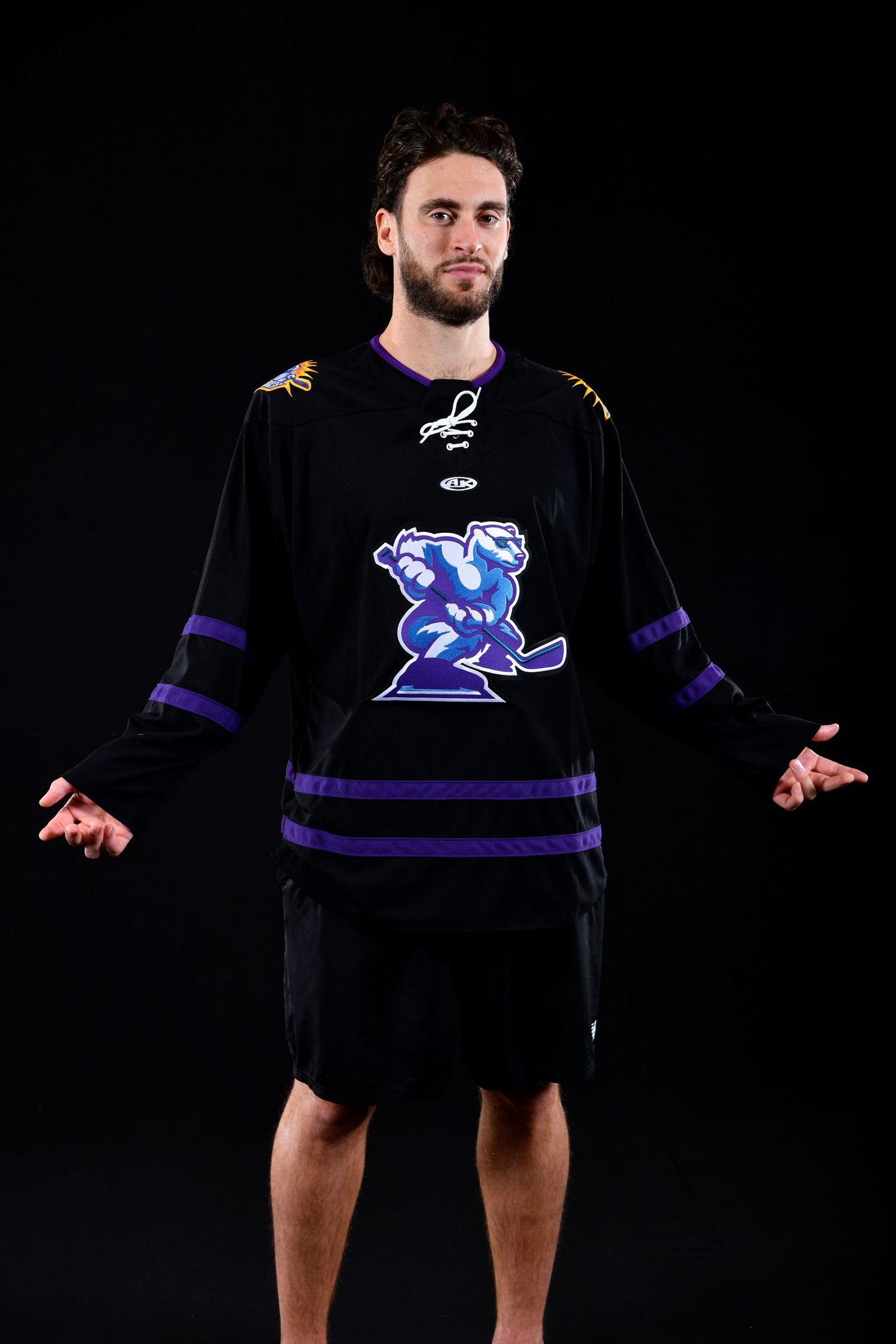
New Solar Bears 3rd
-
 2
2
-
 1
1
-
 1
1
-
-
The Team USA jerseys look like old 70's/80's ski sweaters
-
1
-
-
trying to help a friend id a font. pic is attached, any ideas?

-
is there a free font that is similar to Metroscript and Metroscipt tails? I am needing something similar to what you would find traditionally on backs of varsity Jackets or a solid version of MArcelle and Marcelle Swatches
-
need help identifing this font here
-
pic added
-
sorry, I am not that great at identifing fonts but what is the font used down the sleeve of the Thrashers 3rd jersey?
Thanks again

-
I am looking for a free version of the kabel series of fonts, can anyone help?
-
any one have hockey glove templetes?


2023-24 NHL Jersey Changes
in Sports Logo News
Posted
Isles looks like the Preds from a few years ago
Devils looks like a reverse of the Canes