


cdreed
-
Posts
18 -
Joined
-
Last visited
Posts posted by cdreed
-
-
https://www.espn.com/nba/story/_/id/39586633/nba-story-clippers-new-uniforms-logos
Upgrade or downgrade?
I say upgrade on the logos and court, though I was surprised they distanced themselves from the blacktop motif in the move to Inglewood for more of the nautical theme (though an argument could be made for it's location to Long Beach, etc.)
The uniforms are a major downgrade.... Nobody has nostalgia for the awful Clippers of the 80s and 90s, so why bring back these generic uniforms?
-
 2
2
-
 2
2
-
 1
1
-
-
Recent or not, it's the right way to go.
-
 1
1
-
-
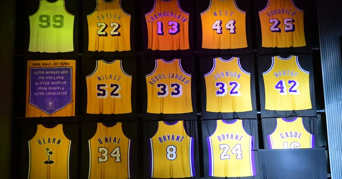
Lakers show how it's done right.... Including Shaq's........

-
2
-
-
Overall however, a massive downgrade,,,, Really looks more at home in 2000 than 2024.
-
2
-
-
Agree that its similar to NBC and SNF.... but still a step up for CBS IMO
-
Better than Twitter, which feels more like 4Chan now...
As for the field, only change for me would be to end the off-center end zones and bring back the conference logos....
-
If this is it, it's fantastic!
-
1
-
-
First peek at Super Bowl LVIII field.... Just about a carbon copy of LVII complete with yellow Chiefs end zone... Just swap out 49ers endzone and Super Bowl logos.
I kind of wish we would have the helmets back.
-
Overall a slight upgrade but I was really hoping we were going to see the end of the lame cartoon players....
-
2
-
-
-
3
-


Los Angeles Clippers Rebrand
in Sports Logo News
Posted
Agreed... Very surprising when they had spent the last few years seemingly courting an inner city-style look and are now moving even more inner city to Inglewood.
This is like moving from being a wannabe gangster in Brentwood to being a wannabe preppie in Inglewood.