


Lumbergh
-
Posts
2,351 -
Joined
-
Last visited
Posts posted by Lumbergh
-
-
The Ravens/Lions matchup looks gorgeous today. Lions wearing blue pants and Ravens in classic home unis.
-
 4
4
-
-
Here's the finalized version of this concept:

-
1
-
-
Cleaned up a few elements on the bird and on the secondary shield:
-
3
-
-
2 hours ago, the_grateful_ted said:
I’d ditch the B in the raven, besides that very creative concept I like it!
A go at the logo minus the B.
-
2
-
-
Here's a concept I've been tinkering with lately for the Ravens. The dark purple has been replaced with lavender to amplify contrast against black, and to give the team a more unique profile. I'm also creating the word mark lettering on my own without a font, so this will come later. Uniforms also to come later. C&C is much appreciated.
-
5
-
 1
1
-
-
Outstanding and inspirational work! Thank you for sharing and putting in the time.
-
On 9/24/2023 at 1:24 PM, upperV03 said:
Such a great matchup. If Washington changed the sleeve stripes to white and added a gold trim to the numbers, these would be my #1 in college football.
-
2
-
-
20 hours ago, nuordr said:
Kansas Jayhawks Blackhawks uniform:
Change the beak to silver since it's a neutral color (get rid of yellow on all school branding), make the bird smaller on the helmet, change helmet to blue, facemask to white, jersey to blue with white numbers and red outlines, pants to white or silver, and you have a winner. The current Jayhawk with huge shoes and tons of yellow needs to go.
-
1
-
 2
2
-
 1
1
-
-
Tampa looks really good.
-
4 hours ago, bowld said:
These honestly dont look too bad. In fact, I really like them when paired like this. Modern take on the Tillman era Cards
Totally agree. Nothing crazy but it's not hard to connect these to the Tillman era. Overall, huge upgrade IMO.
-
4
-
-
On 3/12/2023 at 7:23 PM, coco1997 said:
EDIT: I guess my one nitpick with Japan is the use of red on the caps when it doesn't appear anywhere on the rest of their uniforms.
The pinstripes on this uniform are actually red. I see it while watching the game tonight during closeups.
-
7 minutes ago, Cujo said:
Why would the XFL (assuming things go well for them this time around) take on any of the USFL's failing product? It would be far easier to go the expansion route -- move into vacated USFL cities and create their own XFL branded identities once all those USFL teams fold.
Maybe a team like Birmingham who might have a chance to keep fan attention could join. They already have a name and identity, and coaching staff/roster. Seems easier to just grab a team instead of throwing more money to start from scratch.
-
I will say my original plan last weekend was not to watch the XFL. I had ncaa basketball on until the XFL evening game came on (Orlando vs. Houston). I watched it, and ended up watching the rest of the games. The Rock and ESPN have managed to put an entertaining product out there and if I were to guess, wouldn't be surprised if a few USFL teams eventually get absorbed into the XFL. I can't imagine the USFL wins this battle.
-
2
-
-
Suprisingly don't hate DR's gradient jersey. It might work in the right lighting settings. Also, they may have the greatest baseball roster ever assembled in this tourney.
-
1
-
-
22 hours ago, 4_tattoos said:
Am I seeing things or does St. Louis have a light silver stripe on their darker silver helmets?
Yes they do, it matches the away uniform color at least.
Also, pretty sure Bob Stoops wore his 2020 Renegades hat yesterday...
I'm not hating the football and like the potential, but some of these unis/identities will definitely need altering if the league continues.
-
6
-
-
4 hours ago, gosioux76 said:
These are fun. I think it's smart to keep a set like this in the rotation, much like the Twins do with the '80s powder blues.
And maybe this is an unpopular opinion, but I favor the simpler "T" cap logo, which is also the one I most associate with Nolan Ryan's Rangers stint. It in no way matches the jersey font here, I realize, but I instantly identify it with that franchise. Of course, this could just be nostalgia speaking.
It also doesn't help that the newer version of the T is asymmetrical, with the left side serif extending further than the right side. I've noticed that the new TX logo fixes this issue, but the primary logo does not...It bothers me every time I see it. I'd love some kind of modernization of the Nolan Ryan T at some point.
Here's a quick example I made to show this. Really hope they fix it at some point.
Here's the new TX logo where this was fixed:
So the Rangers obviously know about this symmetry problem and fixed it on the new alternate logo. I'm surprised they didn't just go ahead and fix the primary logo when they moved into their new stadium.
-
3
-
-
The block Kansas City lettering looks better than I thought it would on the blue jersey.
-
6
-
-
5 hours ago, monkeypower said:
Still the best the Twins have ever looked.
Though as much as I love the M hat, I would make the TC hat the primary and make the M hat the alternate.
One my first fitted caps as a youngster. I'd love to see it come back in some fashion.
-
2
-
-
On 10/22/2021 at 4:47 PM, DarthBrett said:
I keep wondering what the new Rockies addition might be. I honestly think it will be one of 2 things. 1), they kill the black vests and come out with a new, black ALT jersey (and I would hope only use it on the road and make the purple ALT exclusive to home games). Or 2), since they started wearing ALT all-white pants with their black & purple alts a few years ago, maybe an all-white ALT jersey with no pinstripes to go with those pants? Sort of like how the Mets had one for a while.
As a Rockies fan, I'm betting on the vest being retired and a black alt reading "ROCKIES" in purple with silver trim. Couldn't imagine a pinstripe-less white uni since the pinstripes (besides the sleeve logo) infuse the only purple.
-
miltonANDlumbergh >>> Lumbergh
Wanted to keep the Office Space theme going, but in a shorter fashion. Had that name for sooo long, decided to slim it down a bit.
-
Pitt looks absolutely horrendous, even the announcers are remarking how bad they look...
-
4
-
-
3 hours ago, Ben in LA said:
Seems legit

-
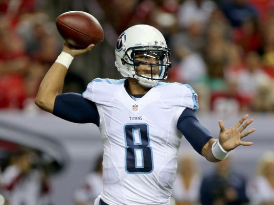
If the Titans removed their helmet stripes, they would look 100x better:
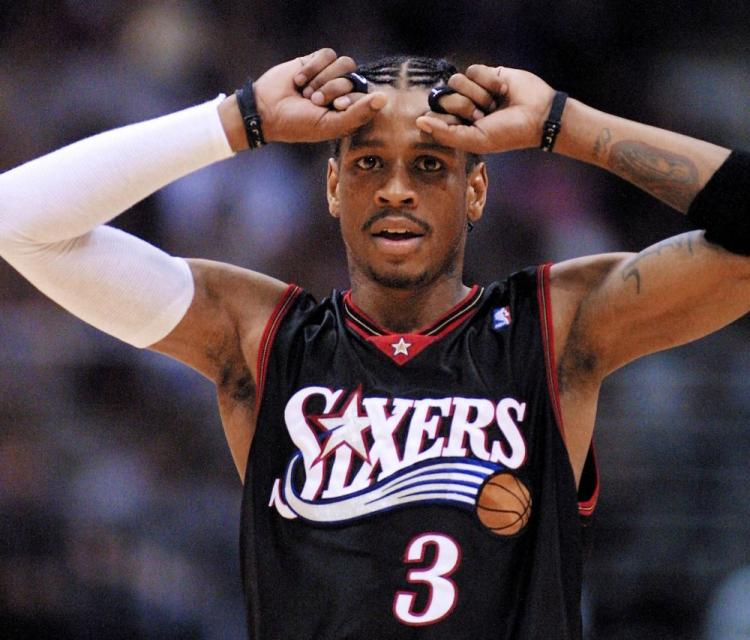
This is the best the Sixers have looked ever, and this is the best black jersey in league history:
This is better than their current set which I've grown tired of:
-
1
-
-
Great stuff. Mind blowing actually...Here is my request, my coveted Denver Bears favorite logo:
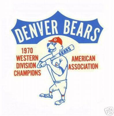
Just the bear, not the text around it.

awesome work. really good job. thanks a bunch!


2024 NFL Changes
in Sports Logo News
Posted
I designed this as a concept a few years ago. The Broncos Wire beat writer has been in contact with me since yesterday regarding this. I'm not sure how it happened either...