


The Giant Pacific Octopus
-
Posts
905 -
Joined
-
Last visited
-
Days Won
4
Posts posted by The Giant Pacific Octopus
-
-
17 hours ago, Ridleylash said:

He lives!
The original version of Nyisles was deemed to scary for the kiddies.
I can't imagine why.

-
 1
1
-
-
Negatives:
No wave stripes
No teal (the little dab on the logo doesn't count)
No wavy name and numbers
No lighthouses
Positives:
The Fisherman is back. He's back in the New York Groove.
Nyisles is back. The greatest mascot in the history of history. (Well except for Mac Tonight from McDonalds)
-
2
-
-
I was wondering what those decals on the back of the Penguins and Bruins helmets were. (From tonight's game).
-
13 hours ago, VampyrRabbit said:
The NHL Barons? Hell no, that team was a dumpster fire.
Not to derail this thread but check out this old SI article about the Barons.
https://vault.si.com/vault/1977/03/07/clevelands-not-barren
What a :censored:show that team was. And that was after their first season. They came back to play another year!
-
1 hour ago, Sport said:
NO! Better yet, not only are they not worth referencing, they're one of the worst franchises in professional sports history and it's a dumb stretch of a reference. There's lifelong Cleveland residents in their 50's who don't know Cleveland had an NHL team. They were an attendance disaster, they were an on-ice disaster, they were a front office disaster who required a loan from the NHL to finish the 76-77 season. They hold the ignominious title of being the last franchise in the NHL, NBA, NFL, or MLB to fold and they only made it two seasons. Cleveland, while yes also in Ohio, while yes the home of our AHL team, is two whole ass hours away and is not the same city. It's not even all that similar. "But they used Ohio in their logo" I DON'T CARE.
When the Barons and North Stars merged, the merger deal was written on a cocktail napkin in a bar in Czechoslovakia, and after the board of governers approved the merger, one of the governers was quoted as saying "All we did was take two bags of :censored: and merged them into one bag of :censored:."
-
1
-
-
58 minutes ago, Nordiks_19 said:
I don't get the sudden love for the fisherman, it was ugly af in the 90s, and would still be ugly today.
-
 1
1
-
-
They ruined the Fisherman.
-
8 hours ago, DTConcepts said:
what are the odds the reverse retros will have jersey ads?
What are the odds that one day we'll have digital ads on jerseys? During a game you'll see the Montreal Canadiens logo vanish from the front of the jersey and be replaced by a Bell ad for 15 seconds.
Bell Internet.
The fastest 7G Internet in Canada
Connect your home and all your devices to the most reliable and powerful Internet in Canada.
Bell Internet.
Before reverting back to the CH logo.

-
I just want to say the new Kraken mascot sucks.
-
 2
2
-
 4
4
-
-
Not really unused because it was just a mockup for the 1982 draft but check out the all green North Star "N".
-
On 8/10/2022 at 1:42 AM, Frylock said:
That right there seems like the smoking gun. What a garish mashup, though! Black and yellow stripes, with a red and green crest? Oof. Almost feels like a “this is what they had in stock, so these are our team colors” sort of situation.
I agree. When I saw the (inaccurate) replica at the HHOF back in the 90s I thought it was pretty sharp (blue with red and white trim with the pretty flower on the front). But then after doing research and finding out they had ugly bumblebee stripes, I was disappointed.
BTW Not to derail this thread any further but I always thought it was funny that renditions of the Rosebuds logo on the web were so inaccurate from the actual logo on the sweater including the one on this site. Check out the comparison from the actual logo to the common renditioned one.
BTW The original Rosebuds of the PCHA (1914-1918) had a rose logo too. It just wasn't on the sweaters. It was on their team pennants (which was the only type of merchandise back in those days).
-
3
-
 1
1
-
-
On 8/7/2022 at 8:26 PM, uniformity said:
Little known fact: the Portland Rosebuds uniform above was a black and gold in a rugby style sweater with horizontal stripes.
Weird thing is (in regards to the horizontal stripes) is that some sweaters looked like they had them while others didn't. Look at McCormicks sweater vs everyone else.
-
 1
1
-
-
12 hours ago, Frylock said:
I’ve heard that lately, and have been having a hard time finding proof. Yes, I know, no color photographs, but is there a written reference from that era? Portland teams are my jam, so, I’m super intrigued by this.
Way back in the day (around the turn of the century) I was helping a guy named Lee with his old site the Hockey Sweater Museum. I think he was from Victoria and he found a reference on microfilm where the writer (who covered the game) referred to the visiting Rosebuds as having black and yellow colors.
-
1
-
-
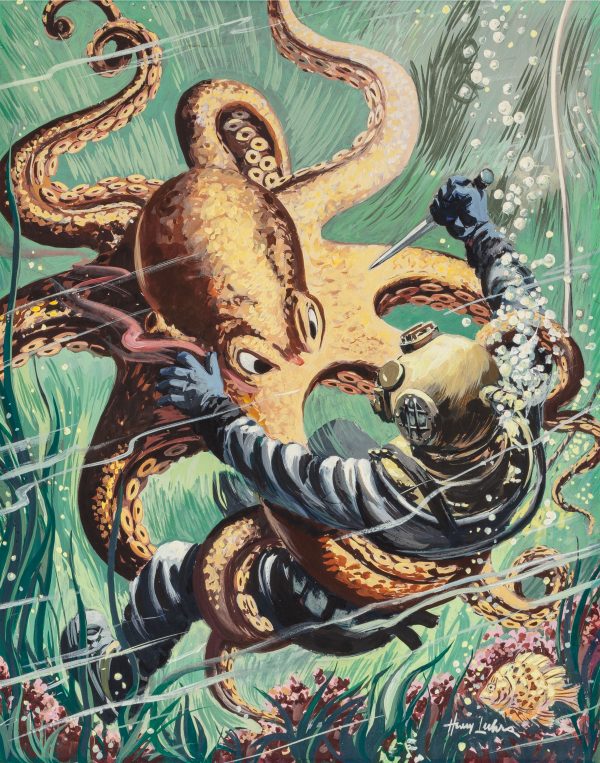
On 2/7/2022 at 9:26 AM, CS85 said:
They've still yet to release their mascot (which I'm hoping is an old-timey scuba diver).
Bring it on!!!!!
-
2
-
2
-
1
-
-
23 hours ago, SFGiants58 said:
Point us to it in the Toronto Star's online archives, please. I'm sure you can find it, you're a crafty octopus.
You see here is the thing. I dont go through my life keeping a bibliography of every news report I read or recording every radio spot that I hear especially in the pre-Internet era.. Back in the 1980s and 1990s it never occurred to me that one day I would have to cite something I heard or read to some stranger on something called a "message board" on something called an "Internet". I have a strong memory (especially from the 90s and 80s. When I was younger) and I remember specifically the little girl winning entry news bit.
Now if you are so obsessed with tracking down a citation or radio report to verify the story, I've given you the avenues to pursue your research.
Here is the Fan590 link
Contact them and tell them you wish to listen to their radio archives from the 90s (providing they still have the original recordings on file somewhere) and they will help you on your way.
Her is The Toronto Star website
Inquire about finding archives from the sports news stories from the 1990s, and I'm sure they will point you in the right direction.
-
13 hours ago, kimball said:
I'm pretty sure it wasn't the little girl who named the team. There was a contest of over 2,000 suggestions and Raptors was one in 10 that were considered. I'm looking for record of the girl winning the contest, but I'm sure it was a drawing of a few hundred suggestions like how most of these contest end up being.
I found this from the official Raptors page: http://www.nba.com/raptors/news/behindthename_081606.html
The winning entry was a little girl. I remember it specifically. I remember the Toronto Star article and I remember them announcing it and discussing it on the Fan 590. I don't know if the Fan 590 has archives of their old shows but you should contact their website and inquire.
-
33 minutes ago, SFGiants58 said:
A citation for that would be nice. It could be a simple link, a page from a book, etc.
Back when the name was announced I was listening to it on the Fan 590 (a popular sports radio station here in Toronto), and they stated the winning entry was sent in by a little girl and that she was given a prize pack for her name being selected (i think it was something like season tickets and some jerseys and paraphernalia) . And I remember stating to my brother "So they listened to some kid for the team name". We all hated the name when it was announced.
As for in print there was an article that mentioned it in the Toronto Star and if I recall a blurb in Gamepro magazine under their "Entertainment News Section"
-
42 minutes ago, kimball said:
I'm not sure what being a little girl has to do with the winning entry
The fact that they listened to a little kid who liked Jurassic Park. They name a professional sports team Raptors because some kid loved a movie.
-
Despite the stupid logo, the name Toronto Towers is alot better than Toronto Raptors. No-one knew what a raptor was until Jurassic Park, and the winning entry was sent in by a little girl!
-
1
-
-
I was asking about that Penguin logo on Page 27 of this thread!
-
Has anyone ever seen this before?

http://hockey-blog-in-canada.blogspot.com/2011/10/oregon-ohio-ottawa-oh-oakland.html
-
12 hours ago, Chico said:
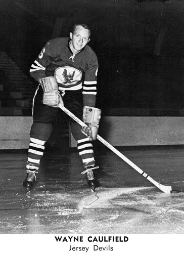
Found this New Jersey Devils jersey on ebay today. I believe the Devils introduced these logos in 1996. They were mainly used for promoting the Devils Den merchandise catalog but do remember having a hat with the shoulder logo on it.
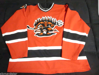
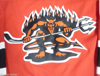


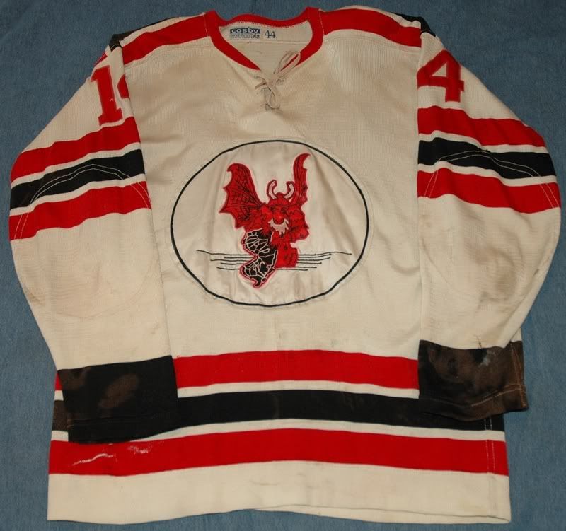
That would be an awesome third jersey. Seriously I was always dismayed that the Devils never had an actual Devil logo. The old Jersey Devils of the EHL did.
-
4
-
-

Failure as a logo and as a brand identity that is.
-
On 2016-07-10 at 2:10 AM, mcrosby said:
I took the liberty of cleaning that logo up. I made a few changes, and may make some more and post over in concepts.

That logo is way better than the logo they use now.
But then again, a picture of a German Shepard's shaved ass would look better than the logo they have now.
-
6
-


2022-23 NHL Season
in Sports In General
Posted
Some tragic news.
The SS Avalanche sank off the coast of Seattle.
The early reports was that it struck an iceberg and sank.
The "official" report is that it struck a pod of whales and went down.
But the local fishermen tell a different story.
They say it was sunk by something else.
They say it was a monstrous creature living deep below the surface.
A creature few men dare talk about.
An octopus the size of a mountain.
Now everyone chalks it up to the fishermen drinking too much alcohol.
They say its just superstition and myth.
Childish fairy tales.
The locals know better.