


Logoman.
-
Posts
9 -
Joined
-
Last visited
Posts posted by Logoman.
-
-
On 7/11/2022 at 1:09 PM, officeglenn said:
Wolverhampton is a weird one to me. Like, technically, their name is Wolverhampton Wanderers FC, but they usually go by Wolves, their website URL is wolves.co.uk, and their crest is a wolf. So their crest just being a wolf by itself, without any words/lettering, sort of made sense to me -- or, at the very least, it didn't add to the confusion. By adding the "Wolverhampton" and "Wolves" text here, though, I think that does add to the confusion. The shape of the shield is nice, and the cross and even the "1877" would be nice additions, but other than that, I don't think any words are necessary.
Commenting on what's here, though -- I can see you've distorted "WOLVES" a bit vertically. That makes the edge of the S not line up with the shape of the shield, which throws things off for me. I realize it's kind of a damned-if-you-do-damned-if-you-don't situation because of the angle of the W on the other side, but I think we're used to seeing the angles of Ws and filling in that space in our brains, so keeping it straight up and down would be less jarring than it is now.
Another alternative would be to alter the shape of the shield to match the wolf's head more. Bring in the top corners so it tapers toward the top. It wouldn't have to be by much -- it wouldn't have to come to a point or anything drastic -- but it could help line things up visually. Then you could distort "WOLVES" to match that taper.
I took your advice and this is what changes I made.

-
 3
3
-
-
As my favorite club in the EPL, I really want to do this one right. It isn't finished and I'm looking for some feedback. I love the current badge but it is indeed too simple. I kept the wolf head because even though it's simple, it does look menacing and does the job. So here it is so far:
-
1
-
-
5 minutes ago, MJWalker45 said:
The outer badge reminds me a little of Houston. I'd also place the FC above the Dallas as the team's name in FC Dallas. I do like the Dallas font though.
Yeah, it definitely is Houston's. Originally I was going to do both in one concept but then gravitated towards just Dallas.
I played around with the the FC and it looks and fits better below. I do like Dallas FC better than FC Dallas that is my reasoning on that. I can play around with the layout again.
-
1
-
-
Here is my attempt at a modernization of Dallas FC. I really like the bull/longhorn design so decided to keep that pretty much the same. There will be more MLS redesigns later in the future. I'm just trying to get back into designing after a very long hiatus. Let me know what you think!
-
7
-
 1
1
-
-
These are all really good! I think there is too much gold on the Pitt gold uniforms though. I think blue shorts and blue facemask or something would contrast it nicely. Just my opinion.
-
1
-
-
On 6/22/2022 at 9:00 PM, dont care said:
Should have kept pontiac. They have so many more memorable models like the trans am, fire bird, GTO ect. Buick has what? The grand national and that’s it.
I love the '05/'06 GTO aesthetic. I always wanted one.
-
On 3/29/2022 at 4:59 PM, coco1997 said:
City Connect is back, and so am I!
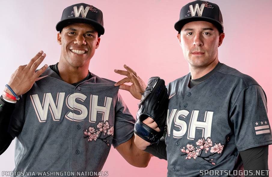
WASHINGTON NATIONALS:
Washington unveiled their City Connect set this morning and I have some thoughts:
What I like:
1. The color scheme2. The cherry blossom theme
3. The cap logo/design
4. The D.C. flag
What I don't like:
1. "WSH" on the front of the jersey
2. The off-white pants
3. Lack of piping/trim
To address my issues with the set, I made a few changes. First, I went with matching slate gray pants to go along with the jersey, which in turn meant pink undersleeves and socks. Next, I used a font called "Grand Gibson" to create a "District" wordmark in the style of the Homestead Grays. (To my knowledge we haven't seen the back of the jerseys yet, so I just used the same font for the numbers.) Lastly, as much as I like the use of the D.C. flag, I don't like that it looks like it's just kind of floating there on the left sleeve, so I decided to incorporate the flag into the actual sleeve design, with two thick pink stripes and three stars facing outward.
C&C appreciated!This is definitely better than the current one. "The District" looks and sounds better than "WSH". The flag sleeves are a nice touch too.
-
Baltimore and Boston both look great.
Atlanta's color scheme is nice but I'm not sold on the name Hammers. I get what you're saying about a name change and I'm sure you were keeping it close with the tomahawk. I'm just not sure if Hammers is it though. I also immediately think of West Ham United.


Wolverhampton Wanderers
in Concepts
Posted
Yeah, I feel what you're saying. I really want to make this one special since I love Wolverhampton but this is a good start so I don't lose any ideas. Thanks for your input.